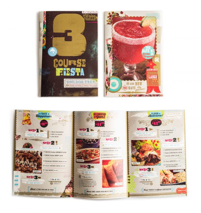
As designers it’s easy to get caught up in the beauty of design work for single location restaurants. When a restaurant grows into a multi-unit there are more problems and hurdles when considering design. It has to work in each locale, pricing may vary between locations, some locations may have special items whereas others won’t. There are a lot of nuances with monetization and optimizing the menu as well. I love typography and clean layouts as much as the next designer, but facts are facts. A fact of menu design is that images raise check averages. People may balk and say that it cheapens the look, but what if the look is meant to be more street? In that case, pictures are exactly what makes sense.
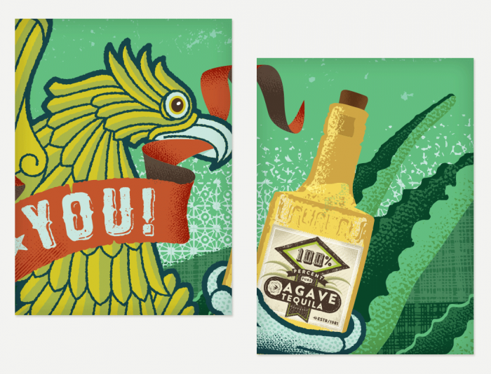
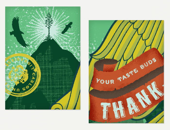
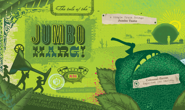
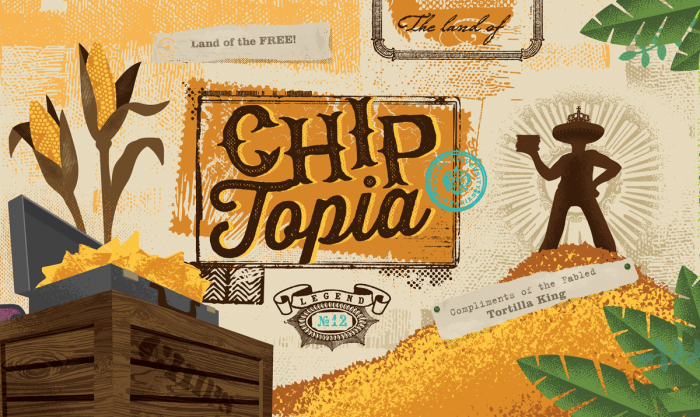
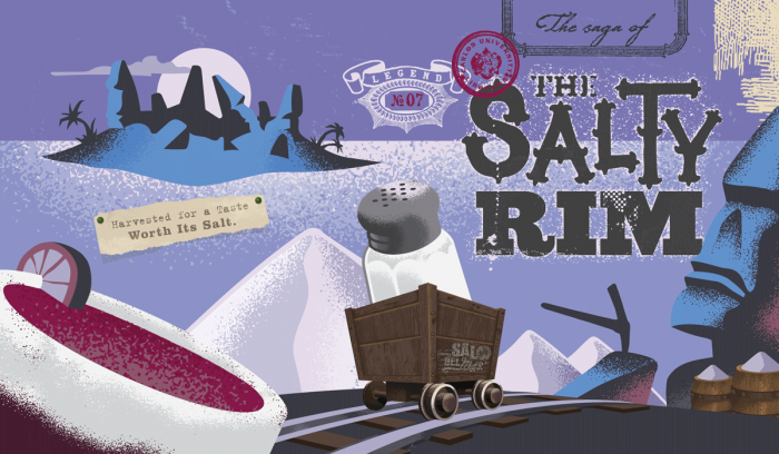
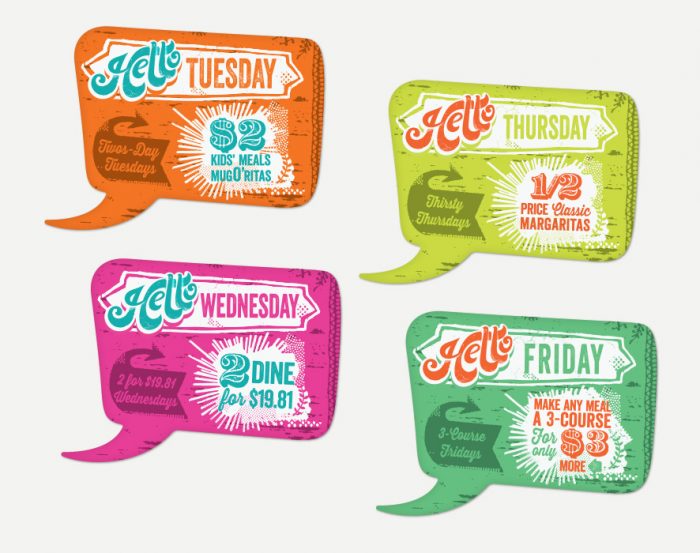
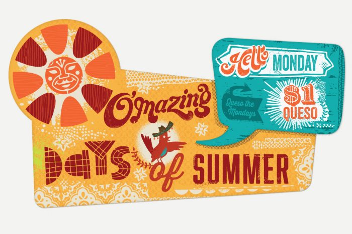
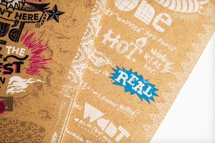
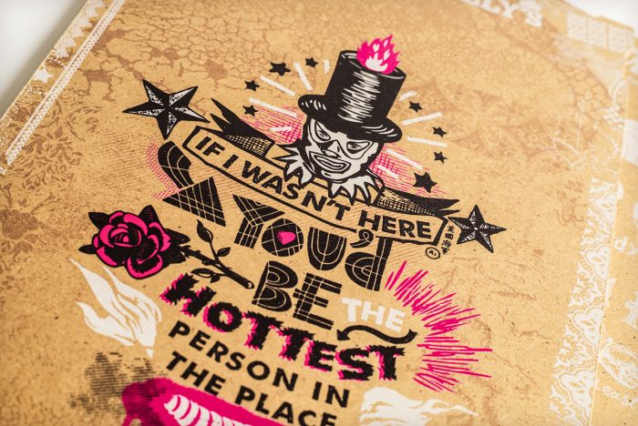
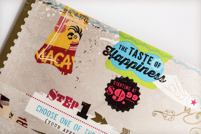
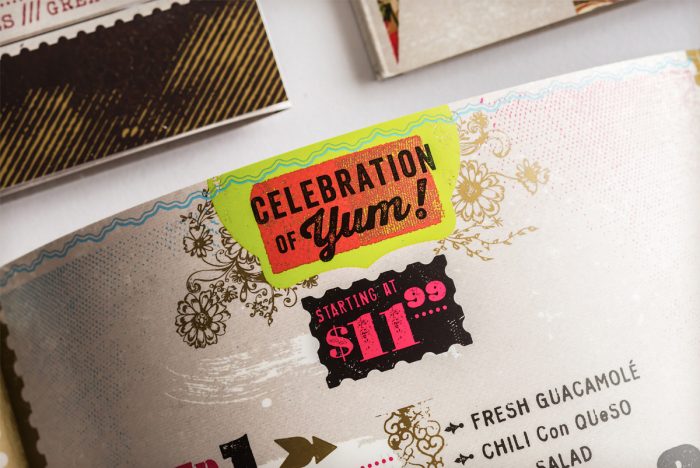
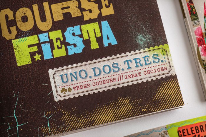
The menu design and art work for Carlos O’Kelly’s is a case where images are introduced to a menu in a smart, beautifully designed way. The artwork and overarching aesthetic plays into the composition creating a fresh Mexican flare while keeping things approachable and street-style. Many type styles mix will illustrations of traditional Mexican icons and receive a gritty texture. Bright, fresh colors pop with each other to create a vibrance across the many touch points. This is an unforgettable brand and they use pictures in the menu.
Designed by Gardner Design
