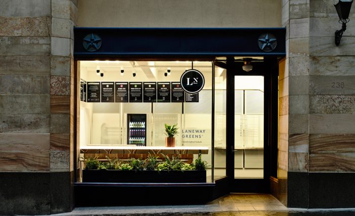
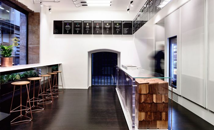
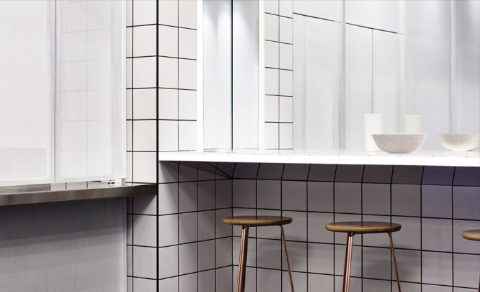
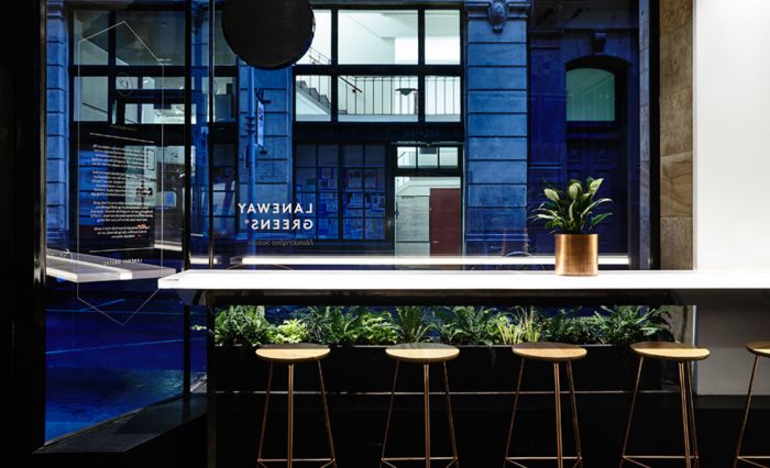
Small, but mighty, the branding and interior design for this quick serve salad bar restaurant is minimalism at its finest. The experience from the interiors through the design touch points is simple, and strong in its delivery making a correlation between the food, vision and visual. The inspiration for the design aesthetic is explained perfectly by Travis Walton, the designer:
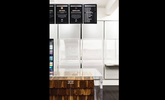
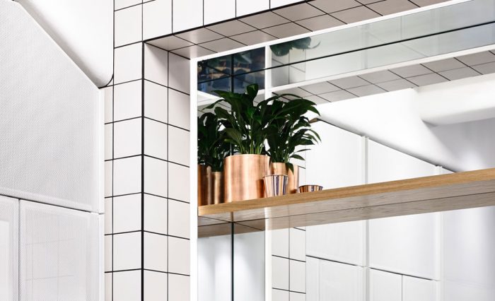
The canvas of warm subtle neutrals against which the salads and smoothies become a vibrant, spotlight-stealing pop of colour; existing hardwood floors and exposed concrete ceiling were retained and complemented with a striking point-of-sale counter encased in solid American Walnut shingles. White powder coated steel and polished stainless steel elements further accentuate the clean ‘future-luxe’ aesthetic, while LED-backlit clear Perspex benchtops and mirrored window film offer a feeling of light, bright, modern space – and plenty of room for reflection.
Architecture & Design by Travis Walton
