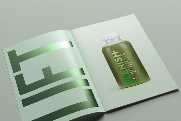
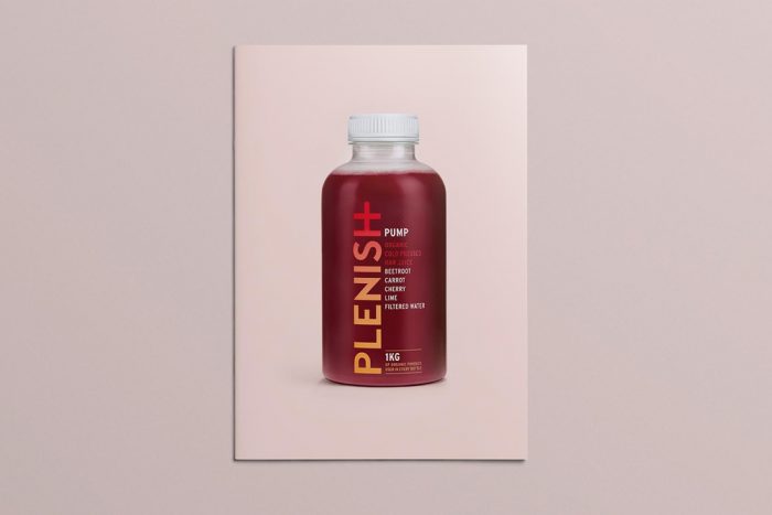
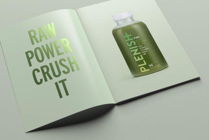
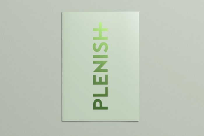
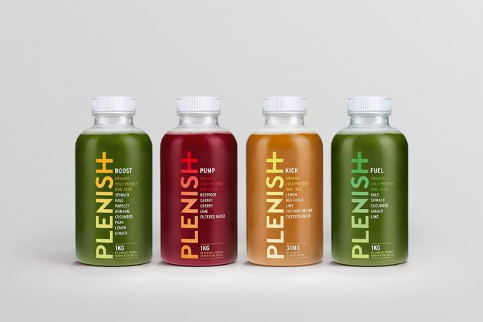
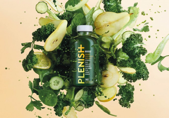
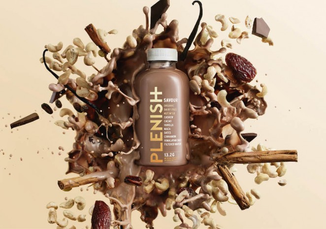
The simplicity of this brand identity is so strong that it jumps out. When offset by the explosions of ingredients, the Plenish brand hits its stride. It’s fresh, strong, and quite different from the other juice brands who tend to go ultra-granola. The strong, bold typography makes a bold statement about the purity of the product and brand. Truly natural colors subliminally tell their story perfectly.

Designed by Mother Design

download (8)

download (7)

download (6)

download (5)

download (4)

download (3)

download (2)

download (1)

download

214381!1453221201!160106plenishcasestudy6

214381!1453221182!160106plenishcasestudy9

The Forktales Podcast™: Interviews with restaurant industry leaders and visionaries

Restaurant and advertising industry headlines and thinking

Reviews of restaurant experiences from around the globe 

Reviews of our favorite design, business, & restaurant books

Our favorite typography and fonts

Inspiration in your inbox

Get the latest inspiration in your inbox every Monday morning, for FREE!

"*" indicates required fields

This field is for validation purposes and should be left unchanged.

Delicious Bits in your Inbox!

Get the latest and greatest content delivered to your inbox for free!

"*" indicates required fields

This field is for validation purposes and should be left unchanged.