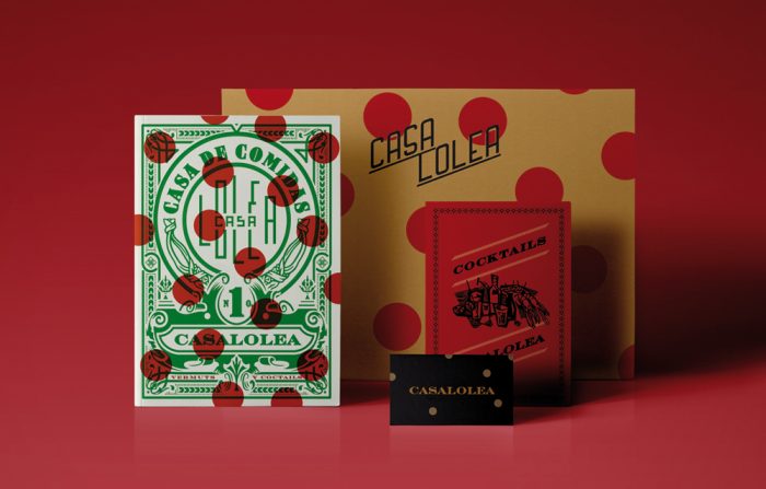
Casa Lolea restaurant branding

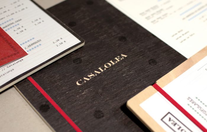
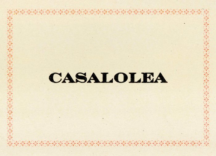
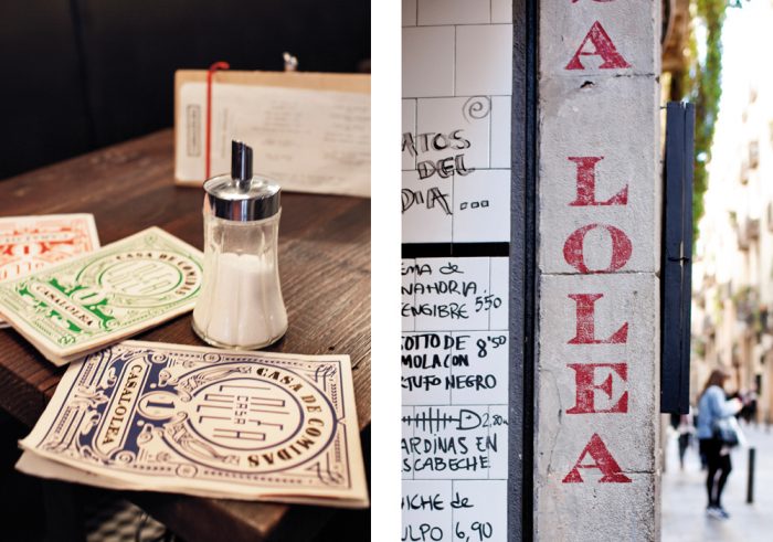
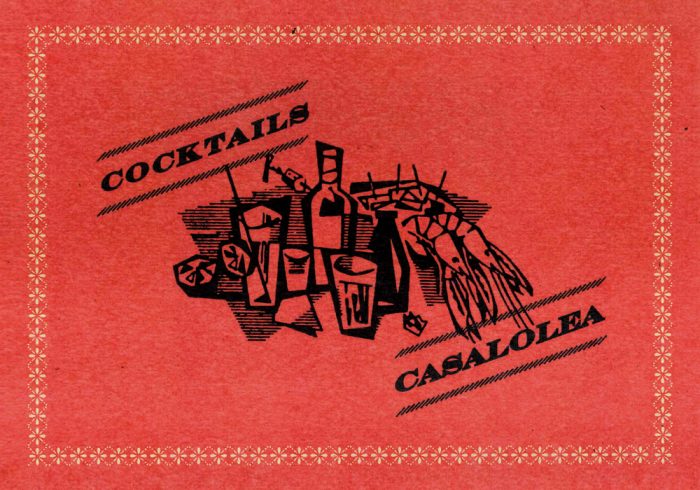
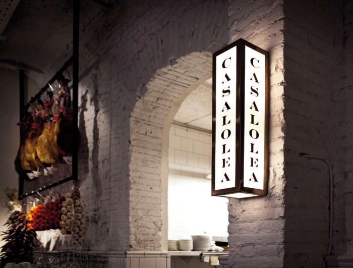
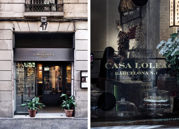
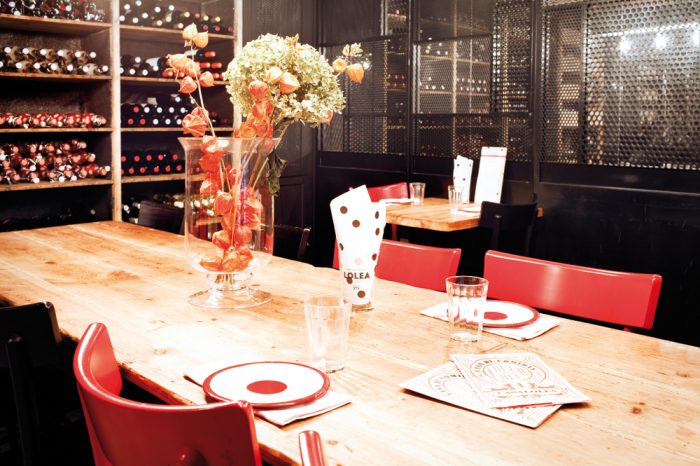
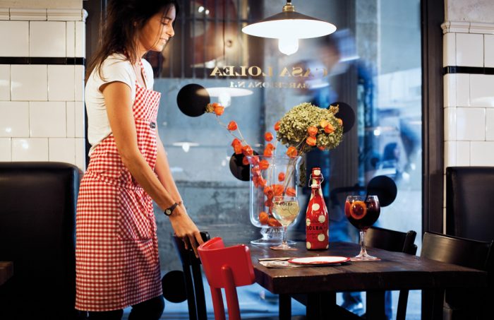
Hey folks! I’m back. Ready to continue sharing brilliance from around the world. Today is a gem of a project from one of the places I visited on my recent trip, Barcelona. Although I didn’t get to stop in here, this restaurant branding work is phenomenal and I wish I had.

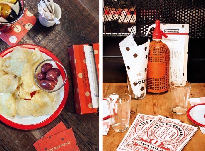
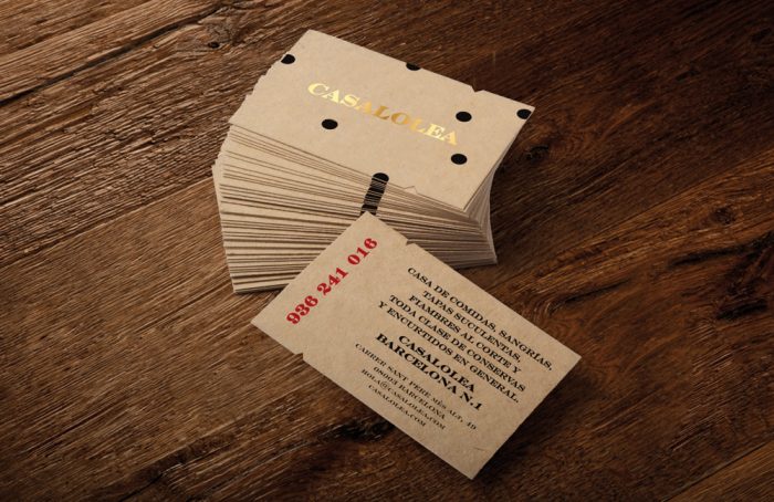
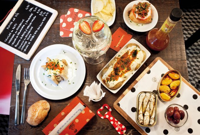
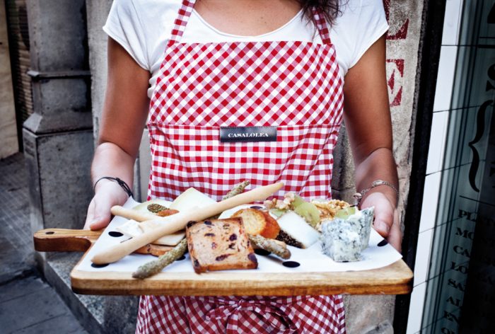
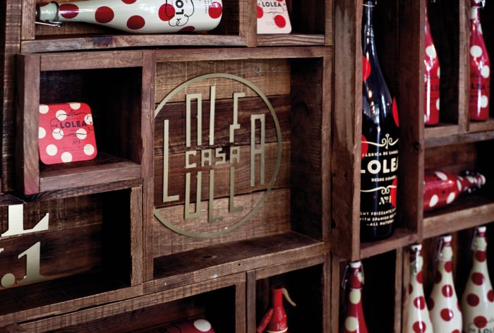
The brand identity captures the historic feel of the brand while delivering it in a fresh, contemporary style. Using overlaying design elements, the team at Estudio Versus melded the two styles which perfectly captures the feel of Barcelona herself. History meets modern and beautiful dance not unlike the improvisational beauty of Flamenco.

Designed by Estudio Versus
0f1b1631777933.565ff957f1c4d


2af9ef31777933.565ff9580100b

4a610831777933.565ff957ed4a8

007f8331777933.565ff957f0c82

29d36b31777933.565ff9580537a

45d4df31777933.565ff9580636e

634fd131777933.565ff957f2b84

1658a831777933.565ff9580740d

8264b931777933.565ff95808787

28865c31777933.565ff957f406a

51173331777933.565ff957ee682

a88cfa31777933.565ff95804337

b5ce9231777933.565ff9580213b b642be31777933.565ff9580329c


The Forktales Podcast™: Interviews with restaurant industry leaders and visionaries

Restaurant and advertising industry headlines and thinking

Reviews of restaurant experiences from around the globe 

Reviews of our favorite design, business, & restaurant books

Our favorite typography and fonts

Inspiration in your inbox

Get the latest inspiration in your inbox every Monday morning, for FREE!

"*" indicates required fields

This field is for validation purposes and should be left unchanged.

Delicious Bits in your Inbox!

Get the latest and greatest content delivered to your inbox for free!

"*" indicates required fields

This field is for validation purposes and should be left unchanged.