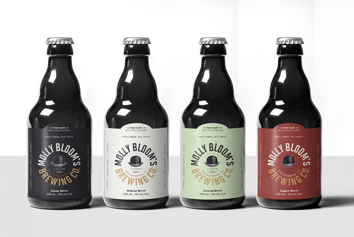
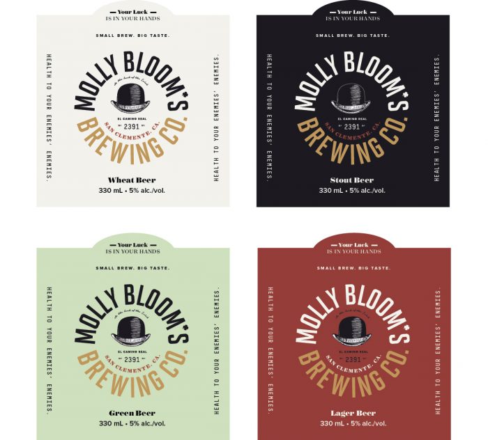
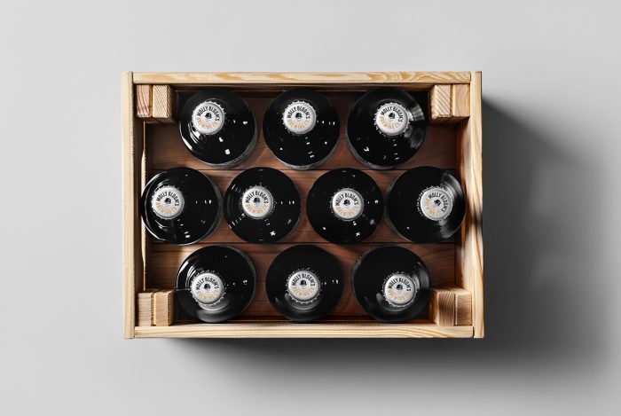
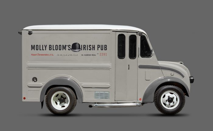
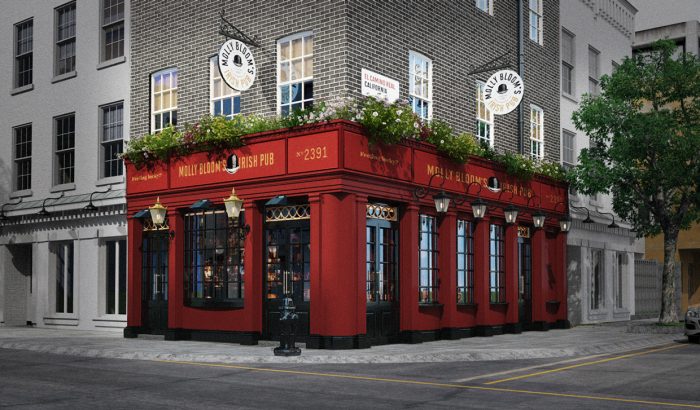
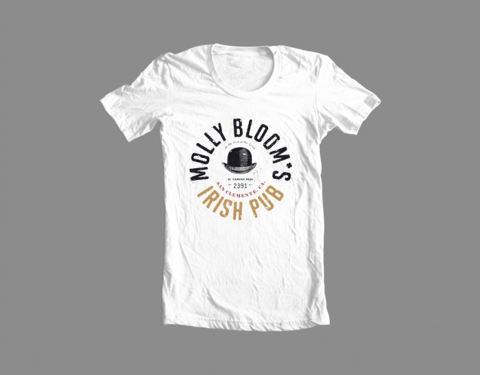
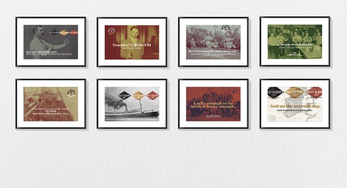
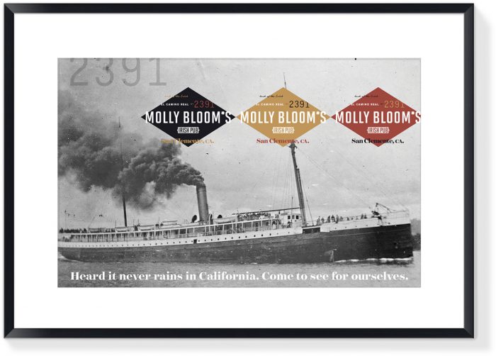
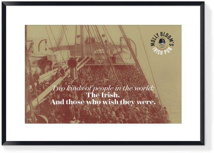
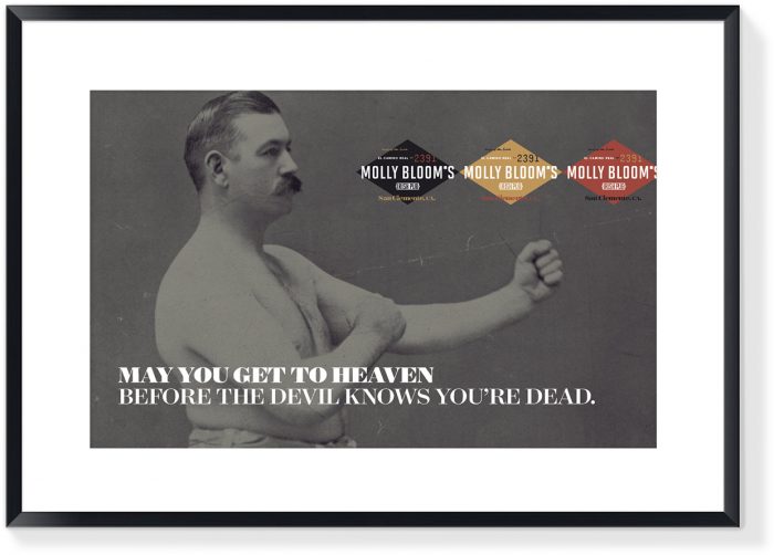
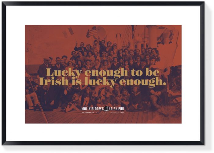
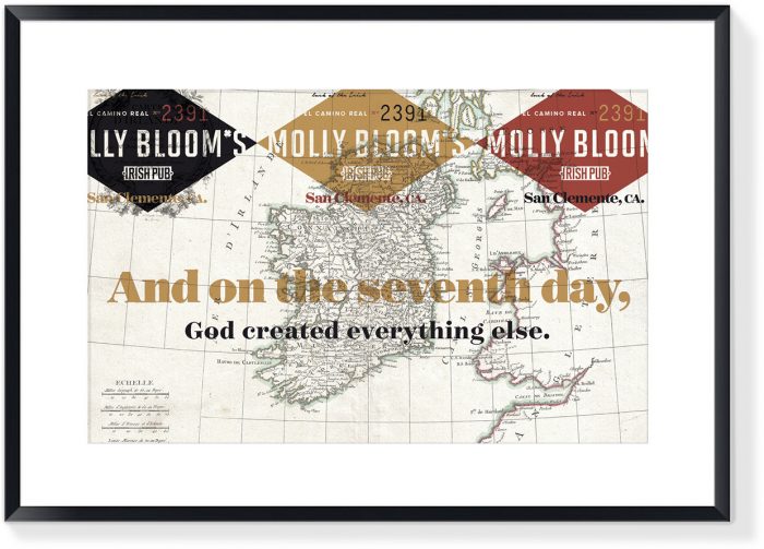
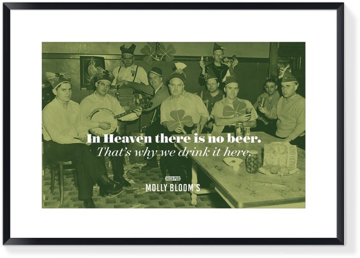
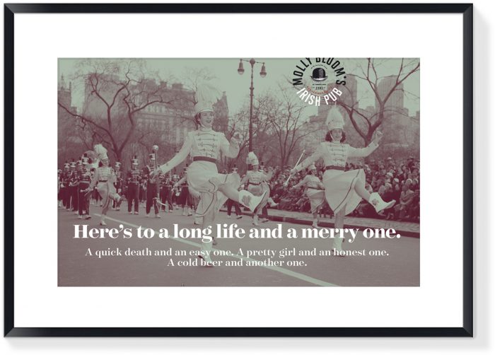
There’s an Irish pub in every city across the US. They all look the same as if they were built from a kit (most actually were along with importing real Irish folks to work the bars.) They’re comfy and folksy and a step into another world, but each one is no different then the next. From the brand’s identity through interiors and marketing, they’re cookiecutter and quite unremarkable. Cue Molly Bloom’s:
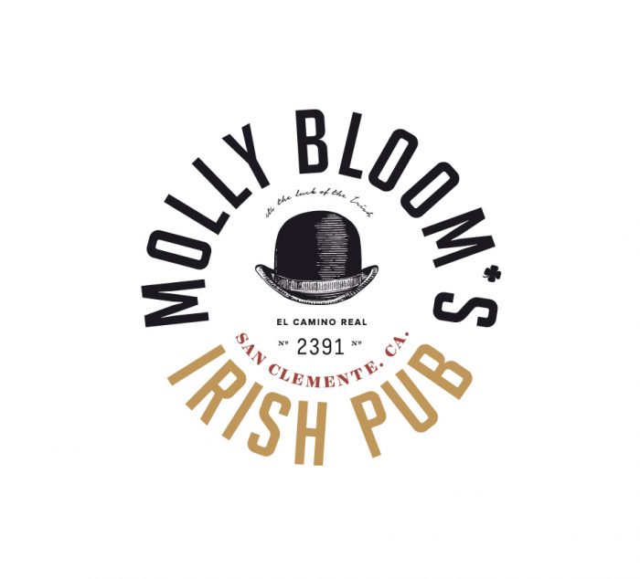
Molly Bloom’s Irish Pub came to me with the task of rebranding their San Clemente pub. Wanting something unique and unexpected, I put on my Irish hat, settled into a pint of Guinness, and looked to the past for today’s inspiration. The new design combines a bit of edge with some Irish irreverence and a touch of vintage American east coast. I’ve never been to California, but now I have the perfect excuse to stop in for a pint. – Richard Marazzi
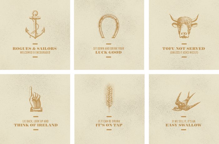
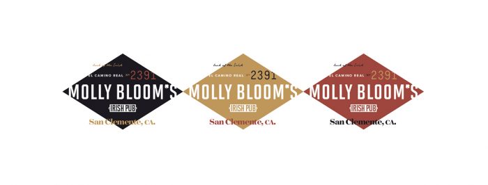
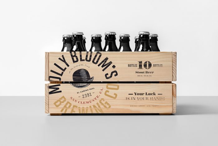
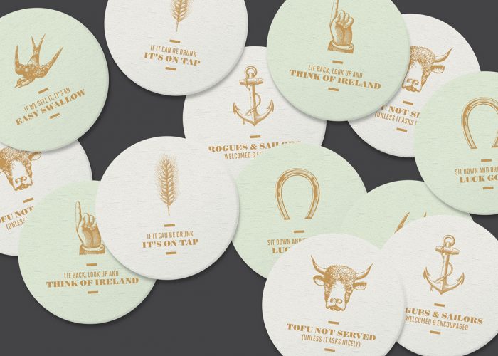
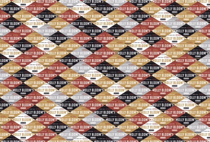
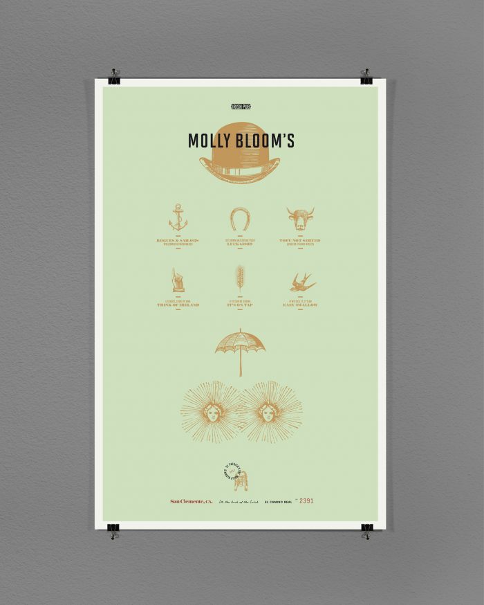
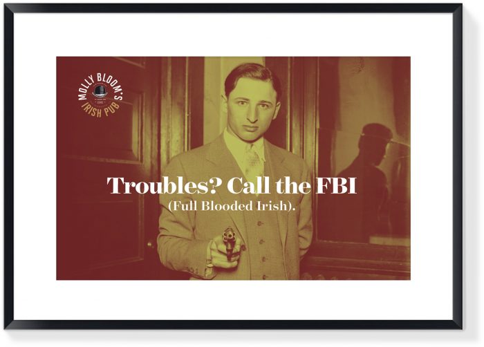
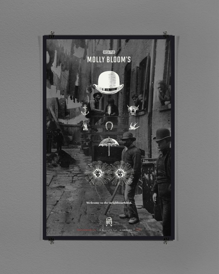
Molly Bloom’s brand identity is robust and fresh. It maintains the classic roots, but does so in a way that side steps the expected Celtic cliches. Strong typography, engraved illustrations, and witty nods to American Irish roots make this Irish pub’s visual and voice unforgettable. The one-liners don’t come across forced and when coupled with the illustrations they just sink in to the soul. The various logo lockups, although different, seem perfectly married to one another making for a family that’s versatile yet strong.
Overall the brand is robust enough to work across many platforms and touch points giving each one the opportunity to shine. Grab a pint of your favorite Irish stout and have a look through this magic.
Designed by Richard Marazzi
