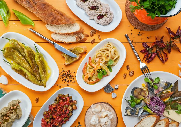
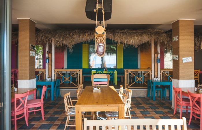
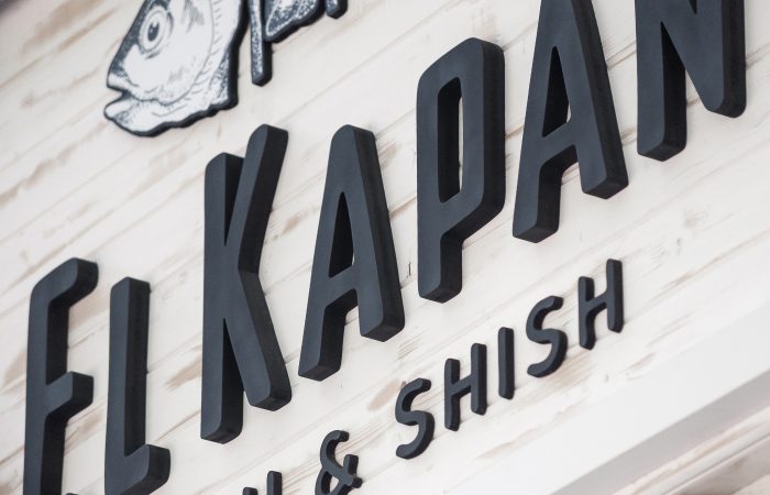
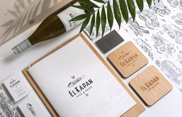
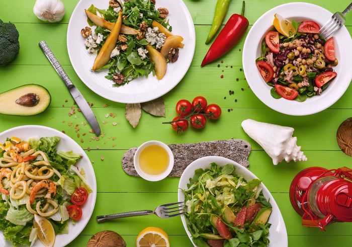
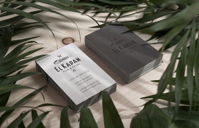
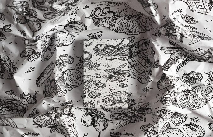
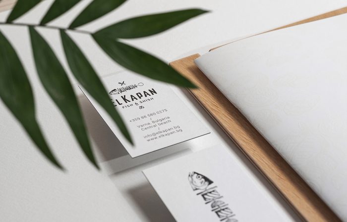
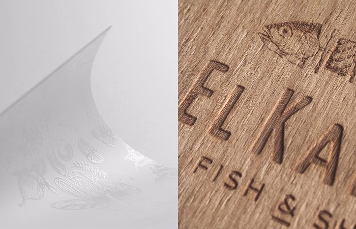
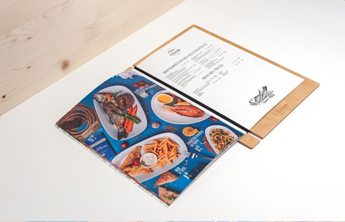
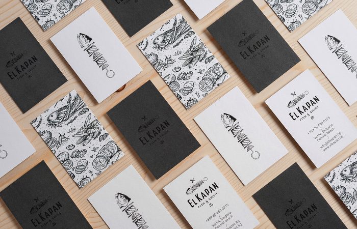
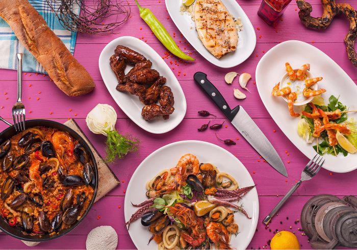
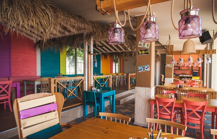
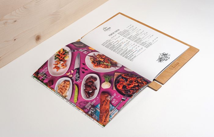
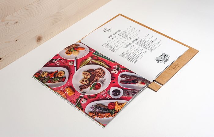
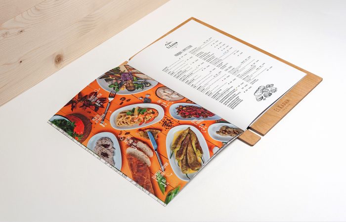
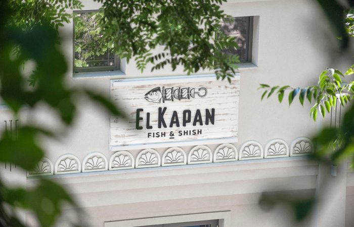
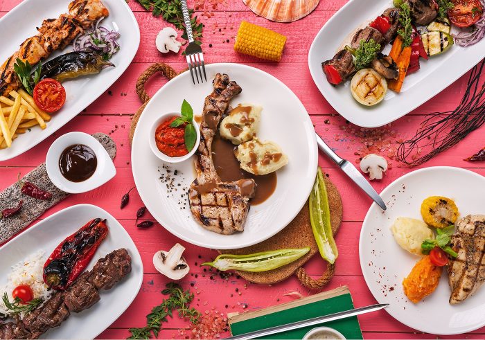
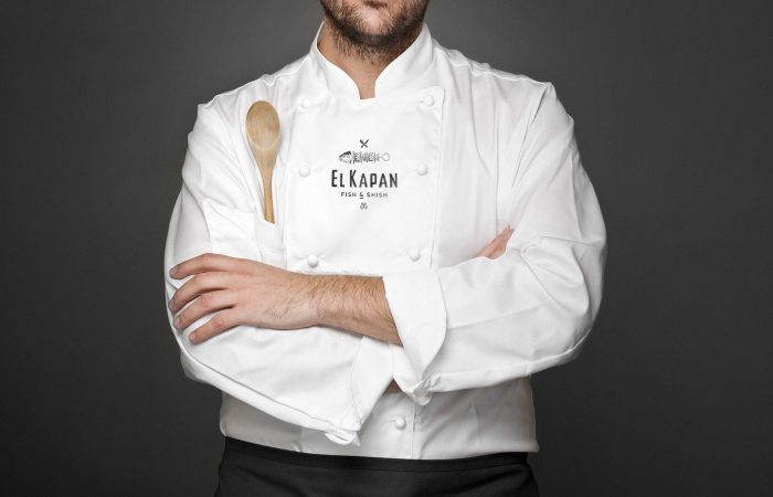
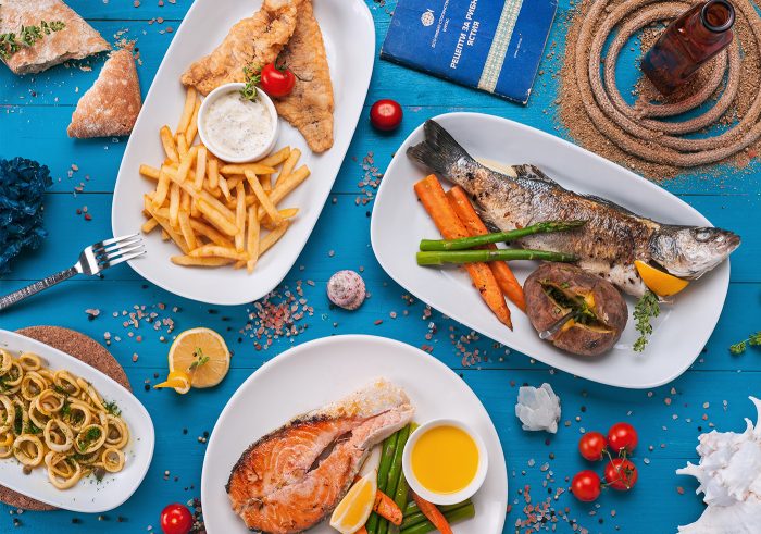
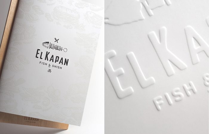
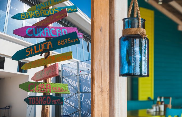
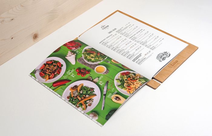
El Kapan’s brand spans across multiple media with each adding its own elements. With bright pops of vibrant colors intermingled with imagery of food and based on a simple reserved layout and base color palette, the brand identity is allowed to command a number of different attitudes. This speaks directly to the offering of “shish and fish” where you can have multiple flavors all on one plate.
I may be the only designer who says this, but I love photography in menus. It’s was a no-no by many chefs for a long time because it reminded them of a chain restaurant. However, when you spend so much time on presentation and creating beautiful dishes, why not let that sell the plate? Some would say it’s because you can’t guarantee that same look every time, however; I think it’s worth that little risk.
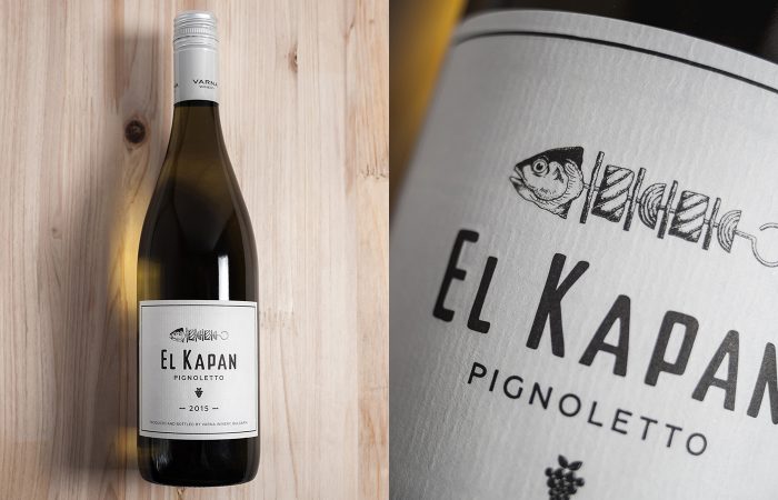
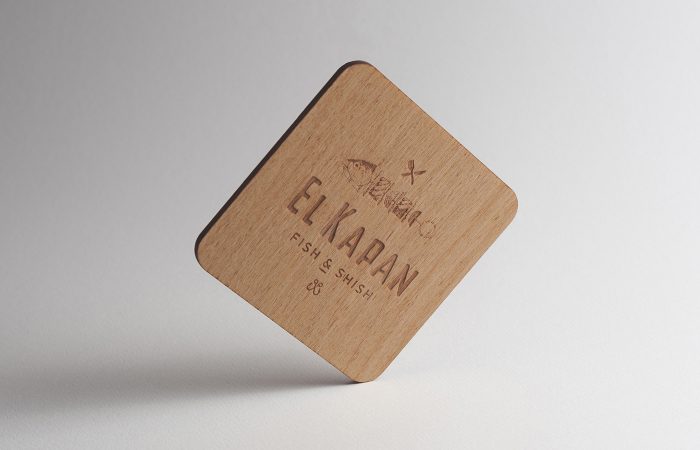
I would have liked to see the color pops find their way into the stationery and wine labels. Even if they were subtle I think it would’ve furthered the tie in. With the pen and ink illustrations a water color element would’ve been a superb delivery mechanism for said color pop. Even without it, they’re simply beautiful.
Designed by Marka Collective
