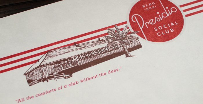
Sometimes an adherence to vintage style is just plain awesome. It evokes nostalgia for a time long past. There’s something comforting about it; familiar. The brand identity for the Presidio Social Club is vintage at its finest. The art deco meets art nouveau influences in typography seem as if they’ve been plucked from history and brought to the now.
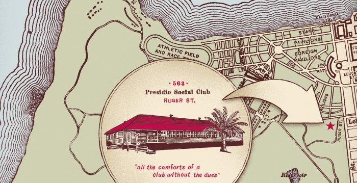
Presidio Social Club’s look is “set within the former army base of what is now the Golden Gate National Recreation Area, the Presidio Social Club recalls the building’s former life as an officers’ club in the 1940s.”
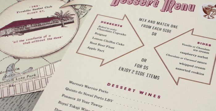
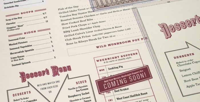
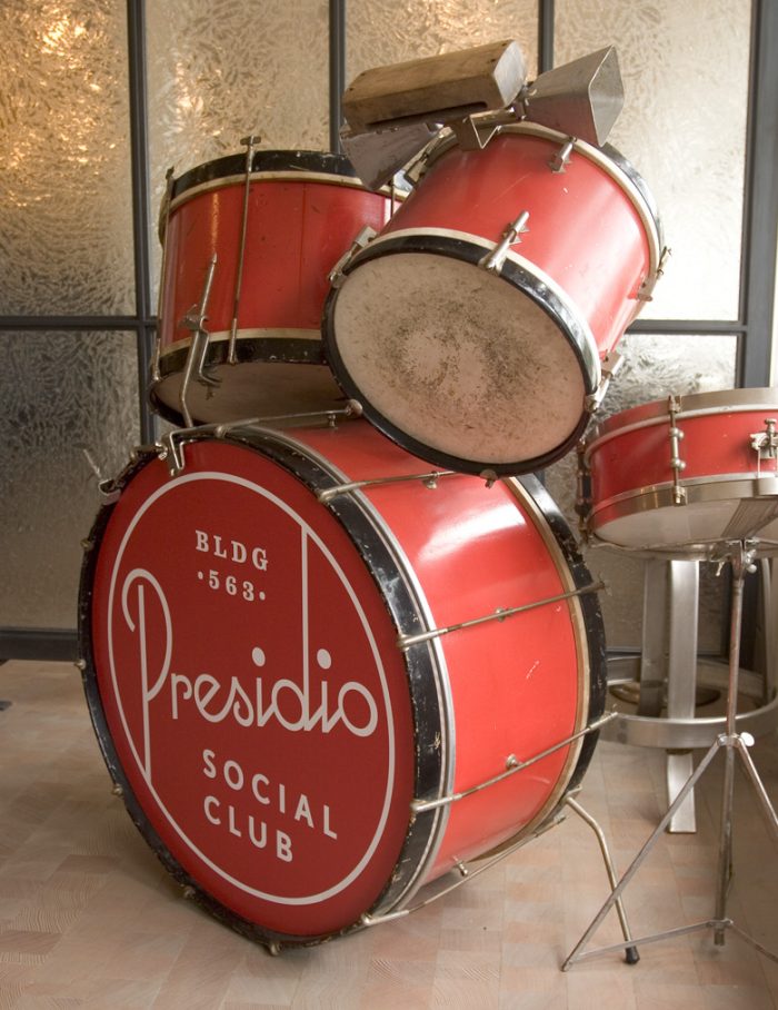
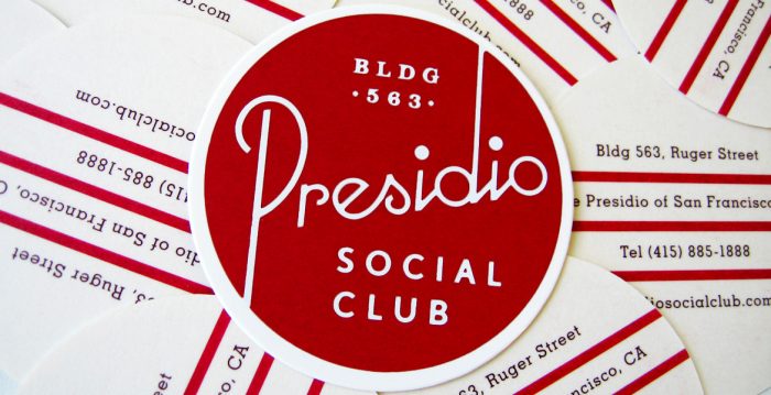
For Presidio Social Club, the identity leverages reds and browns in a limited color palette where a lot is done with a little. Classic border treatments and typographical heraldry elevate the look and meld two normally conflicted styles excellently. Finally, the logo fits perfectly on a kick drum. What else do you want?
Designed by Christine from Strohl while at Mucca Design