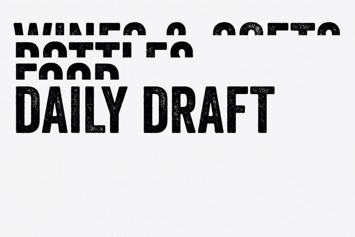
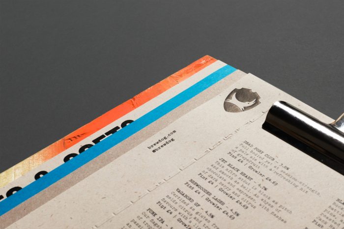
It’s always fun to see restaurant brands go off the standard menu options and make their own. For BrewDog that meant incorporating their fluorescent colors in a graffiti-style application. Offset that urban nod with more modern design based on strong grid systems and you have a unique take on menu design.
The new look is an evolution of the brand that saw many adjustments to a look that was a bit forced. The team at Brand New covers this excellently if you’d like to read more.
Designed by O Street


