A friend of mine asked a simple question on The Facebook last night. “Is there a quick guide for non-designers about font usage? I know the difference between serif and sans.. I know better than to use weird, curvy, cursive for no apparent reason, and try to stay away from ones that are overused. That leaves me with about 6,715 fonts that to me look pretty much the same. I know there’s kerning and stuff… But how would I choose for landing pages, headlines etc. (not for logo). I usually go with UBUNTU for headlines and Nora or Lato for paragraph. Is that a good combo? Thanks!”
Another, more attentive friend posted a quick response that was a perfect answer and gave a deeper dive. He posted a link to a short, but concise post on the Spokane Falls Community College website aptly named Introduction to Type. (Thank you Rickie Bishop). The original inquisitor found value in the tutorial, but wanted a deeper dive into the psychology of type and – more specifically – how to select typography to affect a mood and set a visual tone. My short response turned a bit lengthy, but necessary. So, here it is in all it’s glory.
###
Proper selections of type families are found in the nuances. For instance, with Brandon Grotesque (the type family used for Seven Hens) it’s letterforms are classically geometric, with slight rounded edges, and the lowercase set has some quirks. This seemed perfect for a brand who was serious about the product (geometric, perfect) but had some fun, quirkiness to it (rounded edges soften the look, quirky letterforms add some whimsy). So really, it’s all in the details with typography. What are you trying to communicate? e.g. Classic professionalism that’s serious? Probably want to use a no frills, rigid family like Garamond coupled with a strong, compressed sans-serif family like Tungsten. Just as an example.
The best thing about using, selecting and falling in love with type is to learn the “rules” then break them. However, you have to learn some rules first.
1. God is in the Details. Typography is an amazing craft that is often overlooked. After all, we type and write every day so letters are letters are letters. Except, typography has personality that’s found in the nuances of letterforms. In those details you can find the root of mood-changing design opportunities. Scrutinize the type family thoroughly. Does it have clean edges? rounded? Rigid? Are the letterforms classic, modern, geometric, whimsical? Every curve and vector adds to an overall feeling the type family will emit, so go deeper than sans-serif, serif, script. You can see this in action with the way the Tungsten type family changes in tone between its Original set and the new Rounded set.

Tungsten type family by Hoefler & Company

Tungsten Rounded type family by Hoefler & Company
Don’t Crowd the Party. If you’re just starting out, or dabbling, stick to no more than two type families and commit to using only 2 weights in each. For instance, use Regular and Bold with accompanying Italics for each family. More than two families requires more advanced design principles and an attention to detail that not many can execute profoundly. When it doubt, an advanced type family that has many weights can serve as your sole typographical selection giving you ample options for hierarchy and usage. Sometimes the lone wolf approach is the strongest. It keeps the visual tone focused and simple. However…
Type families Love Getting Married. Using multiple type families can create deeper feelings and portray more than one tone of voice. You’ll find that many type families can hook up with another for more dynamic layouts and compositions. For instance, with the Vigor brand identity we employ both FF More Pro (a classically rooted serif type family) with Proxima Nova (a geometric, semi-soft, modern sans-serif). Separately they have their own visual feel, but together they create a new vibe that’s nuanced and unique.
These are just some basic guidelines to follow. Good rules of thumb. However, the fun part of design is breaking the rules a bit. Bending them to your will can result in some amazingly unique compositions. So long as the intended information and feeling are communicated, you’re clear for takeoff.
On a final note, BUY YOUR TYPOGRAPHY. Don’t use type farms that offer free downloads of janky “fonts.” Instead, shell out the cash for REAL typography, designed and crafted by REAL typographers. Here are my favorite resources:
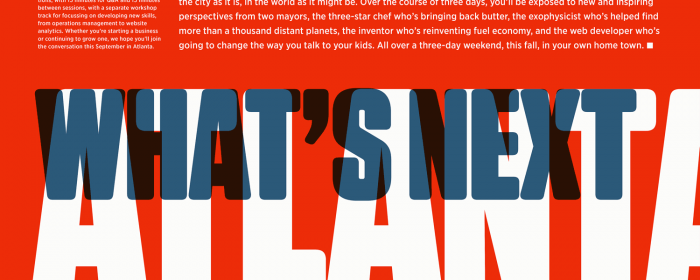
(Centrale Sans Inline by Typedepot by was used in the featured image.)


