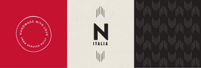
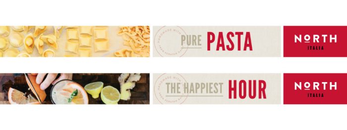
North Italia’s brand identity is confidently simple and strong. Using bold vibrant red with subtle neutral colors, the brand creates an “italian” feel without being too cliché. The restaurant creates hand-crafted dishes from pasta to pizza that are made daily from scratch. The atmosphere is rather approachable, much like a true Italian experience of today.
Project M Plus uses stamp-like graphic/type devices which creates a feeling of travel and, concurrently, authenticity. It’s as if it’s been stamped with approval. This combined with simple layouts and great use of color and texture make North Italia’s brand identity sound.
Designed by Project M Plus in Arizona, USA


