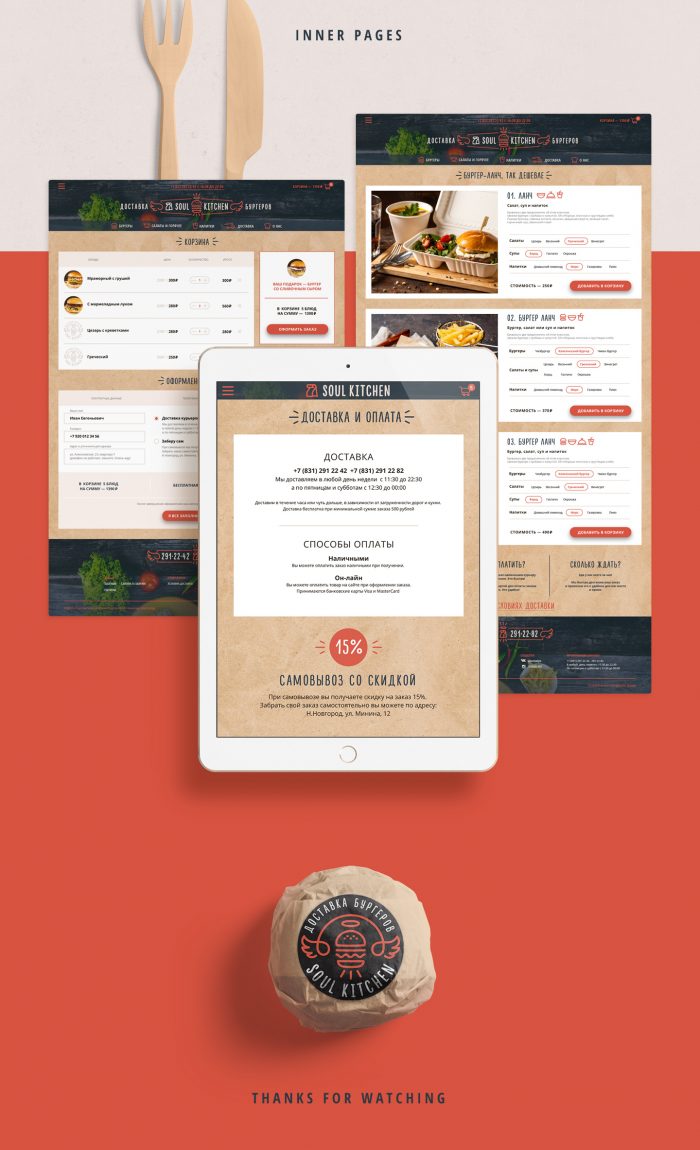
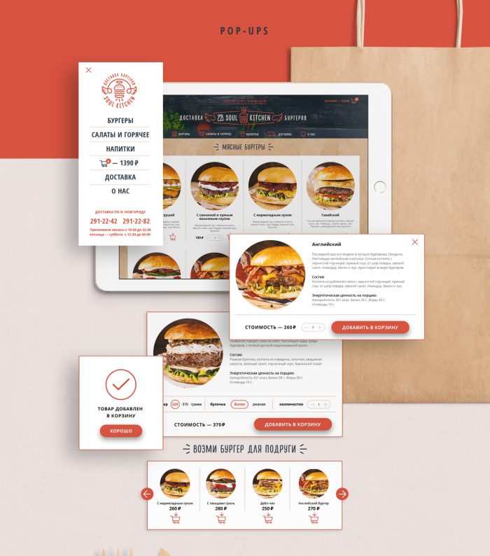
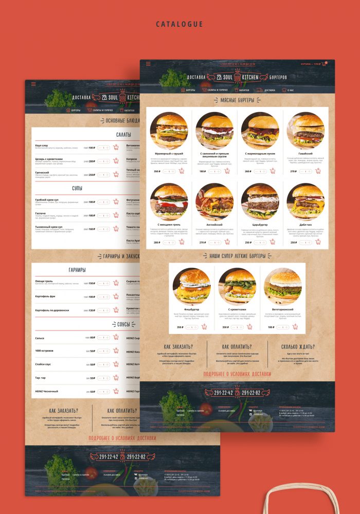
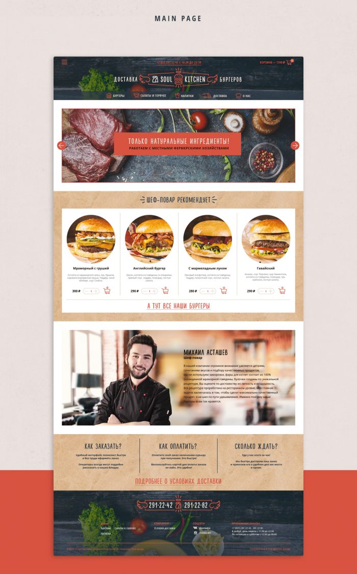
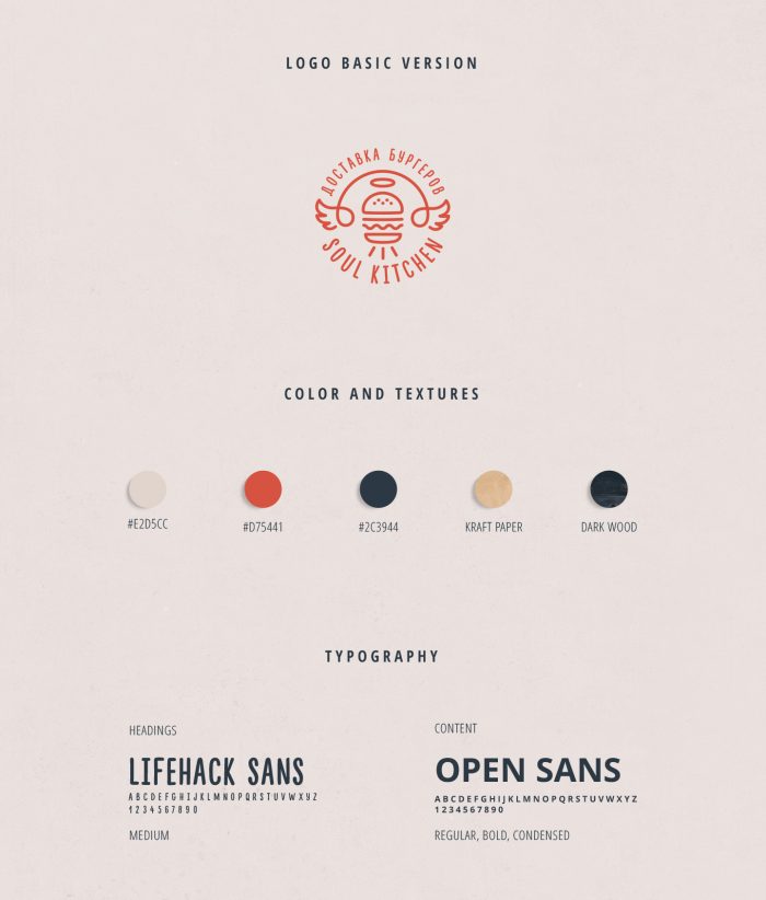
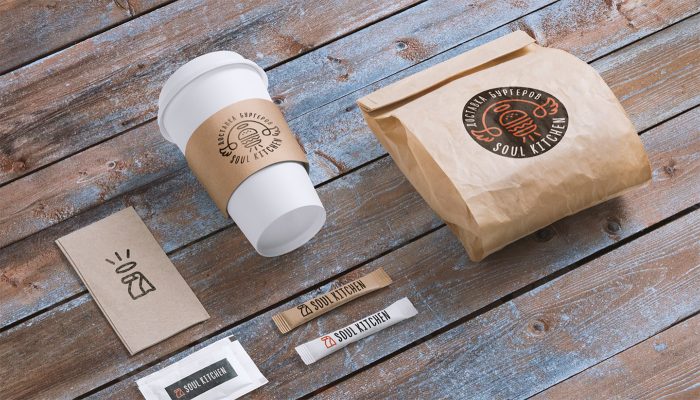
First, pardon the style of the imagery. This was pulled from a page designed from top to bottom with no singular images.
I’m sharing this because of how beautifully orchestrated the design is from user interface and experience through physical touch points. The brand experience mixes photography and iconography style design elements excellently carrying the style throughout all the nuances of the UI/X. The headline typography marries nicely with the illustration supported by a strong sans-serif, modern family that serves usability quite well. It’s easy to see how this would flesh out into the space and supporting ephemera.
Designed by Work Room in The Russian Federation. Find them on Behance.
