
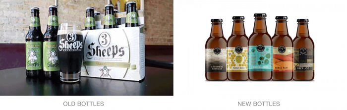
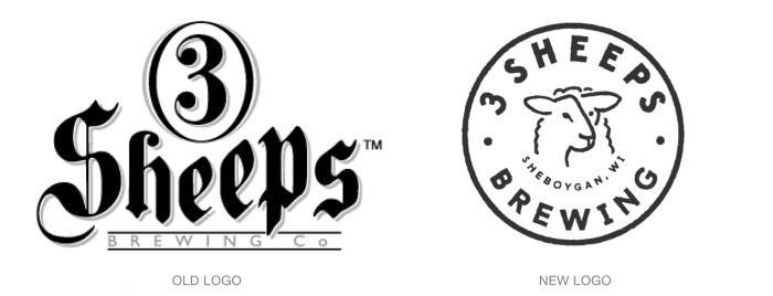
At first I was skeptical because here in Atlanta we have a prominent brewer called 3 Taverns. They’re identity is spearheaded by a unique and memorable “3” mark was this brand. However, the redesign takes the brand in a fresh direction with a more unique and unified look and feel. 3 Sheeps Brewing’s new identity puts the sheep at the forefront in a lockup that’s easily used for other elements of the brand like the “brewed with heart and science” badge. The simple circle serves as a visual anchor to unique illustrative label designs the artfully represent the feeling of each brew. The design creates a perfect ribbonization across the shelf while giving each craft beer style it’s own glory.
Designed by Studio Malt in Chicago, Illinois USA


![]()


![]()


