Good Union BBQ restaurant branding

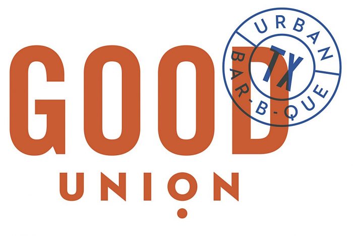
Who doesn’t like writing about meat? I guess vegans and vegetarians, but besides them? It’s quite obvious I’m not the only one who shares this love for savory proteins. The team at Matchbox too their meat-loving attitude and ran throughout the brand identity and visuals for Good Union BBQ.

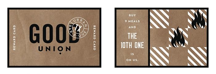
The barbecue joint’s brand is a mix of high contrast black and white photography that interacts with color planes, graphic devices and type. Big bold typography delivers the message of meat in compositions that are hard to ignore. The brands visual language is unique and versatile which enables the team to give each touch point proper glory and design focus.

Designed by Matchbox Studio in Dallas, Texas

The Forktales Podcast™: Interviews with restaurant industry leaders and visionaries

Restaurant and advertising industry headlines and thinking

Reviews of restaurant experiences from around the globe 

Reviews of our favorite design, business, & restaurant books

Our favorite typography and fonts

Inspiration in your inbox

Get the latest inspiration in your inbox every Monday morning, for FREE!

"*" indicates required fields

This field is for validation purposes and should be left unchanged.

Delicious Bits in your Inbox!

Get the latest and greatest content delivered to your inbox for free!

"*" indicates required fields

This field is for validation purposes and should be left unchanged.