American Baked bakery branding

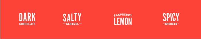
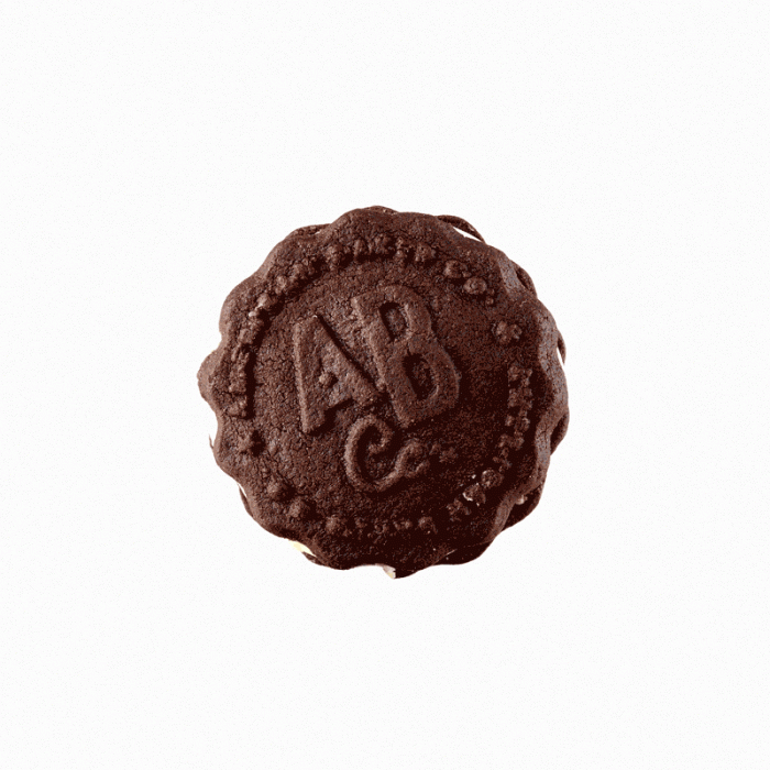
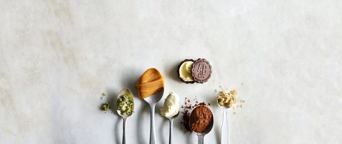
The edibles market has so much potential as new laws open up the doors to new opportunity. American Baked Co is new blood on the scene baking up delicious edibles for the people in Washington. Their identity is simple and approachable without an in-your-face “marijuana” look. A vibrant red-orange creates a warmth while nodding to the core offer of baked goods. A strong typography creates a quickly identifiable mark with the nuance of marijuana leaf that’s understated, yet poignant. The classic, semi-nostalgic brand identity is a breath of fresh air in a market full of clichés.

Designed by Hum Creative in Seattle, WA

The Forktales Podcast™: Interviews with restaurant industry leaders and visionaries

Restaurant and advertising industry headlines and thinking

Reviews of restaurant experiences from around the globe 

Reviews of our favorite design, business, & restaurant books

Our favorite typography and fonts

Inspiration in your inbox

Get the latest inspiration in your inbox every Monday morning, for FREE!

"*" indicates required fields

This field is for validation purposes and should be left unchanged.

Delicious Bits in your Inbox!

Get the latest and greatest content delivered to your inbox for free!

"*" indicates required fields

This field is for validation purposes and should be left unchanged.