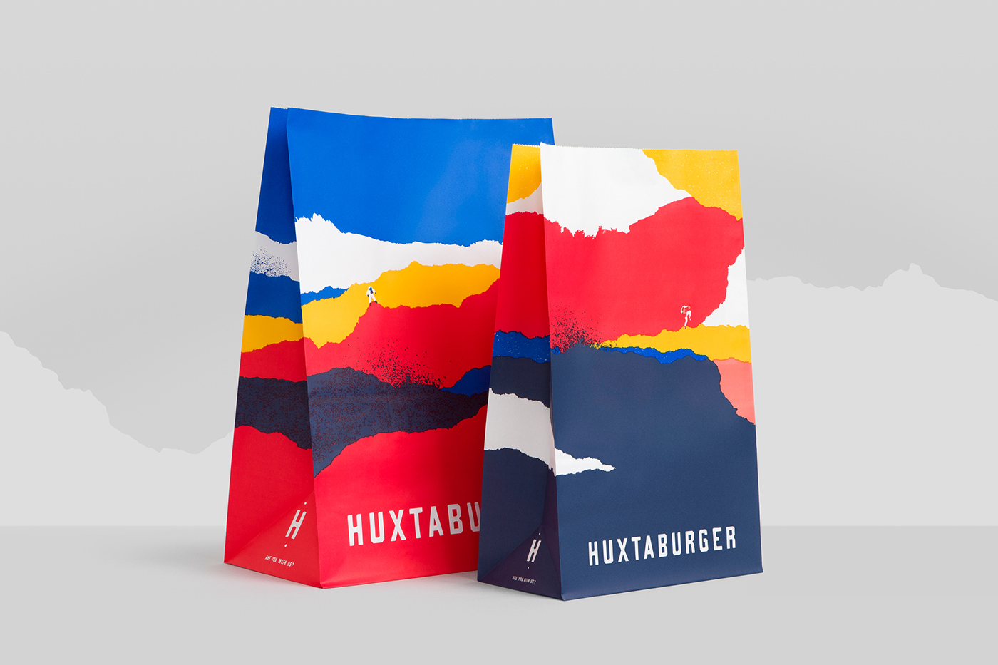
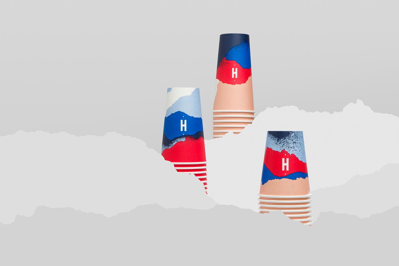
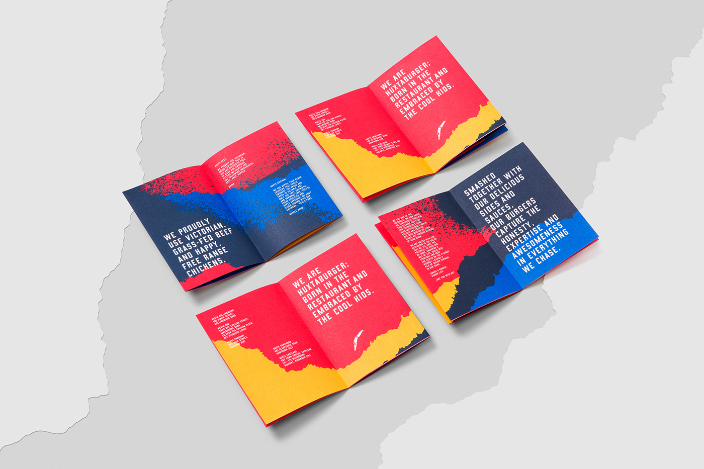
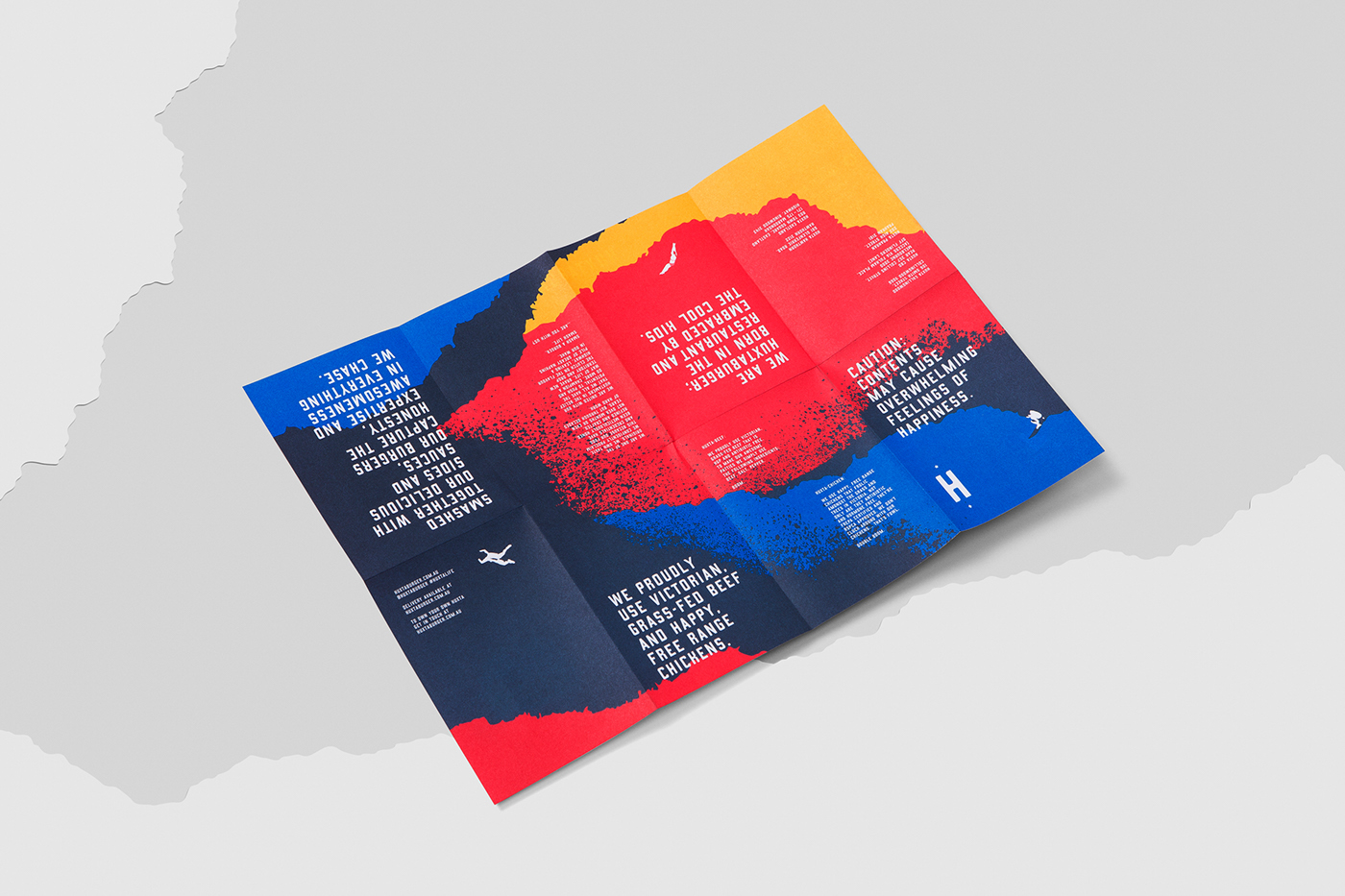
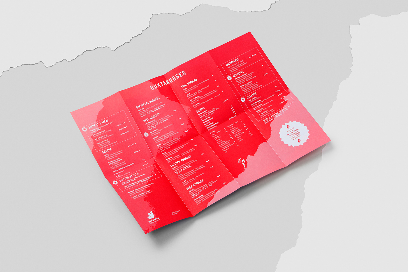
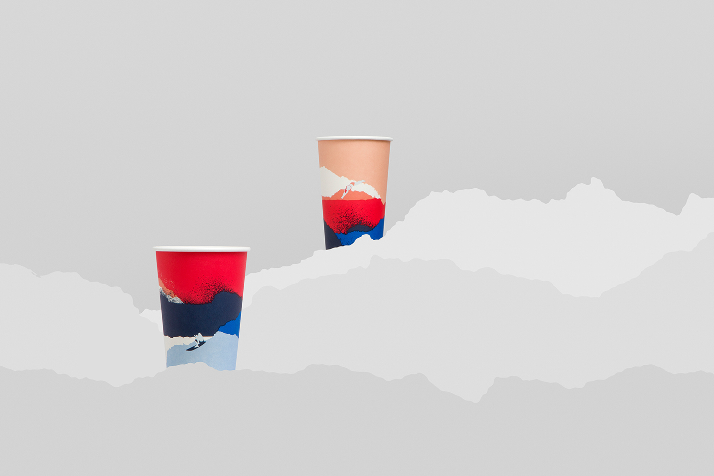
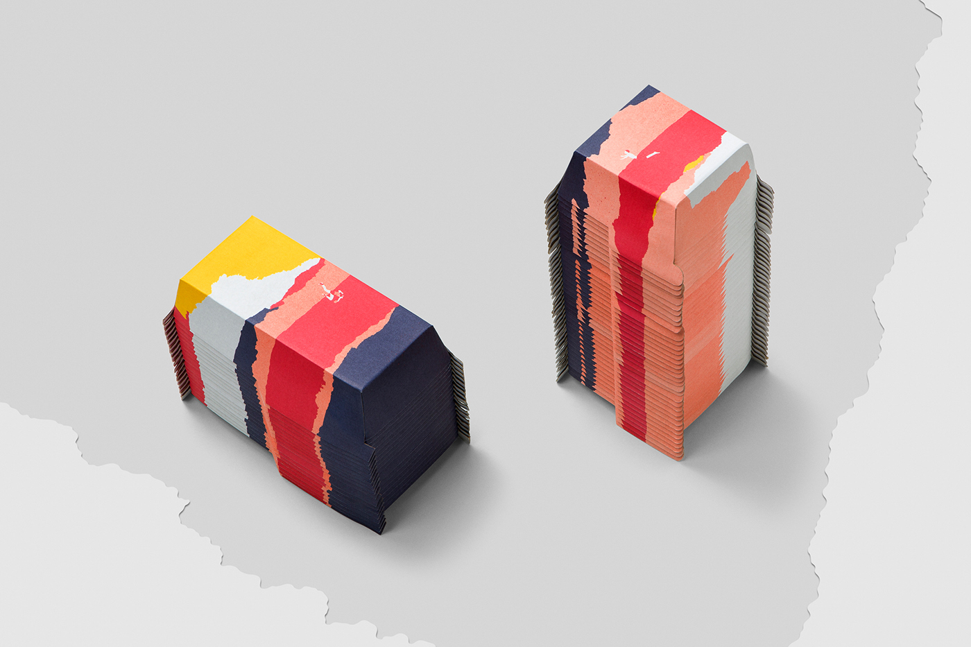
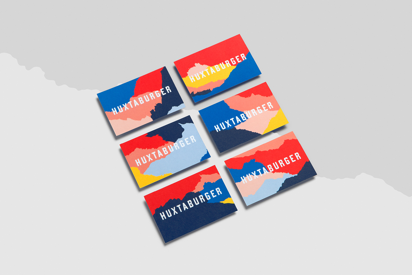
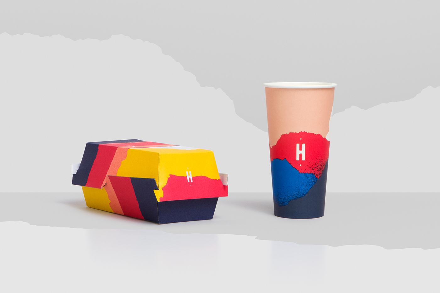
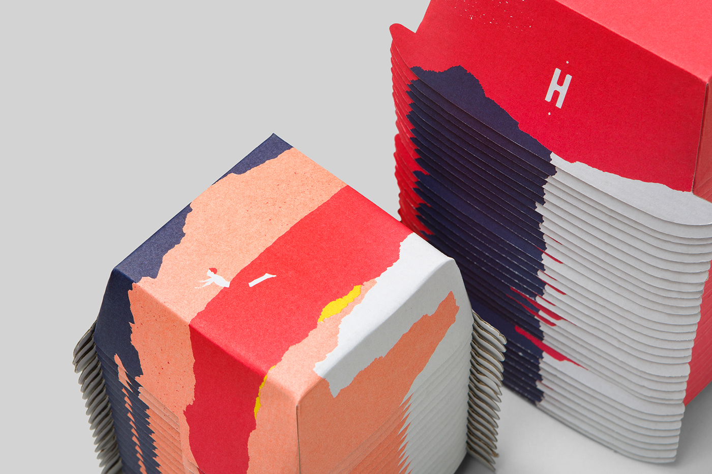
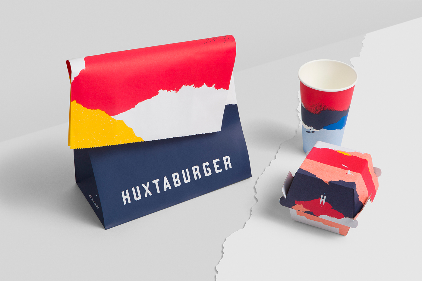
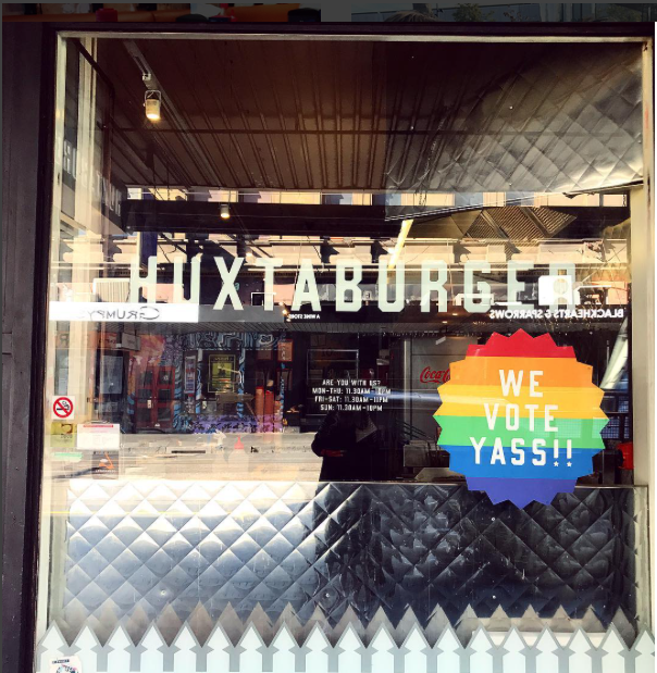
Huxtaburger is what I want to see McDonalds doing. Something visually entertaining and turning the iconic yellow and red fast food colors into something way more fun. The ripped paper texture gives it a friendly feel without feeling too “designy”. And the way the primary colors pop against the pink really caught my eye. The detail in the “landscape” they use on a lot of the paper material almost looks like a mixture of mountains and clouds, and if you look closely you’ll find tiny figures of an astronaut or a diver leaping into the valleys of cut paper.
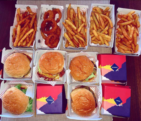
However as much as I enjoy the color scheme and bold aesthetic, I love to see how the food of the restaurant looks with the branding so I stole a few of the pics posted on their Instagram. They have an ice cream burger you guys!
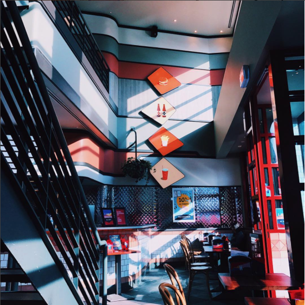
This project was done by Pop & Mac in Melborne, Australia you’ll want to check out their work here. They have some other great restaurant branding projects as well as some notable posters and logos.