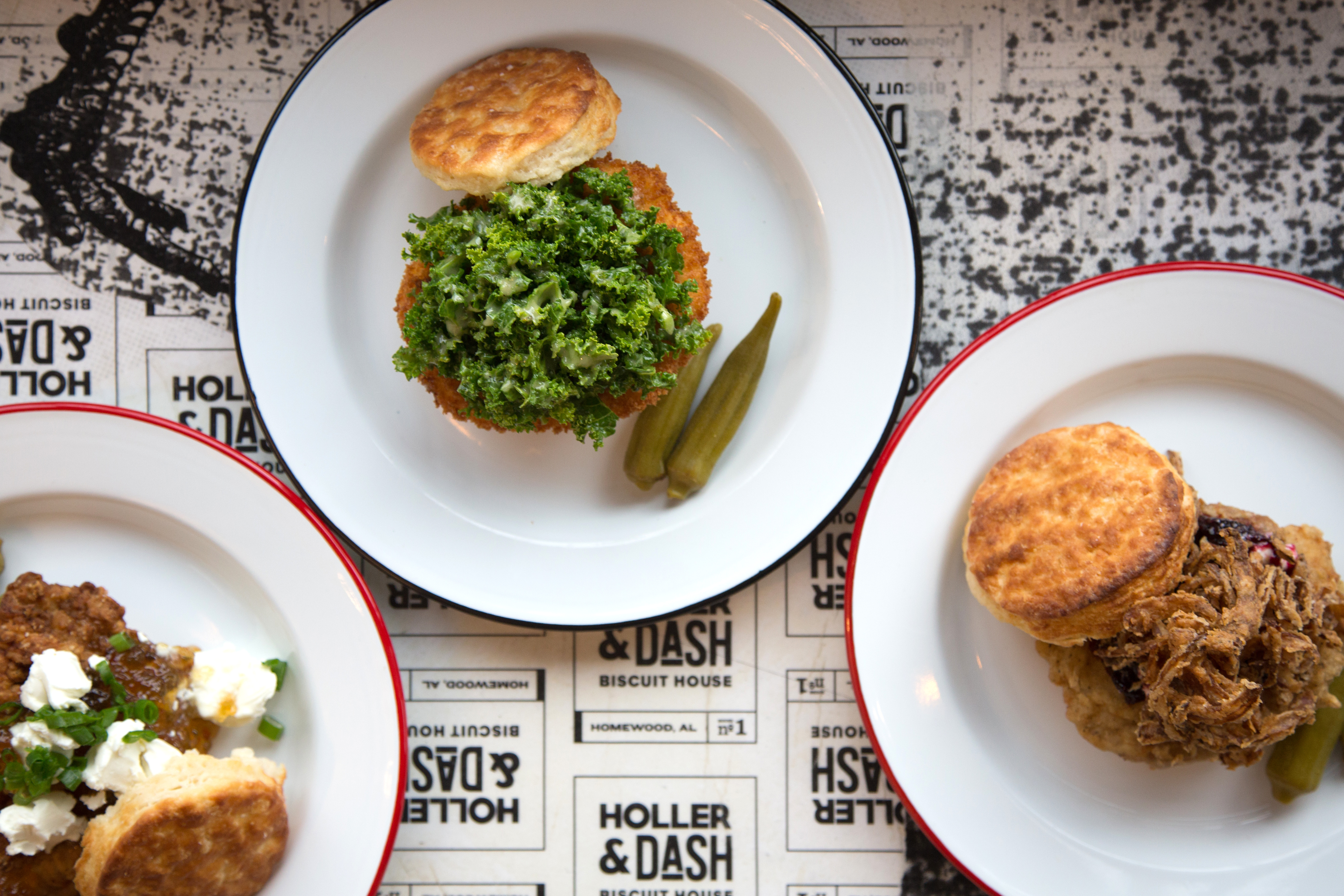
Joseph wrote about Holler & Dash, about a year and a half ago and asked me for my thoughts and feelings about the updated portfolio. As a millennial, this is exactly what I crave as a restaurant concept; quality breakfast that I can pick up and go, or sit down and nourish my morning hunger with a soft biscuit, a nitrobrew and a fresh playlist in my AirPods. Just kidding, I can’t afford nitrobrew or fancy earbuds.
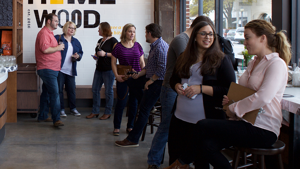
Holler & Dash is a spinoff restaurant of Cracker Barrel, but stepping into the space you wouldn’t know it. Where Cracker Barrel is a little hokey in its down-home atmosphere, H&D envisions a new south, one that is bright, exciting, and a little tongue-in-cheek.
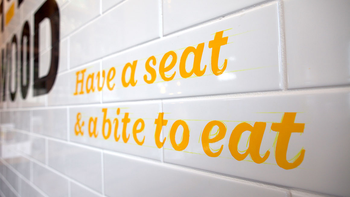
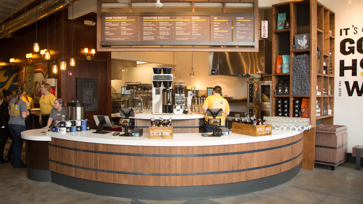
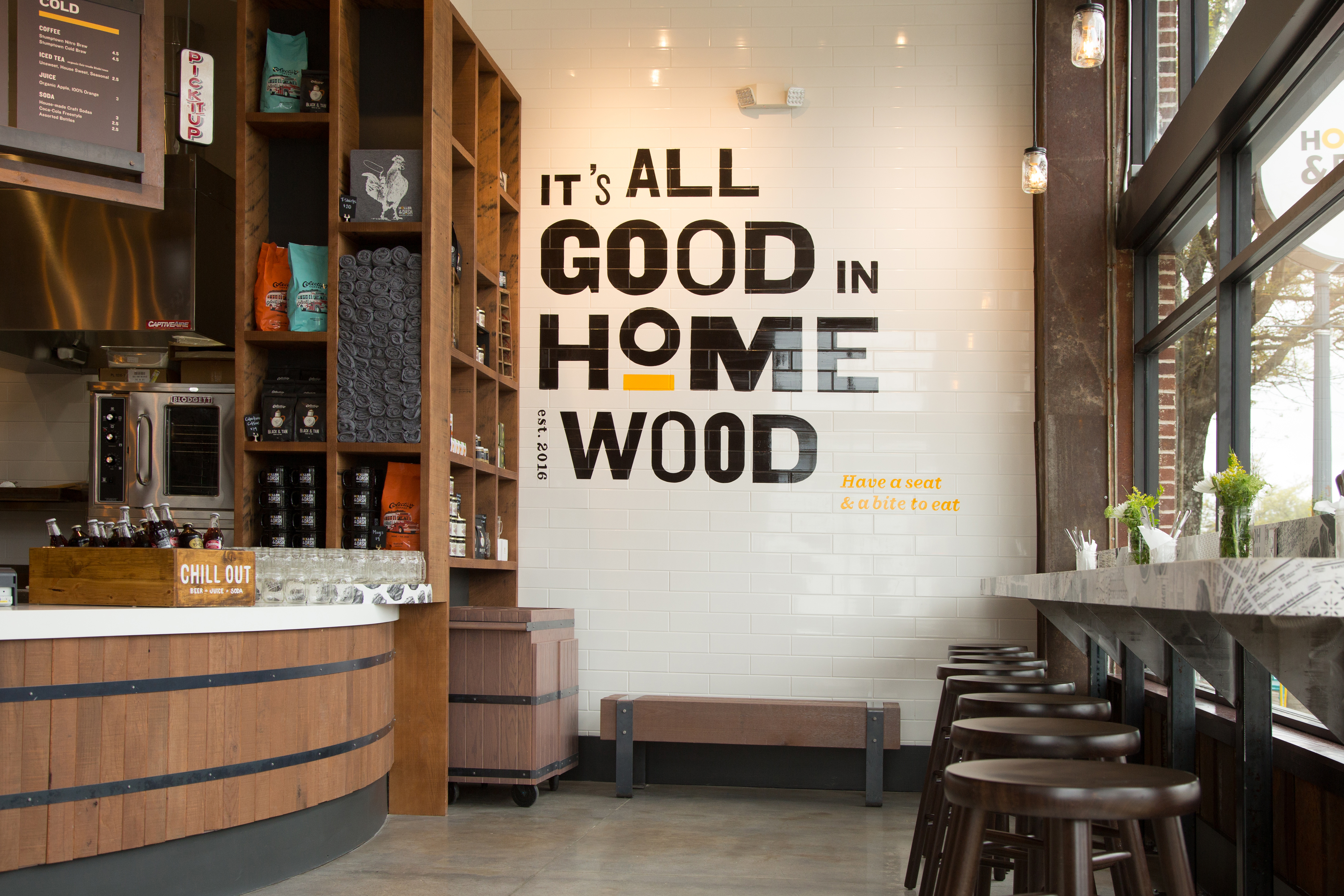
The overall look and feel is a fun spin on typical southern tropes; using wood-cut typography a la Hatch Show Print on their website, staff shirts, and an assortment of swag sold at each store. I want to put it under the category “southern modern”. It also looks like actual hand painting on the tile in Homewood’s location which gives it an authentic feel.
Yes, CB is still trying to sell you jams and coffee mugs while you wait for your food, however, they are their own products. House-made hot sauce, locally sourced honey and jams, all ingredients to help you re-create your favorite biscuit sandwich at home. Holler & Dash does a great job of putting the spotlight on their local partners that help provide the ingredients that make it on your plate, and as consumers are becoming more concerned with who their dollar is helping to support, it helps H&D feel more farm-to-table than parent brand CB.
While this brand isn’t reinventing the brunch wheel, using country tropes that we are all familiar with, it’s a welcome departure from Cracker Barrel’s feel. Cracker Barrel is a place that you use as a pit stop on a road trip cause you want an ok and relatively cheap breakfast, more of a stop out of necessity than a restaurant you purposefully venture out to. Holler & Dash is a destination, and in a brunch market like Atlanta’s saturated with sit down restaurants with multi-hour waits and at times questionable prices, the quick, fairly priced and warm brand of H&D is a welcome addition.
PS. This article was co-written by Leah & our newest addition to the Vigor team, Natalie Suarez!
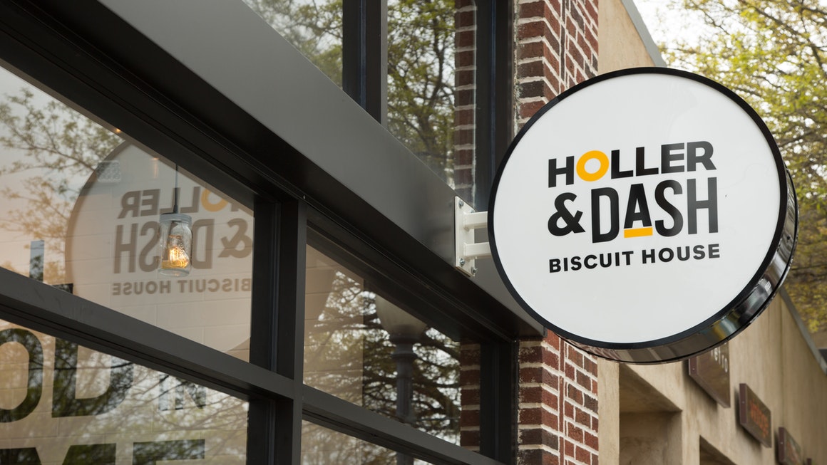
Design for Holler & Dash by Landor.
![]()