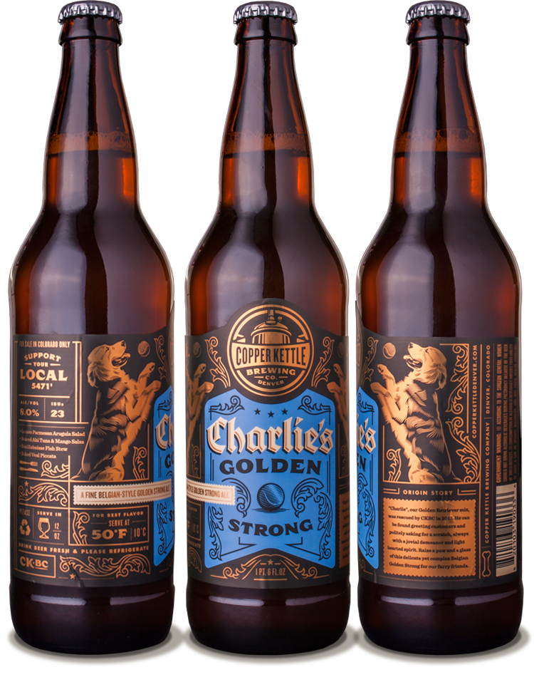
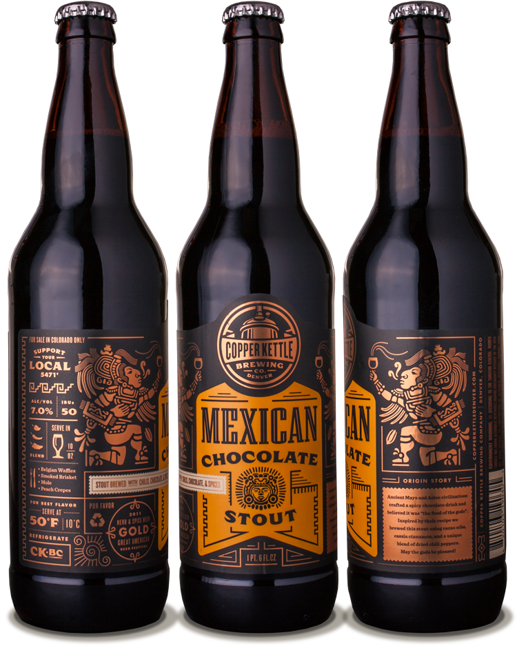
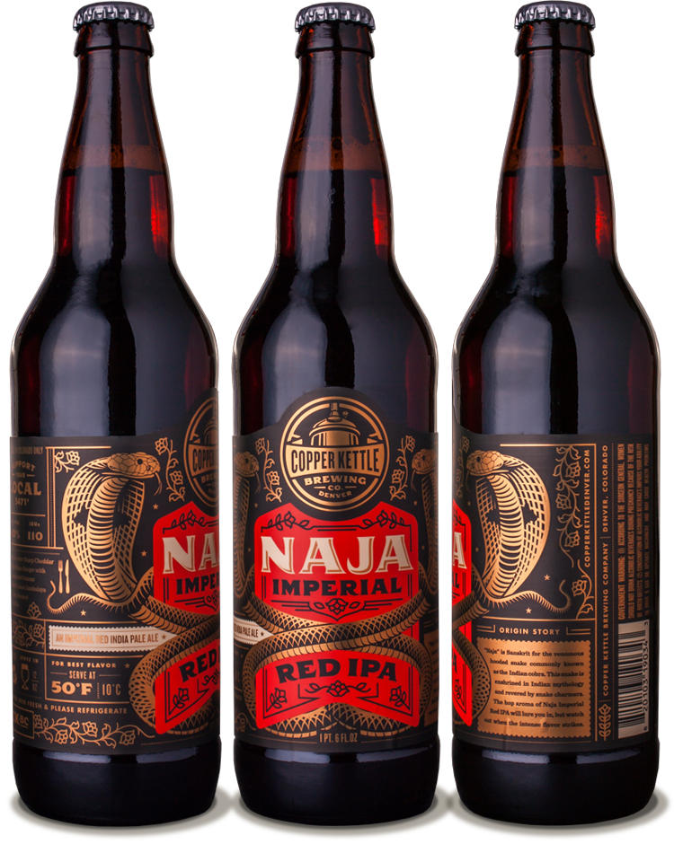
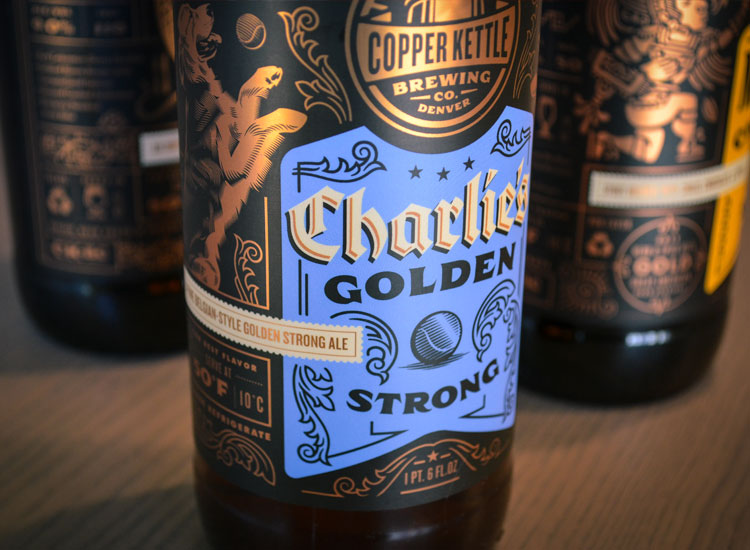
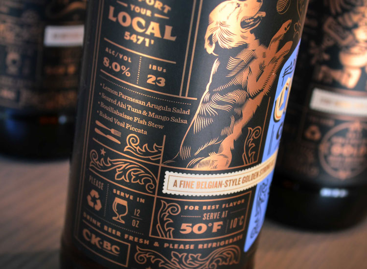
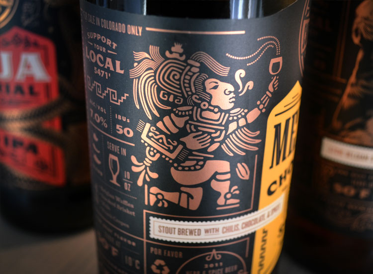
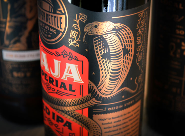
This isn’t the first time we’ve spotlighted Emrich Office on the Grits & Grids blog, and I’m sure it won’t be the last. They make some stellar work, and these copper foil beer bottle labels for Copper Kettle Brewing Co. are no exception. What I really enjoy about these three core beer label designs is the consistency between them, while each bottle individually still feels like it’s own thing. The copper foil also works beautifully with the dark glass on the label. And, I also appreciate the thought that went into treating the label like a complete design. All too many times do we see beer bottle designs that focus solely on the front of the can/bottle that looks out at you from the shelves. My favorite among these three has to be the Naja Imperial, mainly because I really enjoy the interaction between the cobra illustration and the red flag on the front of the label; I think the other two label designs are missing this interactive, layered component.
Label design by Emrich Office.