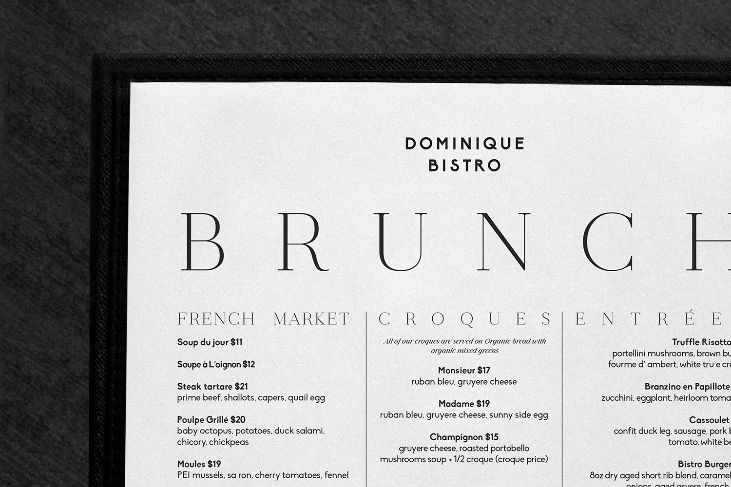
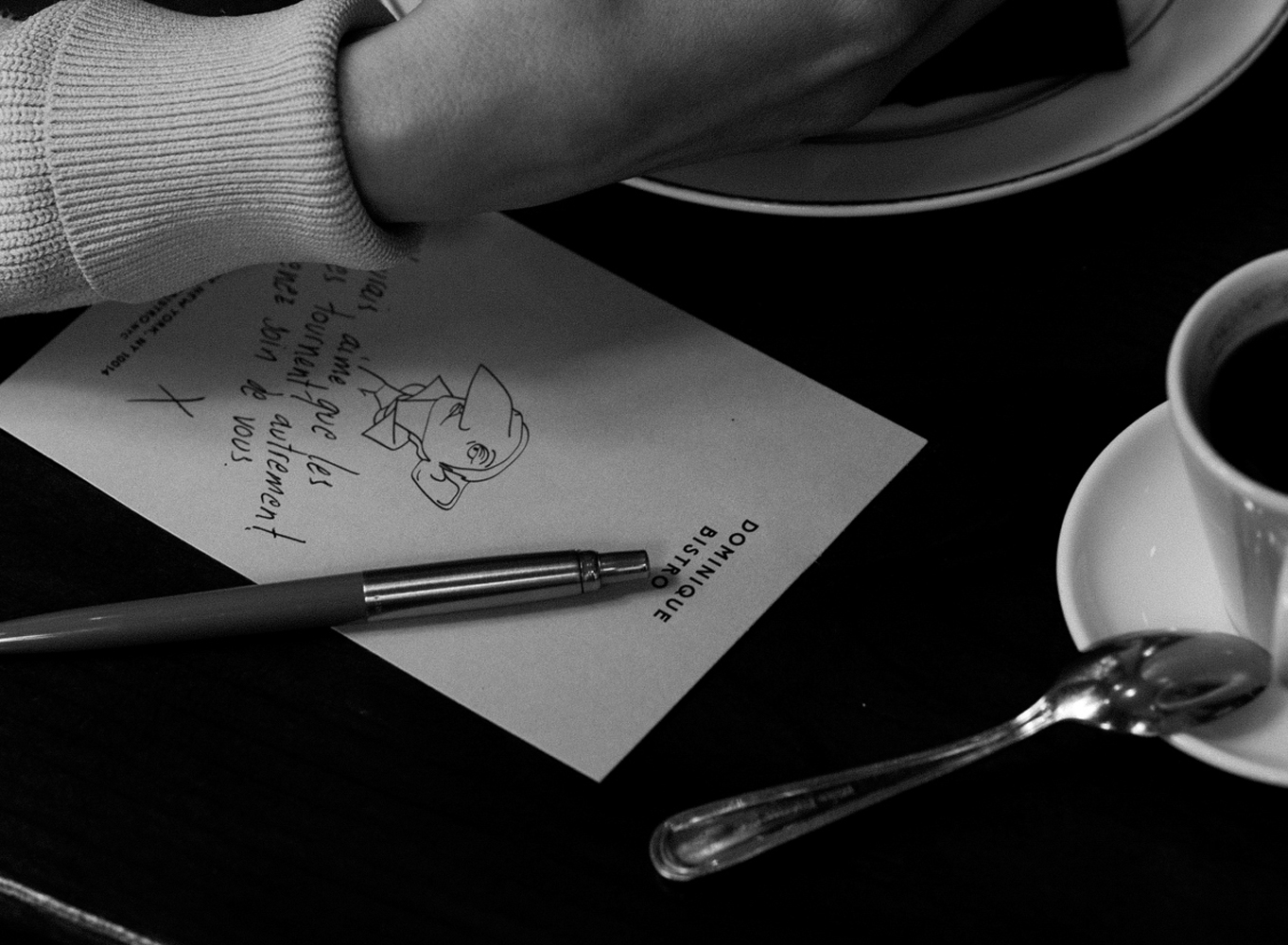
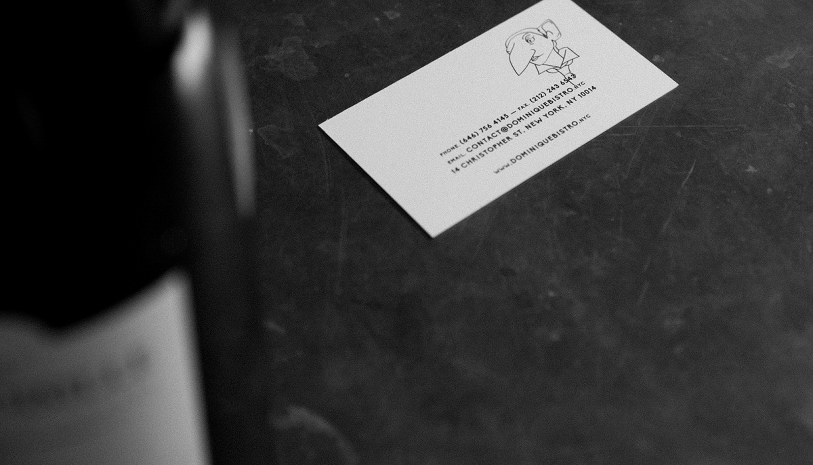
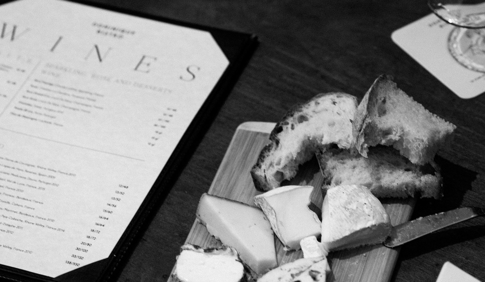
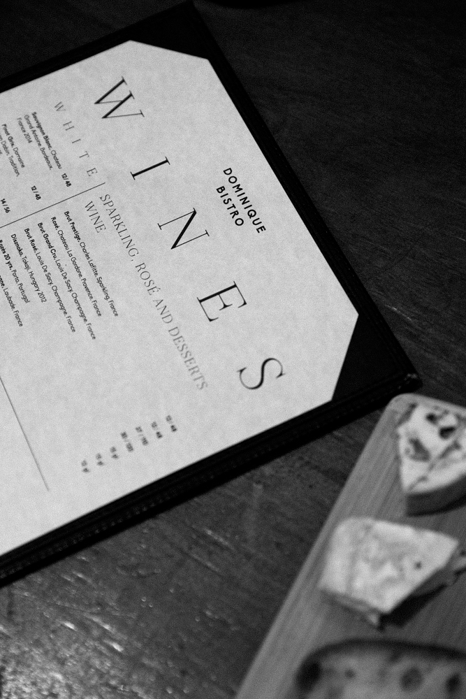
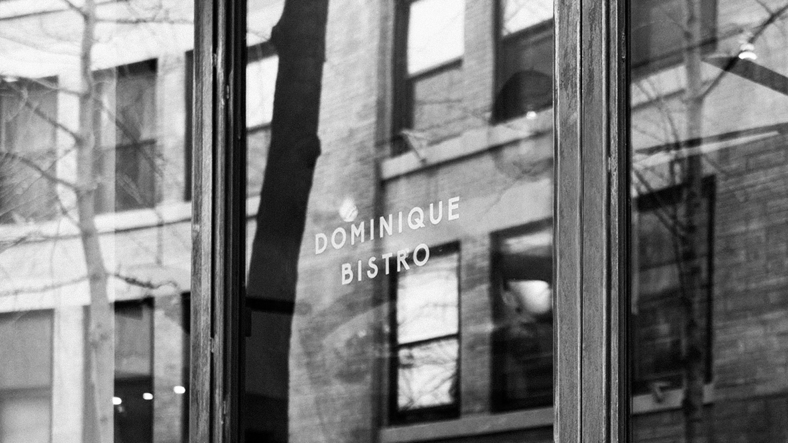
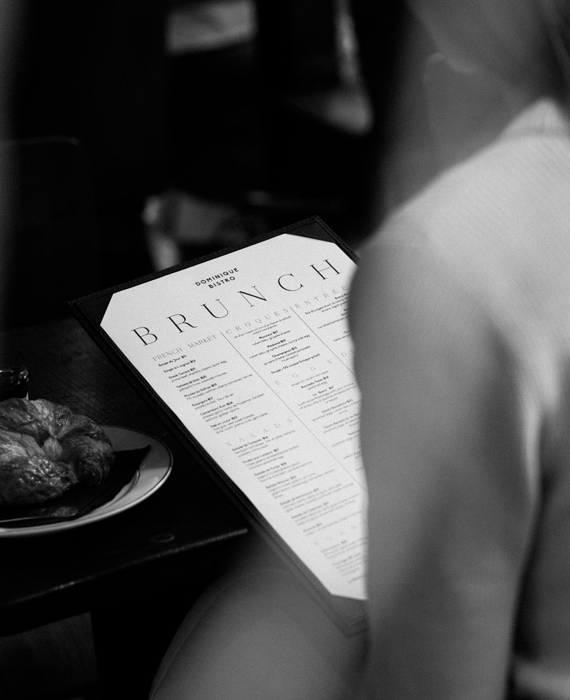
I don’t often feature very simple, clean and type-forward brands when I write for G&G, mostly because I don’t find them very interesting. They tend to be stuffy, trying too hard at seeming high-end, and just don’t hold my attention. Dominique Bistro’s brand is a few of those things, sure, but at least the typefaces they’ve chosen have a bit more personality in them. The letters in the wordmark have high-seated crossbars, and that sans-serif is also used as the body copy in their menus, injecting each printed piece with this offbeat-yet-chic look. To accompany the brand, there is a simple, thin line caricature of who I can only assume is Domnique. It works very well with the sans-serif; they both have this not-quite-perfect quality to them that go hand in hand. Overall, Dominique Bistro keeps it classy while still having some approachable facets to its brand.
Branding design by Savvy Studio.