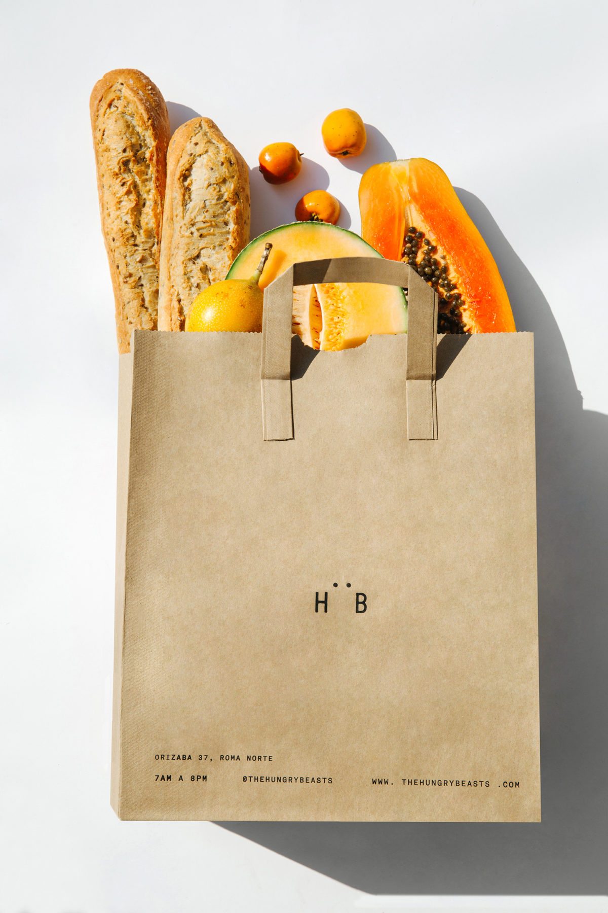
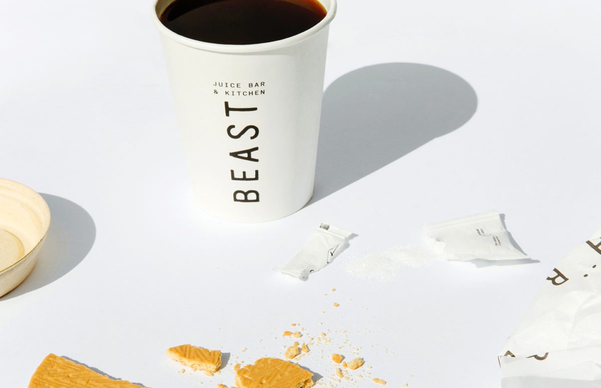
Hungry Beast Juice Bar & Cafe is located in Mexico City, Mexico and was created because there was a lack for a place that was both health-conscious and casual. They focus on the simple idea of providing quality products and healthy ingredients in a creative way.
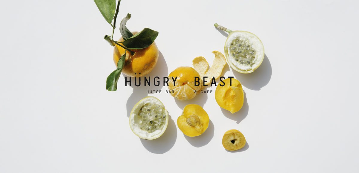
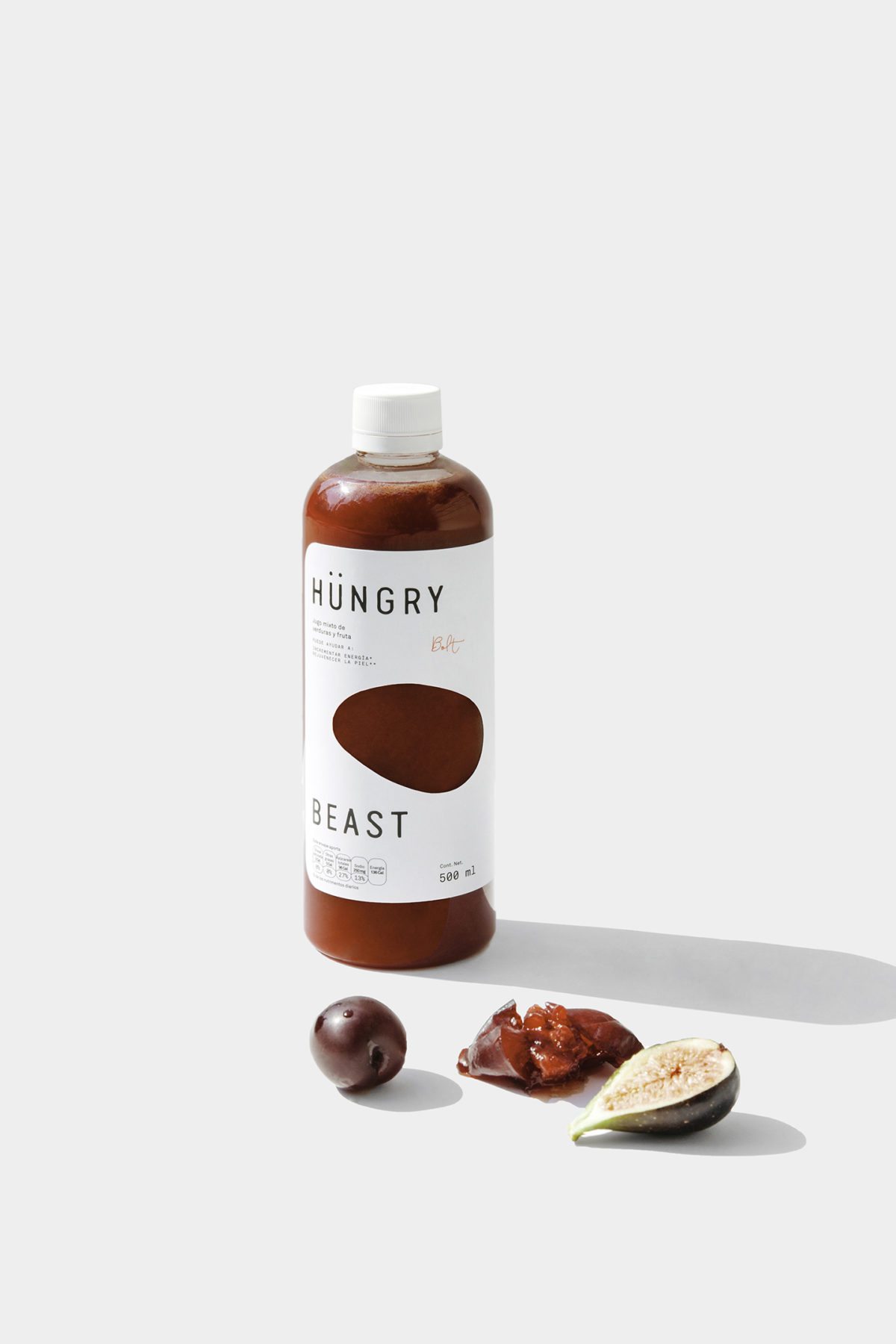
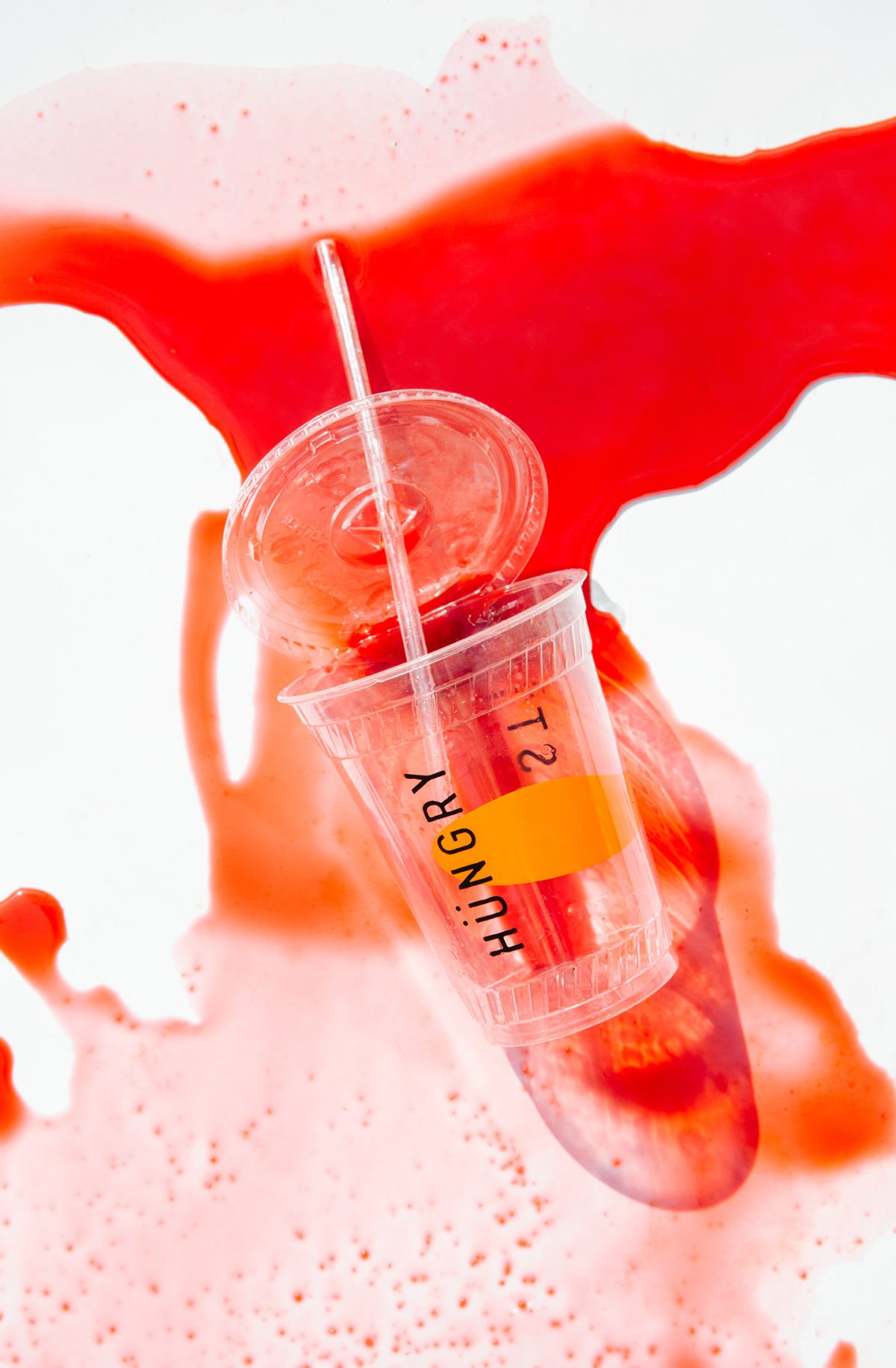
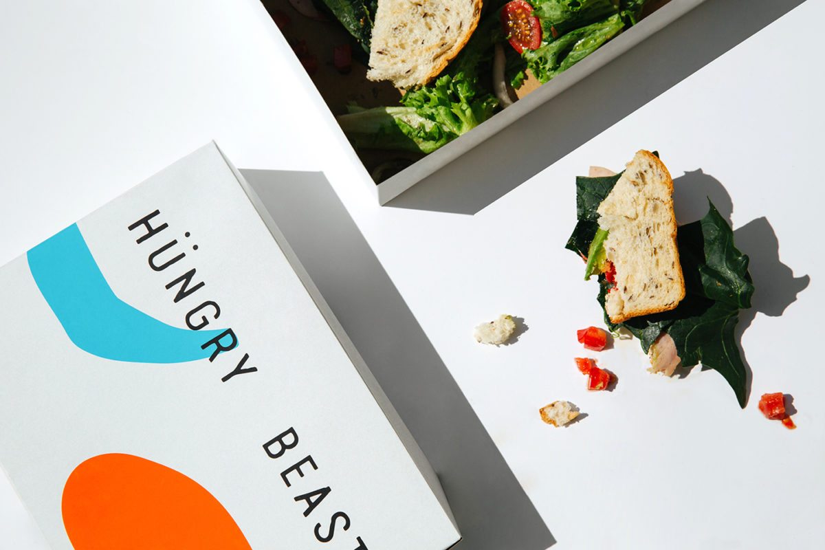
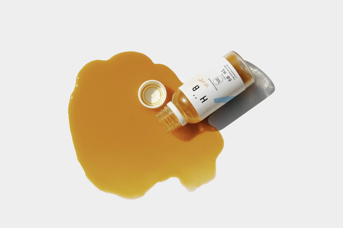
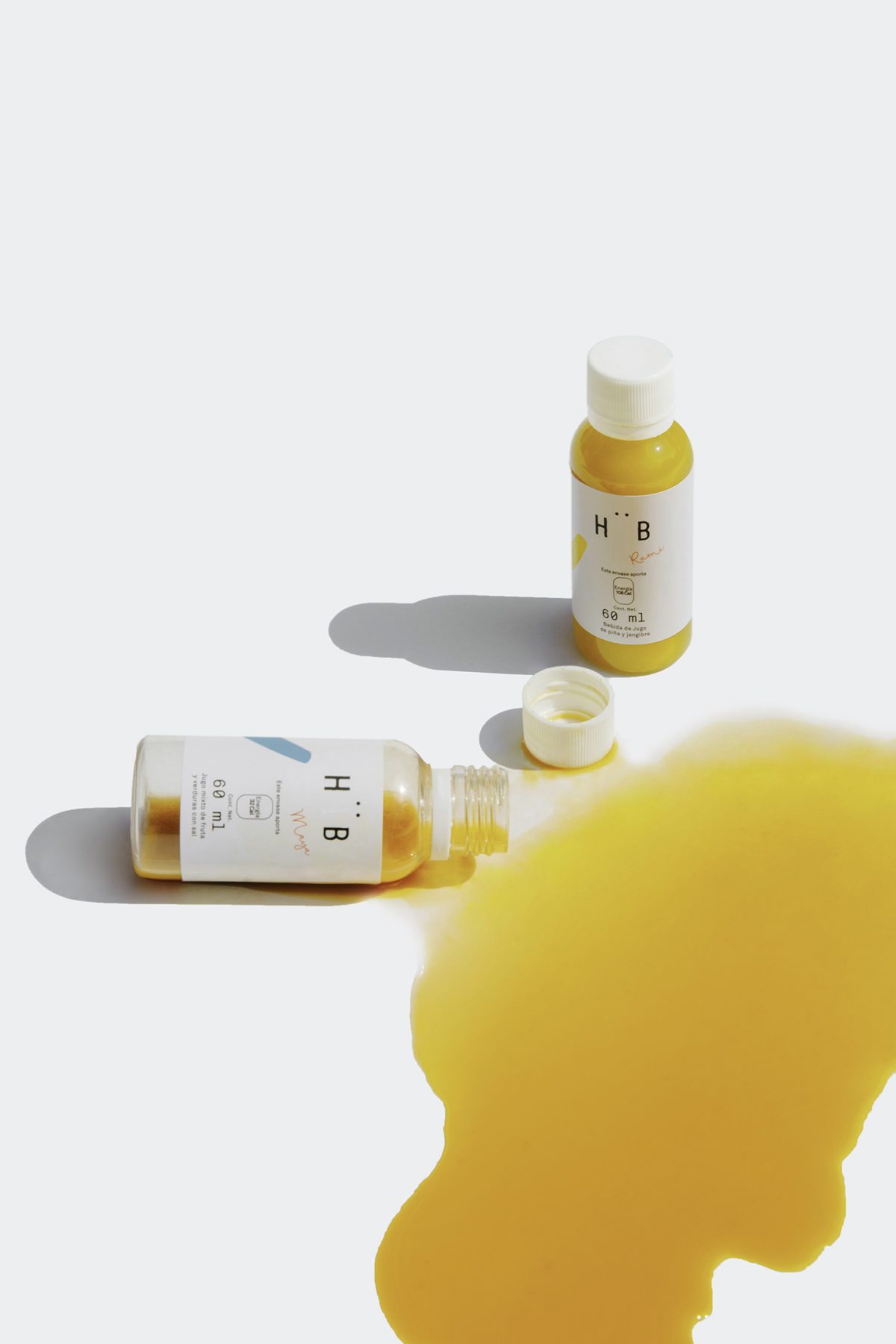
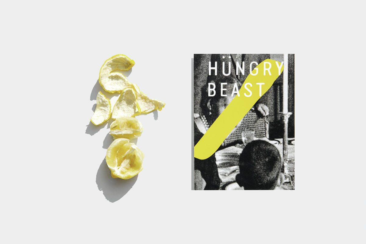
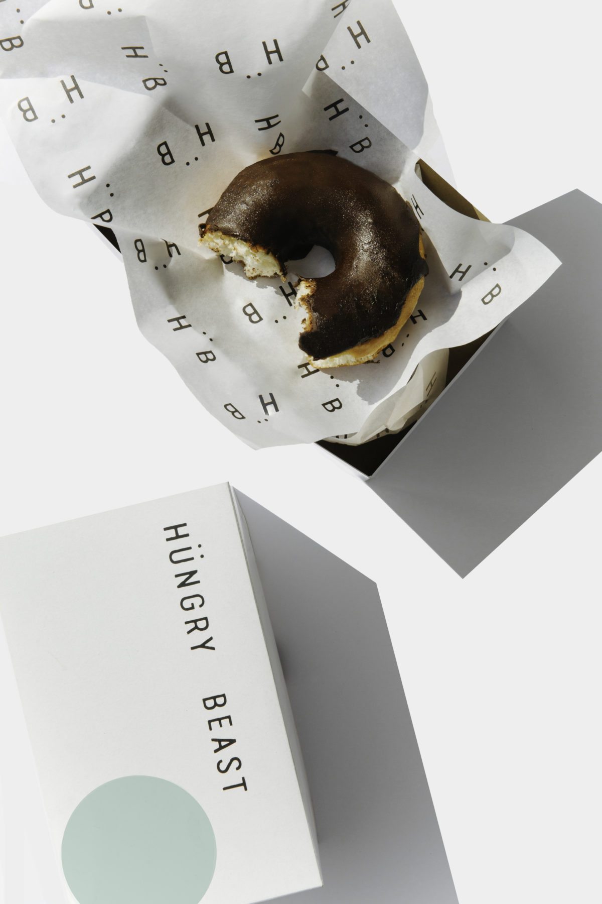
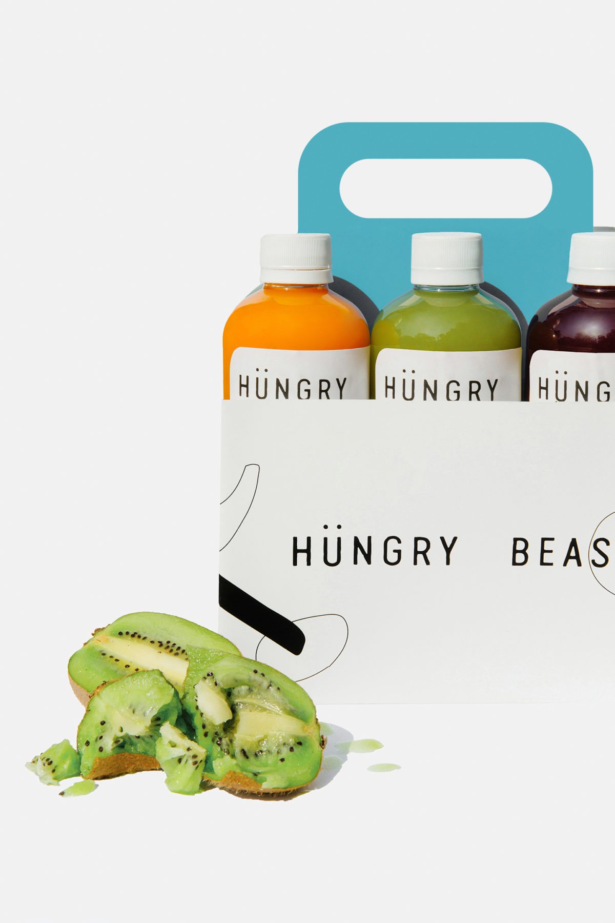
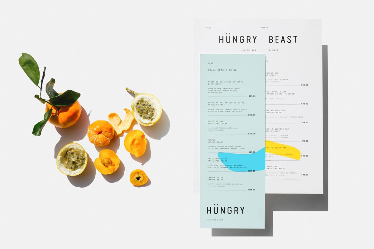
The brand reflects this simplicity. The type is a straightforward sans-serif and is used with an over abundance of white space, which would feel almost clinical were it not for the umlaut (the two little dots over the u in the logo) that punctuates the monogram. To me, this reads as the hungry beast mischievously peering out from the white space, looking for delicious fruit to tear into. The amorphous strokes and shapes of color add another layer of playfulness to the brand, to me reading as spilled juice. This minimal brand really lets the bright freshness of their products take center stage, contrasting starkly but nicely with the fresh juices.
Branding and Packaging by Savvy Studio.
