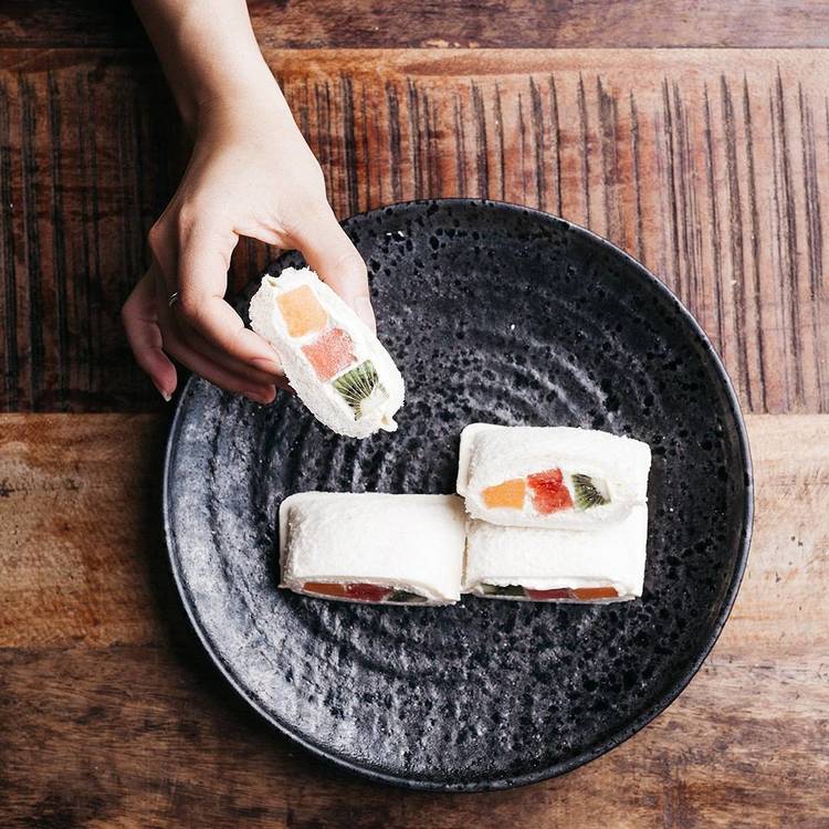
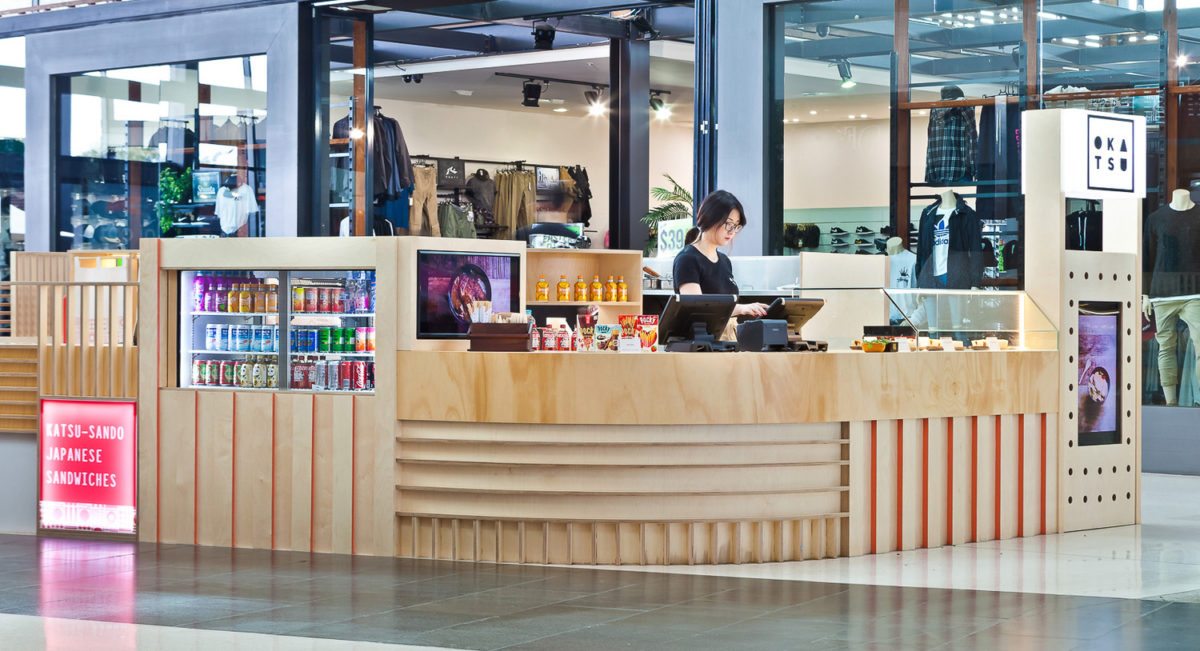
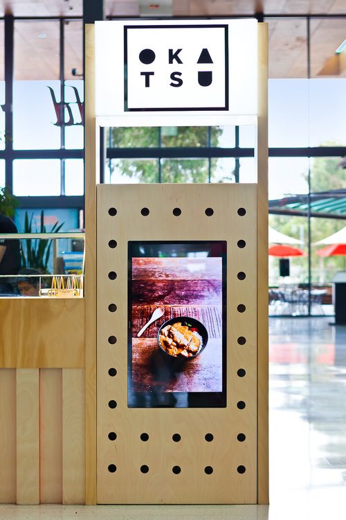
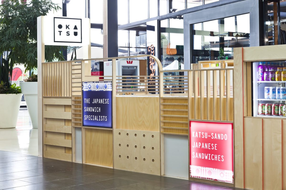
Katsu-sando is a Japanese lunch time staple; a fried pork cutlet in between two slices of bread. It’s fast, simple, and delicious. The owners of Okatsu, an Australian mall kiosk (at least based on what I can tell from the pictures below) wanted to bring the versatility and tastiness of this Japanese sandwich to Australia and asked Brandworks to do the branding, Interiors, and art direction.
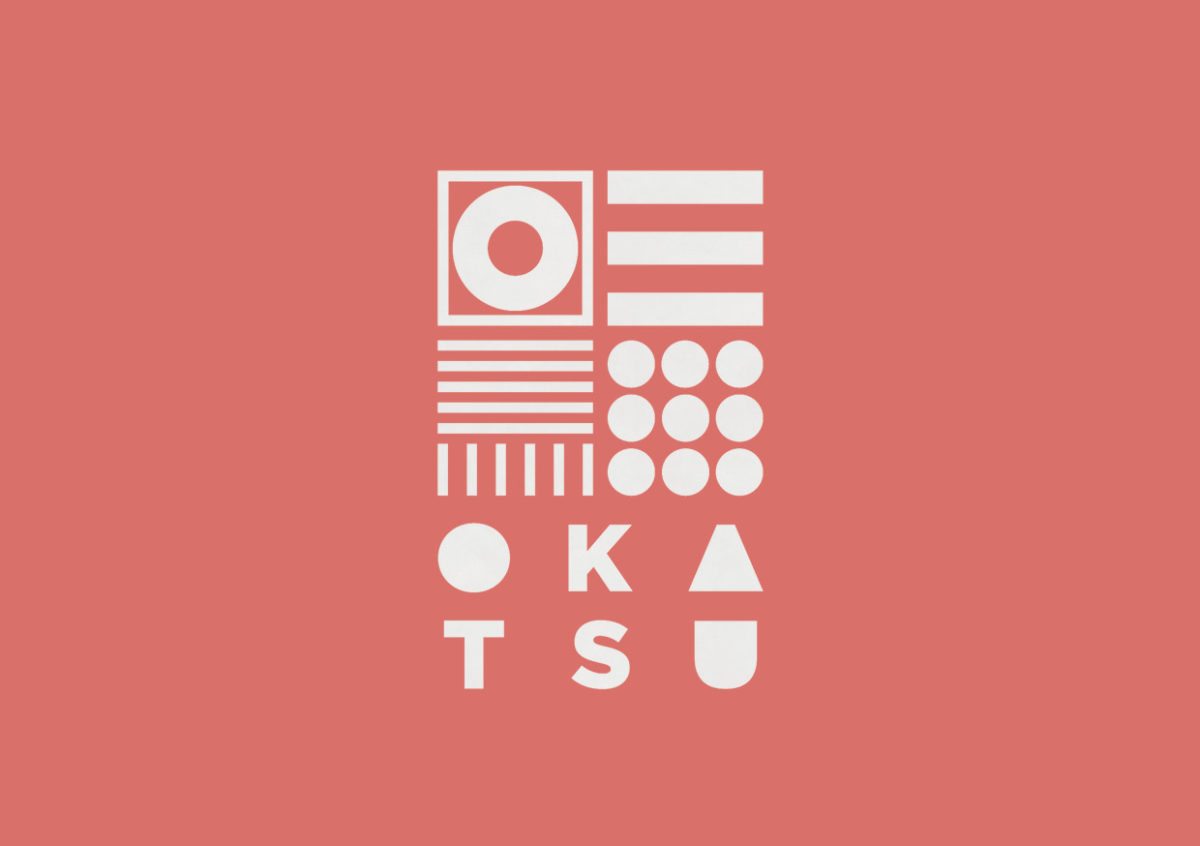
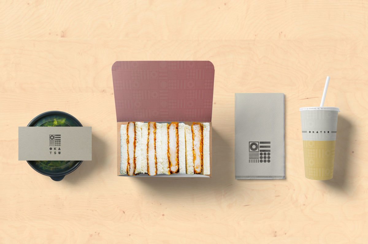
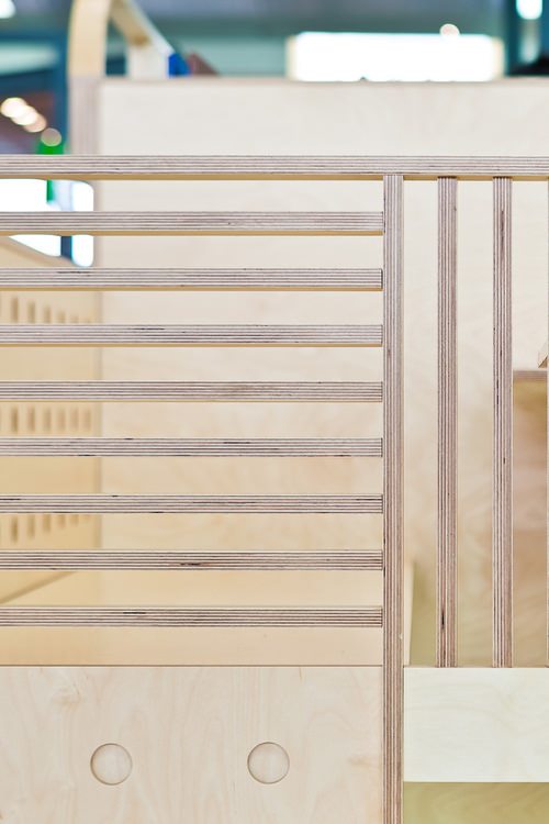
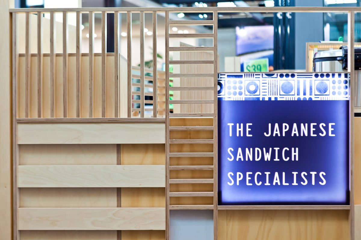
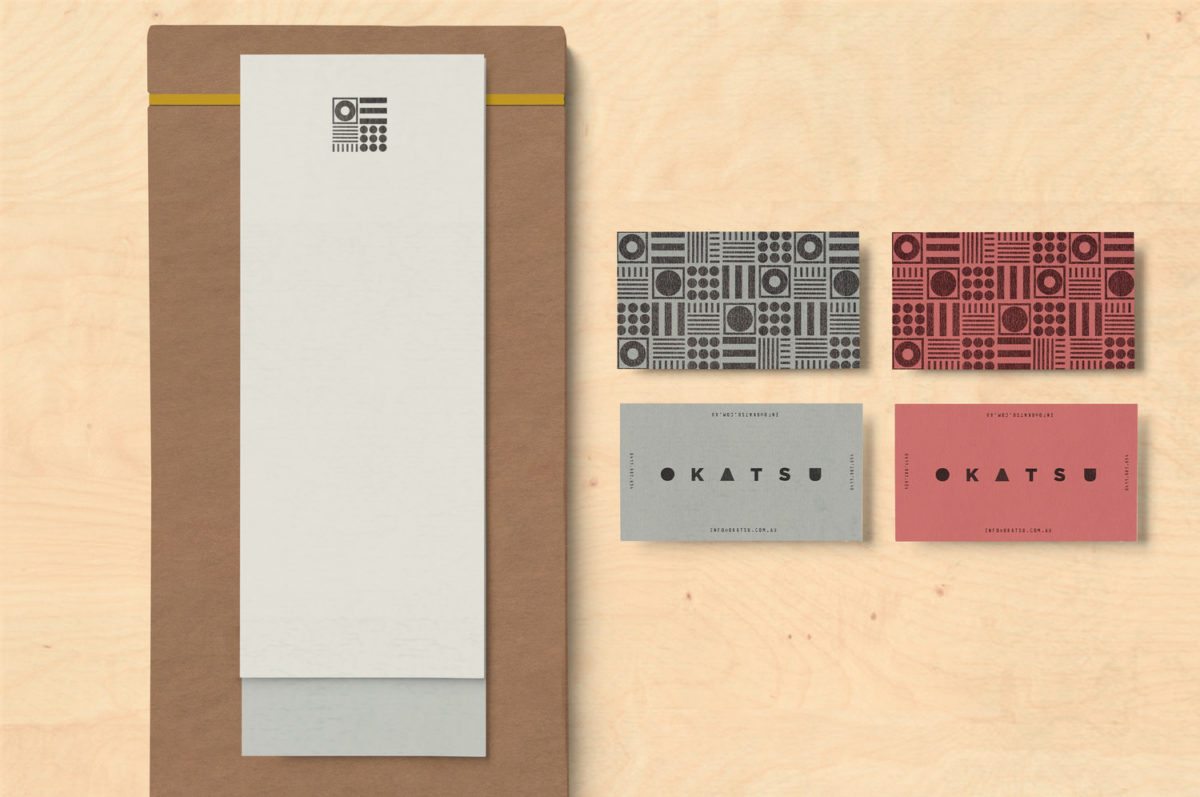
The pattern of the logo mirrors the form of the sandwiches and ancient Japanese seals. Brandworks takes this amalgamation of shape and turns it into a bold pattern, seen on takeout boxes for the product and stamped across business cards. The pattern also seems to have inspired some of the exterior treatment of the mall kiosk light plywood is built and stacked in ways that references this pattern. It’s eye-catching, to say the least.
Okatsu Branding, Interiors & Art Directions by Brandworks.
