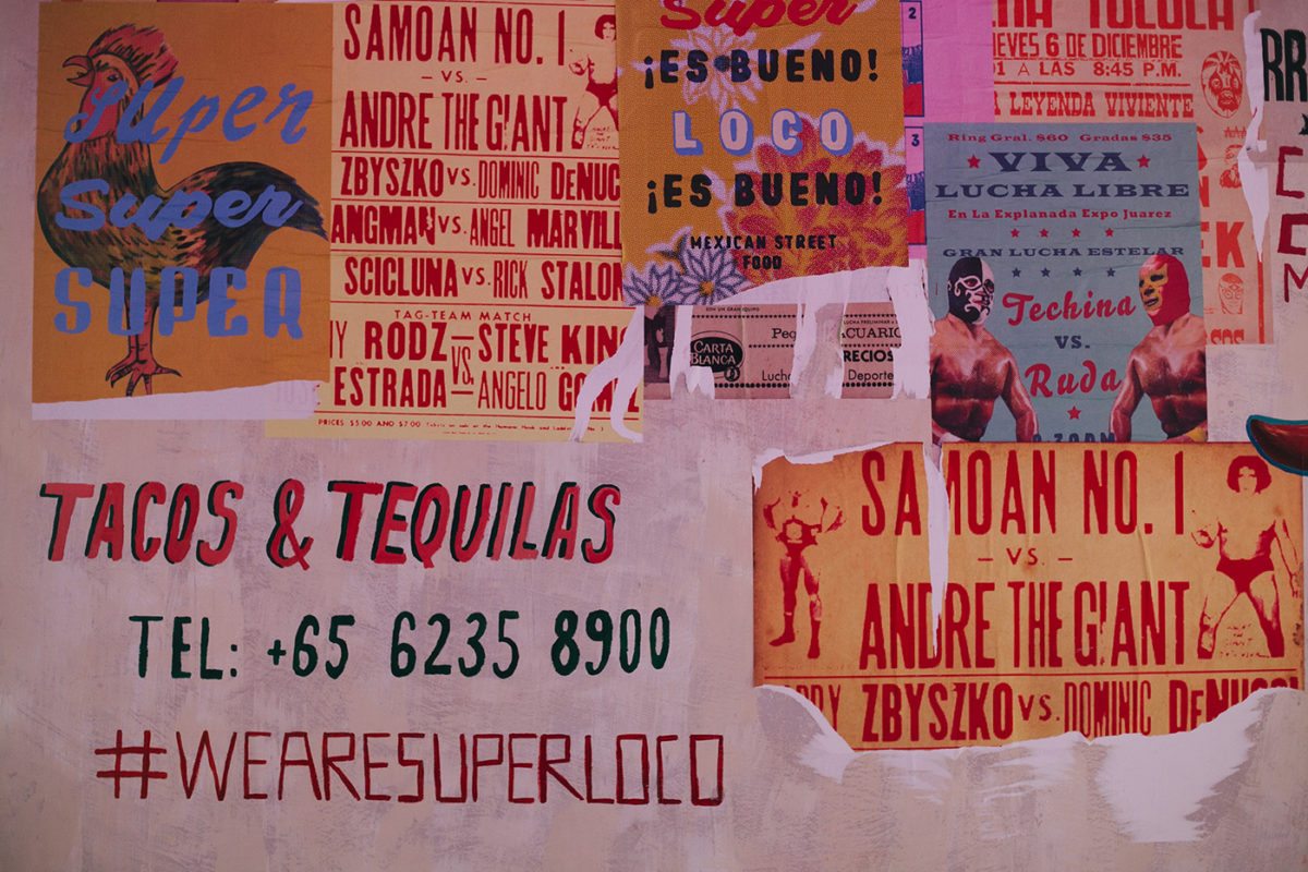
Super fun, Super Loco Mexican restaurant identity has caught our eye today. The always amazing, Foreign Policy was inspired by Mexico’s handpainted street signs and vibrant colors layered on top of iconic symbols of the culture are what make this identity so festive. The illustrations are so simple yet so perfect for this restaurant and as always FP doesn’t shy away from color, or scantily clad luchadores for that matter. The menu looks fun to navigate, it features a conglomerate of great typefaces, slightly textured, and they didn’t skimp on the children’s menu featuring huge illustrations. The Super Loco’s employee uniforms really tie it all together, their servers get to wear fun, bright pink or black tees and the bartenders (I think) wear a custom patterned hawaiian inspired button up.
Foreign Policy in Singapore is always putting out some great projects, their style is unique and their understanding of color and patterns is really inspiring. I have to say I think they are our favorite agency of 2018.