Comaluna Pastry Shop Branding

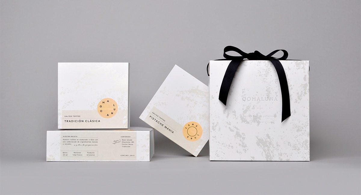
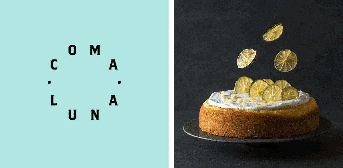
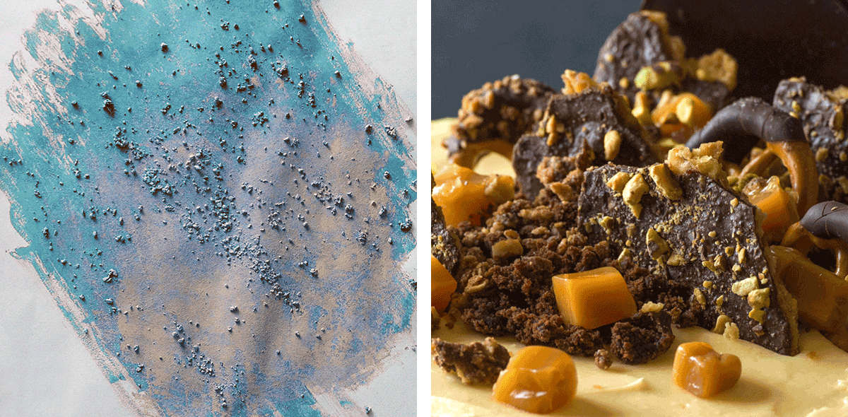
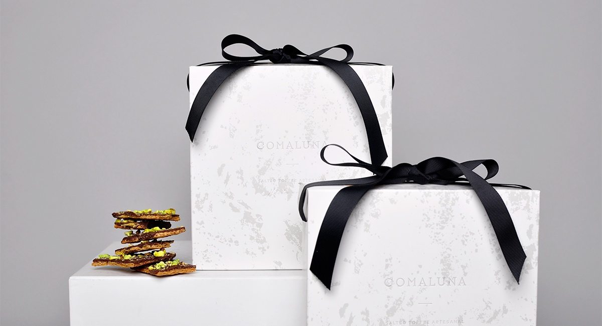
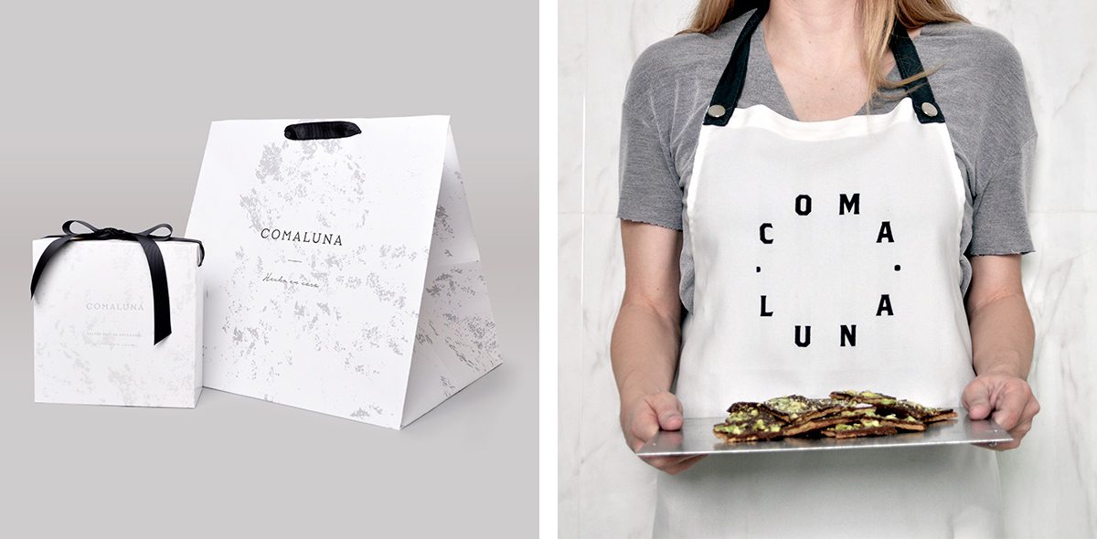
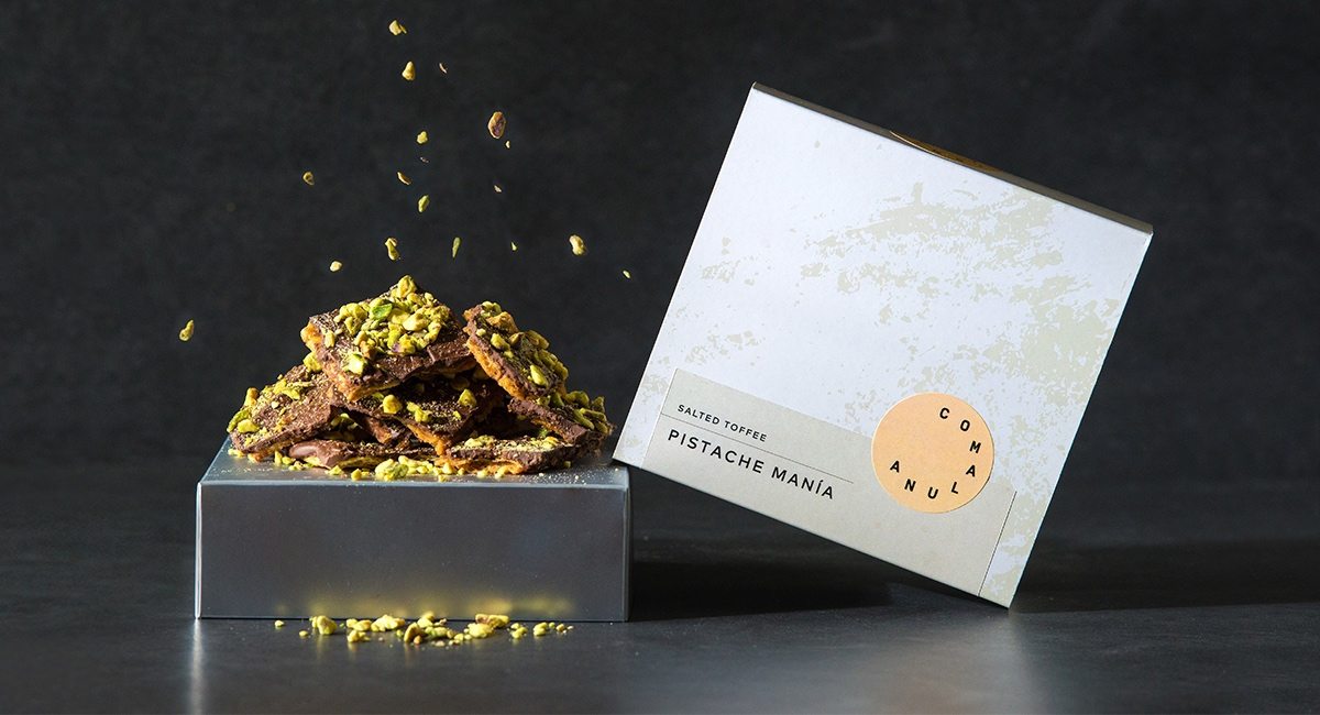
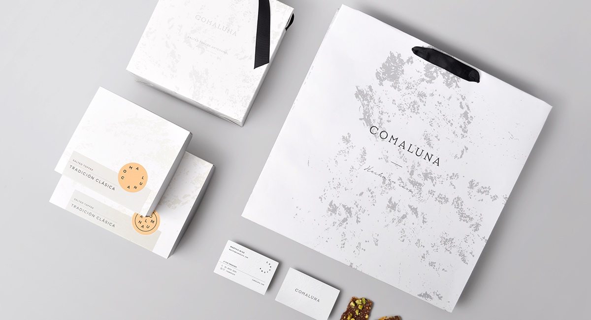
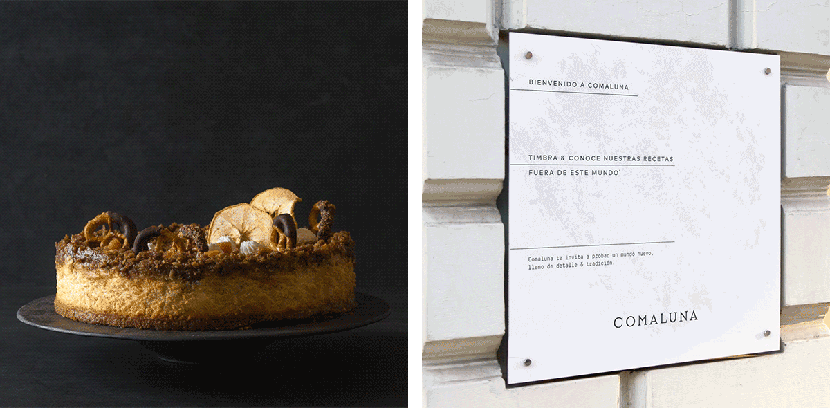
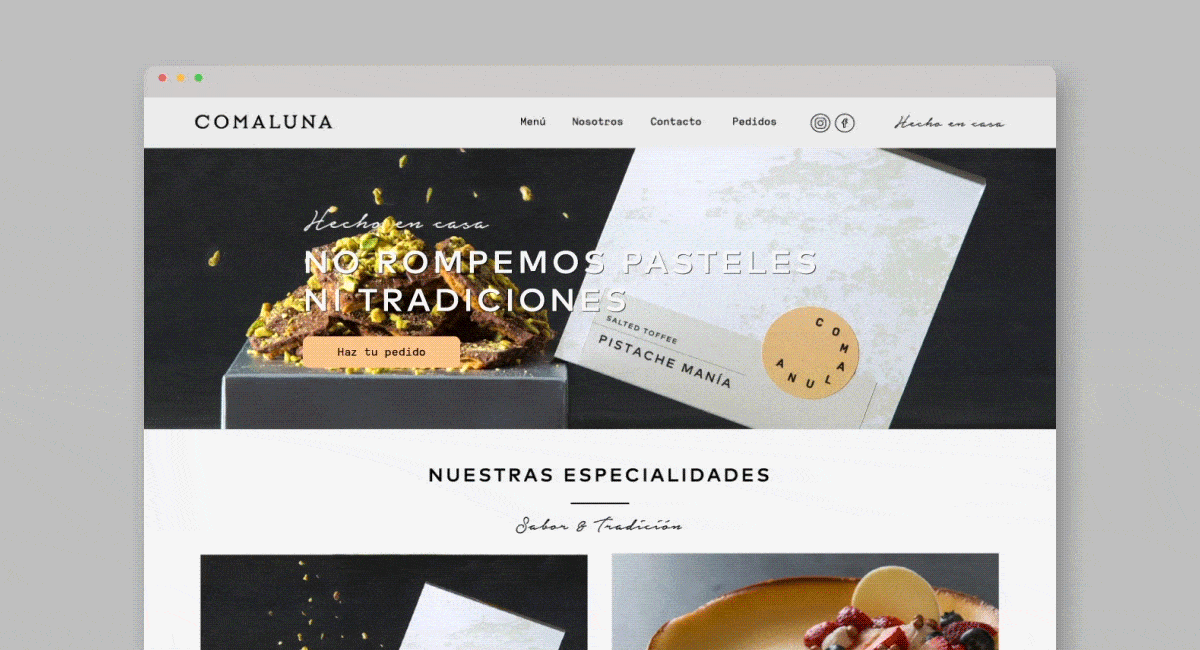
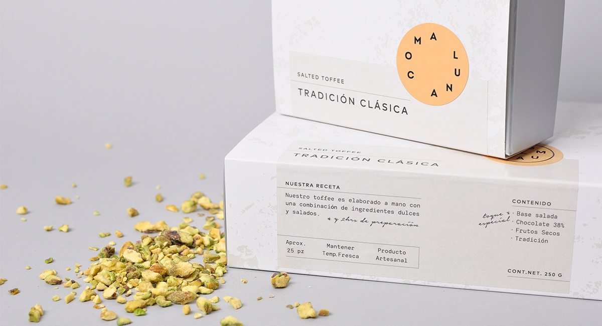
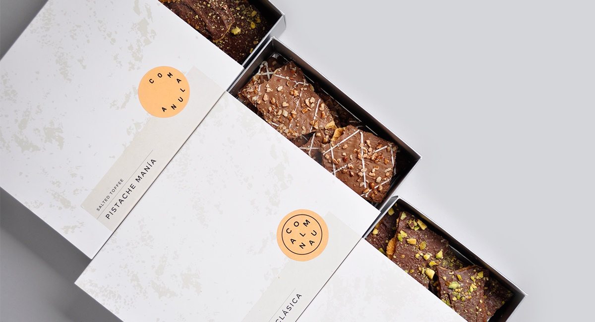
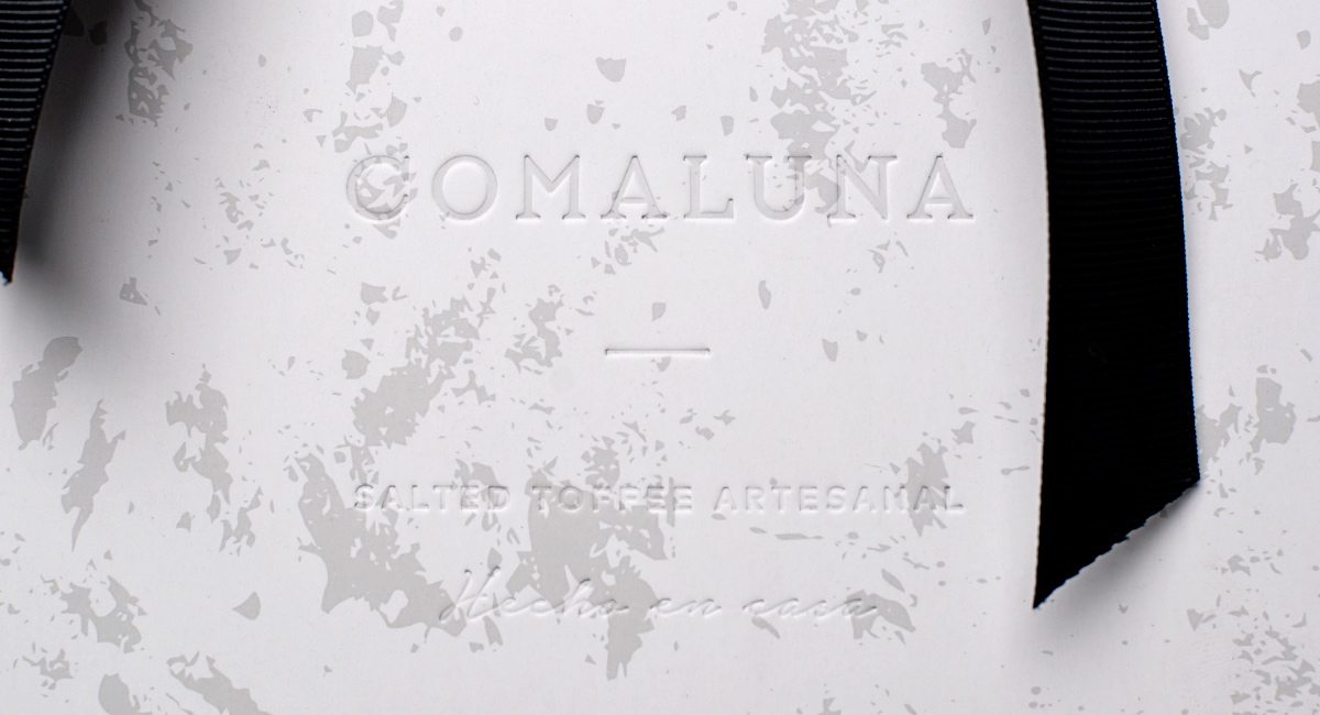
Eat & Moon is a rough translation for the cheese cake bakery name, Comaluna. Inspired by children’s books and possibly Wallace & Gromit of the idea that the moon is made of cheese! Firmalt took this cosmic idea and ran with it. The texture used throughout the brand is inspired by the moon texture and the logo shape is taking the lunar phases and the path it takes around Earth.

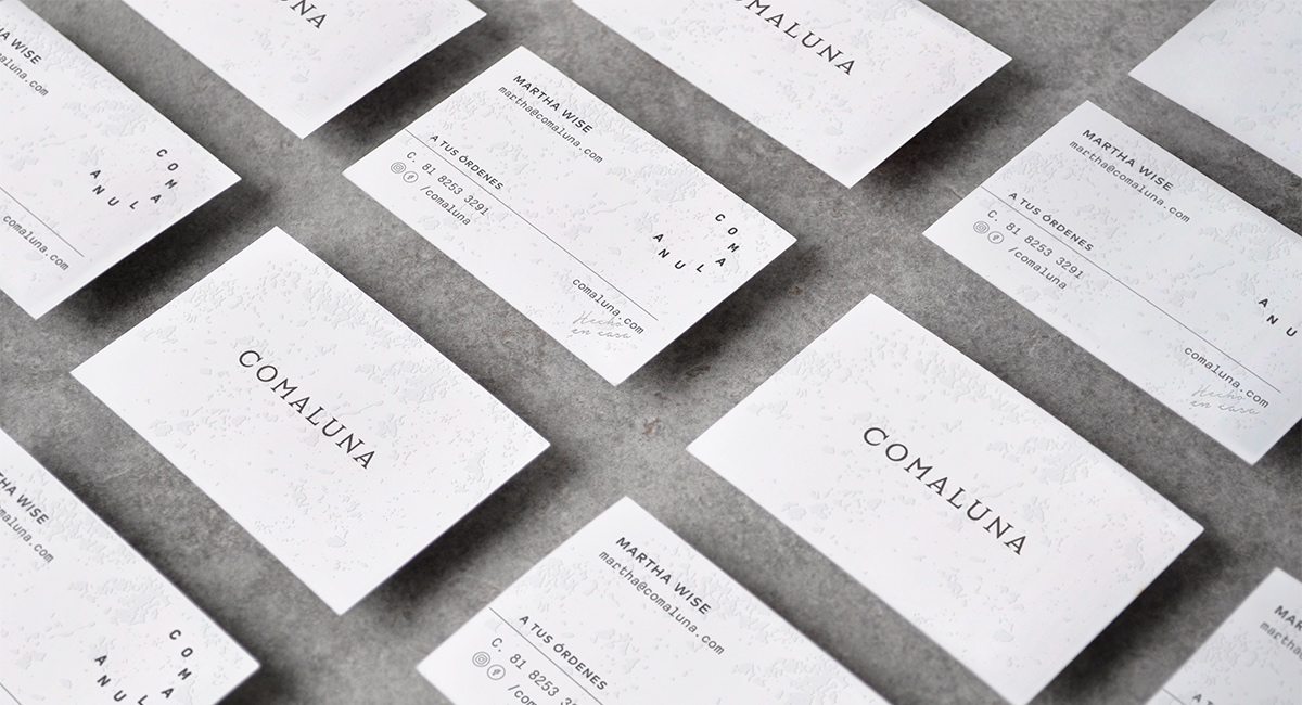
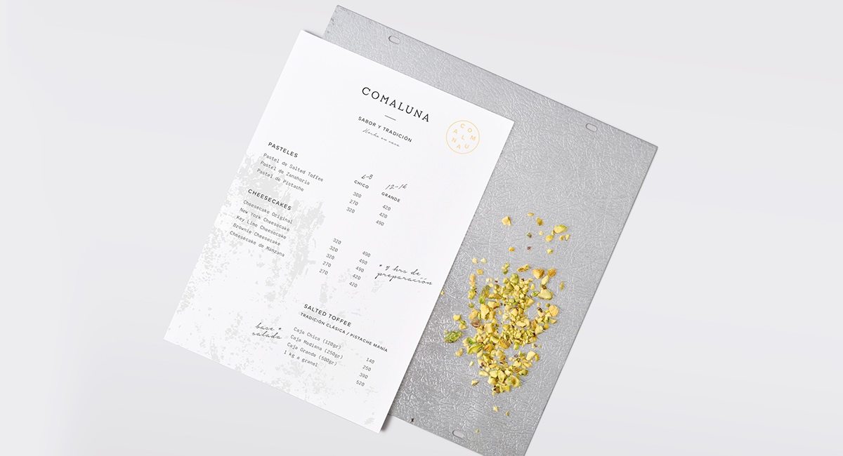
The typography used in the menu and package labels are inspired by traditional recipe sheets and even include a handwritten font that will remind all of us of our mothers, and grandmother’s recipe cards.

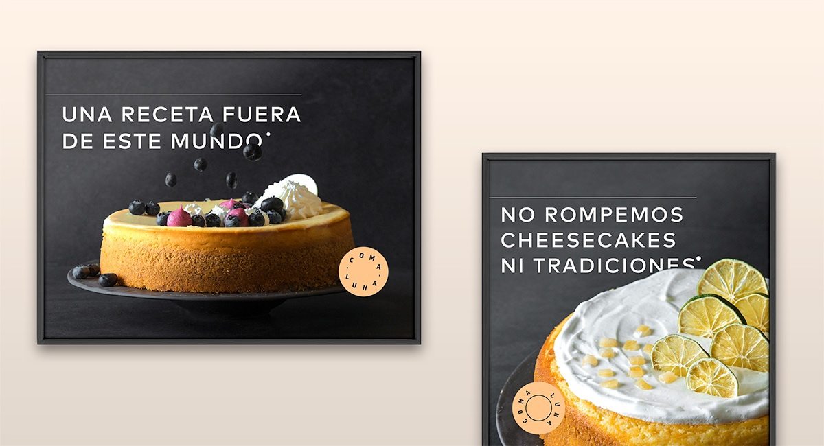
Firmalt knows how to seek their teeth into branding and we love what they put out there.

The Forktales Podcast™: Interviews with restaurant industry leaders and visionaries

Restaurant and advertising industry headlines and thinking

Reviews of restaurant experiences from around the globe 

Reviews of our favorite design, business, & restaurant books

Our favorite typography and fonts

Inspiration in your inbox

Get the latest inspiration in your inbox every Monday morning, for FREE!

"*" indicates required fields

This field is for validation purposes and should be left unchanged.

Delicious Bits in your Inbox!

Get the latest and greatest content delivered to your inbox for free!

"*" indicates required fields

This field is for validation purposes and should be left unchanged.