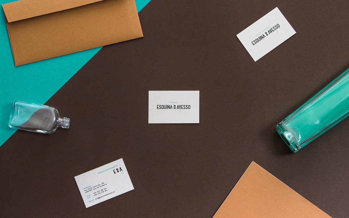
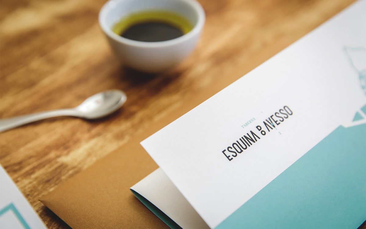
When designing the new brand for Esquina do Avesso, Another Collective faced a unique dilemma; how do you brand a new restaurant, make it modern, and still acknowledge the history of the space it lives in? Their solution was to create something modern and elegant, using a rich brown to mirror the interiors and contrasting it with a bright, ocean teal. I love the layering and contrast showcased on each touchpoint; the modern sans serif logo in the timeless brown, the serif in bright teal, and a monospaced typewriter-inspired body copy ties it all together. The way the menu is layered, different paper sizes and colors stacked against one another, intersected with old wood-cut looking illustrations, creates another visual representation of the old-meets-new concept.
Esquina Do Avesso Brand, Print & Art Direction by Another Collective.


