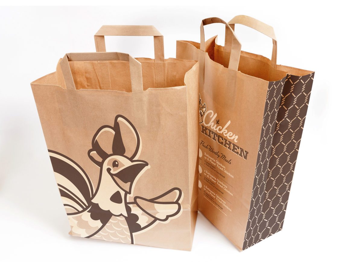
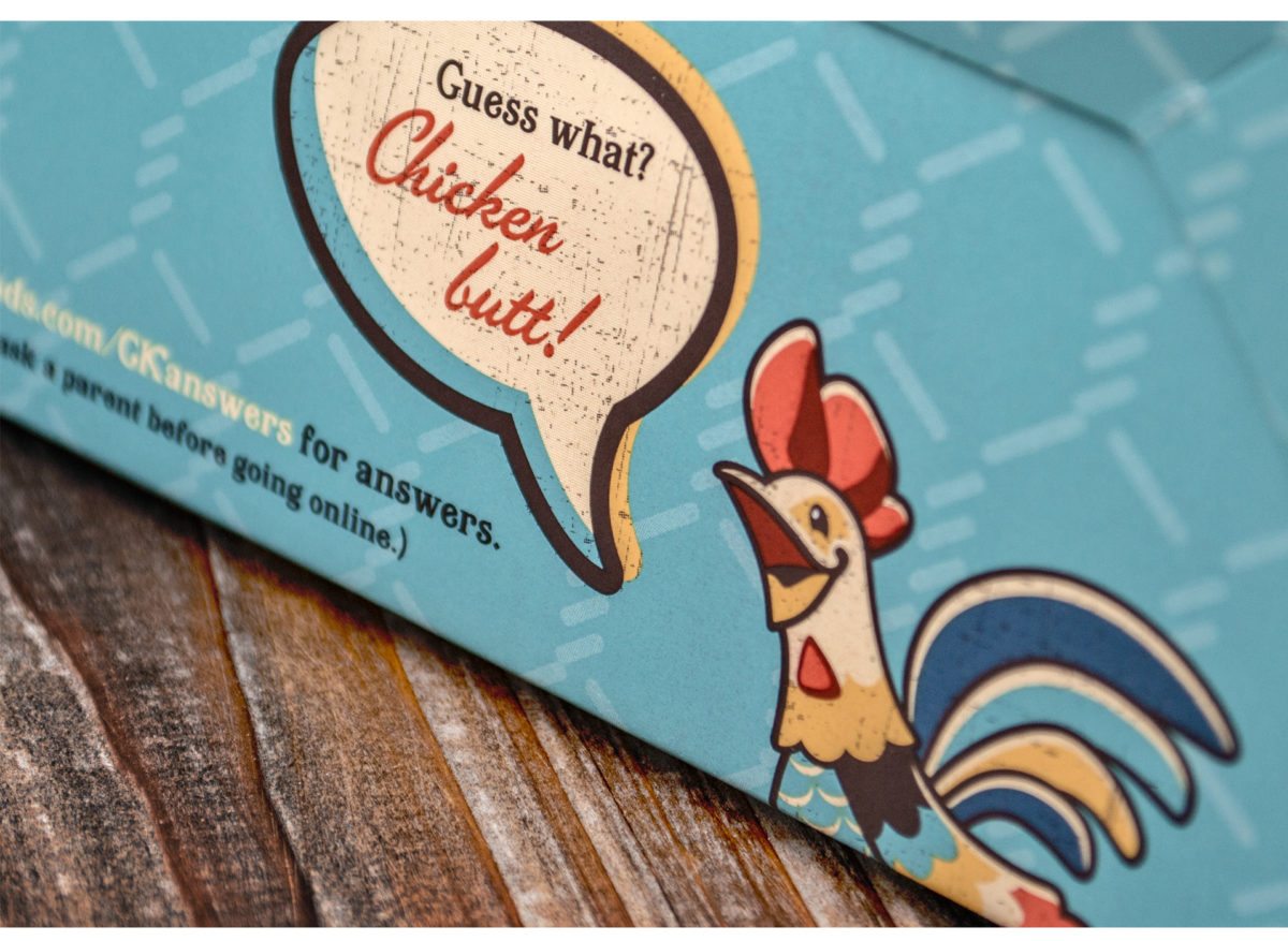
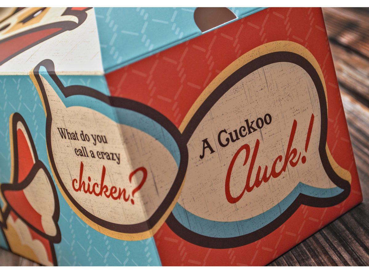
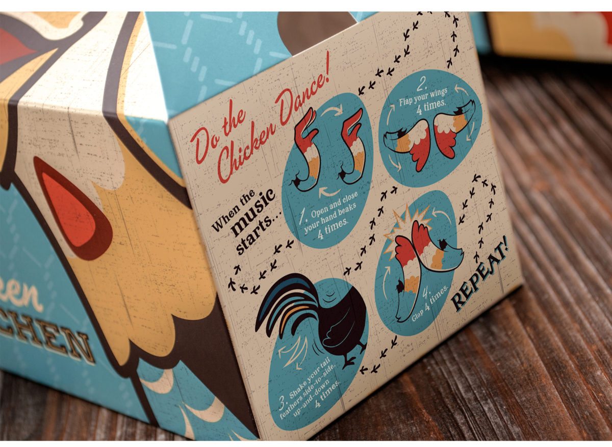
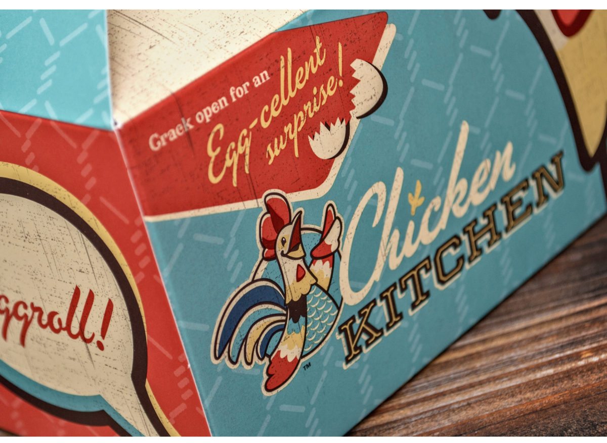
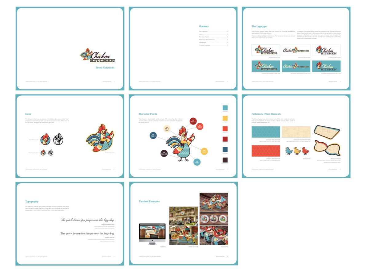
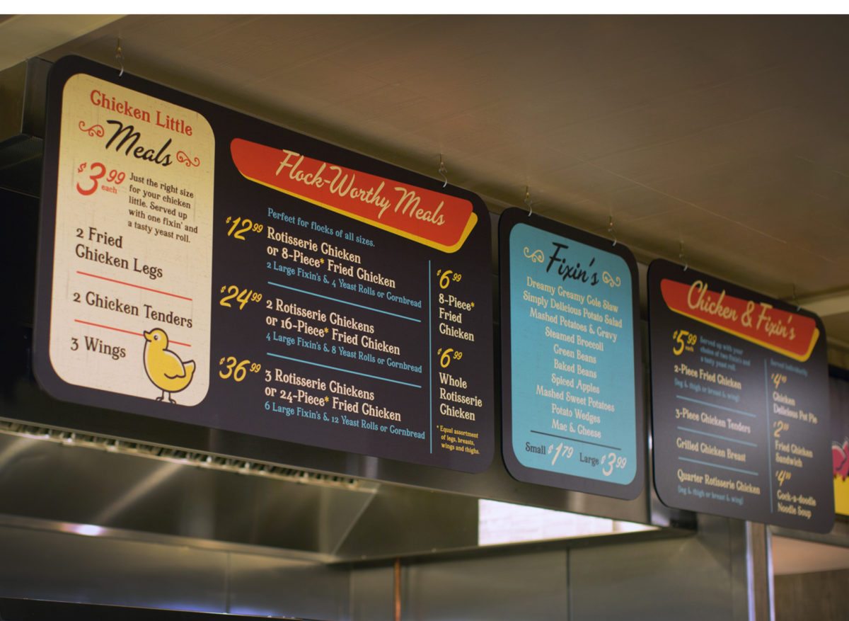
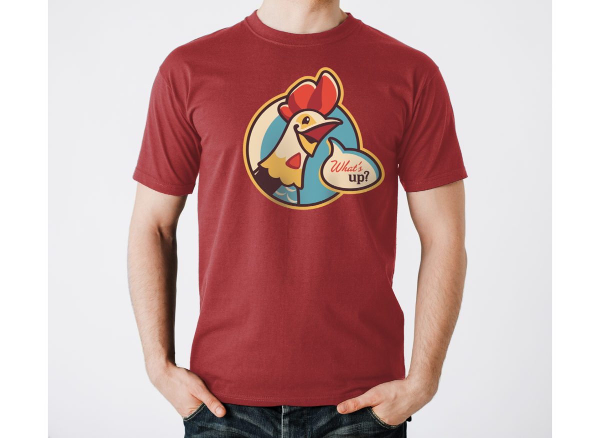
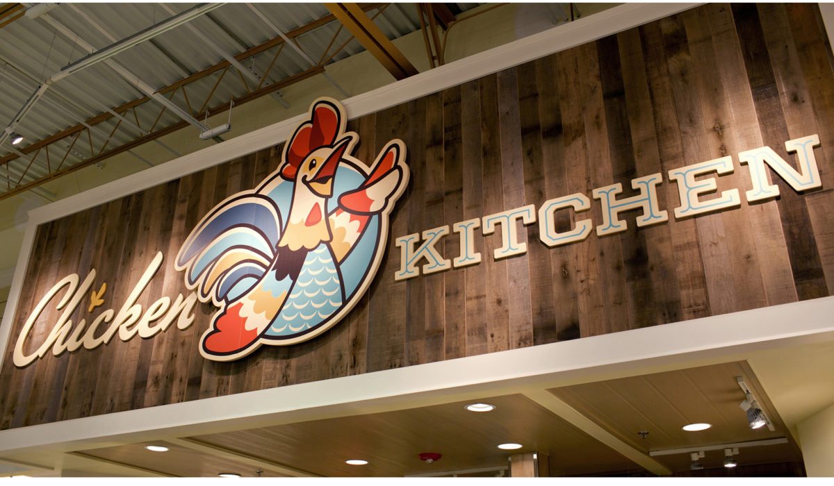
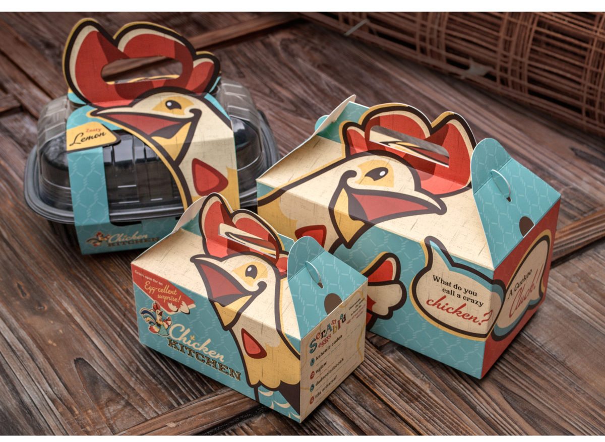
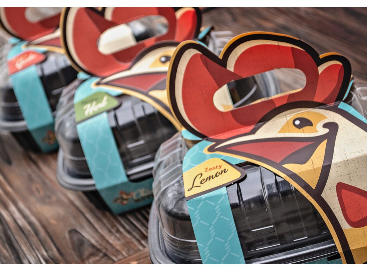
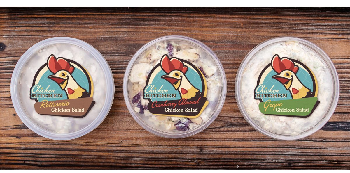
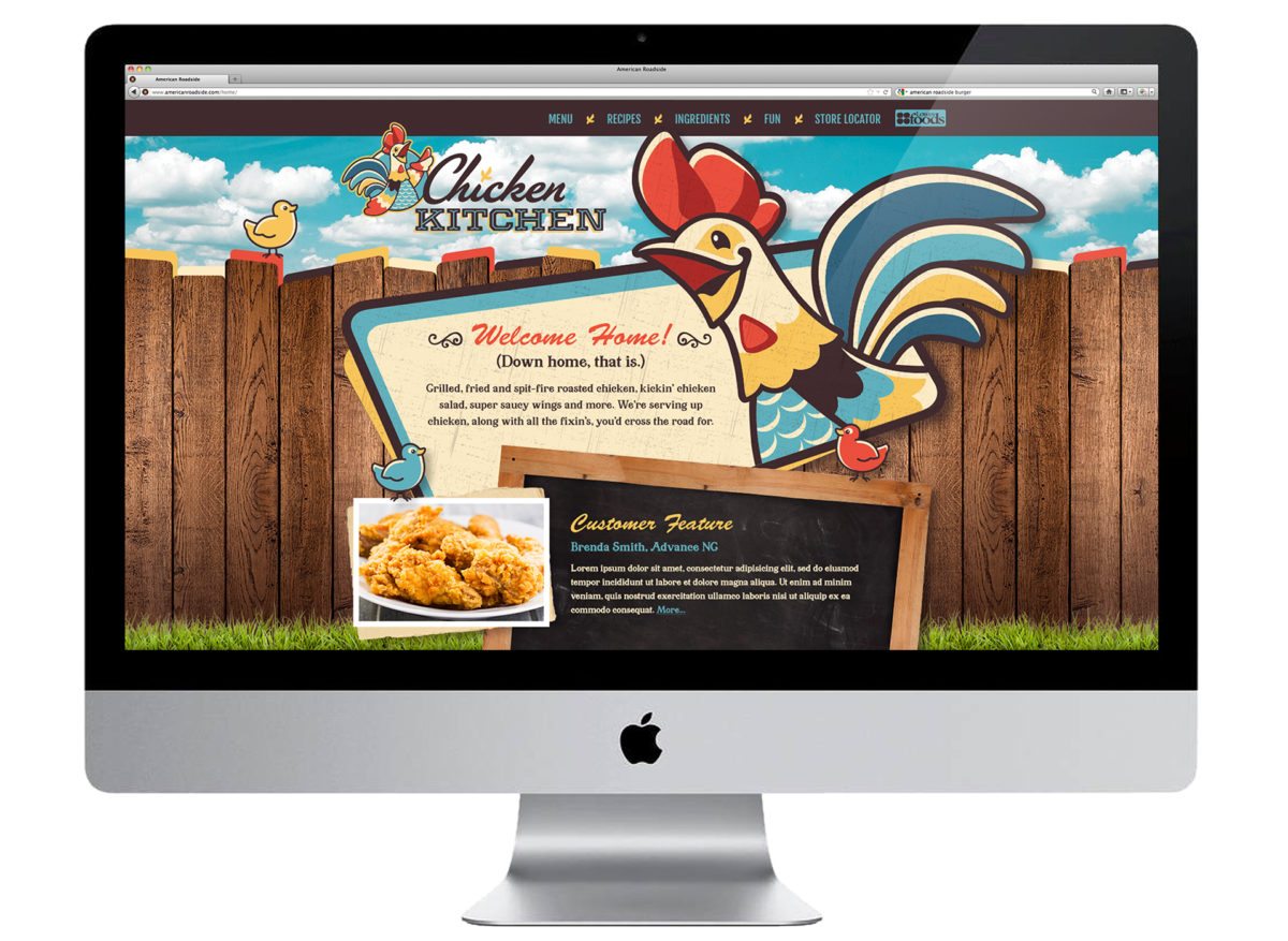
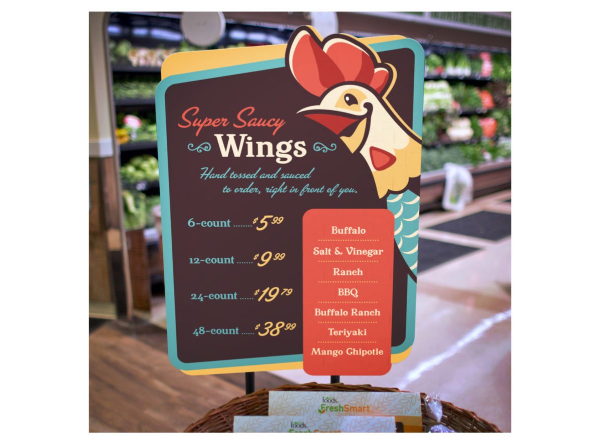
The brand for Chicken Kitchen is fun, colorful and engaging. It’s a bit nostalgic, with muted color palettes, an illustration style, and typographic choices that throw the design back to southern diners of yesteryear. Even the chicken mascot is pretty throwback. The most fun part of this brand is the packaging for their to-go chicken. The chicken’s comb (yes that is the anatomically correct way to refer to the red bit on their head) makes a fun handle to grab the package by.
Chicken Kitchen Branding & Packaging by Wildfire Ideas.
