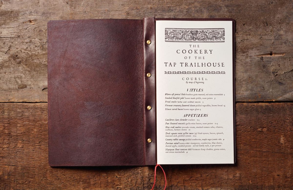
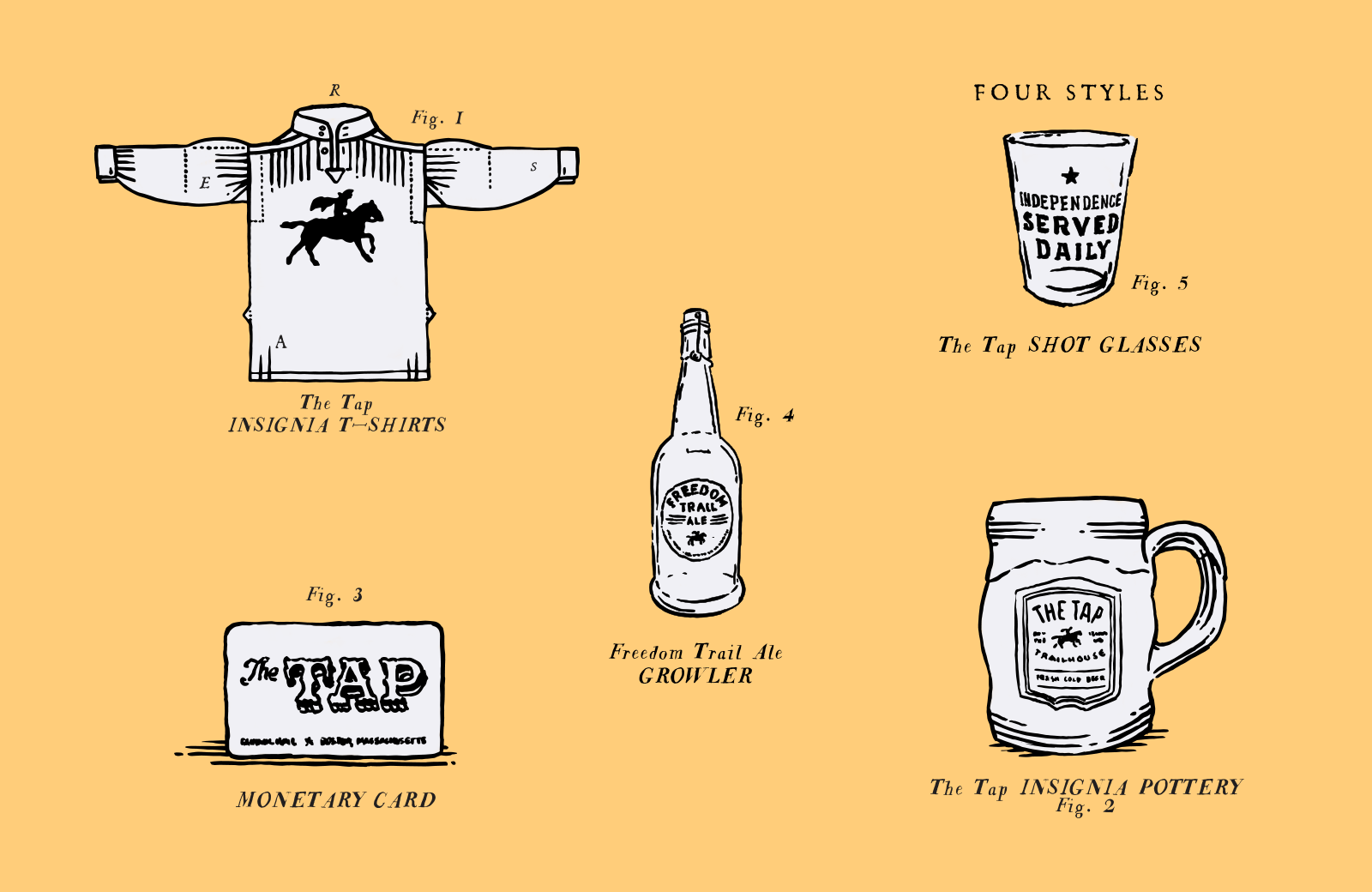
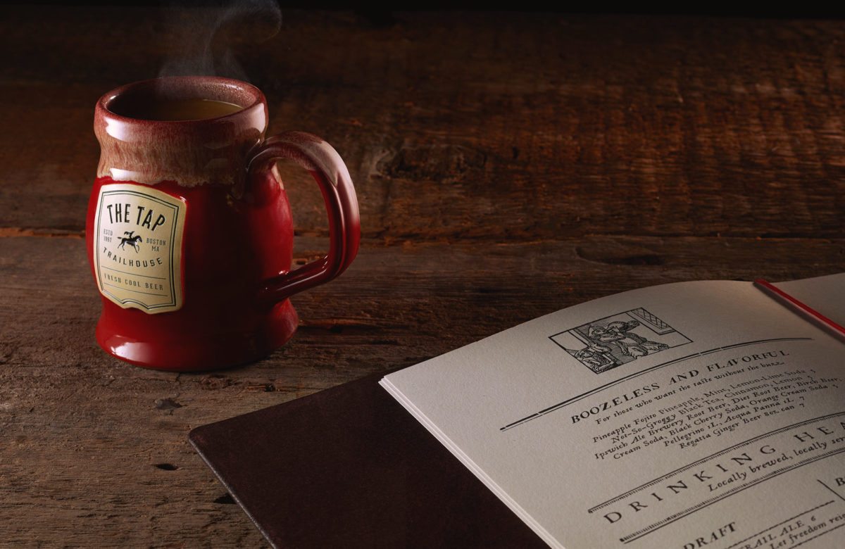
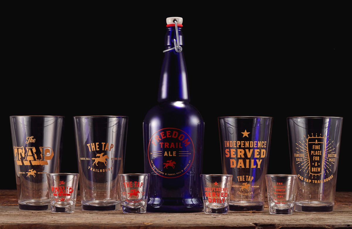
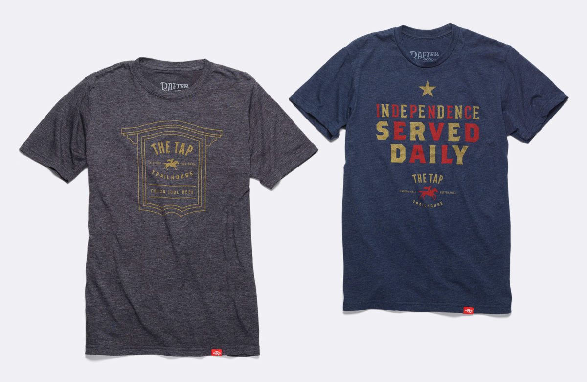
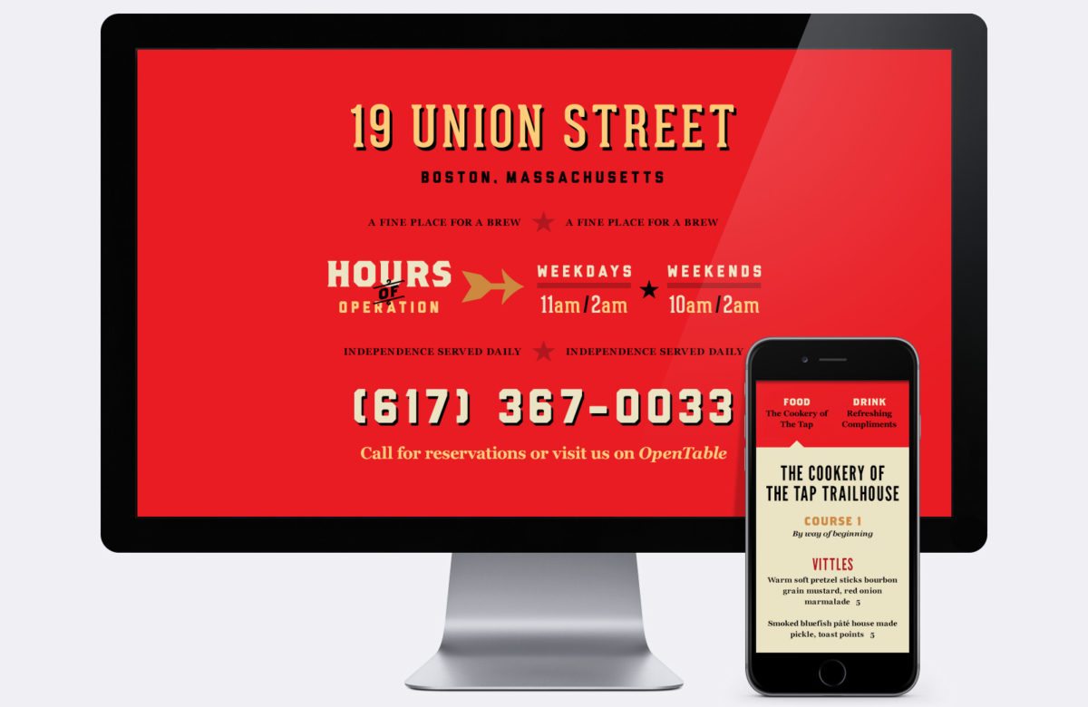
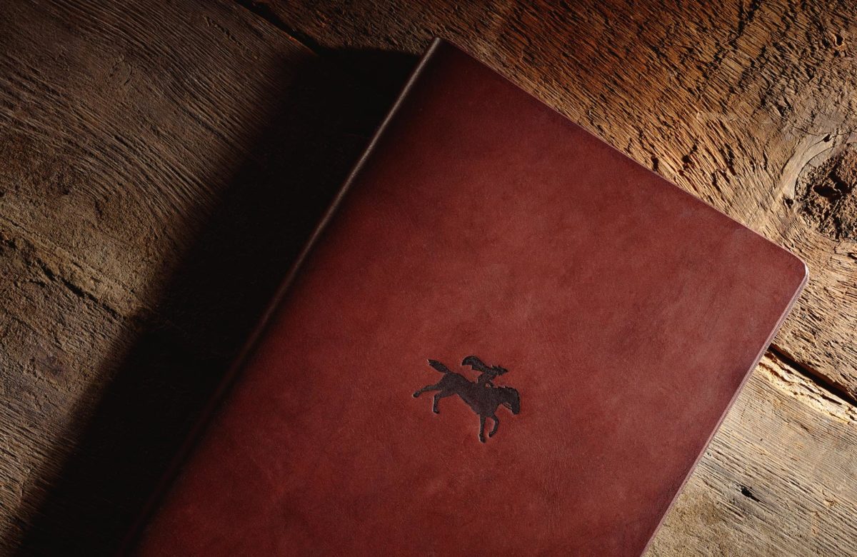
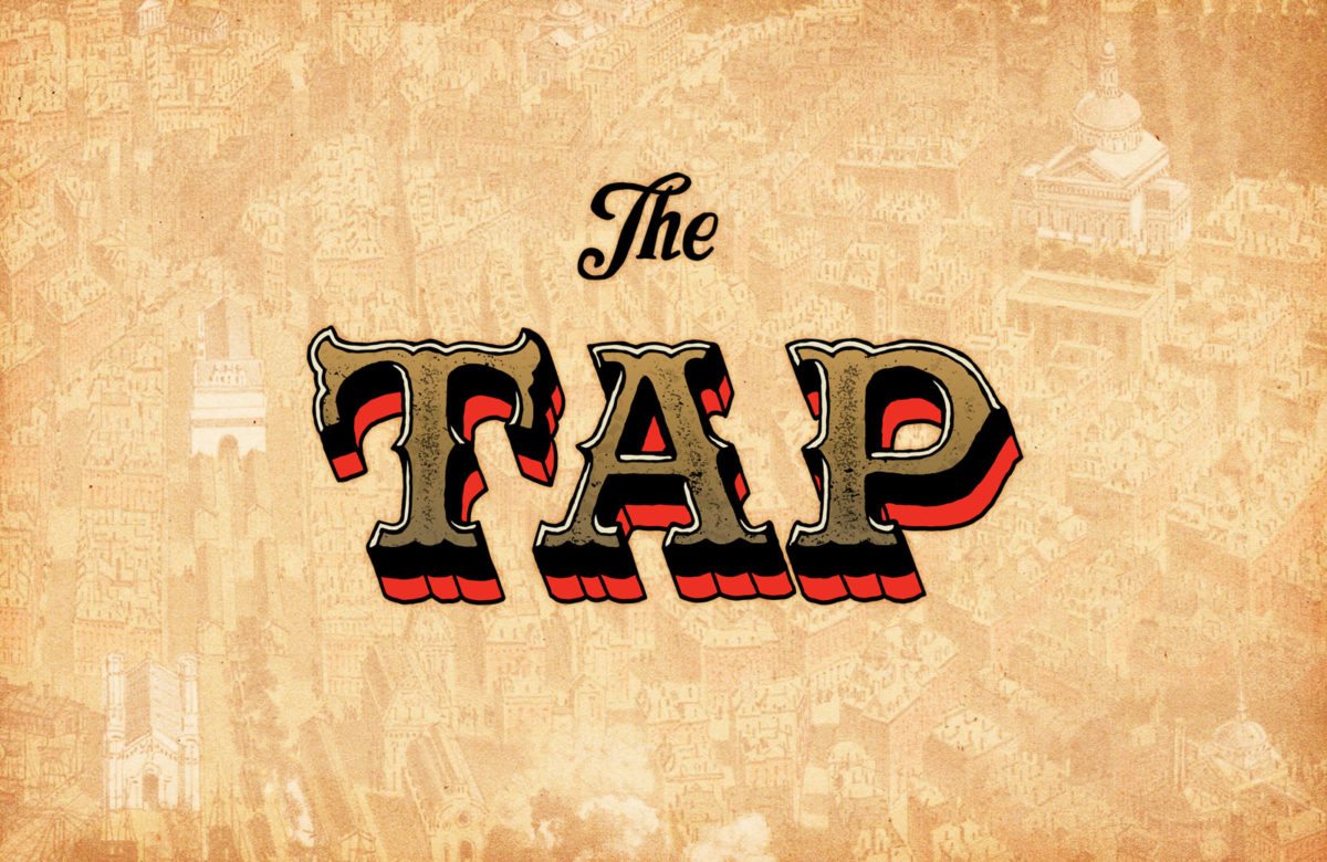
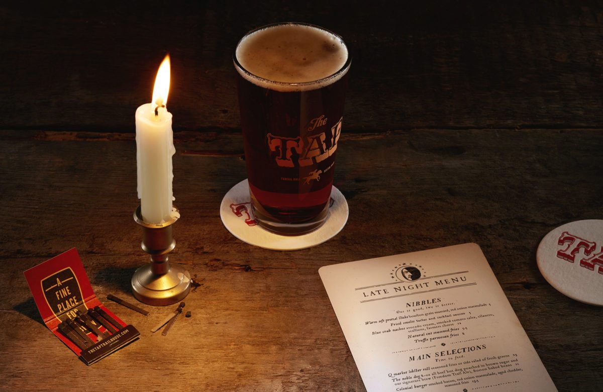
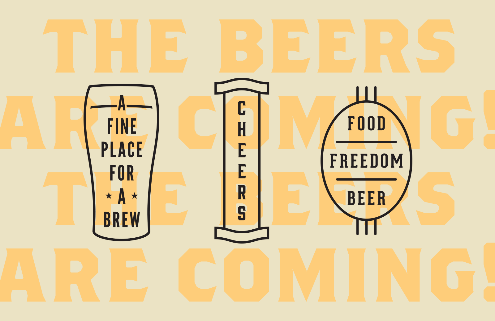
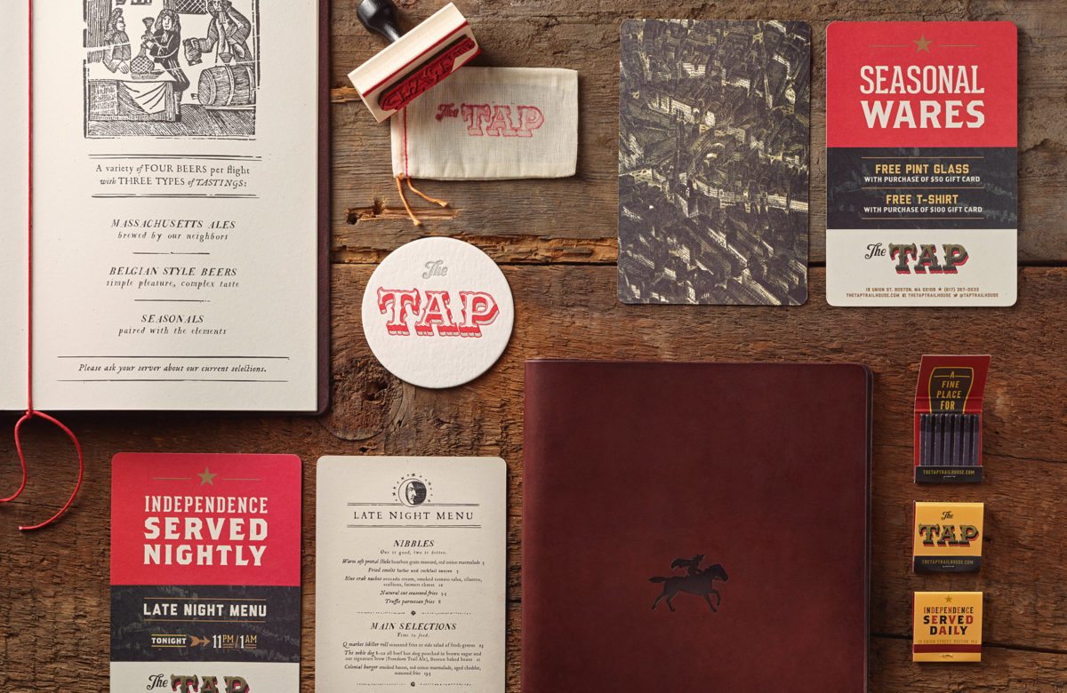
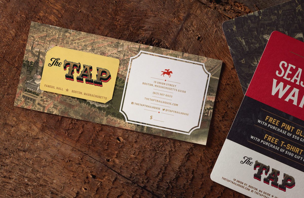
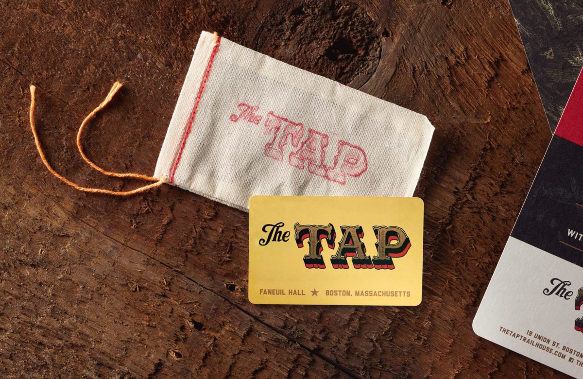
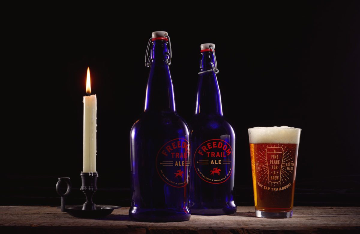
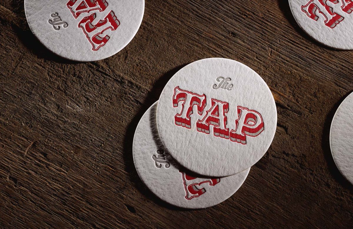
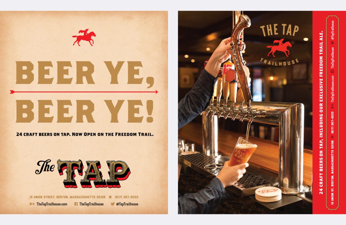
The Tap Trailhouse offers modern interpretations of New England fare, and their brand reflects this old-meets-new in its choice of typefaces, formats, materials, and textures. Stebbings Partners leveraged the Boston area’s rich heritage for inspiration, injecting the brand with colonial-era inspired touches. The menu should be noted that it was featured on Art of the Menu, and it’s easy to see why. As Armin puts it, “…the typography and ornaments are straight up Victorian, further getting you into that time period…” I personally love when you’re able to historically inform your design decisions, but not limit yourself to that era. The Tap’s brand integrates some historically inspired typefaces (the ever popular Brothers, among some others), bringing the brand into the modern day.
The Tap Trailhouse Brand Identity System by Stebbings Partners.