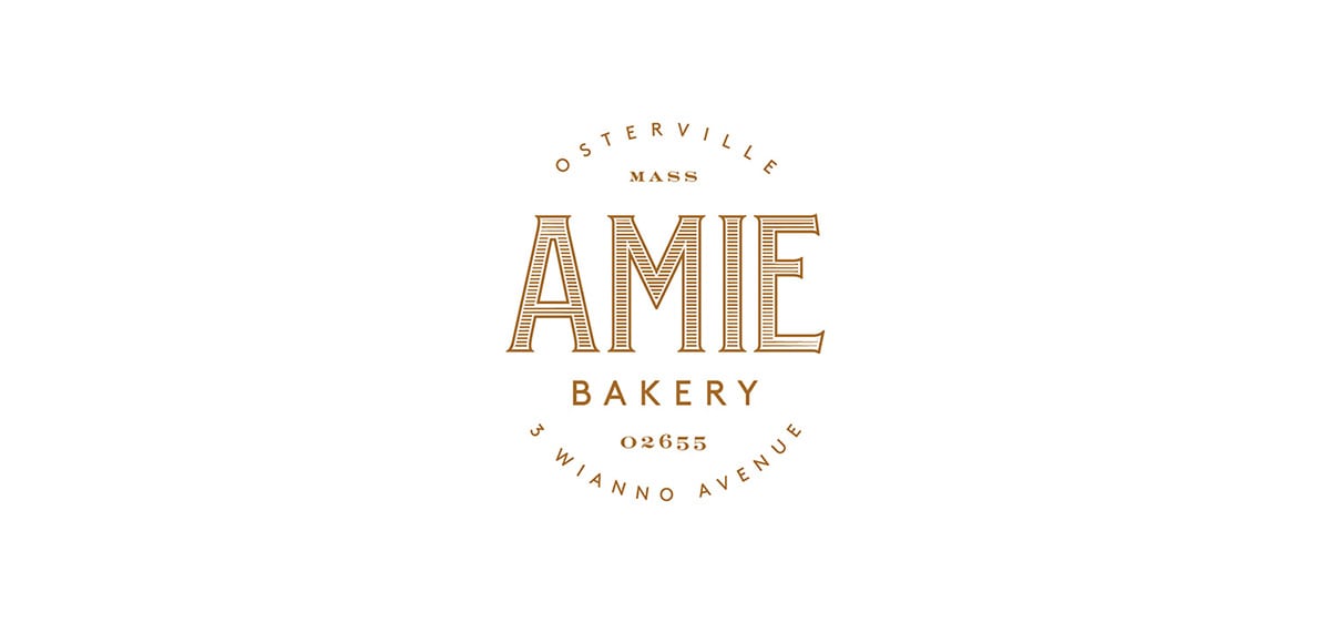
Amie is a small, specialty bakery in downtown Cape Cod, Massachusetts. They like to think of themselves as the town’s kitchen, as friends to their neighbors. Fitting, because ‘Amie’ means ‘friend’ in French. Their brand is traditionally French; spur serif typography with a line pattern that looks like it was engraved onto each letter. The seal they use is classically inspired, incorporating the full address into the mark. The soft gold gives the brand an upscale but still warm and inviting feel, and pairs well with their darker, more neutral teal color. Their patterns seem art deco inspired to me, and add a nice geometric contrast to the soft organic lines and typography of the maps of Cape Cod that also adorn other printed touchpoints.
Amie Bakery Branding, Packaging and Environmental Signage by Peck & Company.


