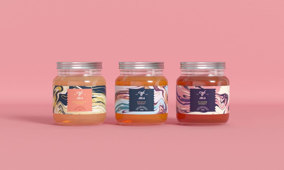
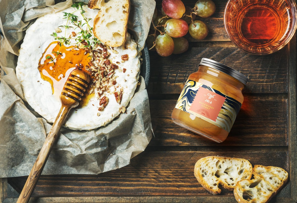
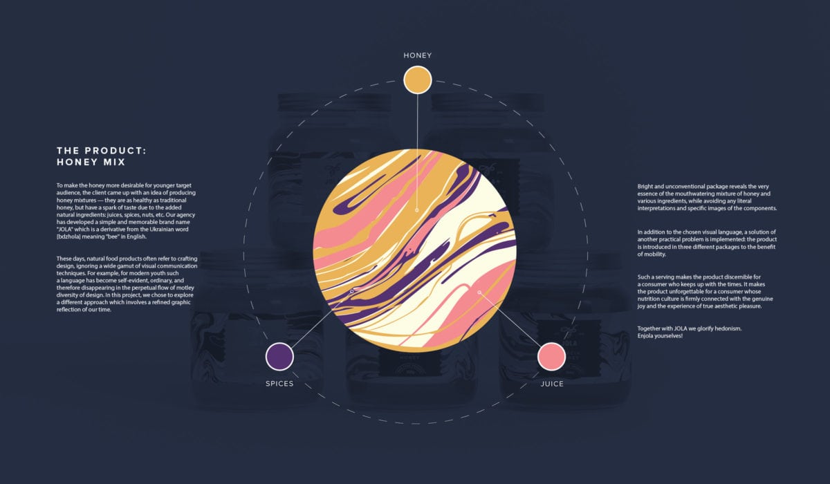
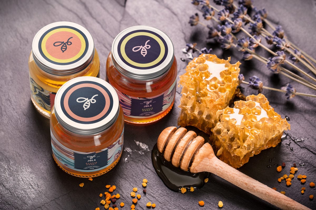
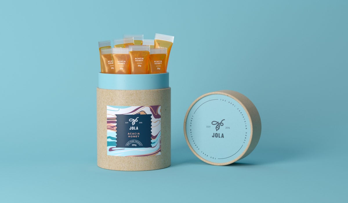
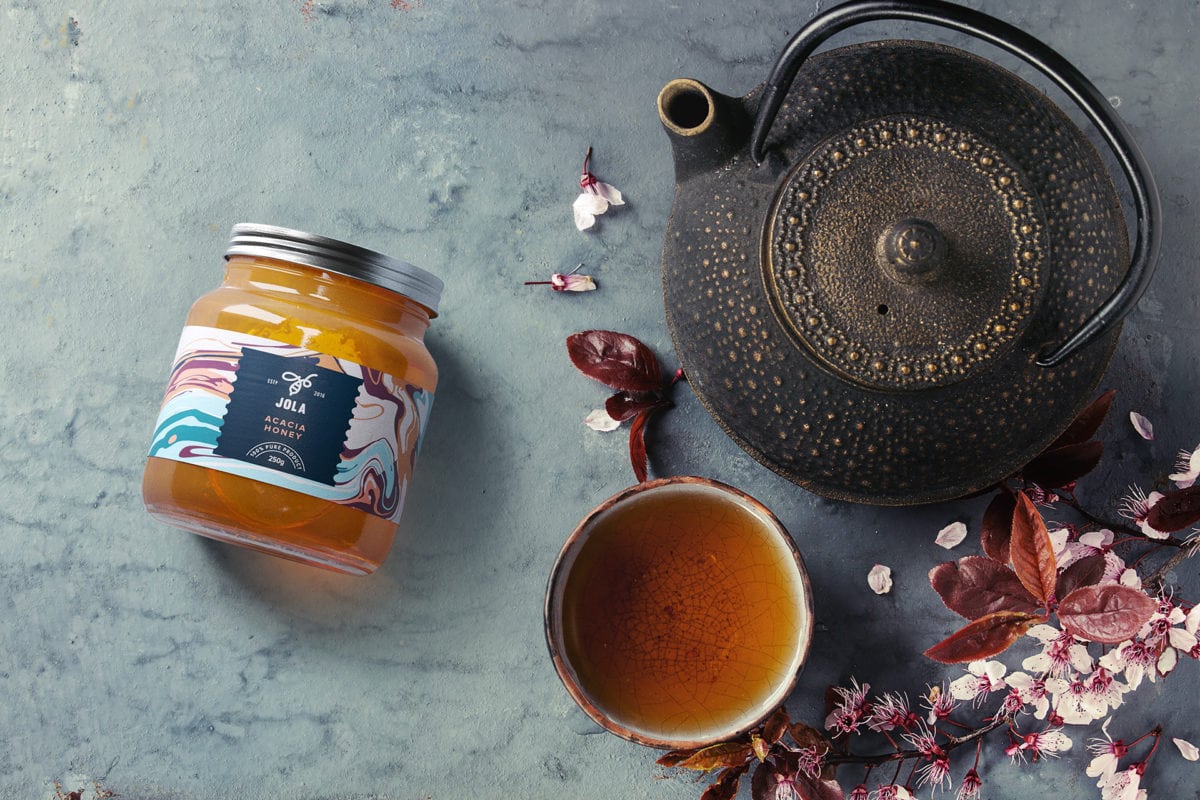
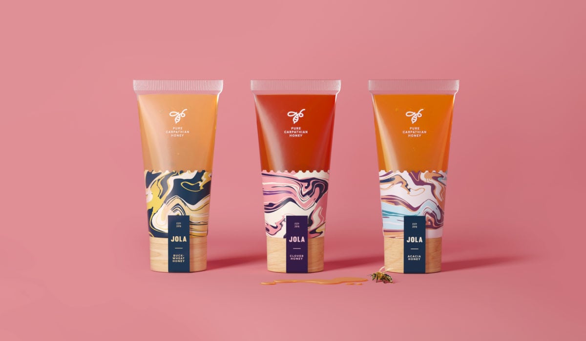
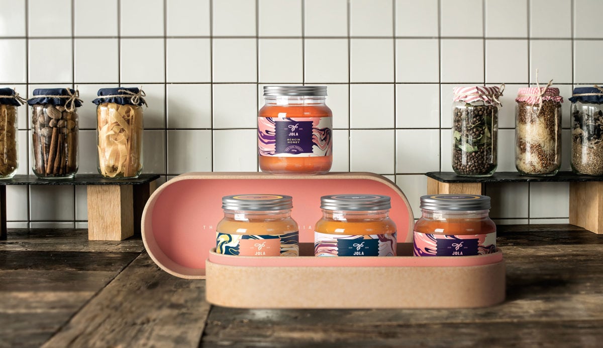
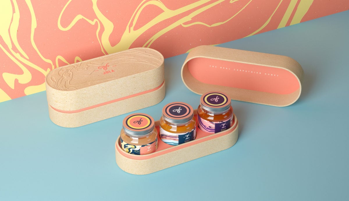
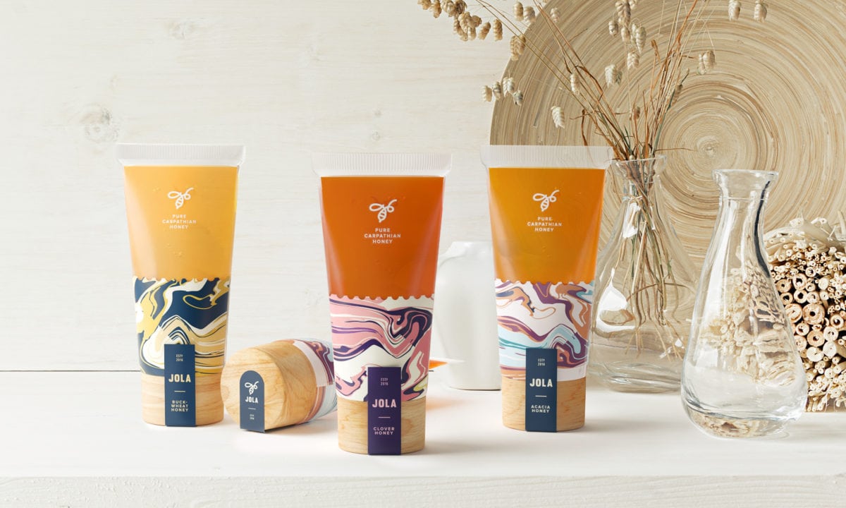
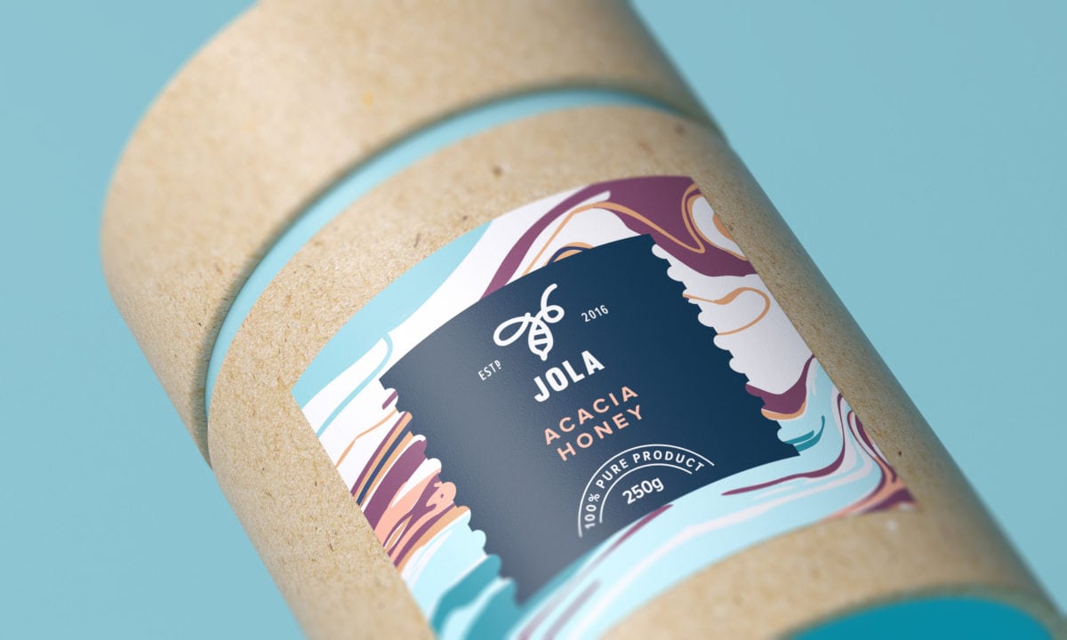
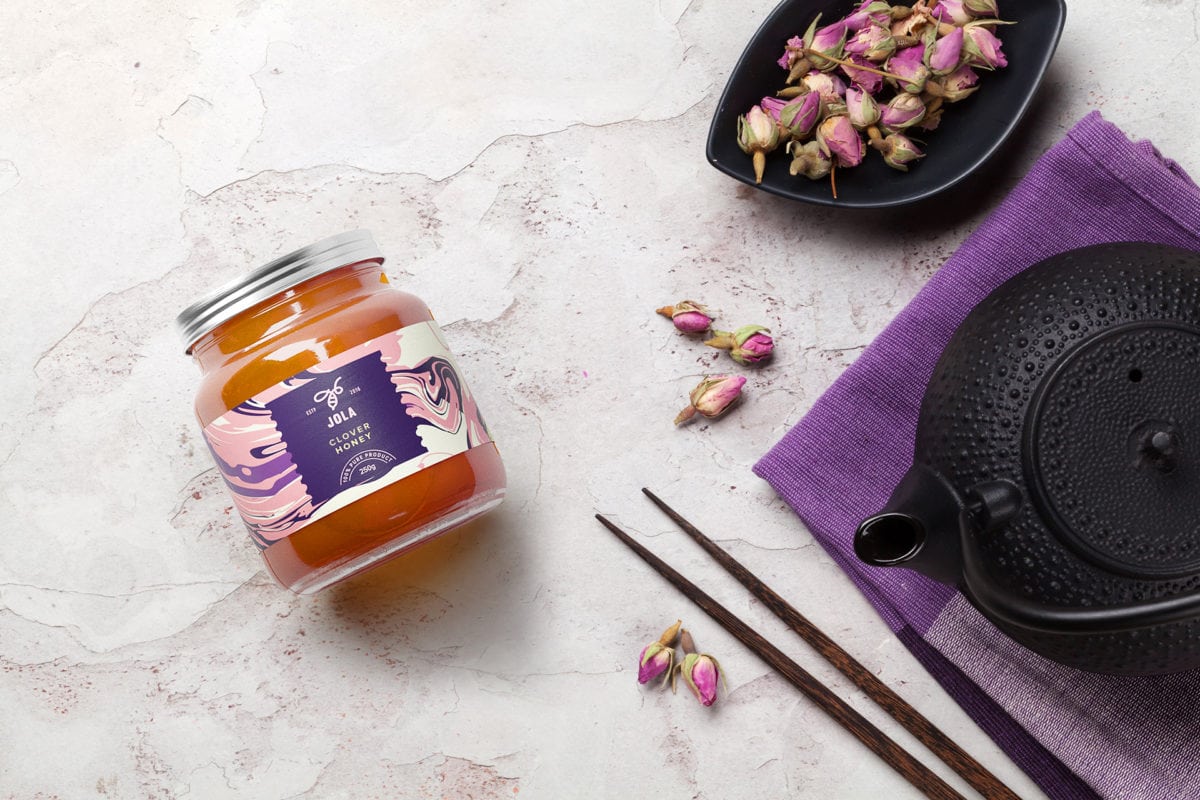
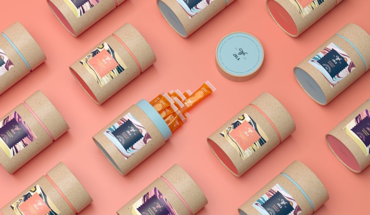
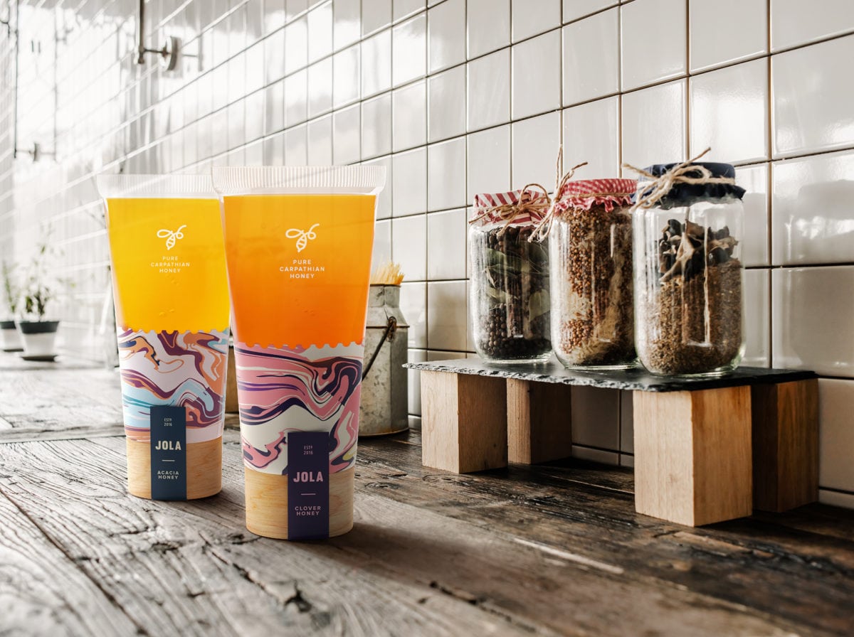
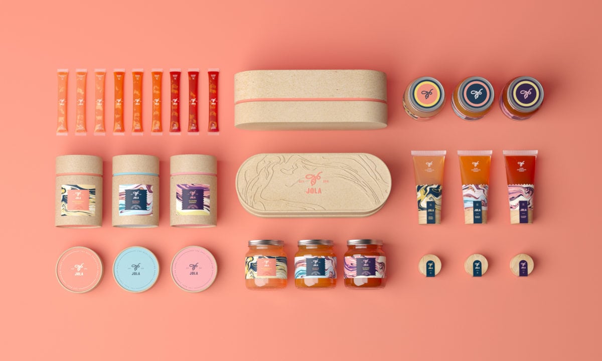
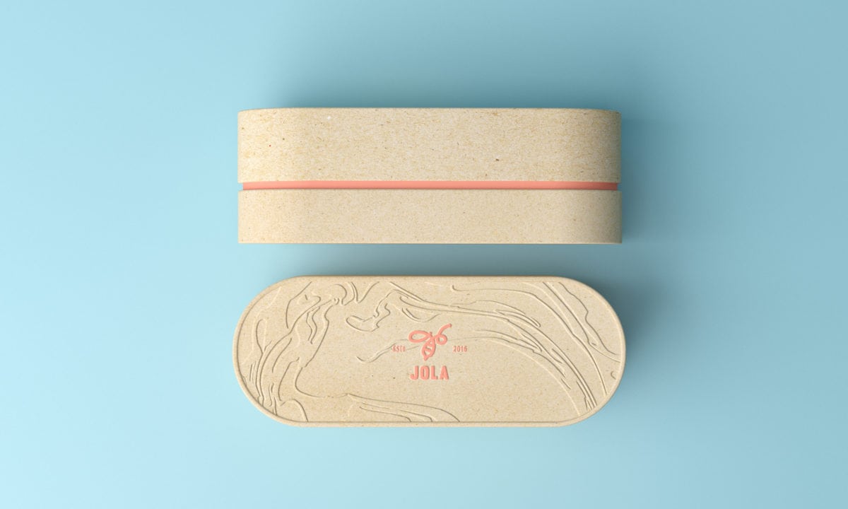
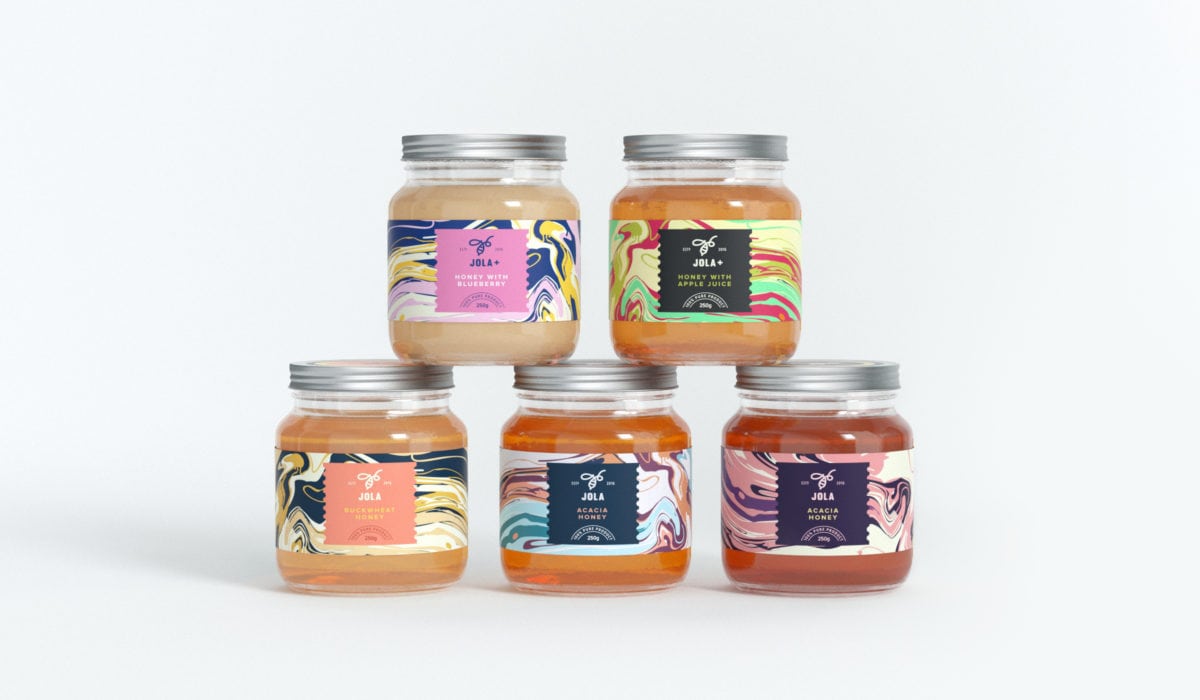
Honey mixtures are as healthy as traditional honey, but have an added twist of flavor by the addition of natural ingredients into the honey, such as juice and spices. This blending of flavors becomes the focal point of Jola Honey’s visual language. Each label features a mesmerizing marbled pattern, the colors of each pattern representing the ingredients and/or flavor profiles incorporated into that specific honey. The bee mark also playfully works into this trope; the bee is made of a singular, swirled line, harkening back to the honey flavors being all swirled together.
Jola Honey Branding & Packaging by Tough Slate.
