Park Tonic Packaging & Branding by Hmmm Creative Studio

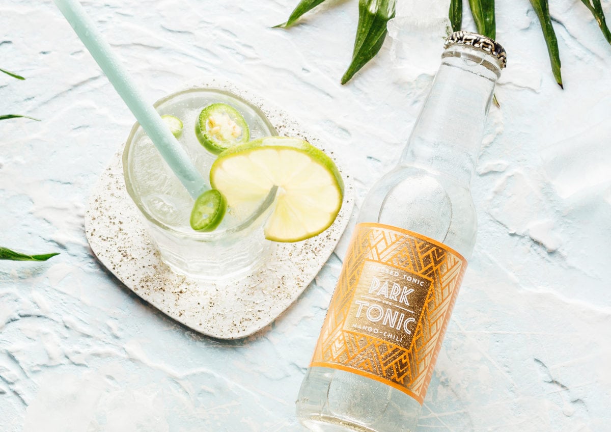
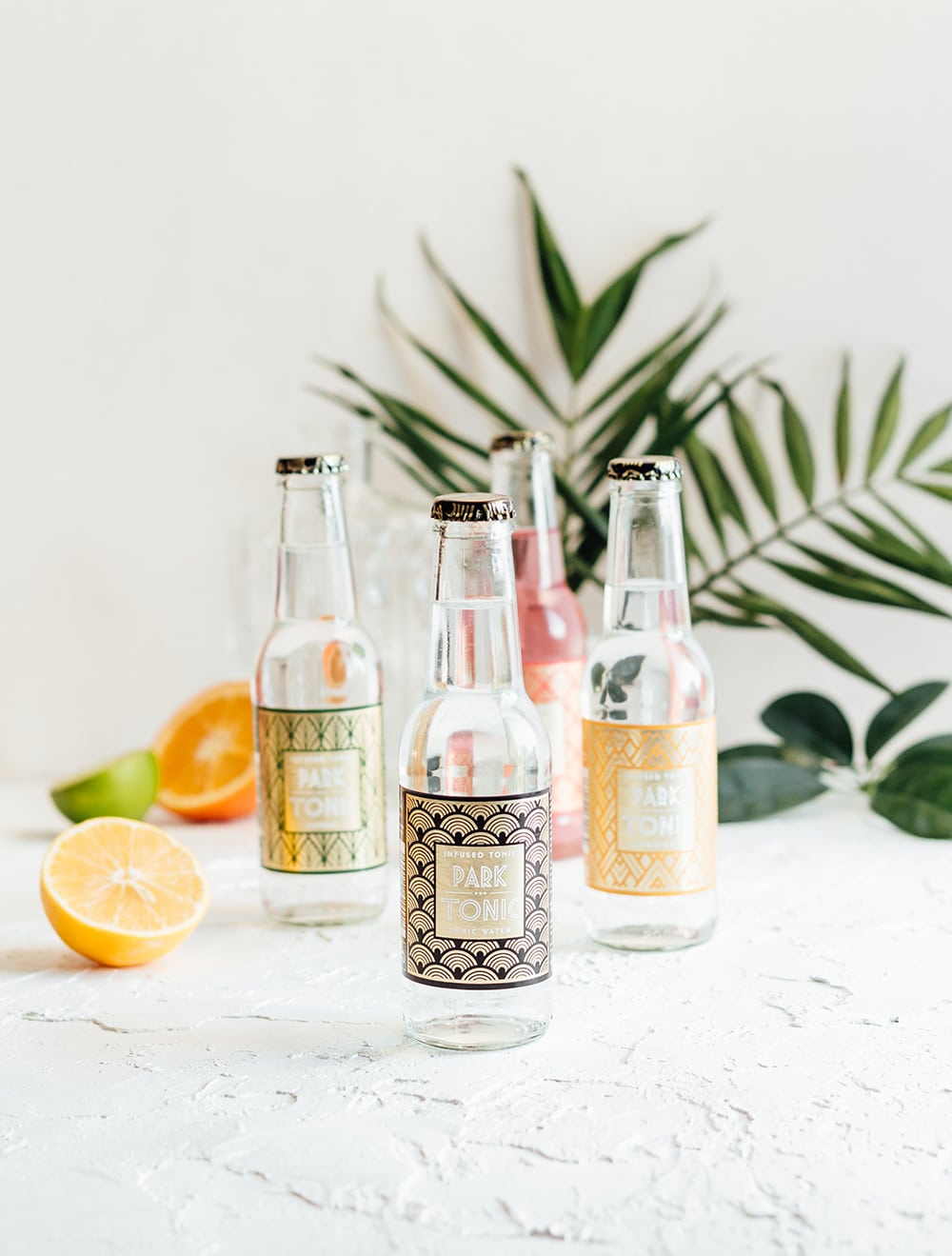
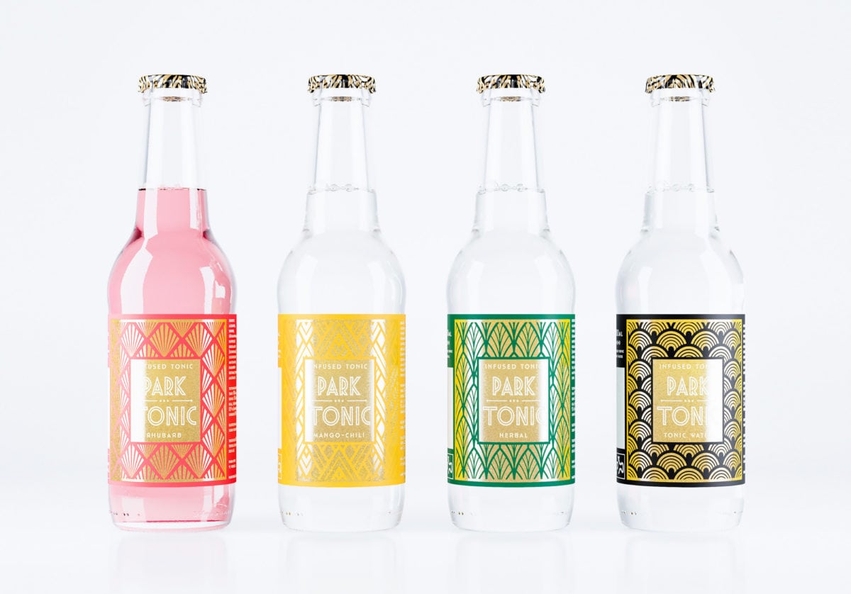
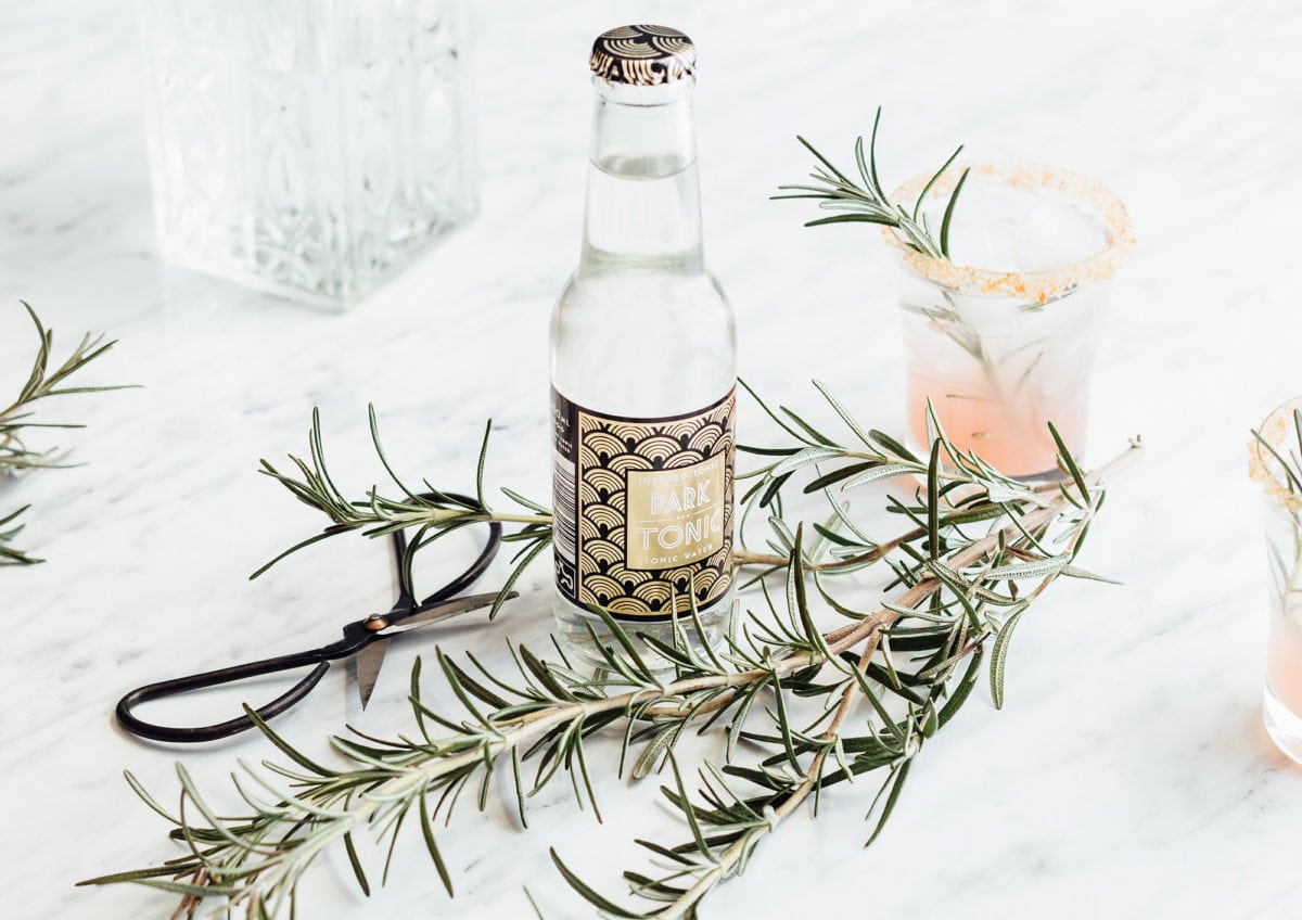
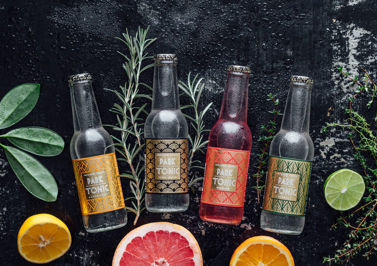
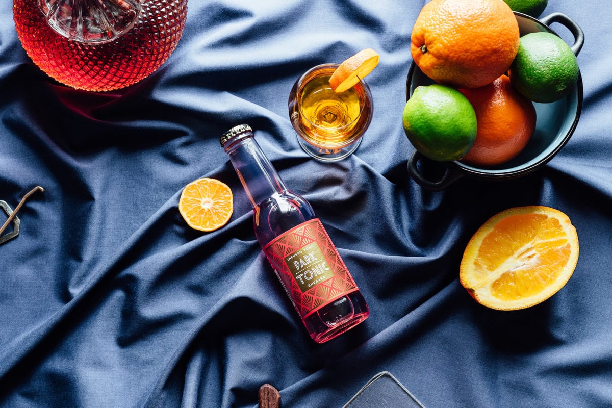
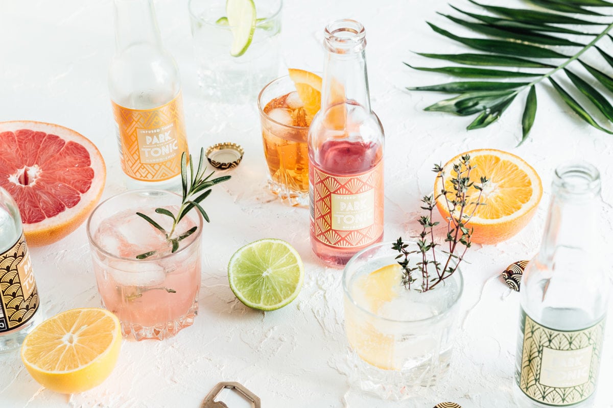
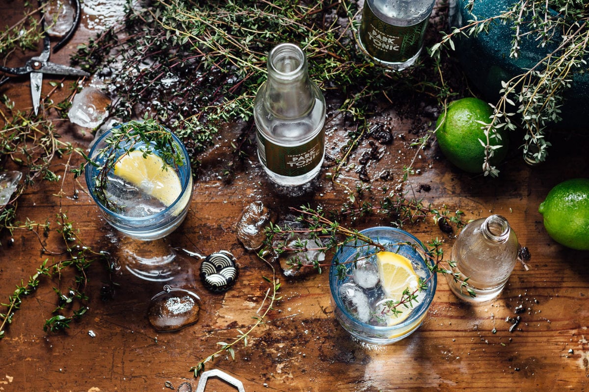
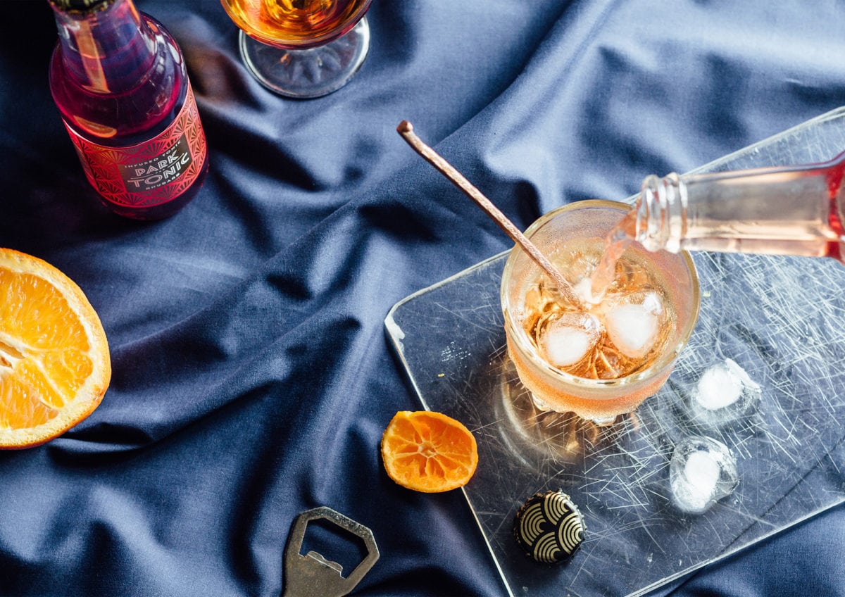
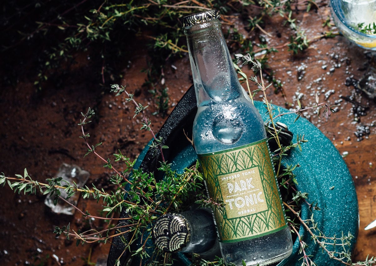
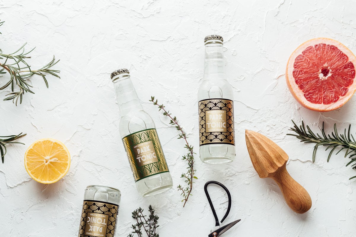
Park Tonic’s look is inspired by the Roaring Twenties, with each bottle flavor featuring a different Art Deco-inspired pattern. The typography of the logo-lockup also is heavily inspired by that time period; tall, sharp and outlined. The labels are decadent, featuring a golden foil treatment on a background color that is inspired by the flavor profile of the individual bottle. Not to mention, the product photography here is really well done.
Park Tonic Packaging & Branding by Hmmm Creative Studio.

The Forktales Podcast™: Interviews with restaurant industry leaders and visionaries

Restaurant and advertising industry headlines and thinking

Reviews of restaurant experiences from around the globe 

Reviews of our favorite design, business, & restaurant books

Our favorite typography and fonts

Inspiration in your inbox

Get the latest inspiration in your inbox every Monday morning, for FREE!

"*" indicates required fields

This field is for validation purposes and should be left unchanged.

Delicious Bits in your Inbox!

Get the latest and greatest content delivered to your inbox for free!

"*" indicates required fields

This field is for validation purposes and should be left unchanged.