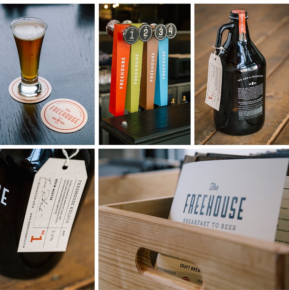
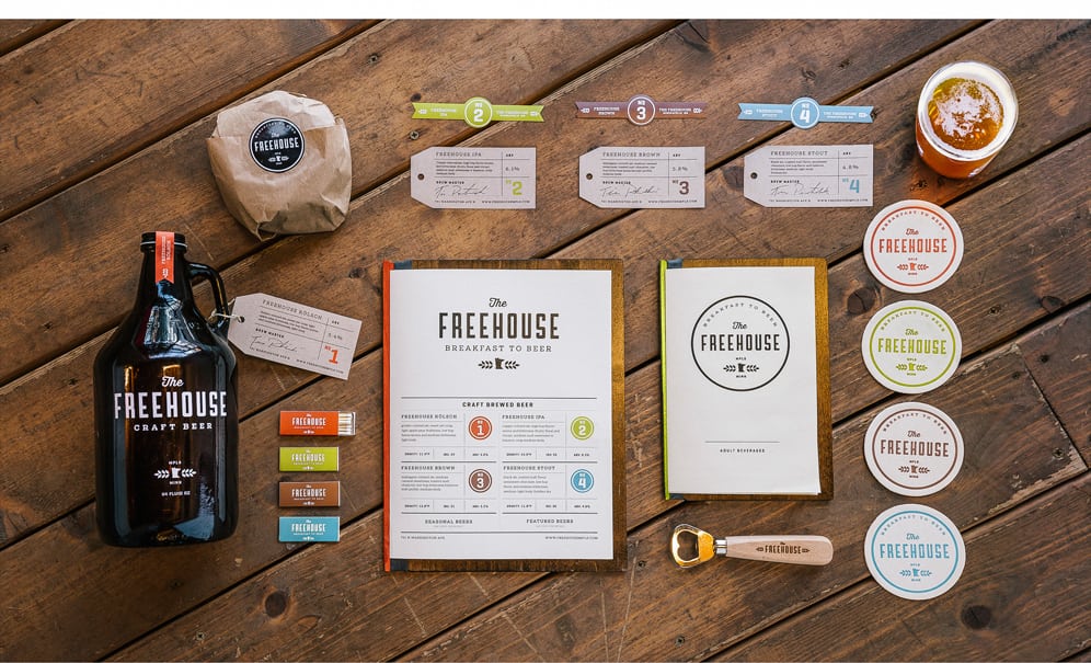
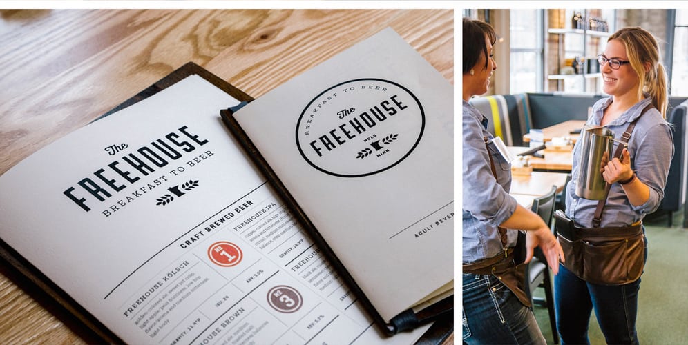
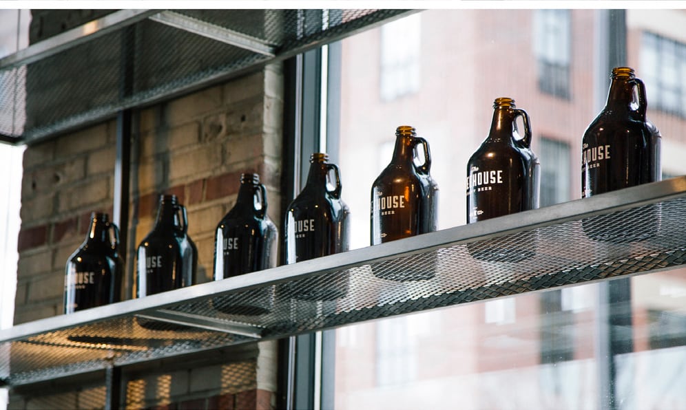
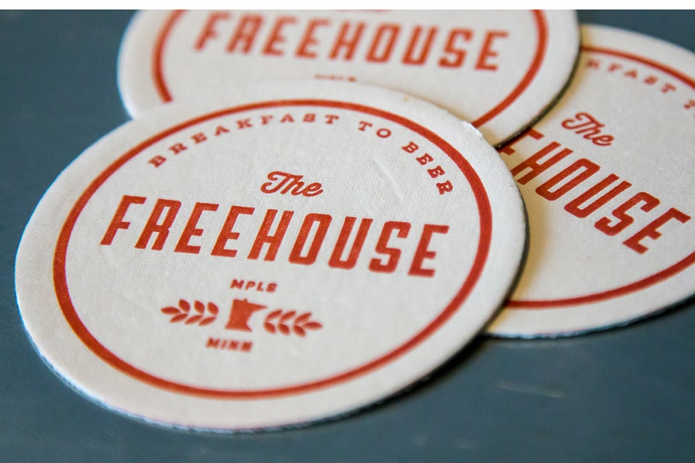
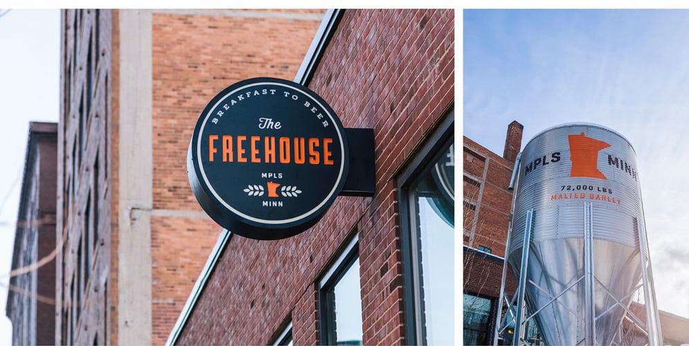
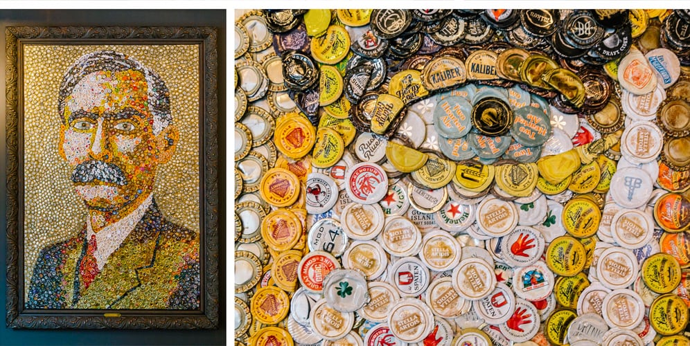
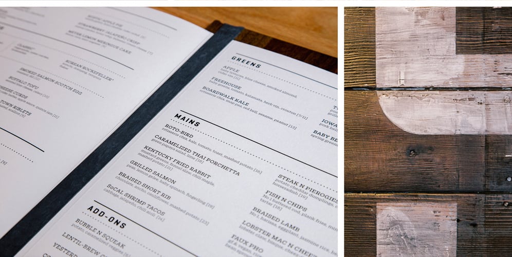
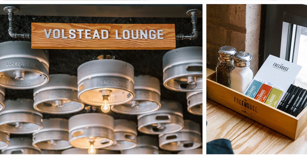
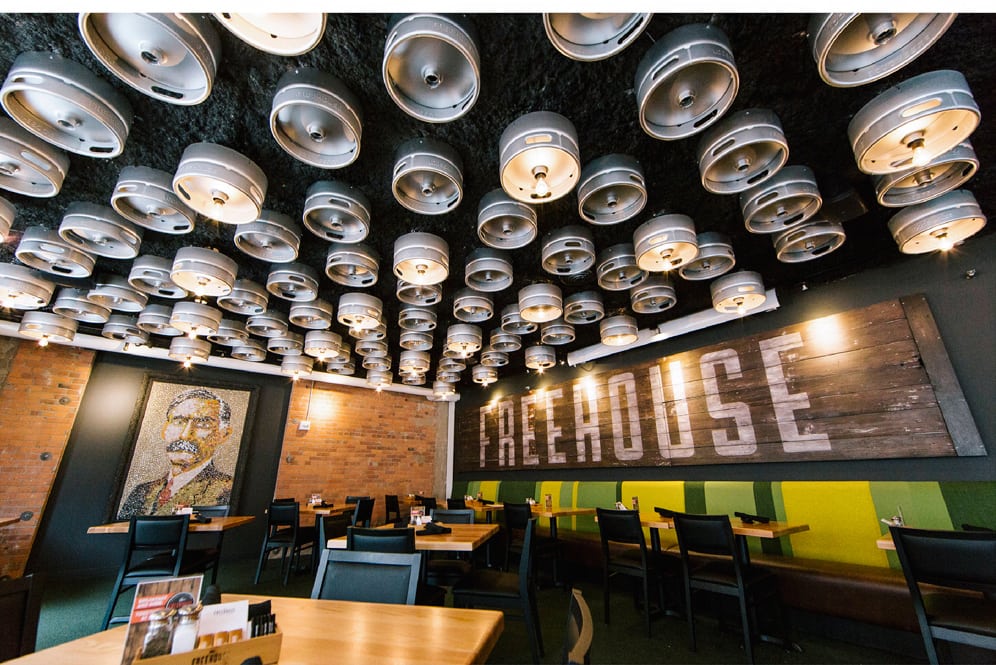
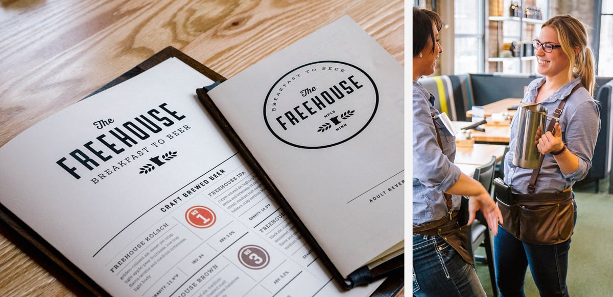
The Freehouse is a brewpub in Minneapolis that serves everything from breakfast to beer. It’s a friendly, brighter approach to a brewpub brand; most brewpub’s I’ve seen these days lean heavily into the industrial, masculine vibe typically associated with brewery spaces. In a way I’d say it represents the friendliness and hospitality of the Twin Cities; it’s bright color palette, with vermillion leading the charge, is welcoming and flexible, being used to add pops of color to the warm paper stock of the menus, coasters, and labels. Typography is the other big player here, with the brand lacking any kind of iconography or imagery save for a small depiction of the Gopher State (Minnesota, folks), and a wide range of typographic styles at that. Mixing and matching all these fonts adds a crafted, down-to-earth vibe to the look, and paired with clean, gridded layouts gives The Freehouse an air of casual sophistication.
The Freehouse Branding & Print Design by Bolster Creative.