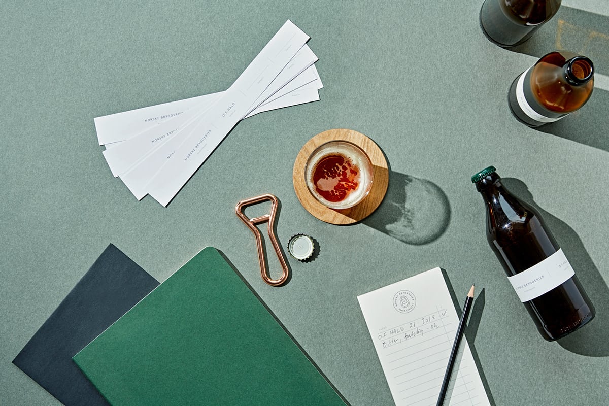
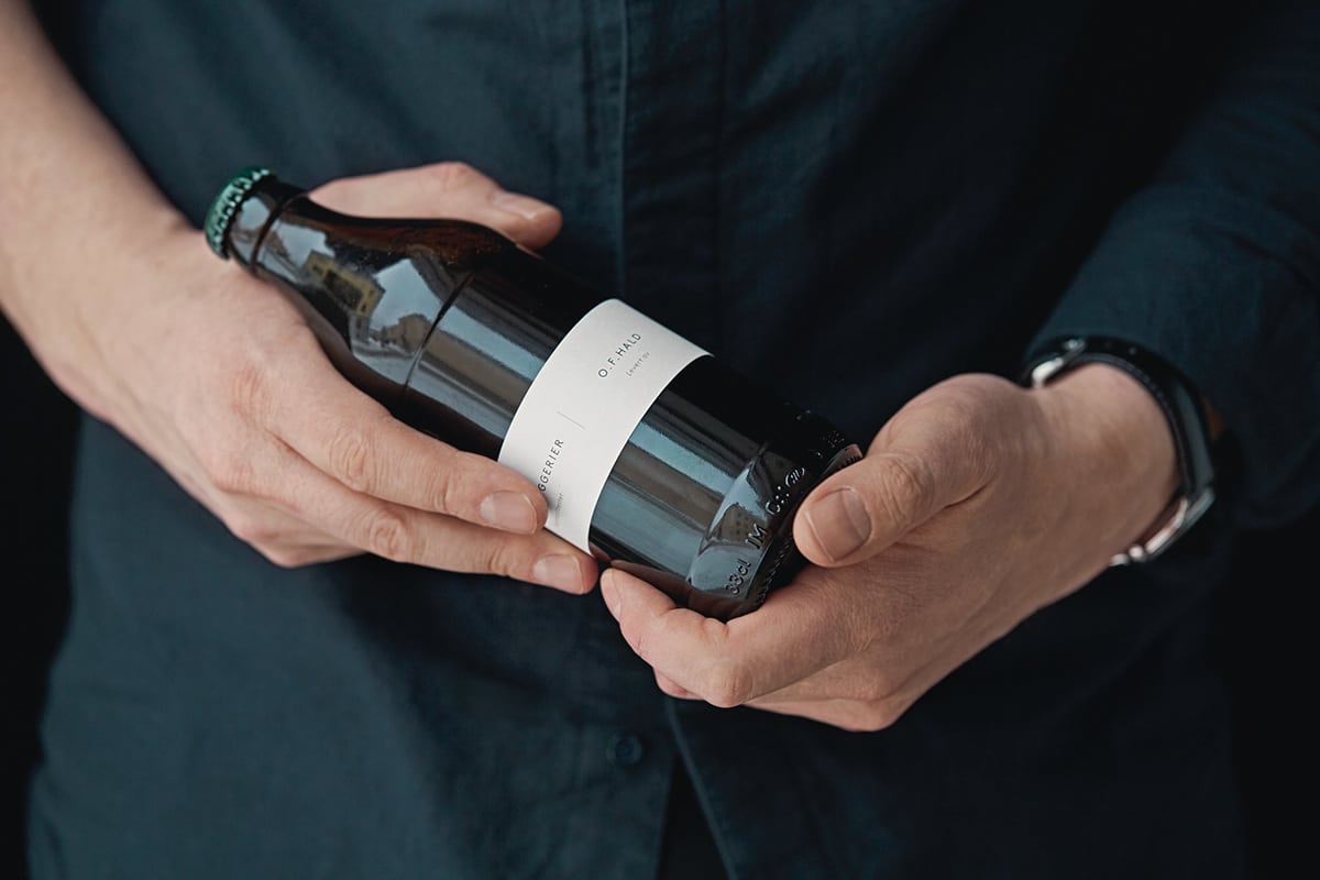
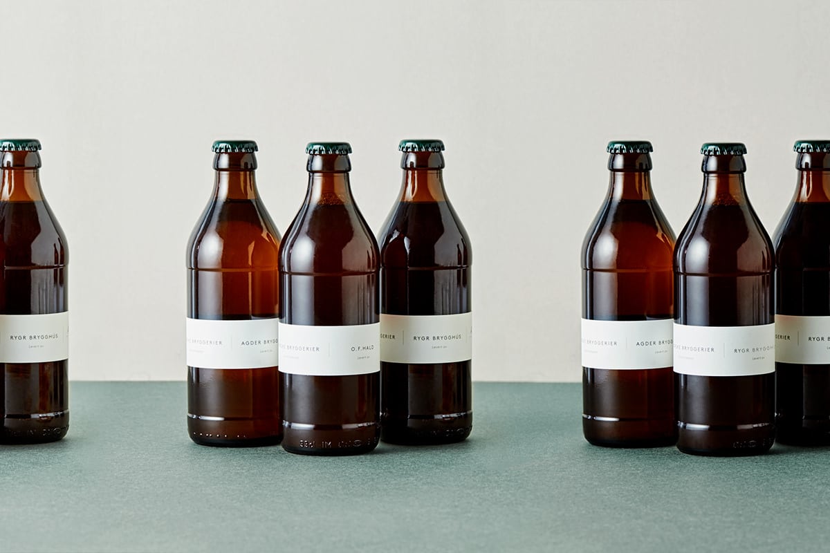
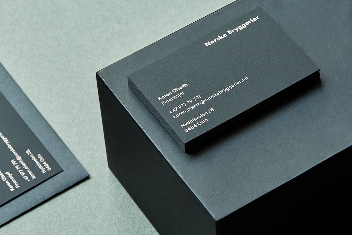
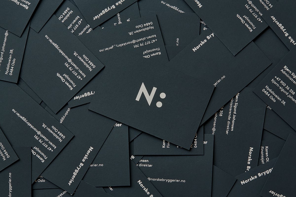
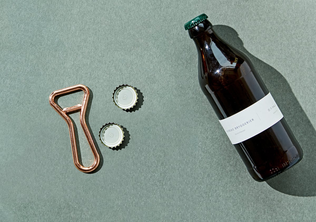
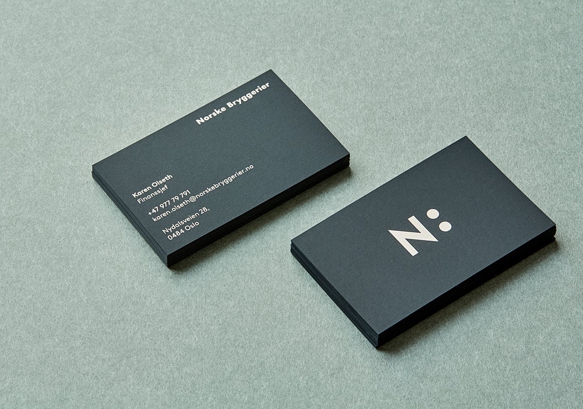
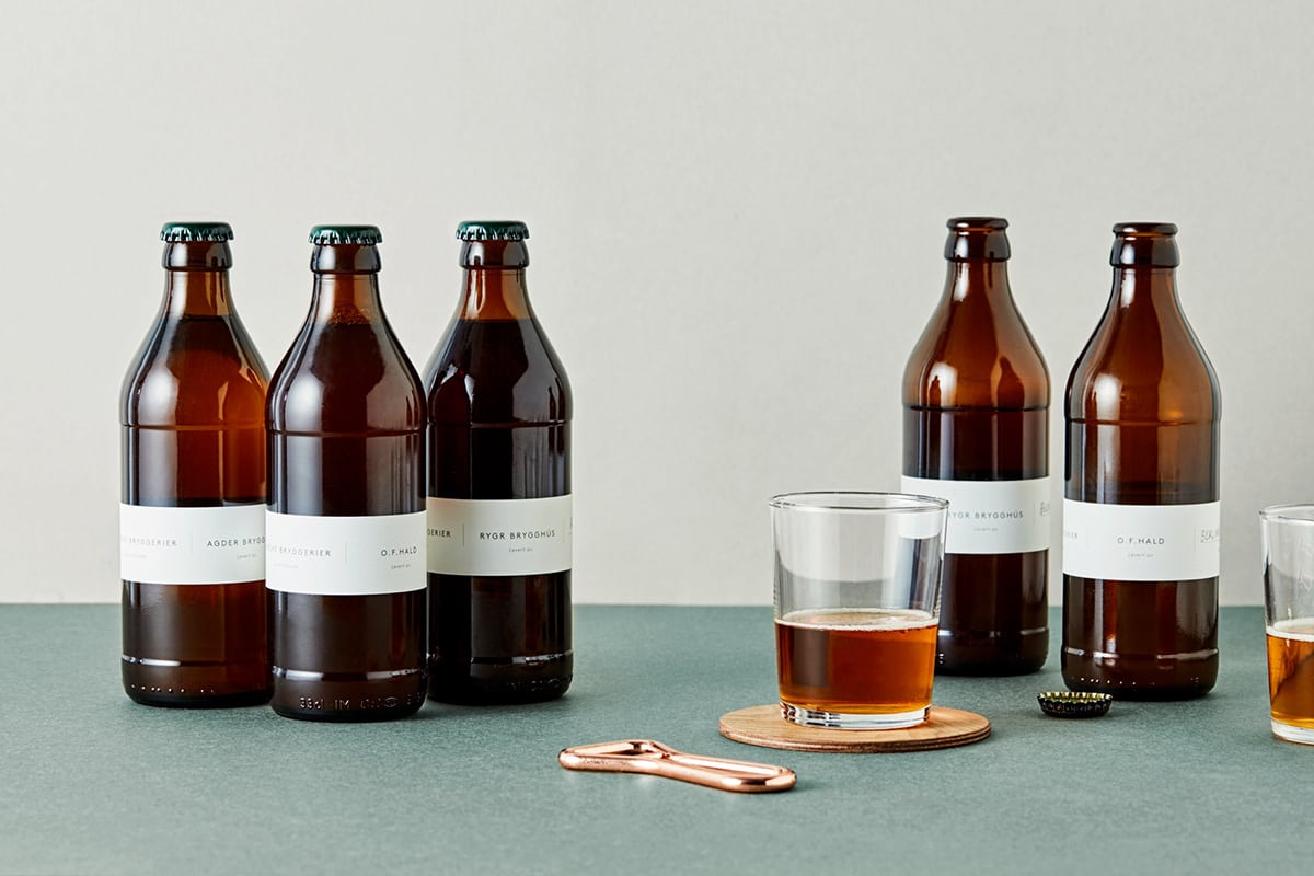
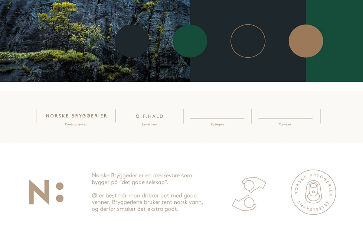
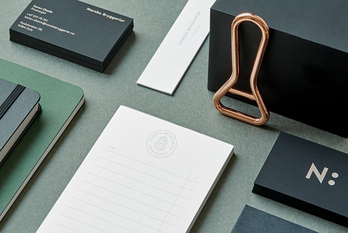
Norske Bryggerier ( which translates to Norwegian Breweries) is an Oslo based company that makes a conscious effort to start up small local breweries along the west coast of Norway and help them develop a portfolio of high quality craft beer brands. From what I can gather, it seems to function similarly to the craft brewer’s guilds here in the states. The monogram mark, the N with two circles, functions as a colon, representing the many breweries under this name. Additionally, the brand overall was designed for non-sale and internal use; in Norway it’s strictly prohibited to advertise alcohol or use any kind of promotion to generate its sales. And so, the design you see below is meant only for internal tastings and quality control among the brewers. The design is purposefully neutral in color and layout so as brewers can focus solely on the taste of the product and not be lead to other conclusions due to visual cues.
Norske Bryggerier by FRANK Oslo.
