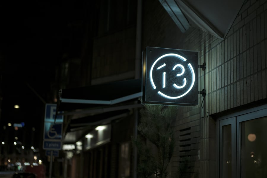
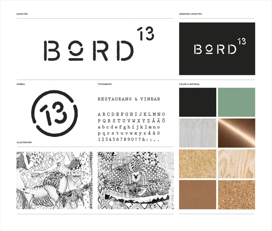
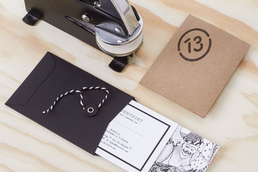
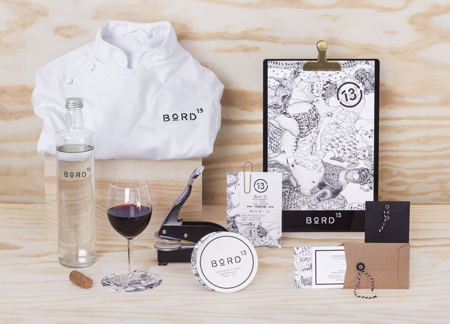
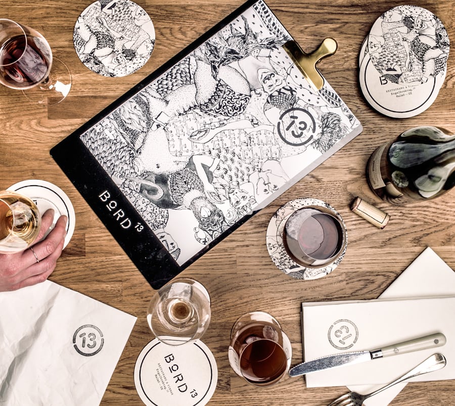
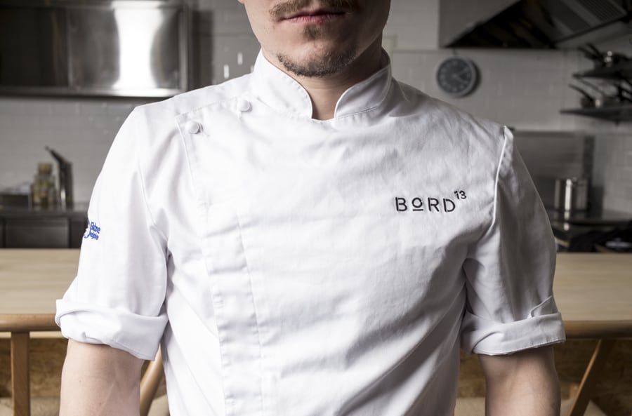
13 is a taboo table number in the restaurant world. But considering their location (street no.13), Snask decided to work with the owner to capitalize on this quirk throughout their brand. While their interior design is clean and warm, their mark has an intentionally stark and almost hollow, minimalist aesthetic. Their use of a monochromatic palette and uncanny, creepy illustrations also gives them a uniquely dark tone to their brand language to the point where it borders surrealism.
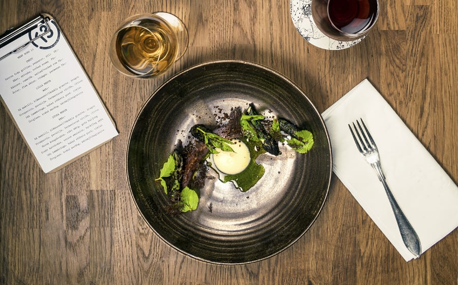
That said, what makes this establishment shine is the contrast of the dark brand language and the surprisingly colorful dishes served. By going full monochromatic with their visuals, the restaurant is able to really put a spotlight on their ingredients which brings a very human warmth back into the overall atmosphere. A rare and interesting visual treat for sure.
Bord 13 Brand & Identity System by Snask.
