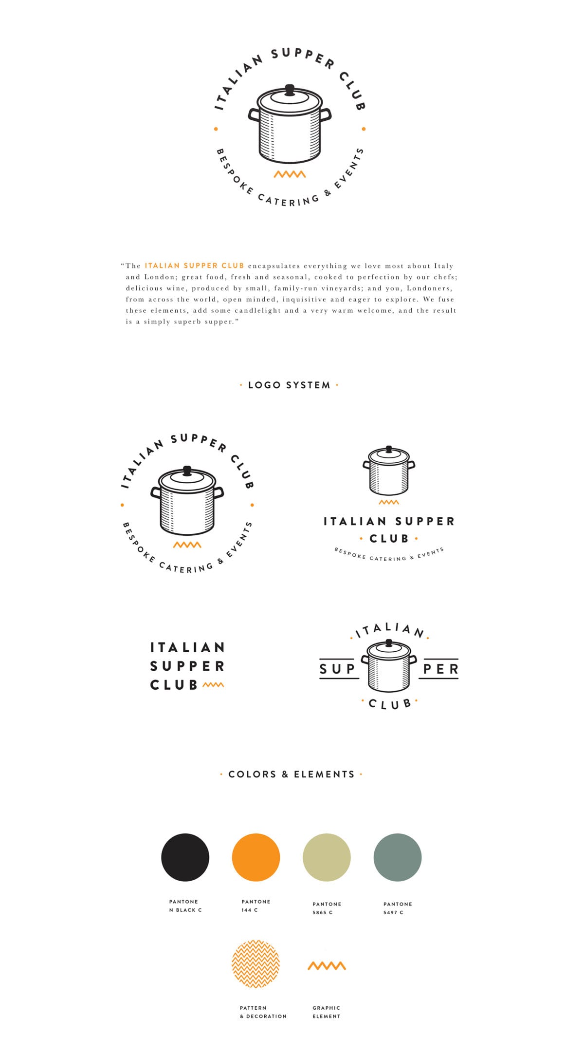
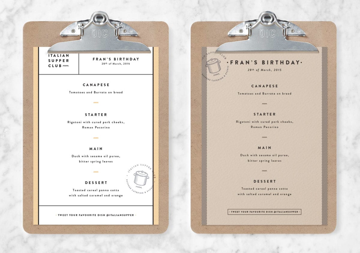
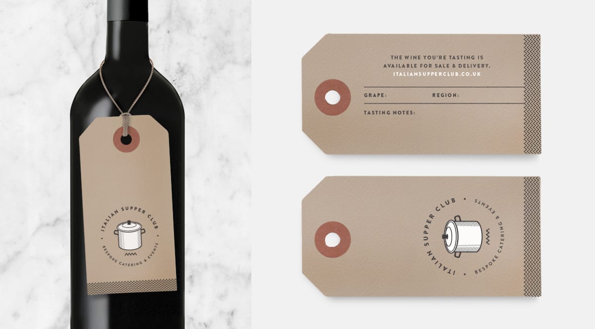
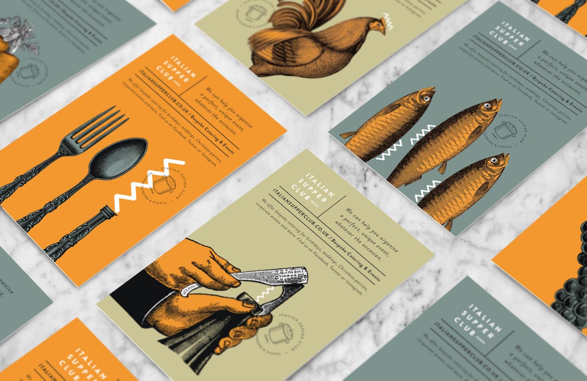
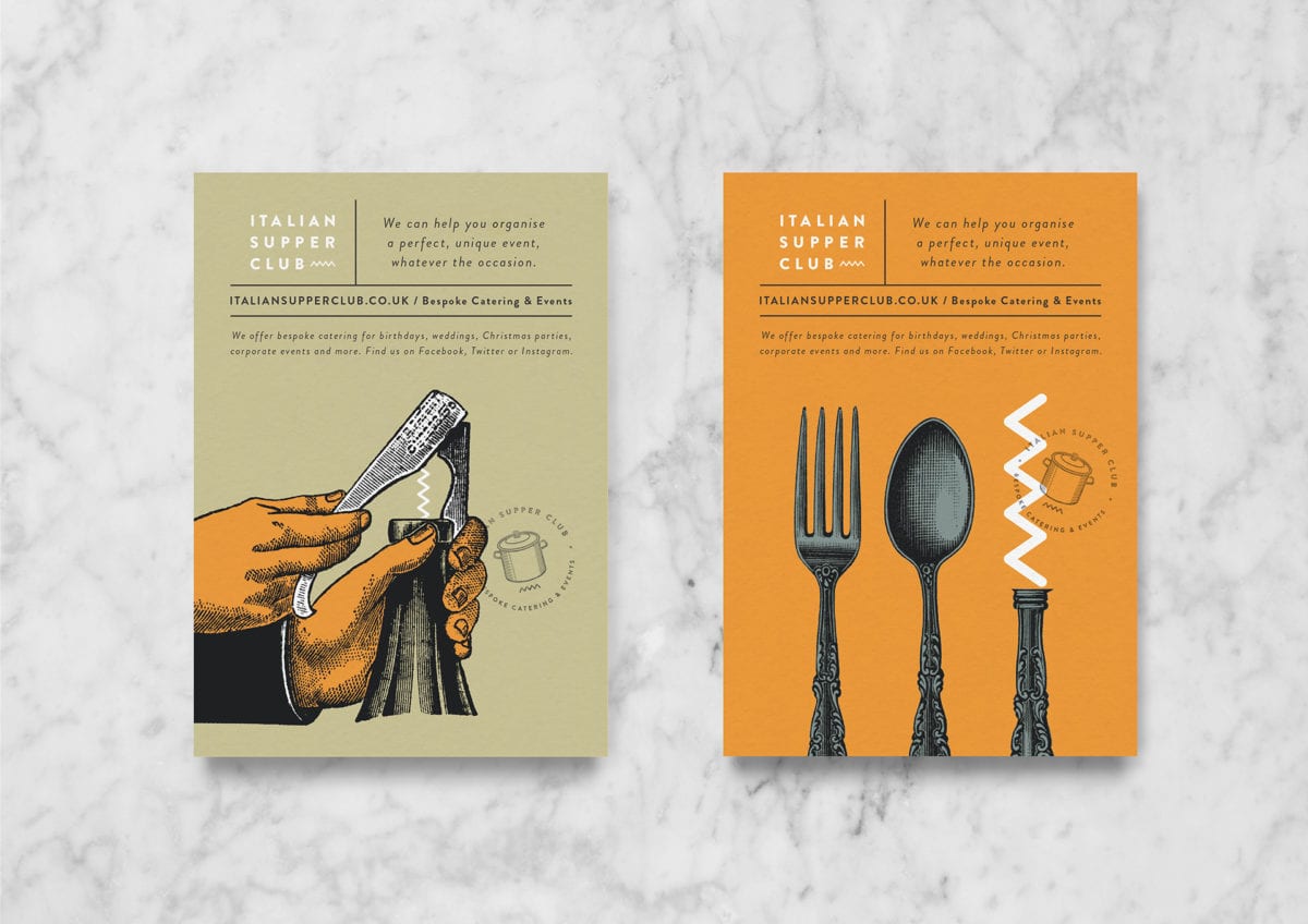
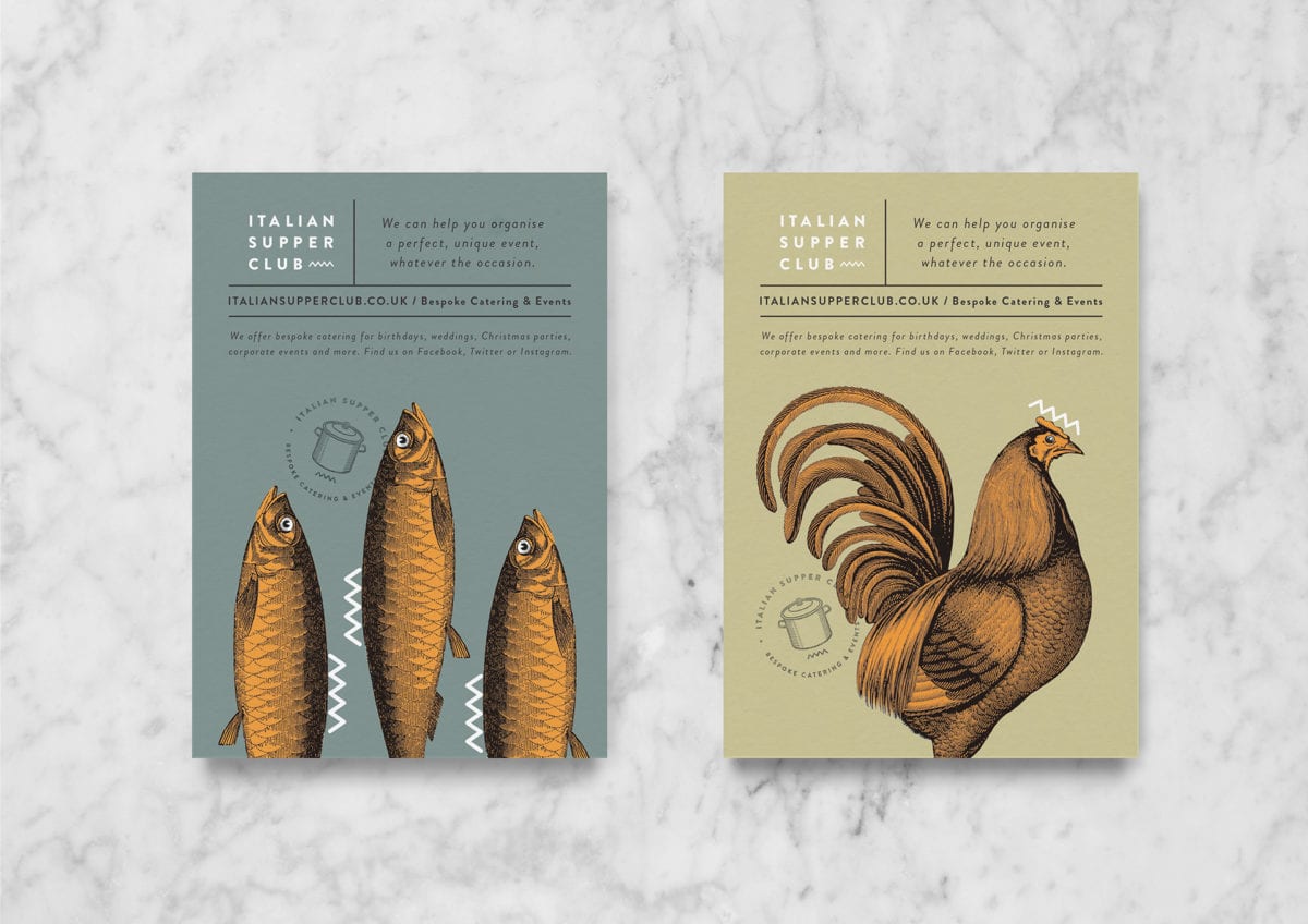
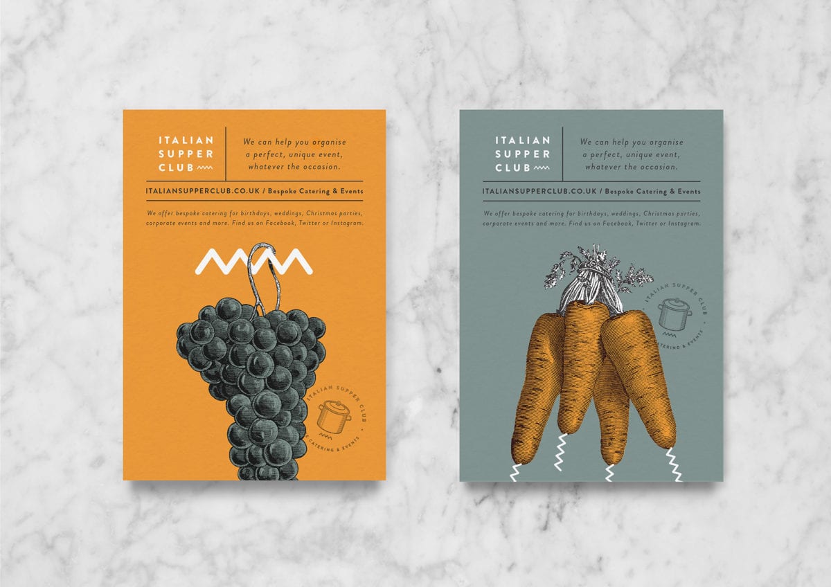
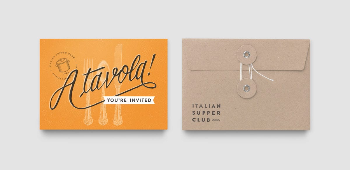
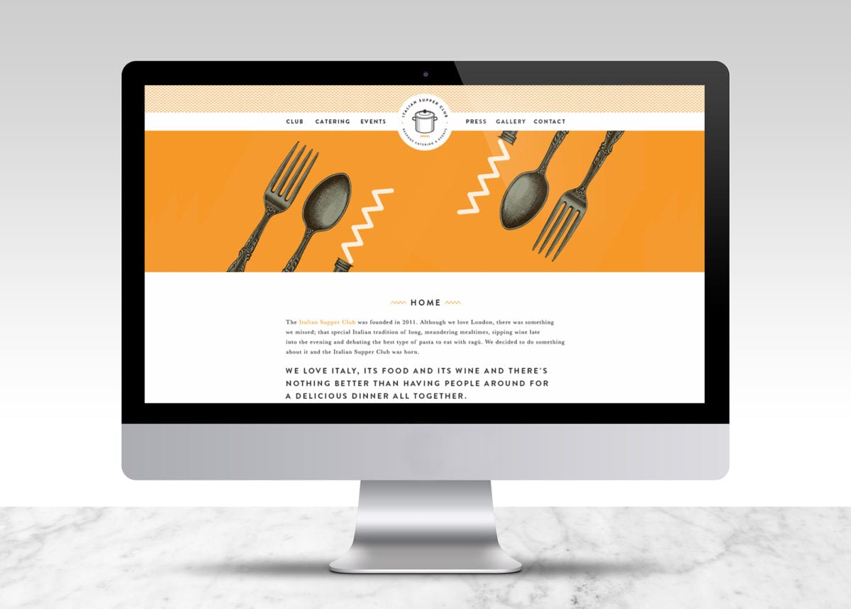
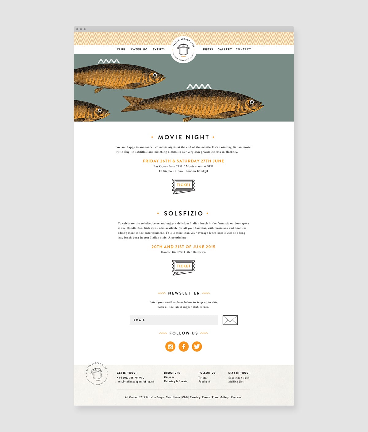
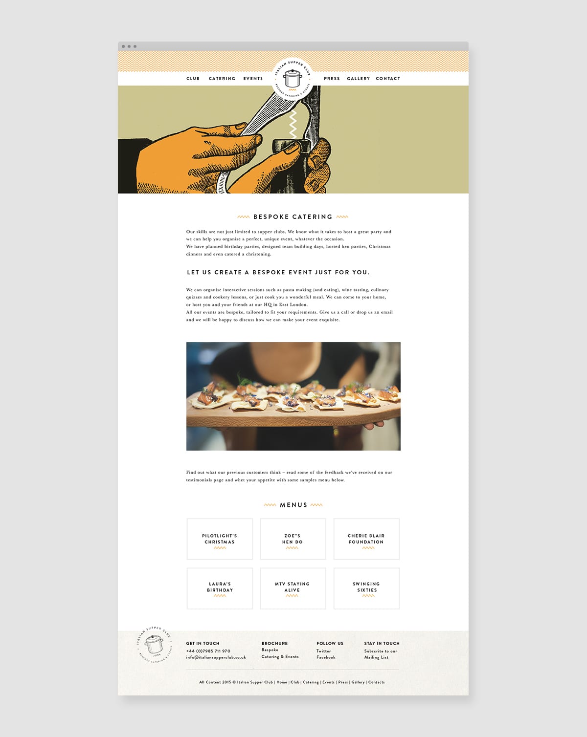
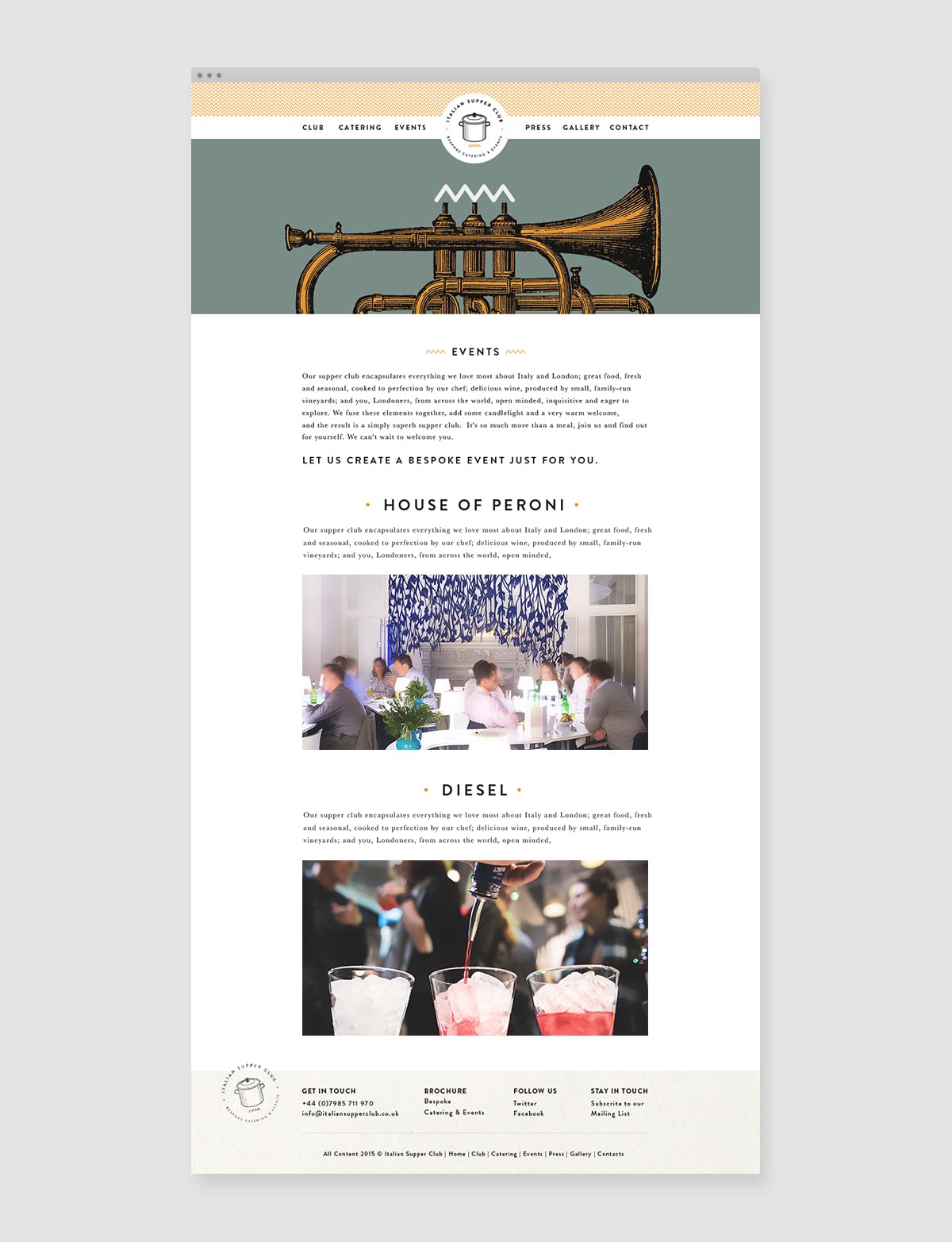
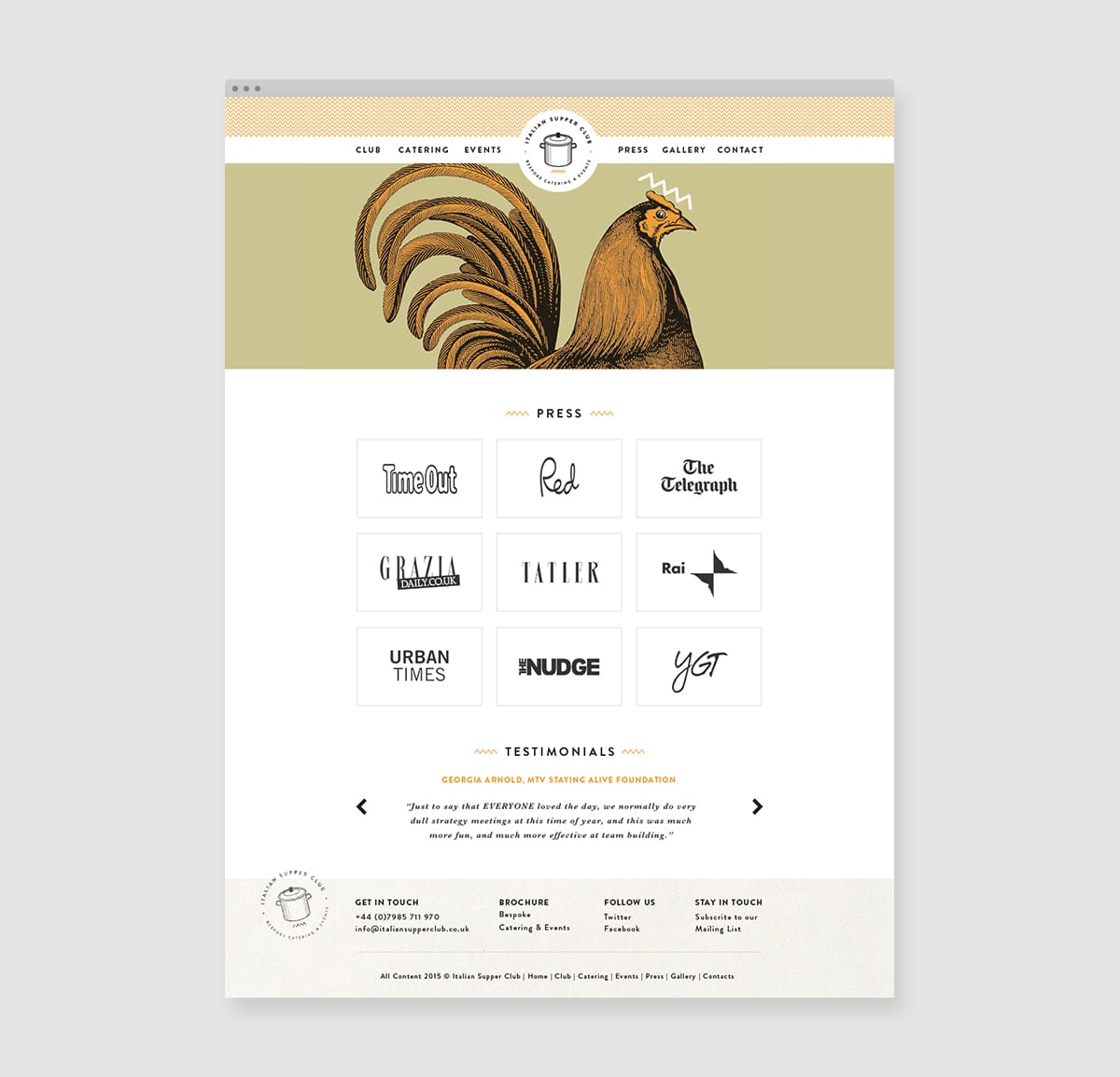
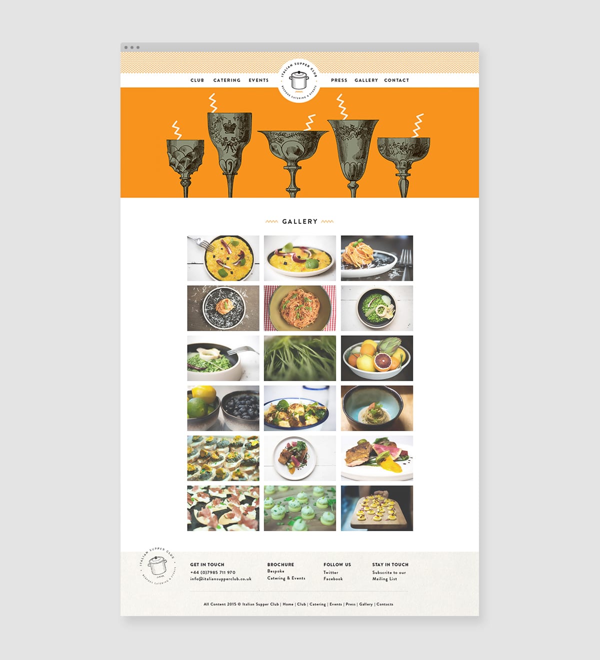
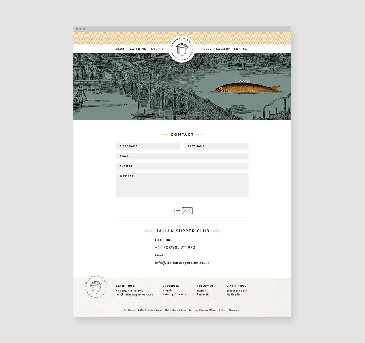
Italian Supper Club is a London-based catering company that provides its clients with the warm environment and rich found you’d find in an Italian home. The branding system is energetic and modern, fitting for a company that caters to lively events. There is an interesting scratchboard/Victorian twist to the visual system when it comes to illustration; designer Giana Lodigiana states that this was to pay homage to the catering company’s adopted city.
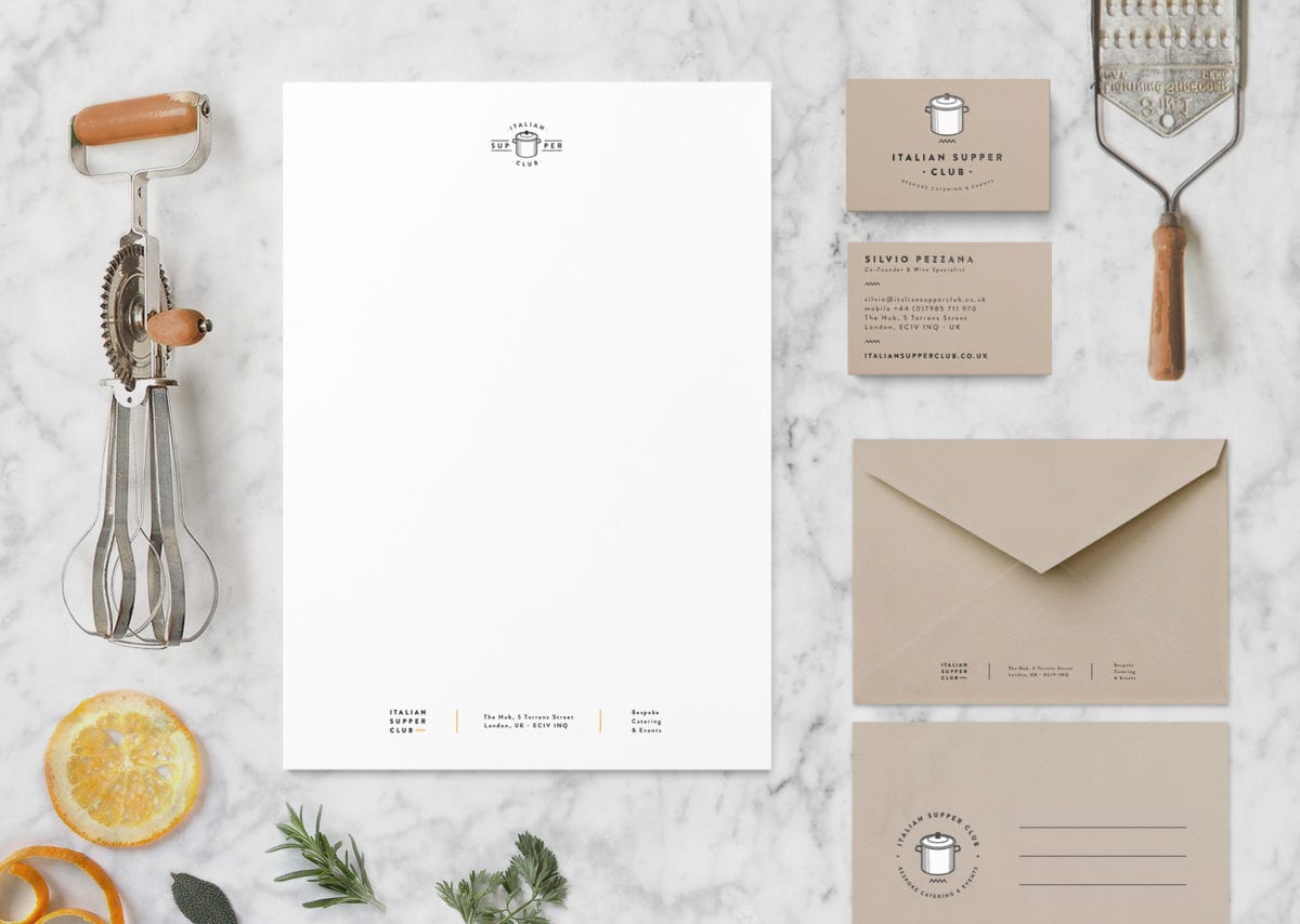
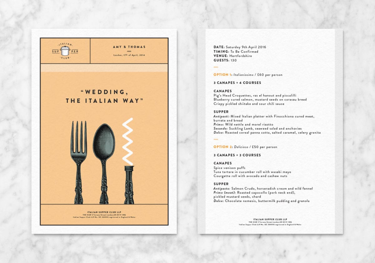
My favorite touchpoints of this system are, without a doubt, the fliers and advertisements. It brings together the bright, unconventional color palette with the old-fashioned illustration beautifully, incorporating the branded chevron graphic element in fun and unexpected ways. These fliers feature an energy that I wish was brought into the stationary set and menus.
Italian Supper Club Branding & Art Direction by Giana Lodigiani.