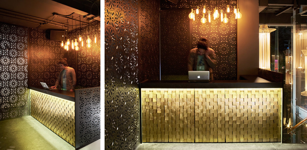
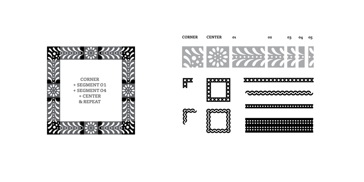
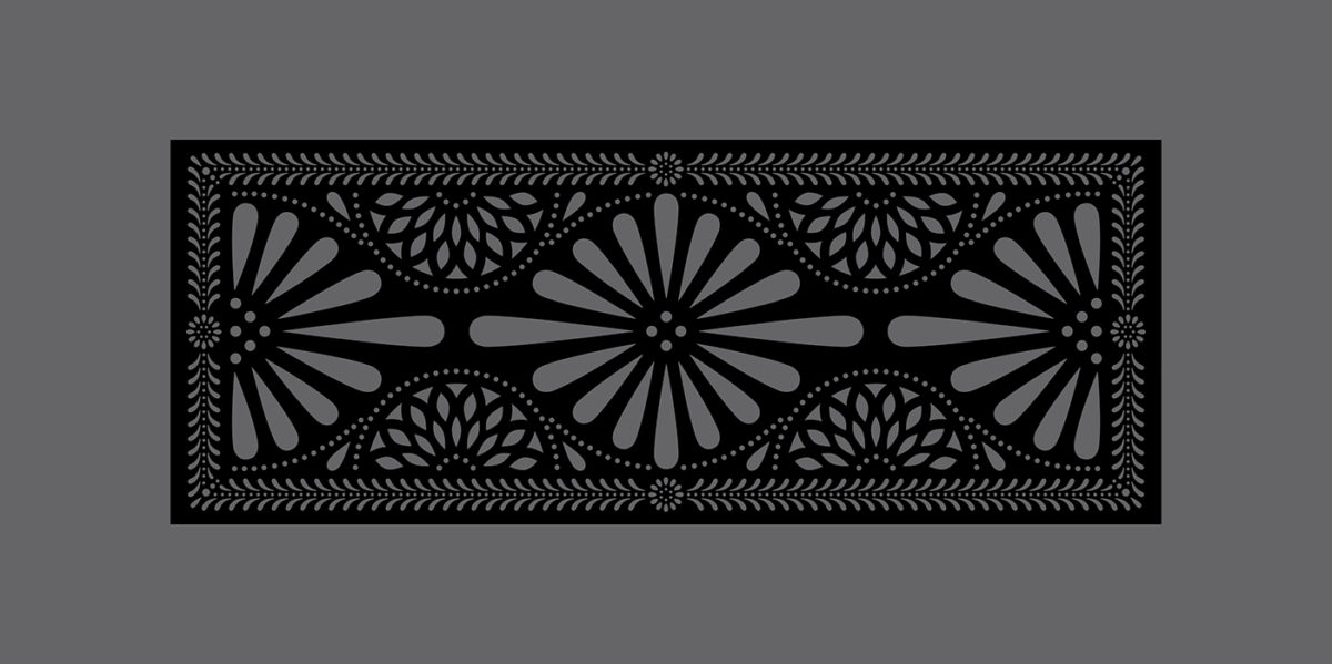
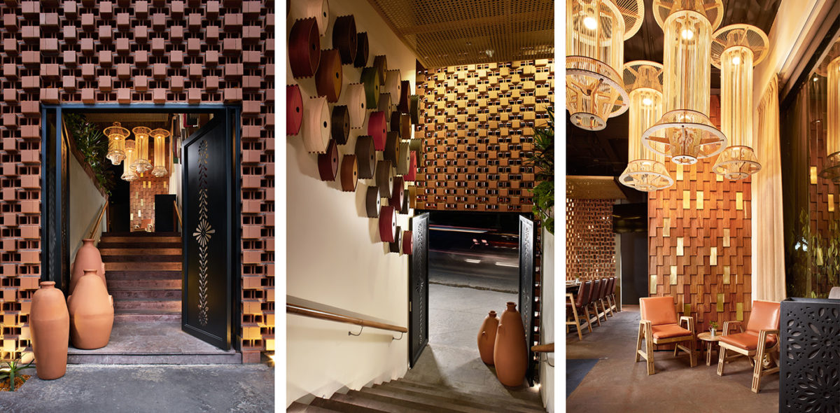
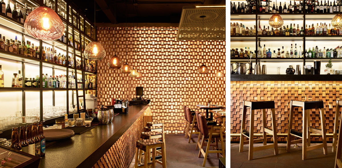
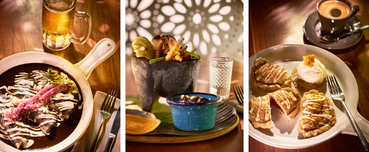
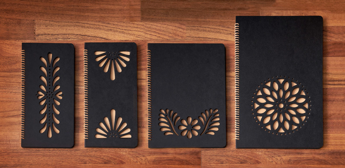
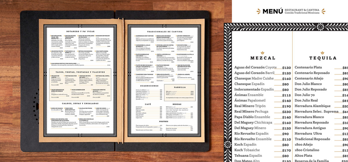
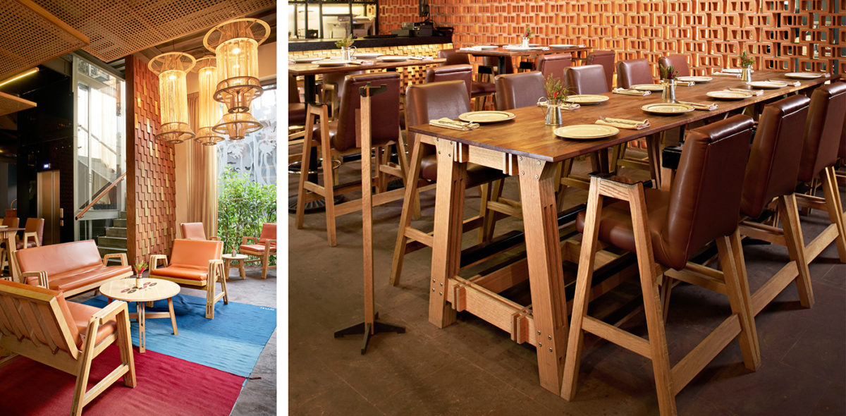
Bartola is named after a small town in Oaxaca, Mexico well known for its black clay pottery, known as Barro Negro. This traditional craft serves as the source of creative inspiration for the restaurant; an earthy black us used as the main brand color throughout, and makes use of the floral ornamentation traditionally found on barro negro as the main visual motif across the interiors and brand touchpoints. Designer Quique Ollervides also developed a beautiful pattern system for the brand, allowing any designers that take the reins later down the line to scale the brand patterns at will. My favorite part of this brand is how every part of this look references back to the barro negro; business cards feature embossed foil, making them seem carved out of the black ground, menu covers are punched in floral patterns, revealing the paper underneath, etc. Even the interiors feature copious amounts of earthenware references; the facade of the restaurant features a red brick wall, and the hostess station is engulfed in the black floral patterns.
Bartola Branding, Art Direction & Interior Direction by Quique Ollervides.
