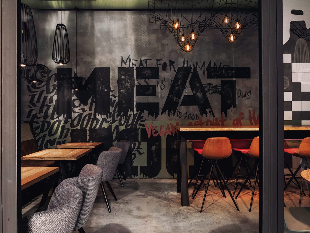
Located in St. Petersburg, the second location of Port was designed to bridge the gap between marine themes and an urban brutalist industrial vibe. DA. achieved this raw, unapologetic and sleek aesthetic with materials often used in Scandinavian minimalistic architecture, marine hardware, and oversized typography both as texture and graphic elements. Their stylistic nods towards seafood throughout the space brilliantly double as accent pieces. The jellyfish pendants, geometric stainless steel fish wall, brushed metal marine lamps, and netting under their incandescent bulbs creates visual depth and interest to the interiors while maintaining a firm footing in the seafood realm without being cliché.
A sleek, beautiful punch to your senses; PORT 2.0 by DA.