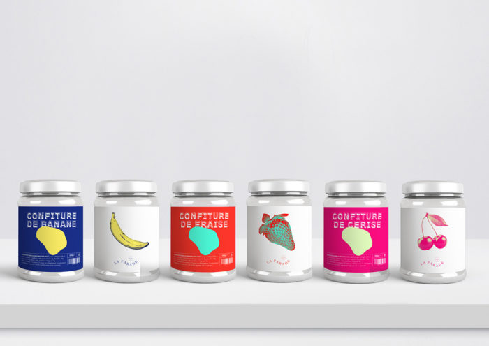
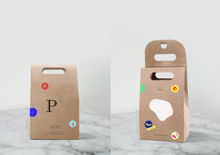
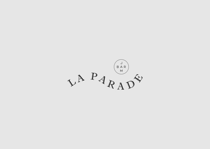
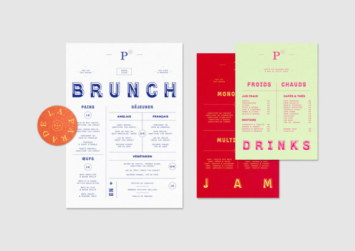
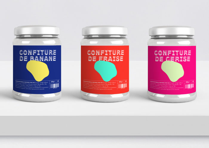
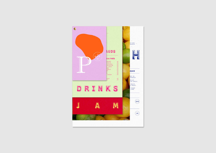
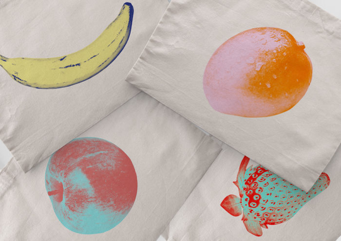
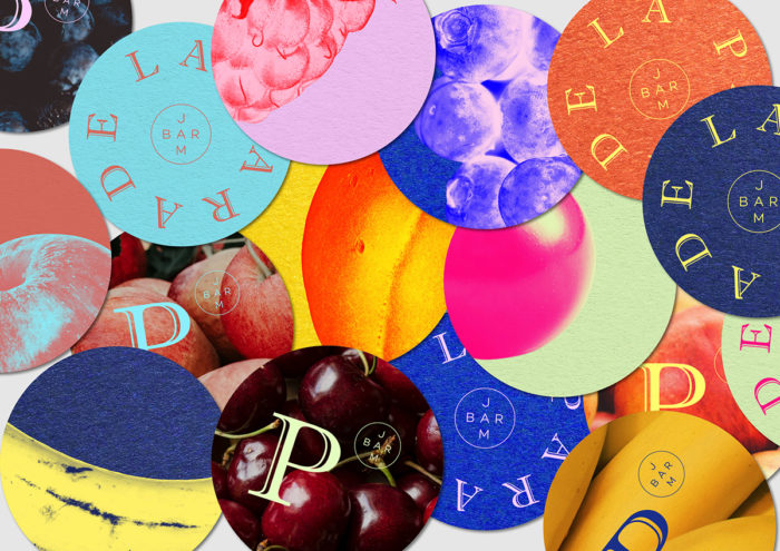
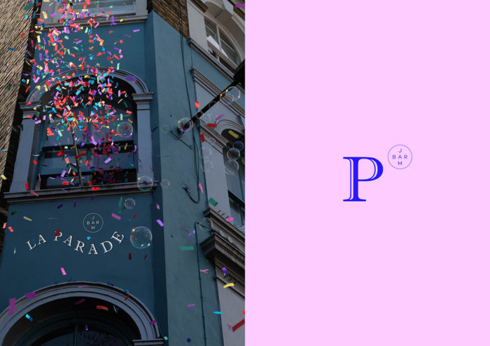
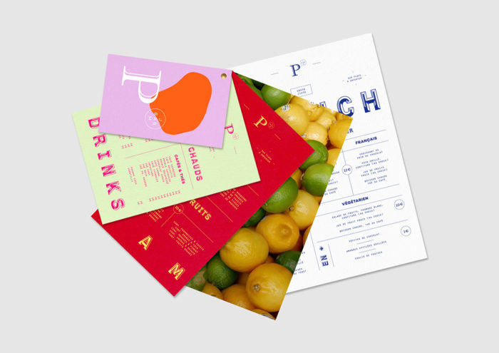
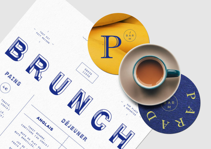
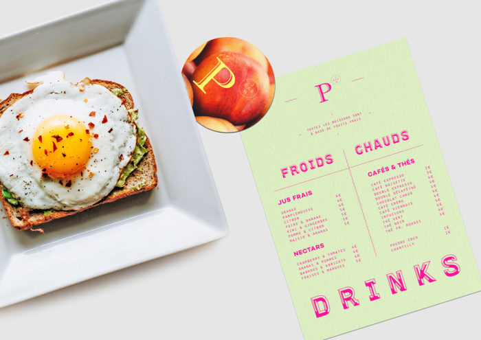
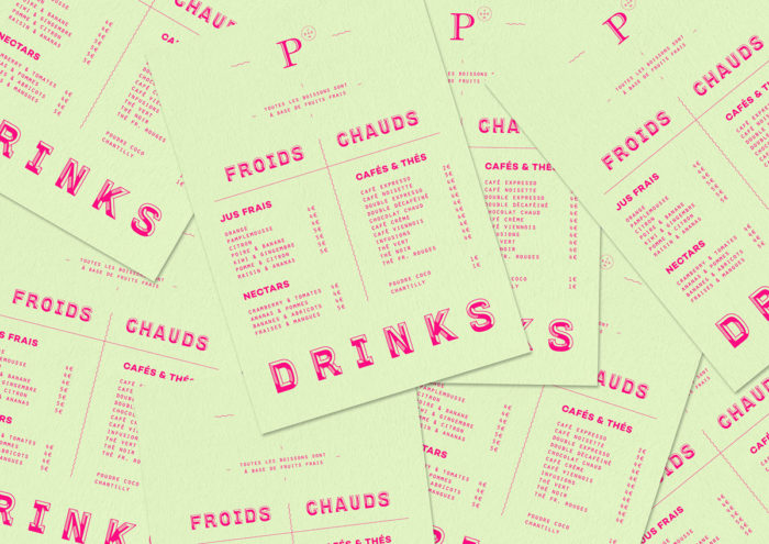
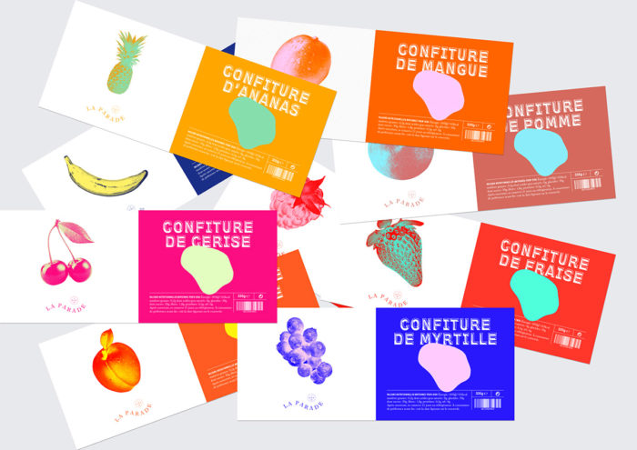
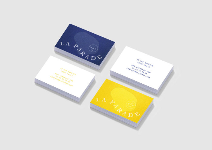
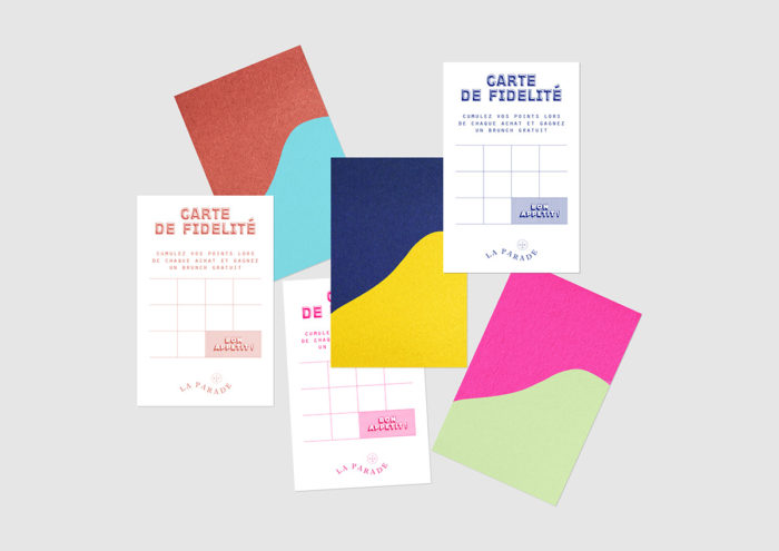
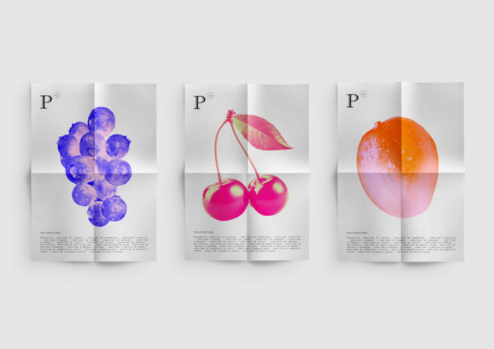
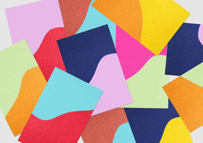
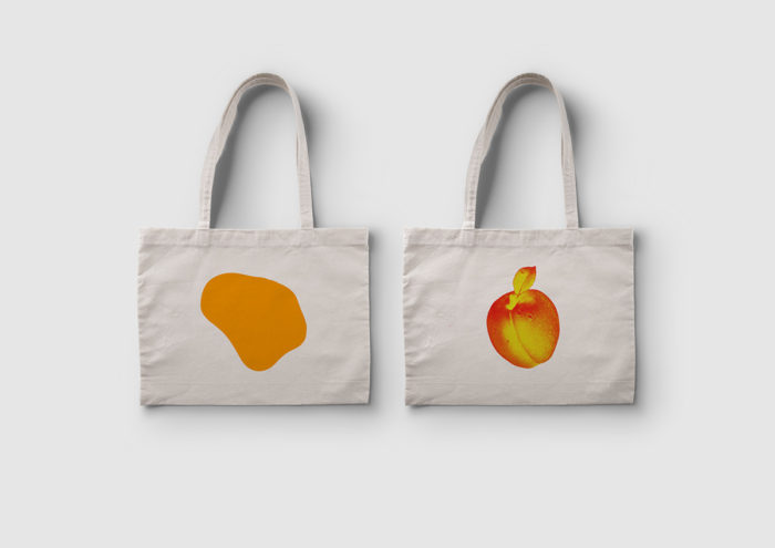
La Parade features a fun, colorful and energetic brand to match it’s name, inspired by parade confetti. It’s a jam bar, which already sounds like a fun and whimsical concept, so of course the look of it would have to match that same vibe. The wordmark features a classic serif typeface set in a wave, playing up the quirkiness of the concept. Bright colors can be found across all touchpoints, and even the colors of the fruit featured on the jam jars has been changed to vibrate with more energy. That’s what I love about this visual system; it visually represents the excitement of being in a parade with a cacophony of colors and typefaces.
La Parade Jam Bar Branding by Studio Impulso.
