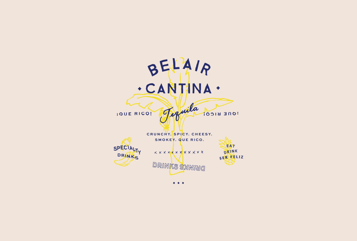
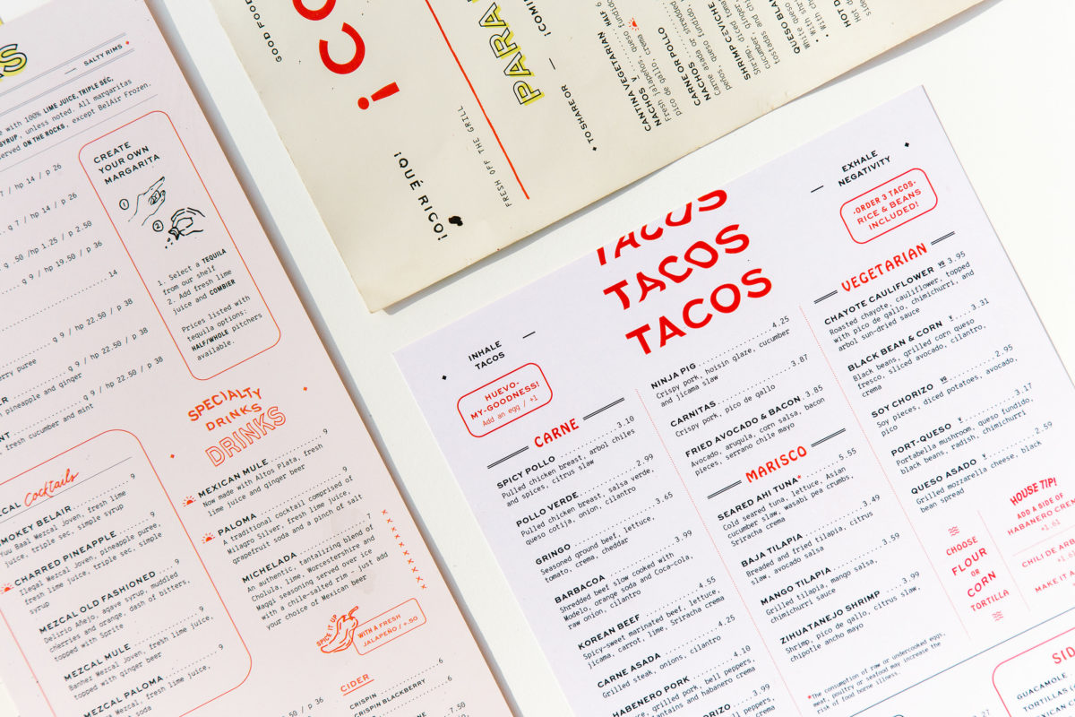
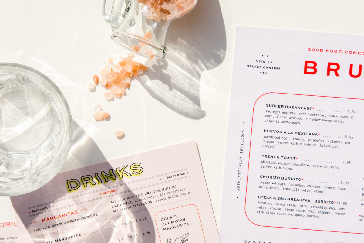
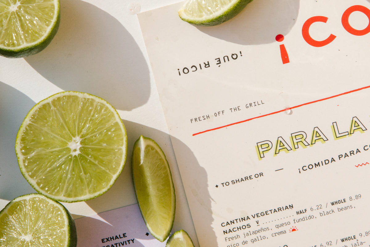
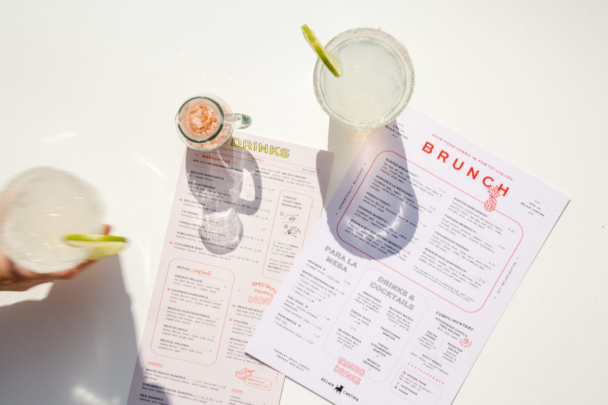
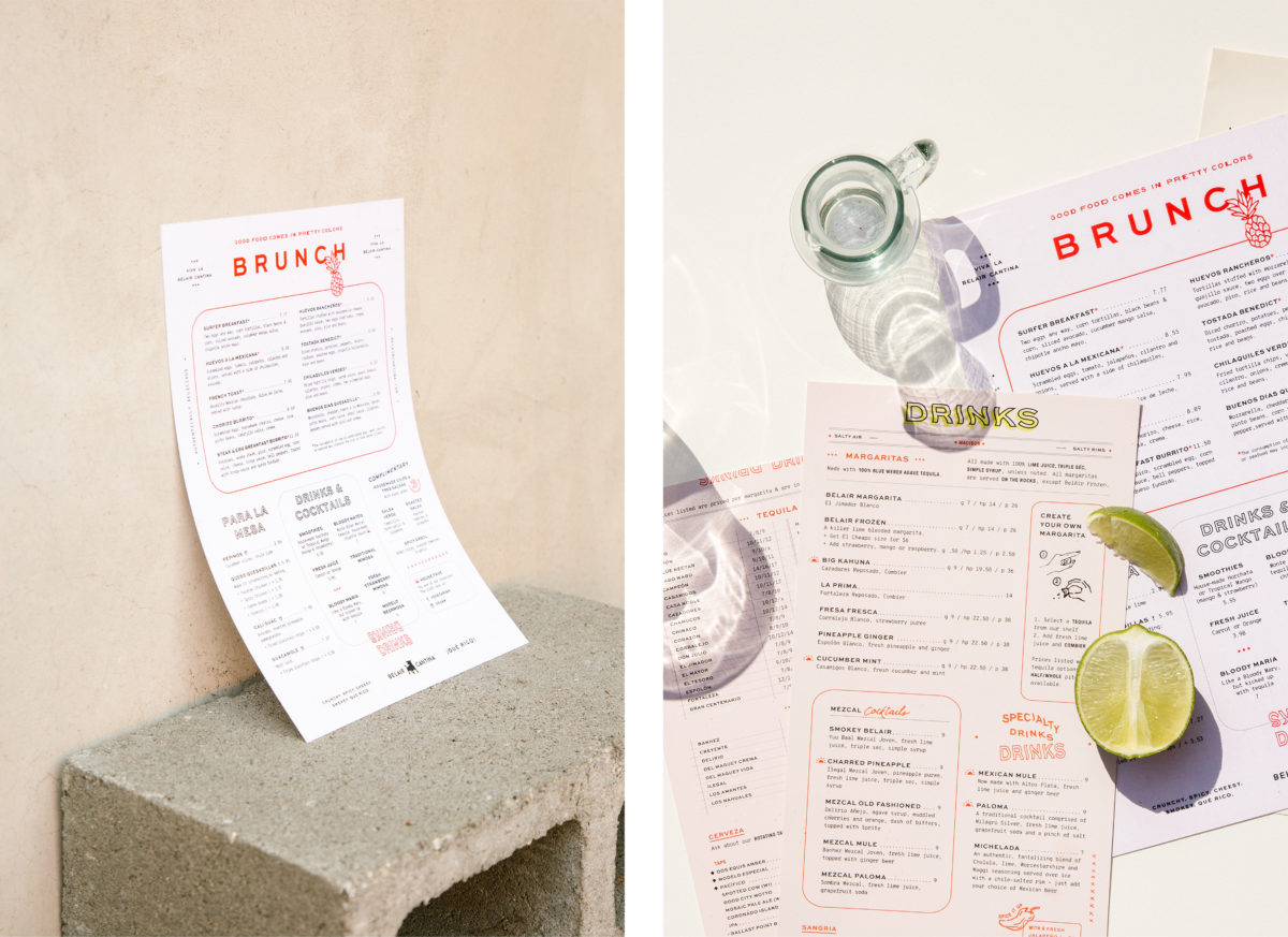
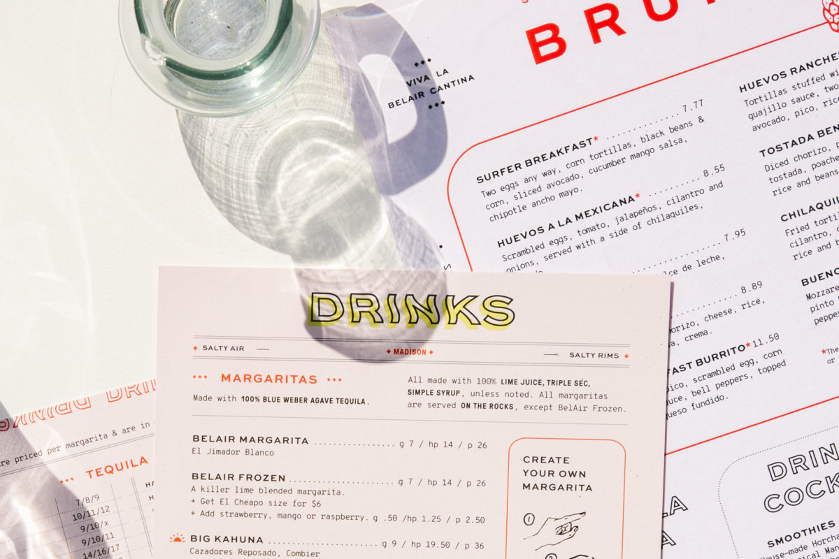
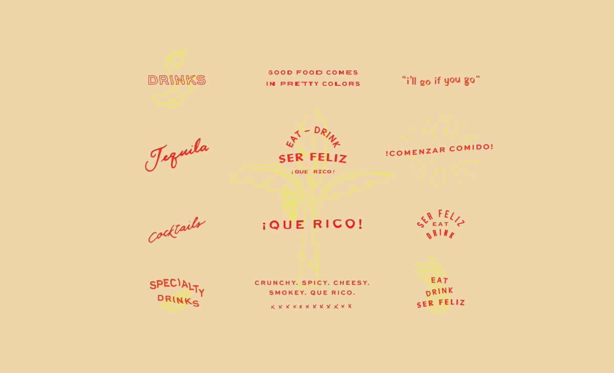
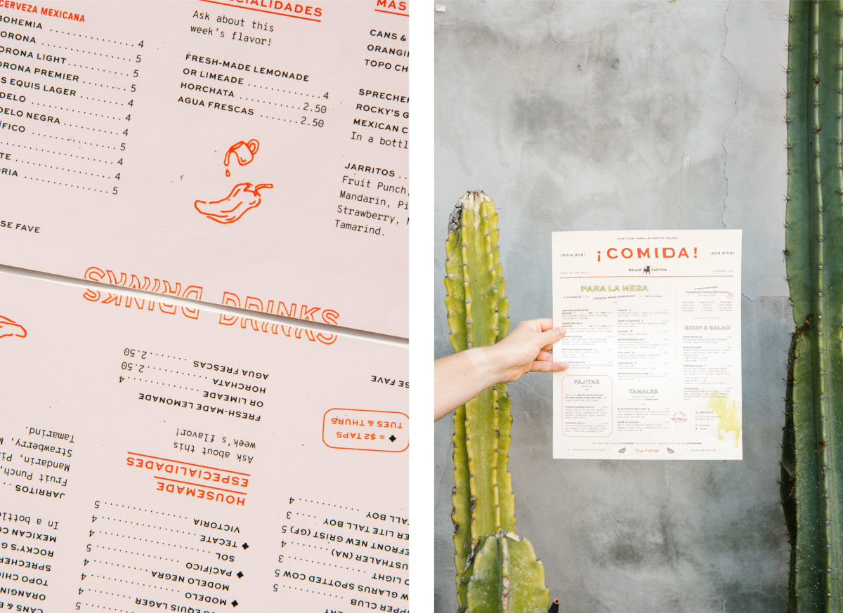
For Belair Cantina, Project M+ leaned on a palette of pastels paired with pops of neon yellow and bright red, inspired by the buildings and signage in Mexico City. They created a collection of custom sub marks — phrases in Spanish and illustrations — for layering and to add some whimsical flair. The fun visual jokes — such as the warped, wavy text, suggesting the viewer has been having maybe one too many margaritas — are a nice detail.
Something else to note; this ‘retro-vintage’ look has been popping up a lot in the last couple of years as new concepts try to make every detail in their restaurants, from the menus to the bathroom finishes, more instragammable for the Millenial generation. That being said, it isn’t always done well and often basic design principles are ignored. That’s not the case here; Project M+ still has an impeccable typographic hierarchy, even with a menu that has a surplus of content. They are still easy to read and more importantly, fun to look at.
Belair Cantina Mexican Restaurant Branding by Project M+.
