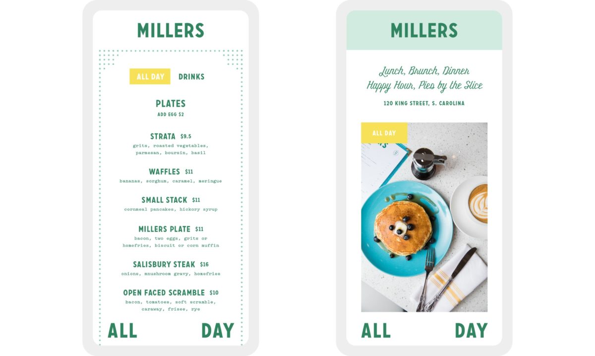
Millers is an all-day breakfast concept inspired by midcentury diners. Based around the restaurant’s centerpiece — a 175-year-old grain mill — Outline created an adaptive identity system that features delicate patterning. The typography is deliciously vintage — print layouts are simple, structured and clean. Fun visual puns dot the visual system; I love the sunrise/egg lockup. The entire identity is jovial and light; seems like a great friendly place to grab breakfast food anytime.
Millers Restaurant Branding by Outline.


