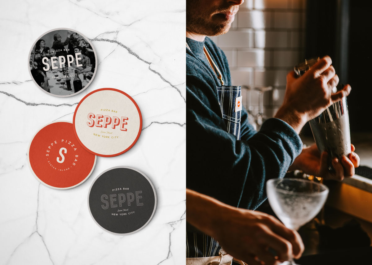
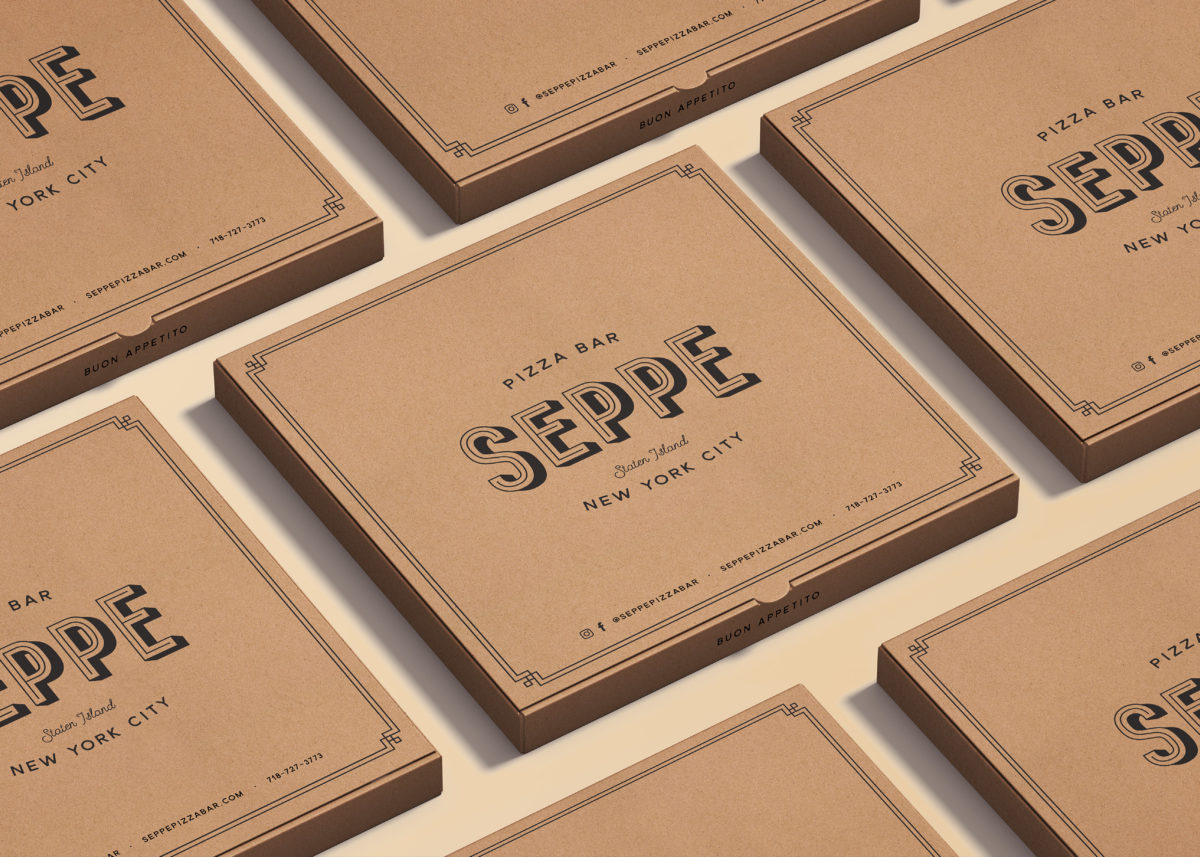
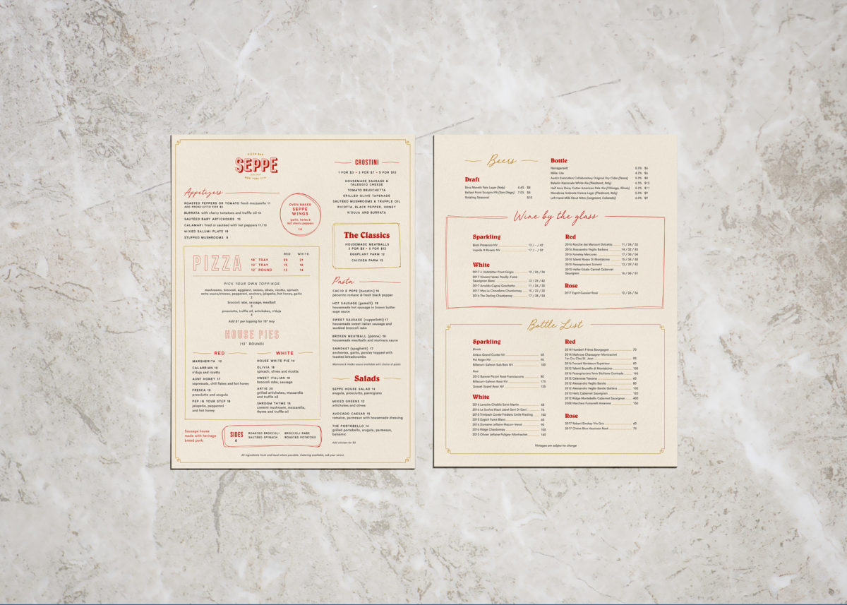
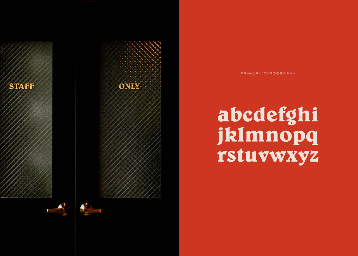
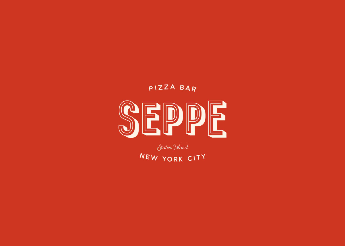
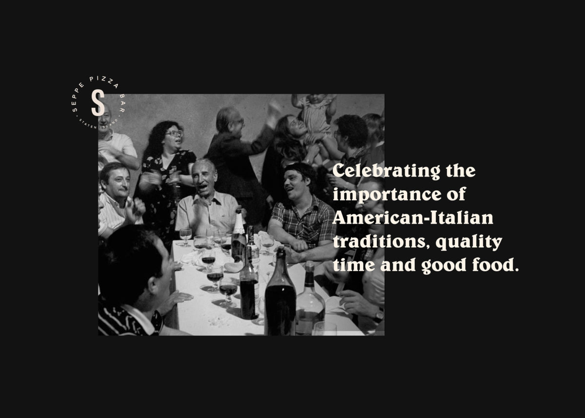
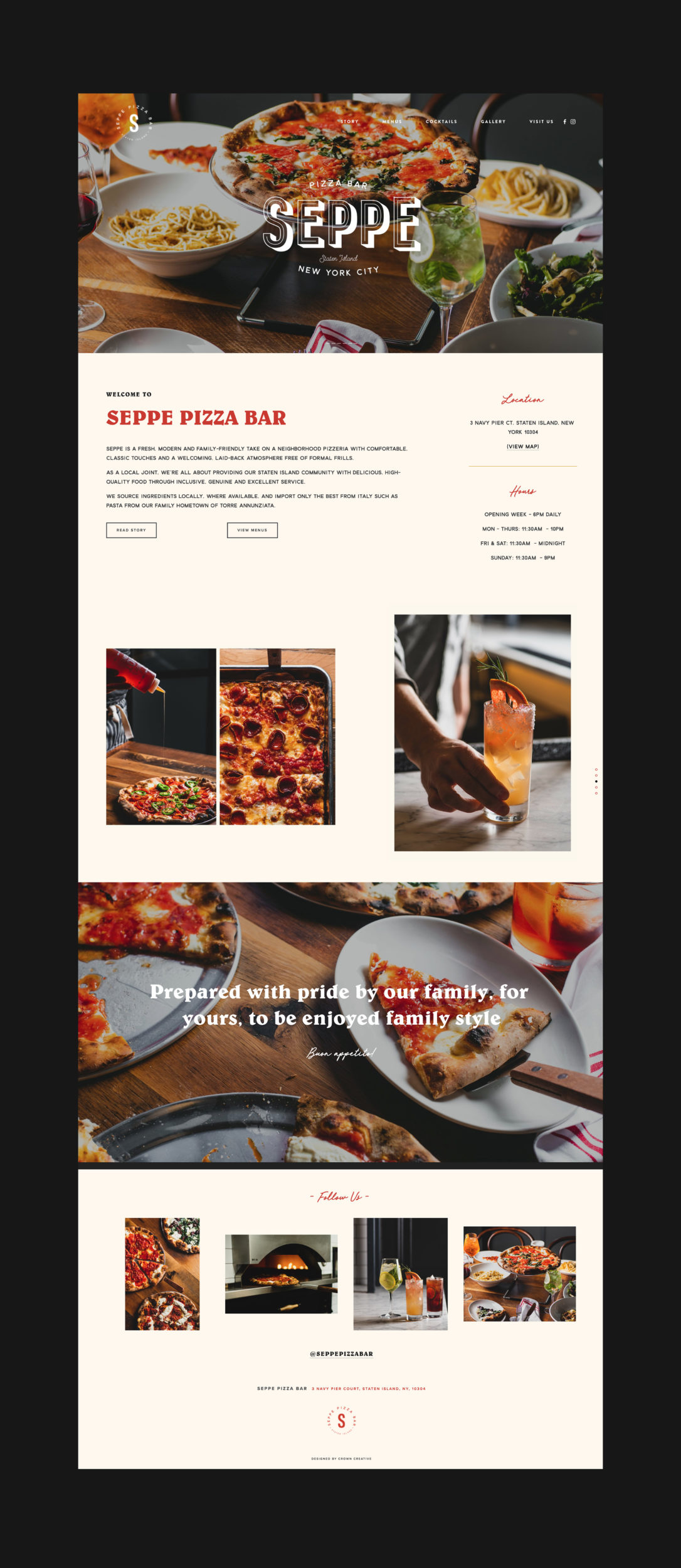
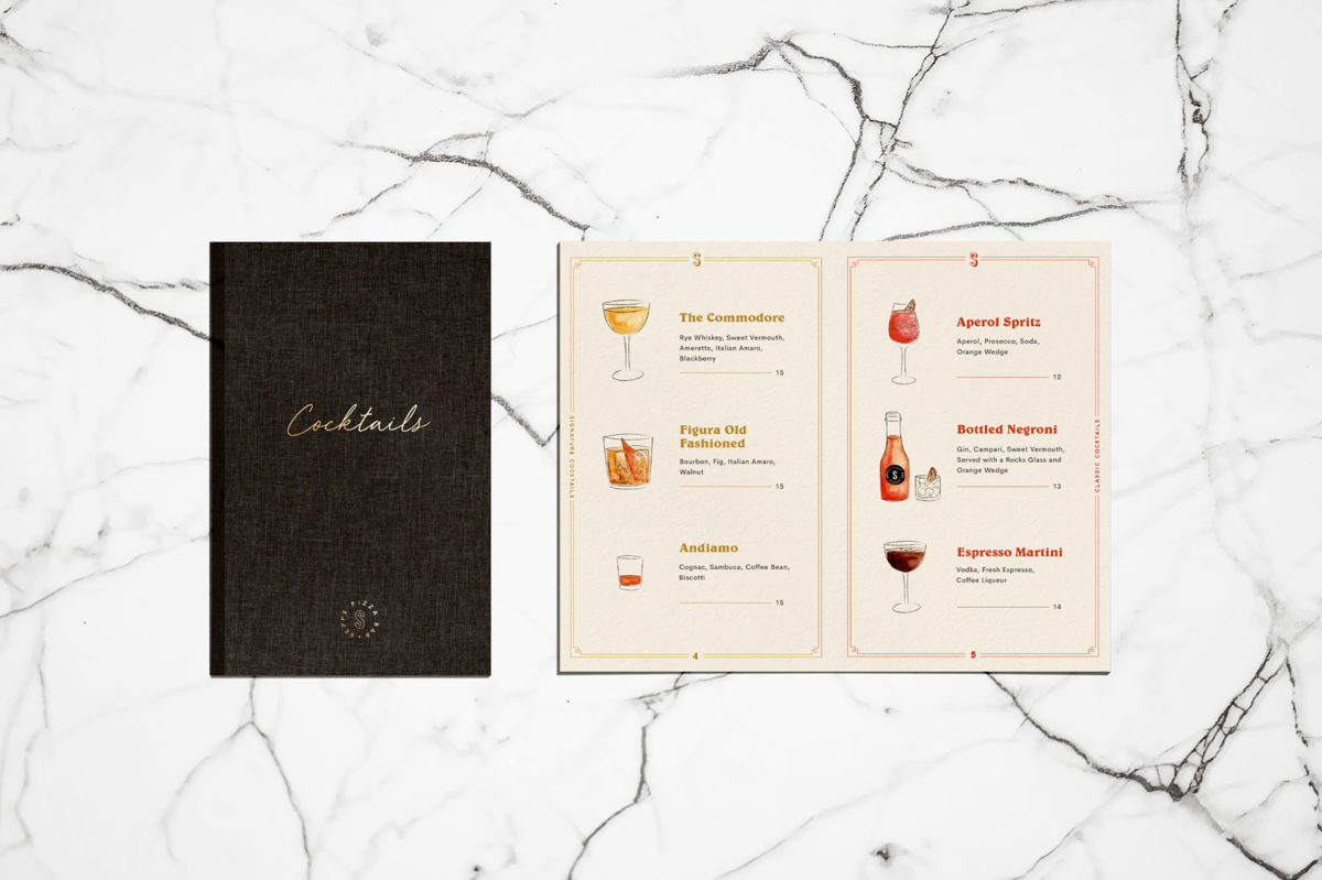
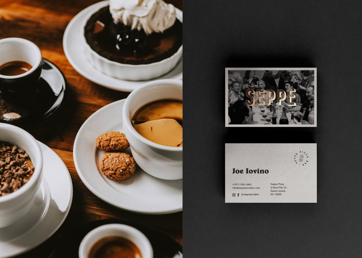
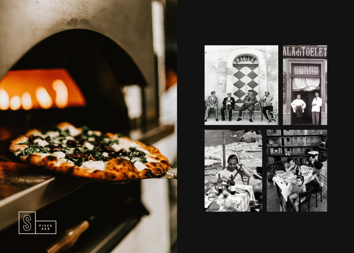
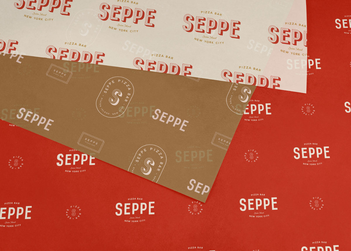
Seppe Pizza Bar is a a fresh, modern and family-friendly take on a neighborhood pizzeria with comfortable, classic touches and a welcoming, laid-back atmosphere. Crown Creative inherited the original wordmark and left it as is, instead choosing to develop the visual identity around the strong typography. A beautiful suite of secondary marks compliments the flagship wordmark and are used casually, with each one getting its fair share of the spotlight. The color palette is the epitome of class; of course there is a tomato-inspired red and a cheese-inspired yellow, but the subbing of a classy black in place of the typical pizzeria green are what really up the posh factor.
Seppe Pizza Bar Branding by Crown Creative.
