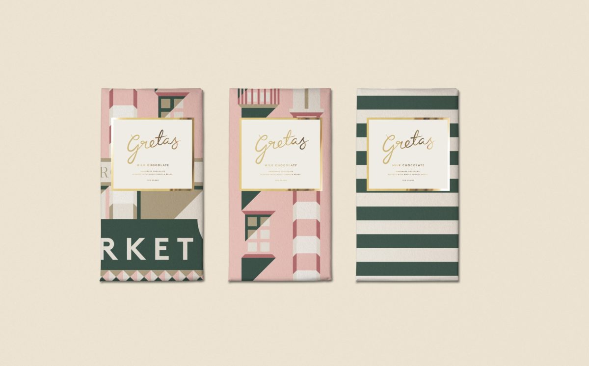
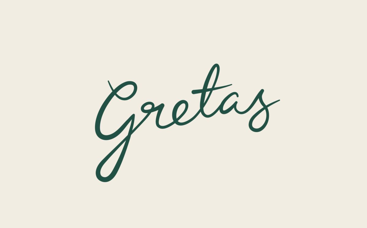
Gretas gets its name from famous Swiss-American actress Greta Garbo, who was discovered while she was working at the former department store that houses the cafe. The identity is based around an illustration that 25th Art House created of the building; it’s cropped interestingly to create a unique architectural pattern on each piece of collateral. The wordmark is feminine and fun, with a calligraphic flair making it feel like a true celebrity autograph. The whole identity has a ‘Grand Budapest Hotel’ vibe to it with its gratuitous use of millenial pink and illustration style, but I’m not mad at it. I think it’s a wonderful evolution of that kind of look, and one that actually makes sense given the context and history of the cafe.
Gretas Cafe Branding & Packaging by 25th Art House.


