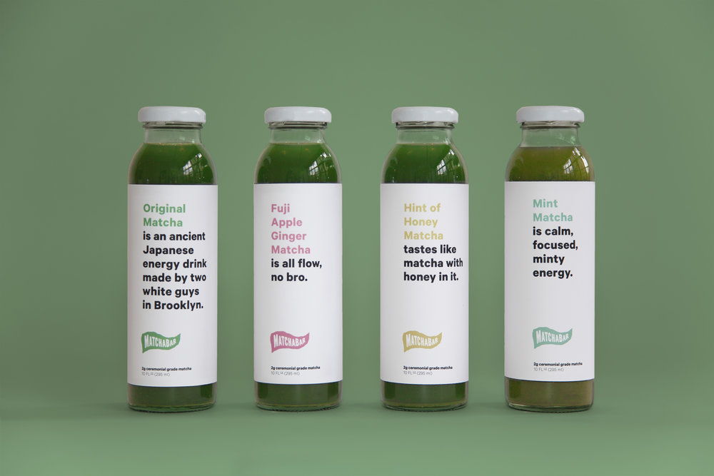
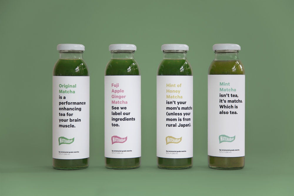
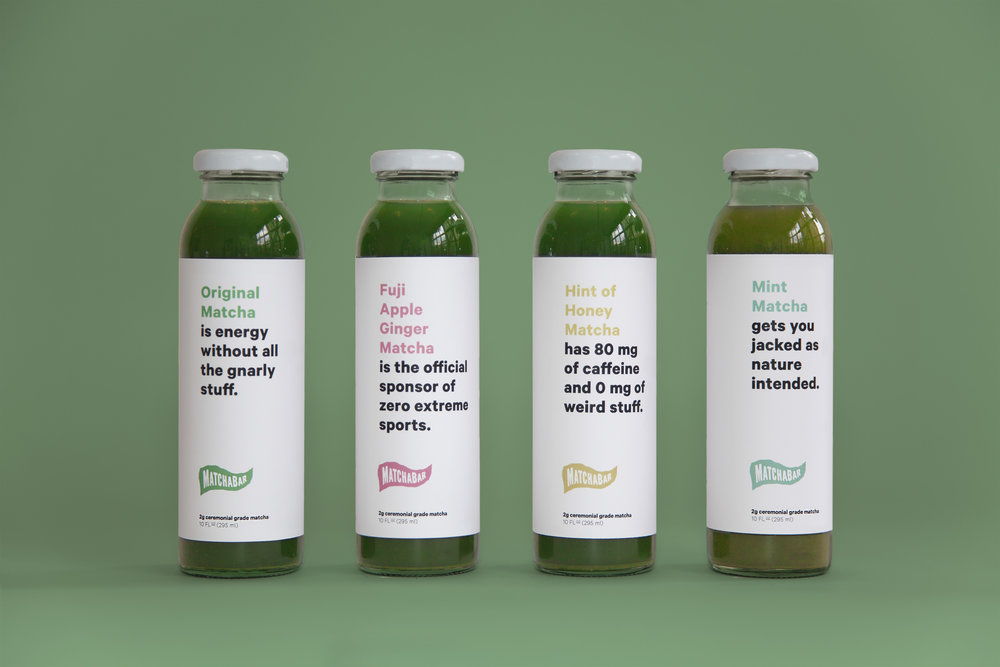
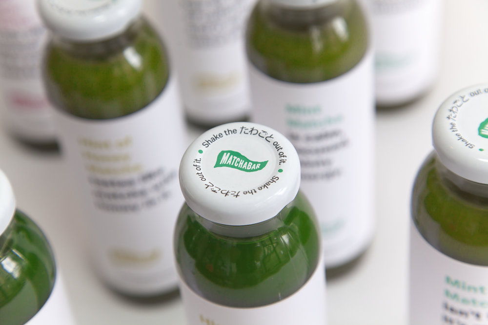
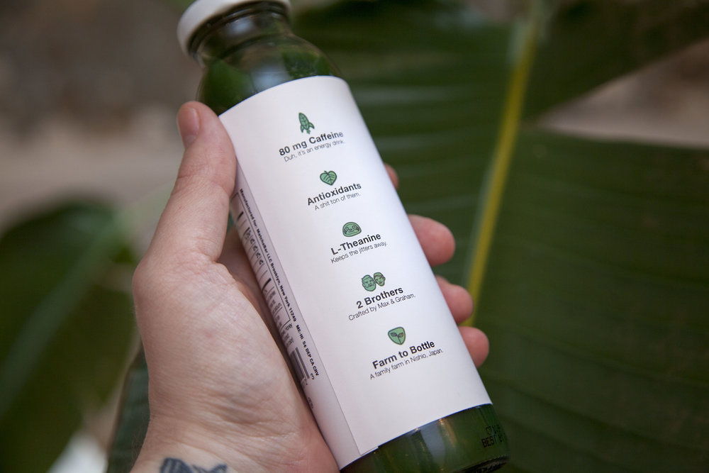
If you live in the states and regularly shop at Whole Foods, you’ve probably seen a Matchabar bottle on the shelf. They have recently started popping up in restaurant cold cases here in Atlanta as well, and I was taken with the packaging and compelling copy. What I find most interesting about this little glass bottle of green drink is that it classifies itself as an energy drink. Now, imagine other energy drinks on the shelf next to a Matchabar bottle. The brilliance of this little brand is how it stands out compared to the Red Bulls of the world, and speaks to the uplifting of mental performance and providing focus in addition to fuel. Matcha’s natural caffeine provides a calm, focused energy that is visually represented in minimal white packaging with matter-of-fact, dry and self-aware copy.
Matchabar Rebrand & Packaging Design by Andrew Charles Bly.
