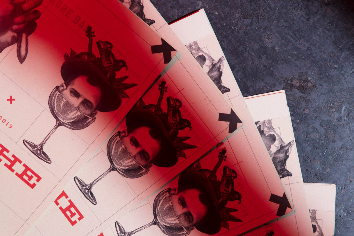
Pinche Bar is inspired by the rough industrial environment its housed in, and its visual identity, likewise, draws inspiration from a rough historical period. Collaged woodcut imagery from the old American west, the age of Prohibition, and figures from Mexican folklore are smashed together to create a surreal and distinctive look. Despite the nonsensical imagery haphazardly placed on their menus, the flow of typography is highly structured, creating a method in which the madness can be navigated. The use of only two colors, red and black, scale back the lunacy, up the class, and visually suggest the fire and charcoal needed to make plate of food.
Pinche Bar Branding by Human.


