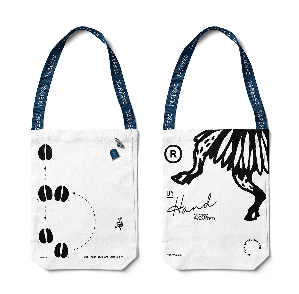
Taresso Coffee Roasters has a brand overflowing with that Luminous Design Group calls ‘typographic implementations’. It’s a look that, when executed poorly, can be overwhelming and hard to digest. With Taresso, however, a restrained color palette helps make navigating the noise easy. Each touchpoint of the brand uses no more than three colors; a neutral base for a background, another neutral for the typographic implements, and a strong pop of royal blue or gold for the important stuff. This balance between the calming use of colors and busy, energetic layouts gives Taresso a unique, high-end artisanal look without skimping on attitude.
Taresso Coffee Roasters Branding by Luminous Design Group.


