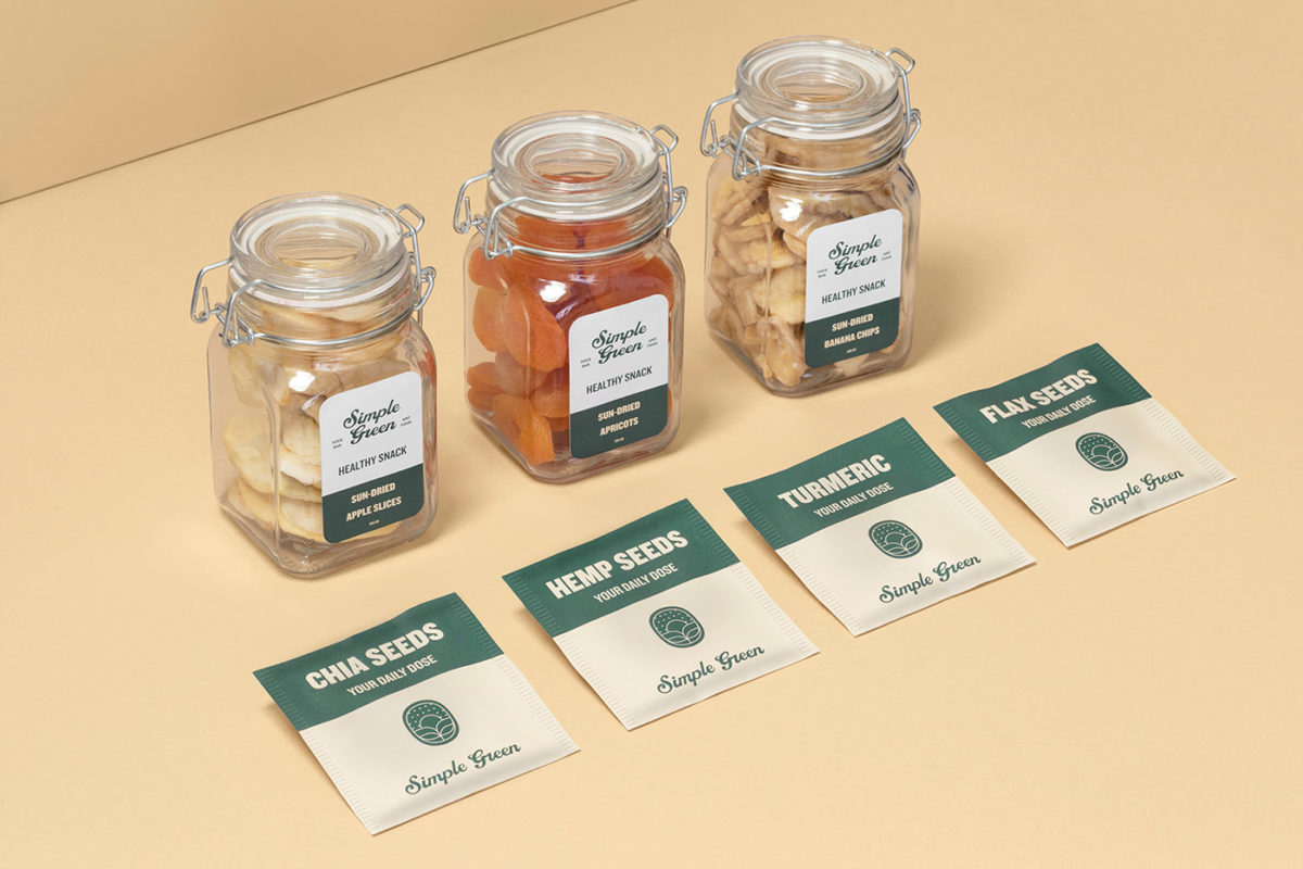
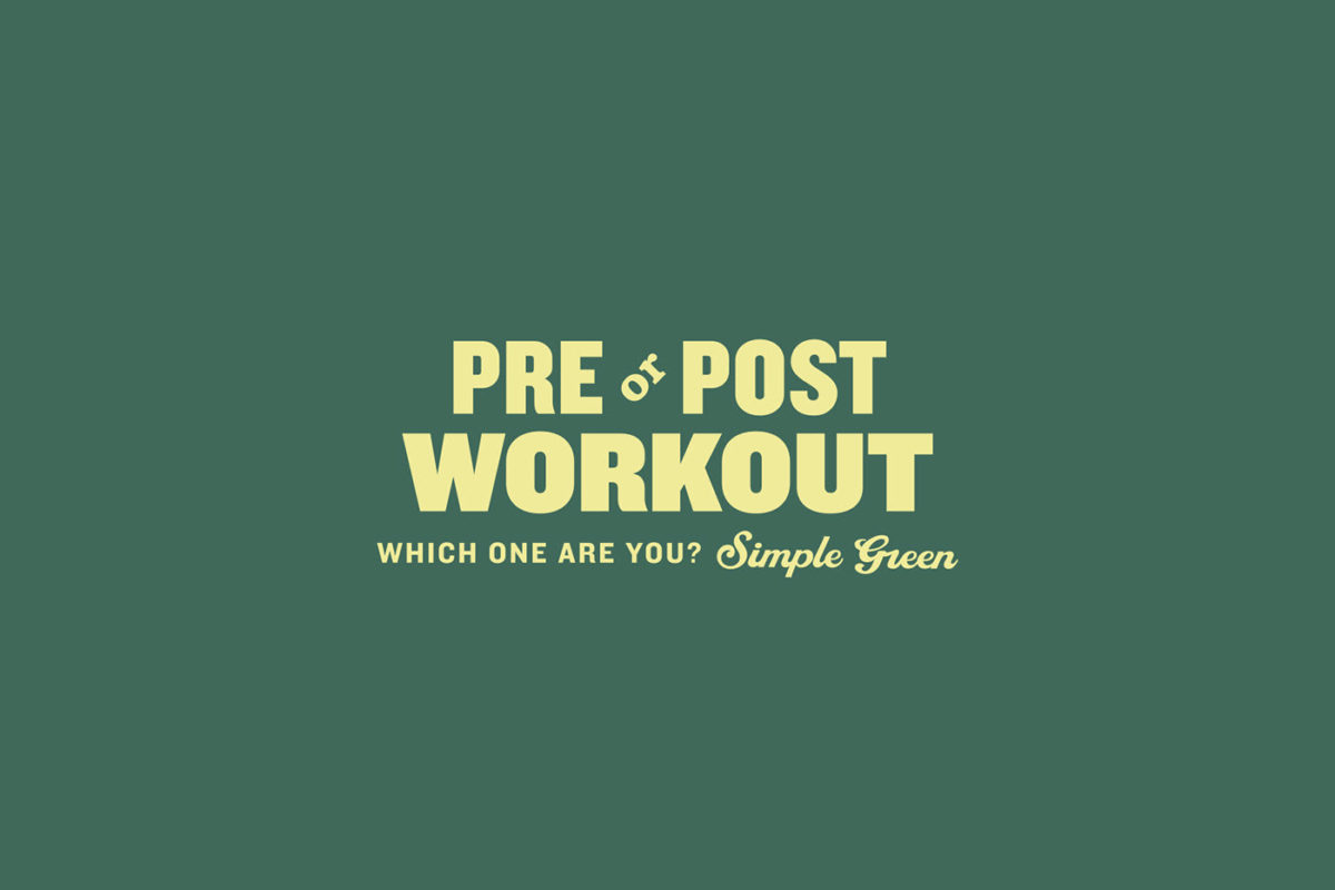
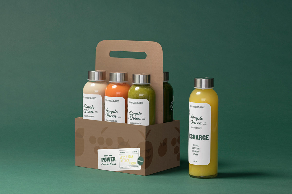
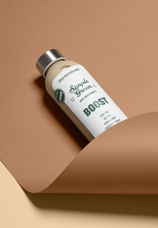
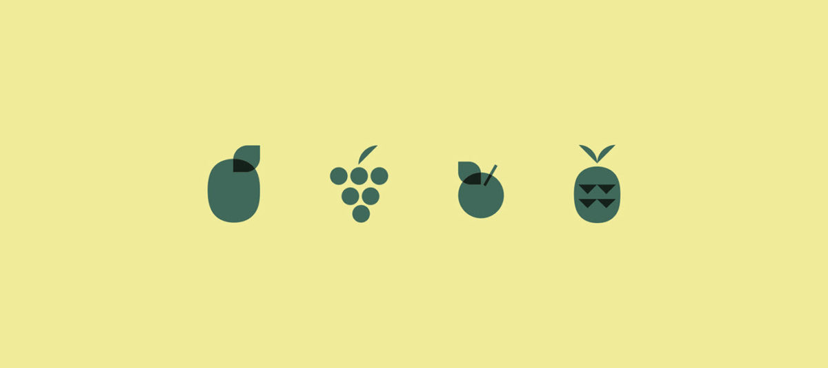
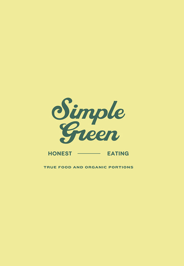
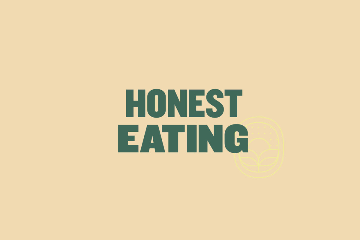
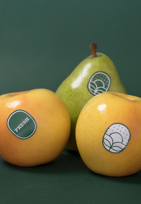
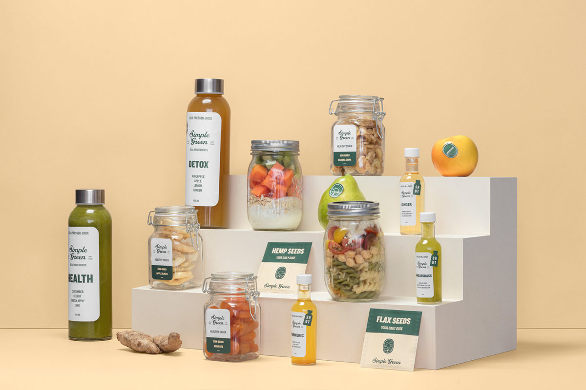
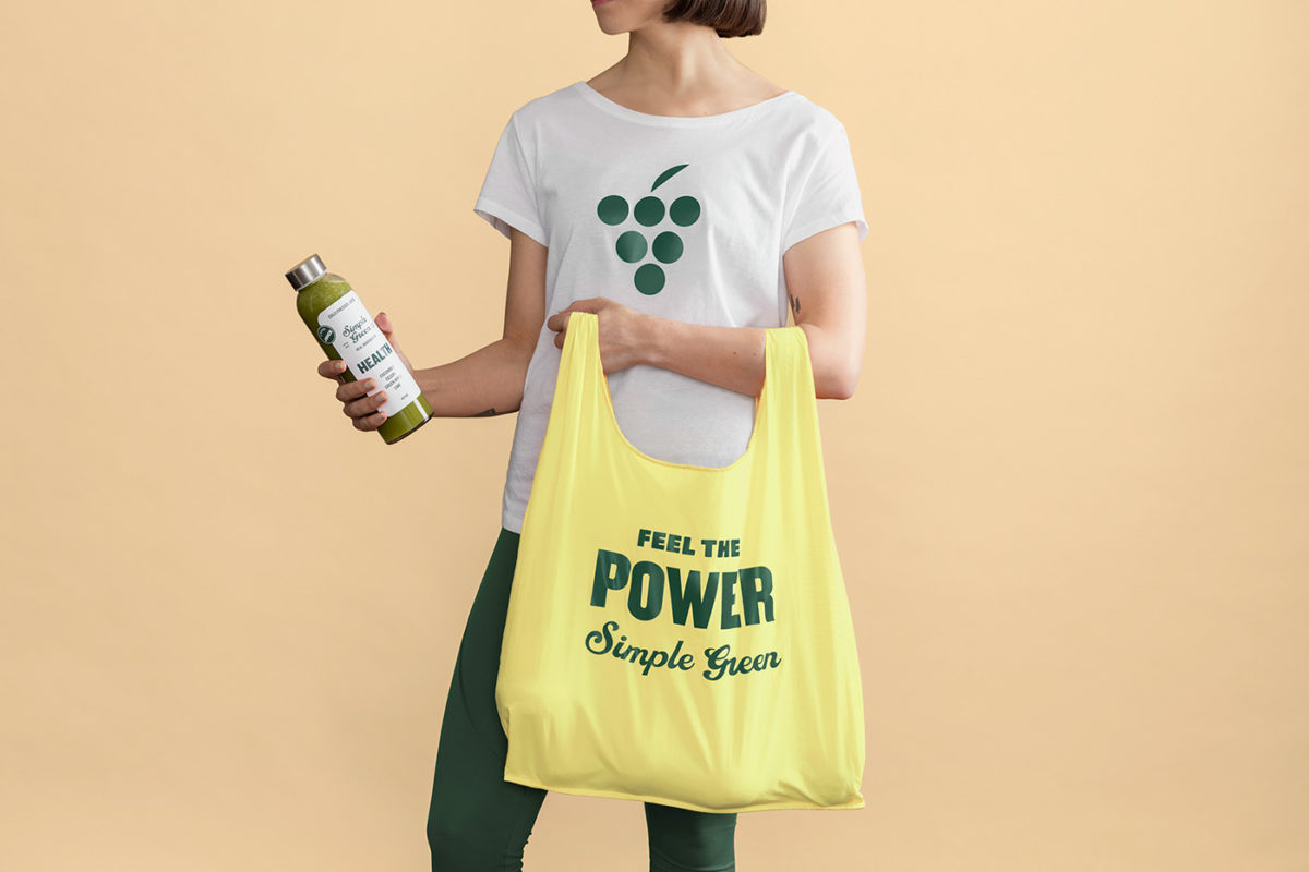
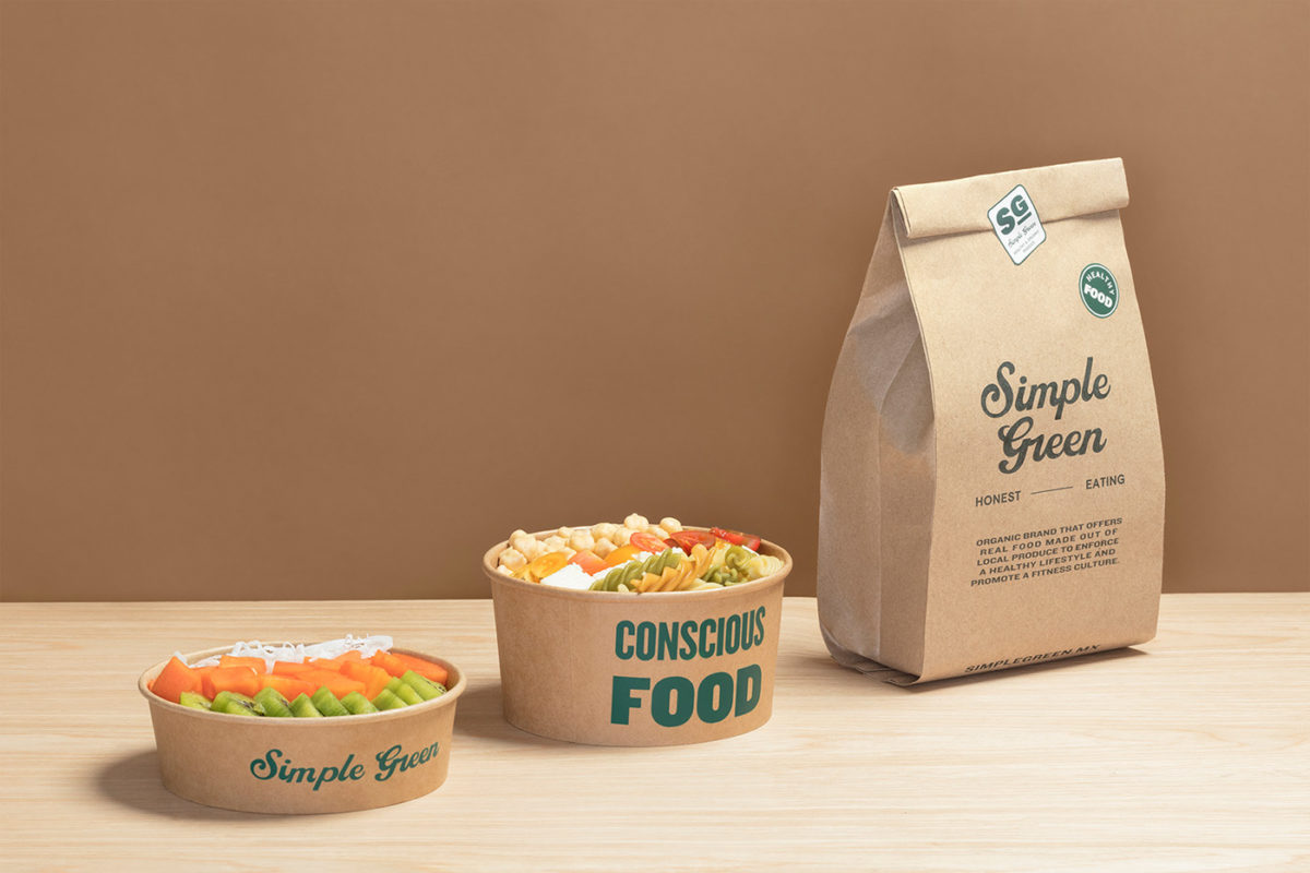
Eating healthy should be simple, and that’s what Simple Green aims to do with its organic produce, prepackaged snacks, and its ‘honestly’ prepared meals. Made to compliment an active and fit lifestyle, Simple Green has an easygoing, friendly vibe, incorporating a genial script as its logotype, supported with a crew of clear and blocky typefaces, ranging from a condensed san serif to a retro slab serif. A simple color palette of muted yellow and deep verdant green allows the product to shine with little distraction from the visual identity, and this simplicity is also carried over to straightforward type systems across their menus and packaging suite.
Simple Green Cafe Branding by The Branding People.
