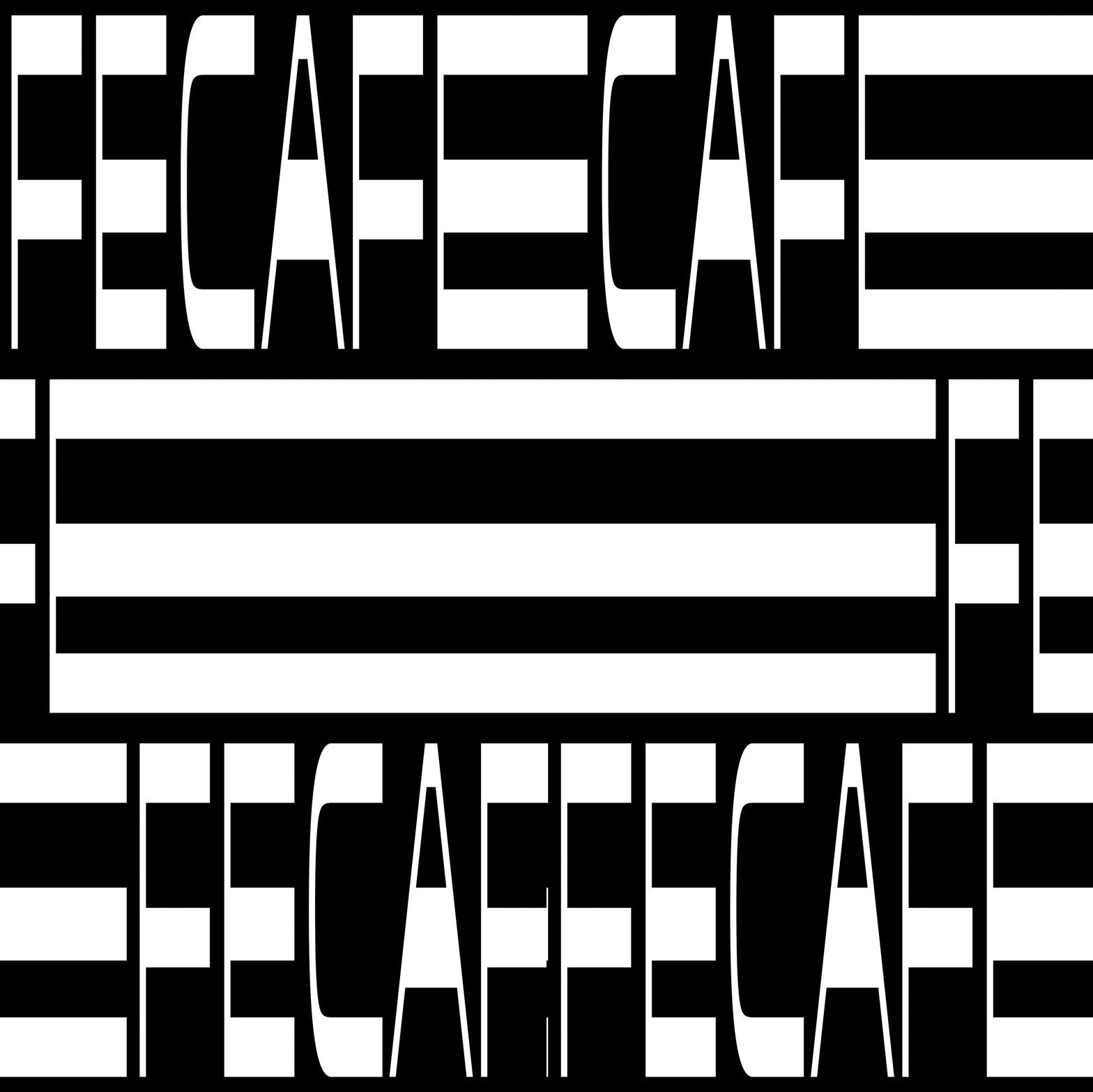
Designed for Seis Montes’ line of “everyman’s coffee”, Fecafe’s name and aesthetics were inspired by the sounds of street vendors selling their brews. The wild typography, iconography, and high contrast color palette give the customer a slice of the eclectic signs typically displayed on the vendors’ carts while adding a layer of polish for packaging that stands out from the rest. The fun composition where the labels are placed at various, seemingly unrelated locations throughout the packaging creates multiple incentives to rotate and visually explore each package to fully understand its contents.
Designed by Diego Prestes.


