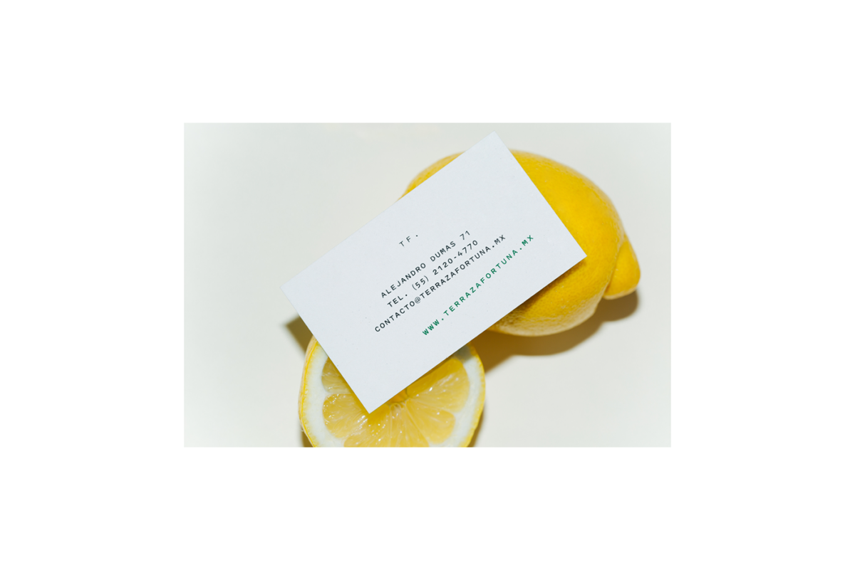
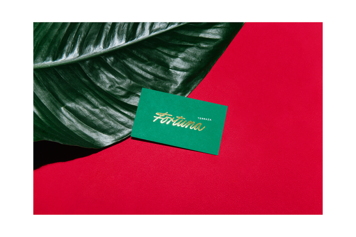
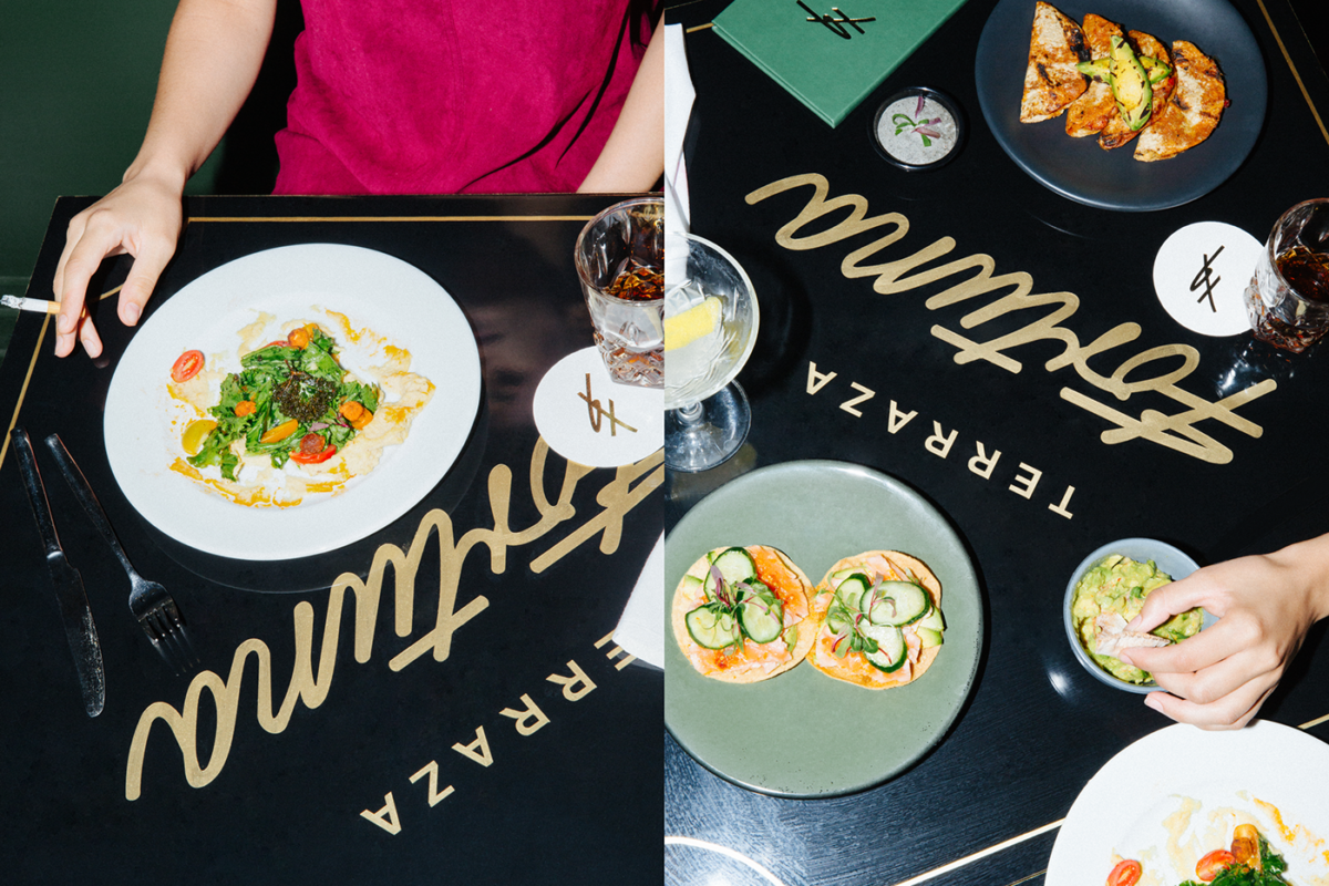
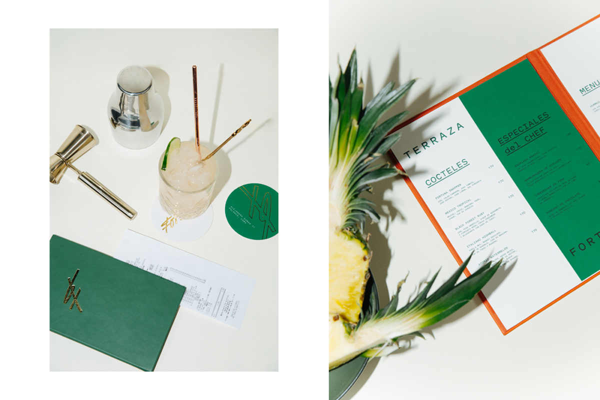
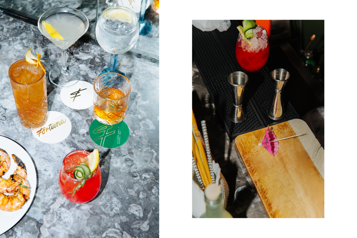
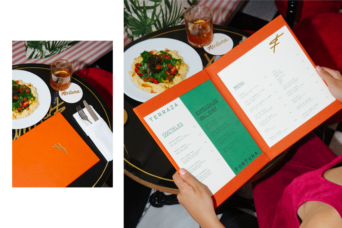
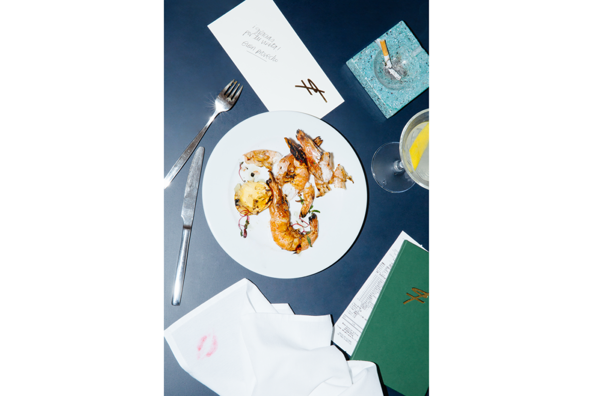
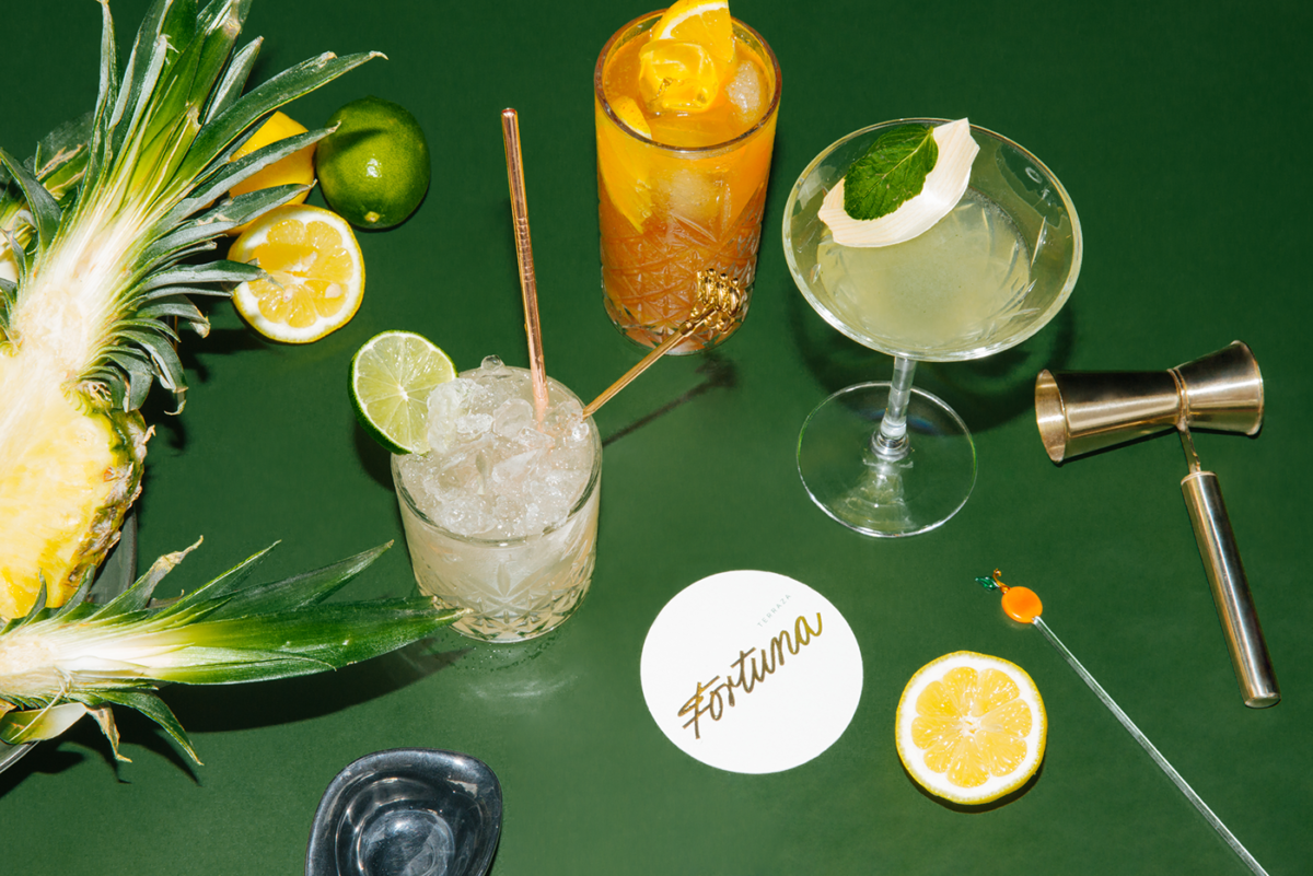
Terraza Fortuna, located in the Polanco neighborhood of Mexico City, offers a joyous atmosphere where guests can grab a delicious bite to eat and bust a few moves on the dance floor afterwards. The anchor of this visual identity is the gilded logotype, scrawled as a signature across business cards and menu covers, that adds personable energy to each piece it graces. The type systems, too, exude this energy, with unexpected layouts found in the menu and off-kilter lines of type found on other collateral. FAENA Studio states the source of this typographic inspiration as the blackboards typically found behind the bar at European terraces:
…typographical chaos of the blackboards full of information, text blocks and different typographic styles, we find two of the words that best define Fortuna’s identity: beauty and honesty.
Terraza Fortuna Branding & Visual Identity by FAENA Studio.
