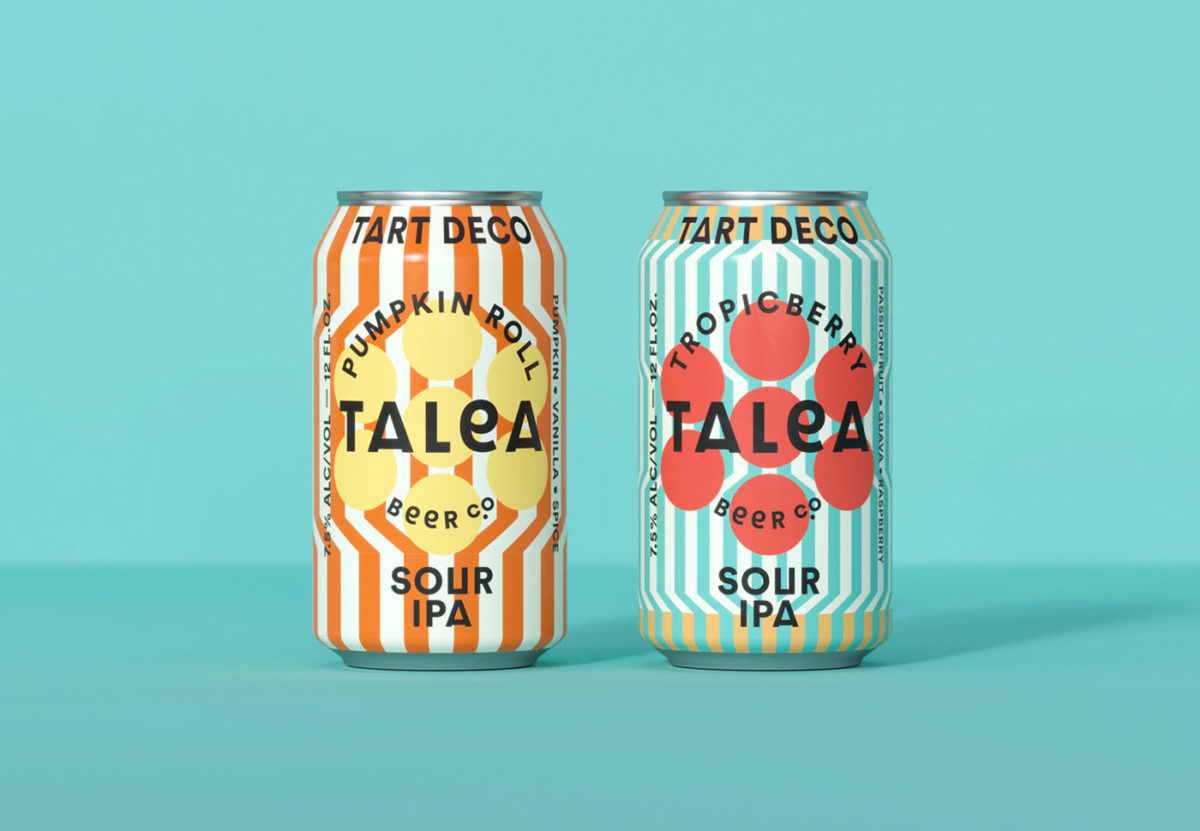
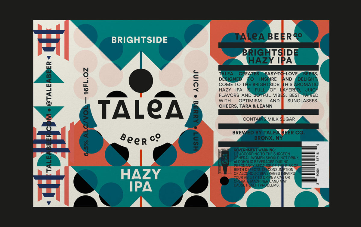
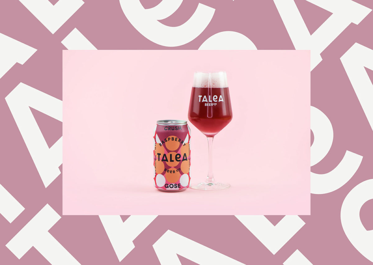
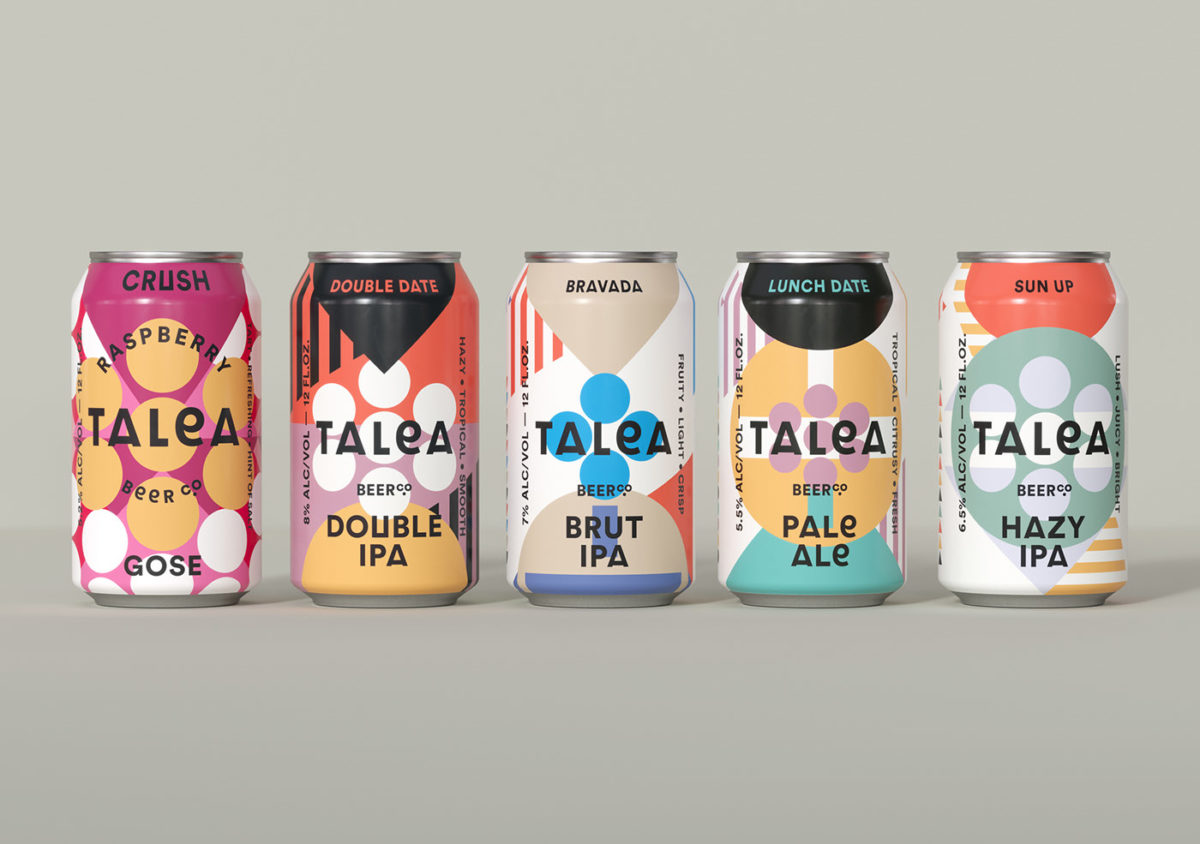
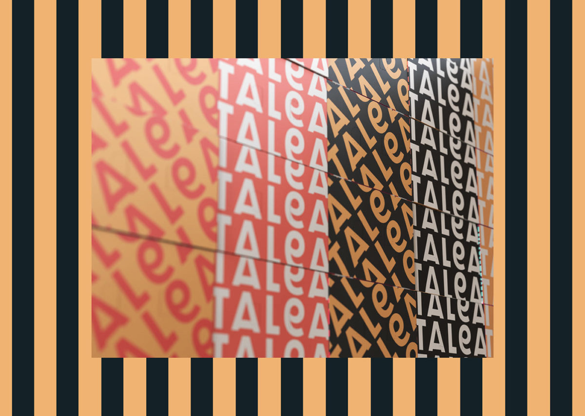
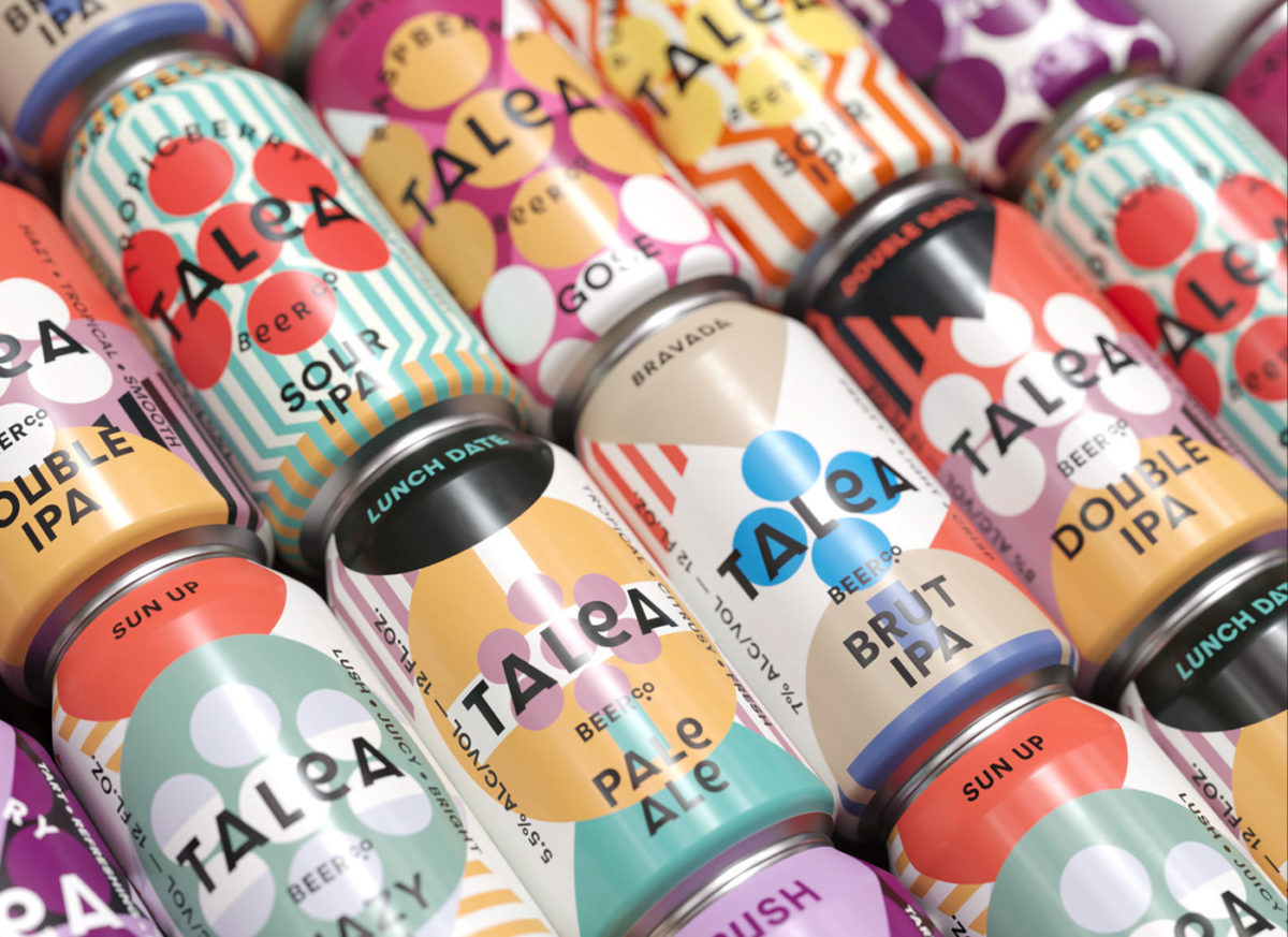
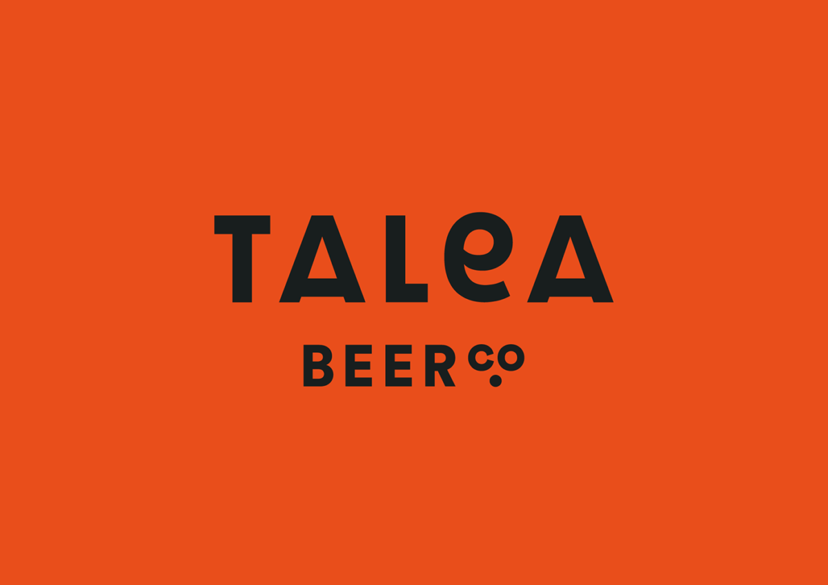
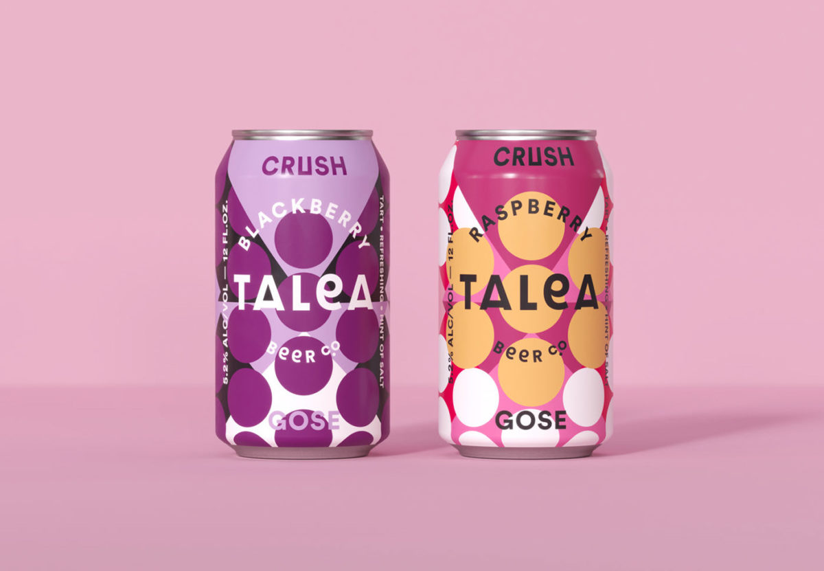
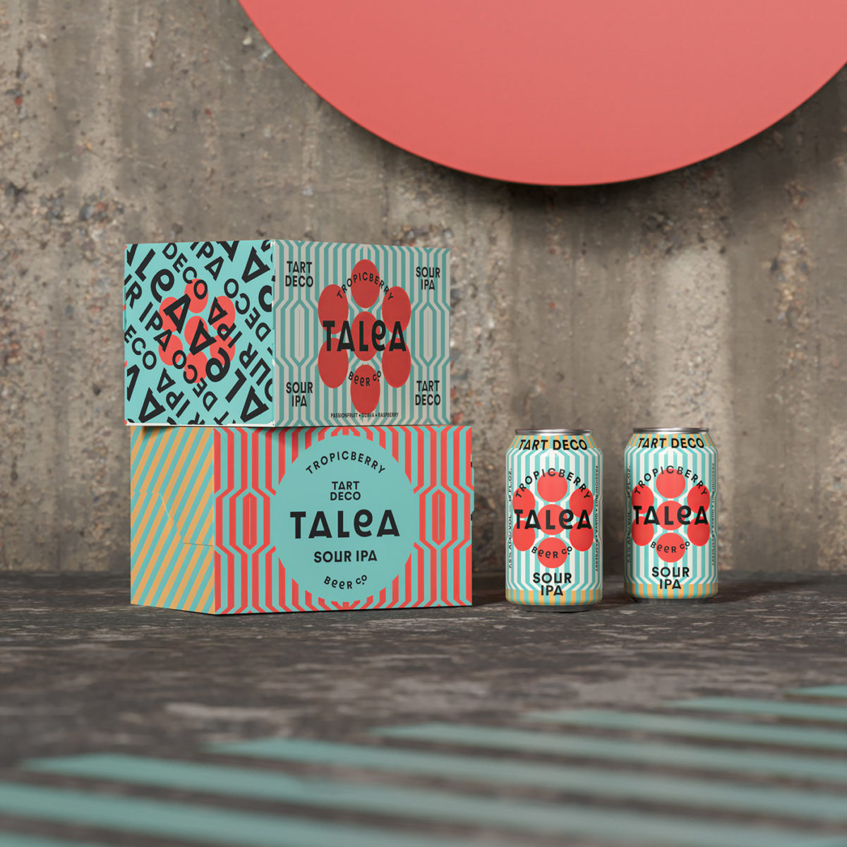
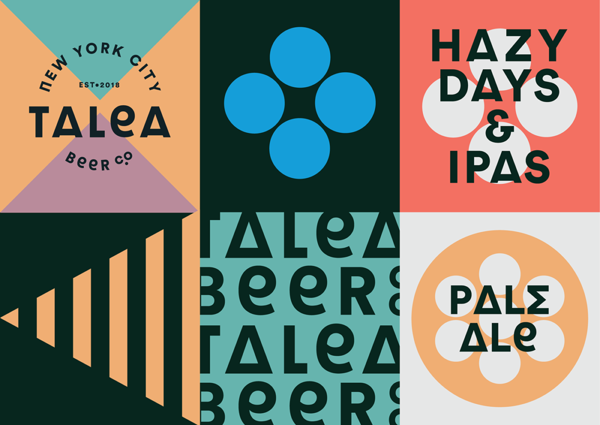
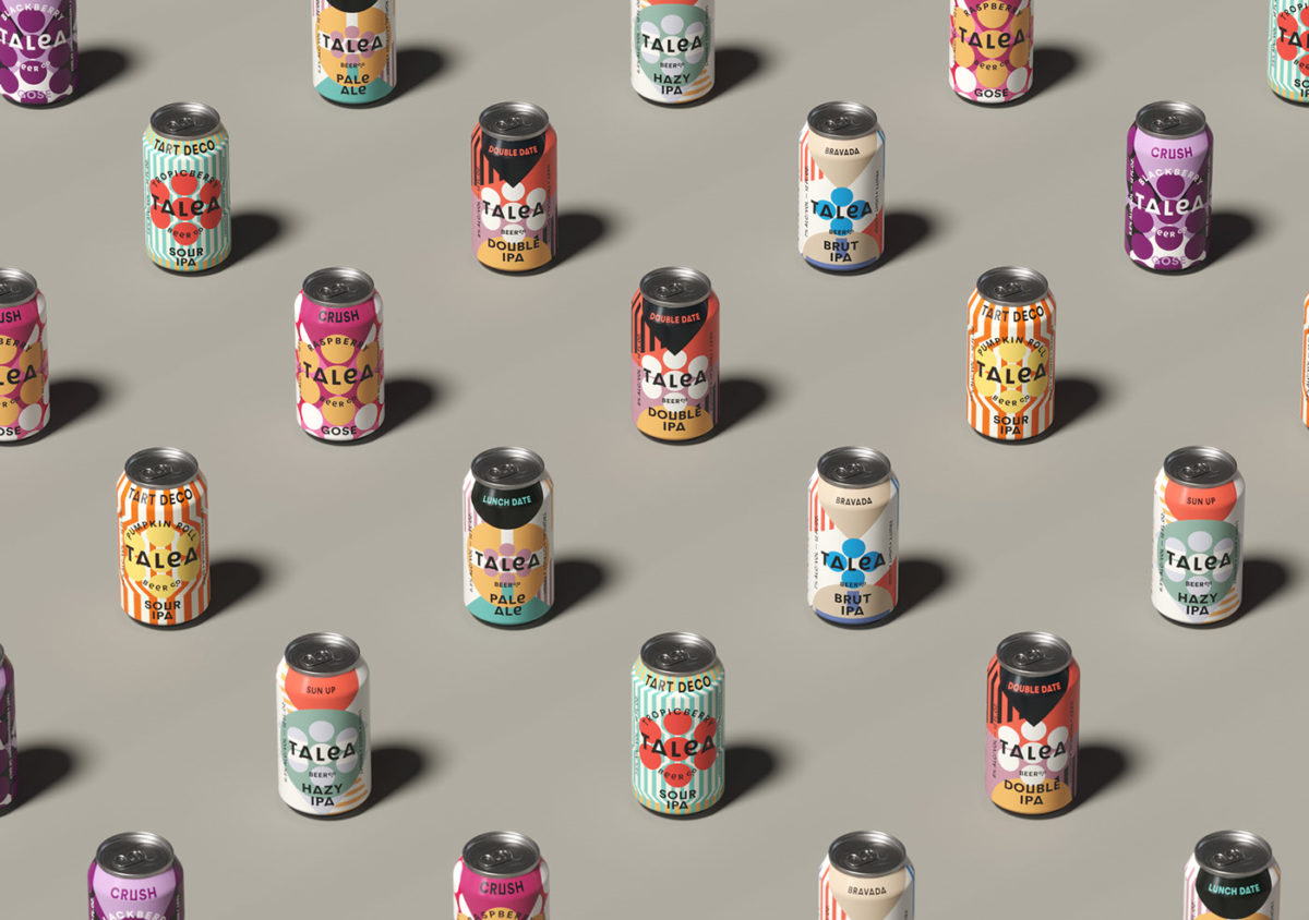
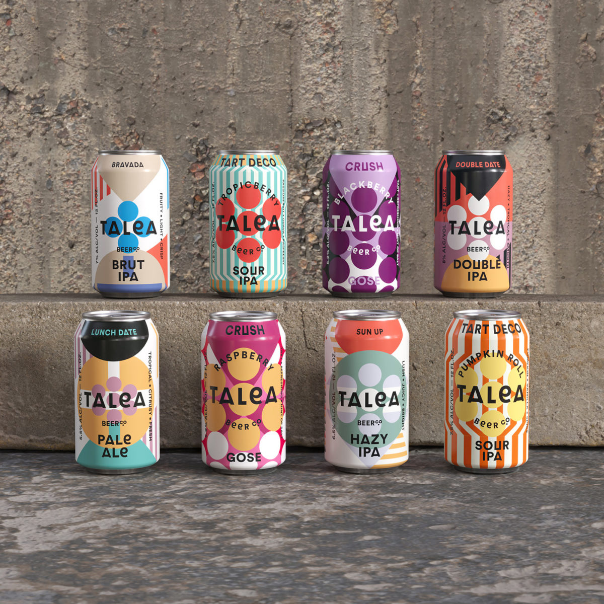
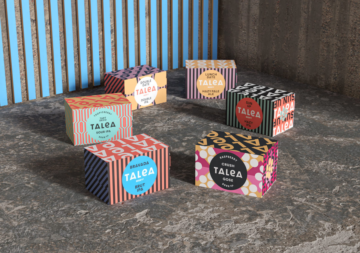
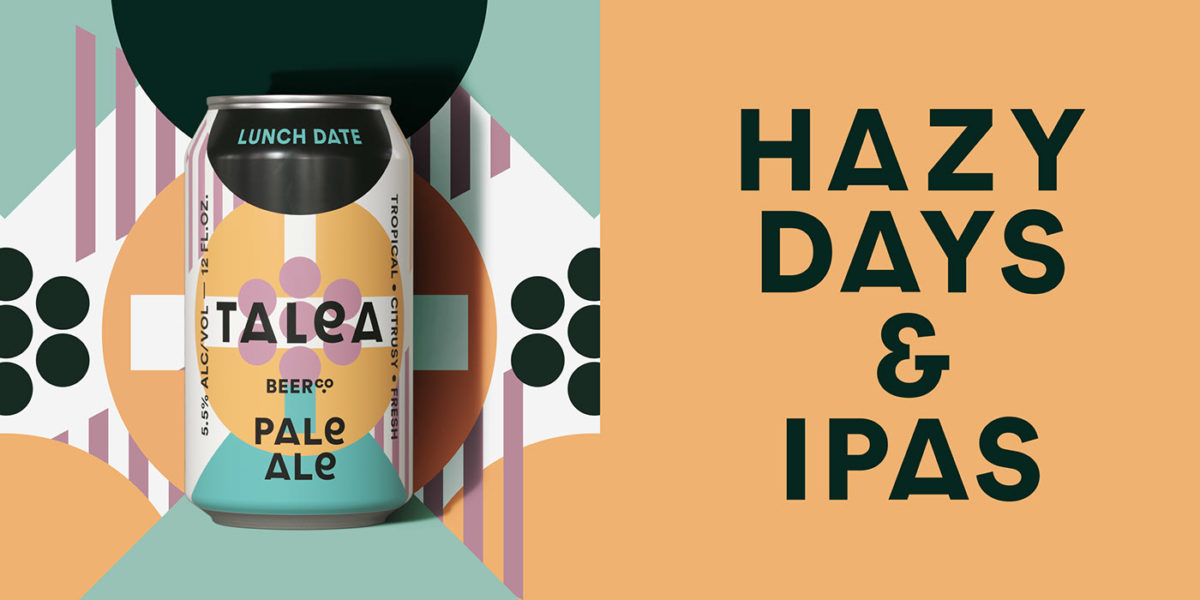
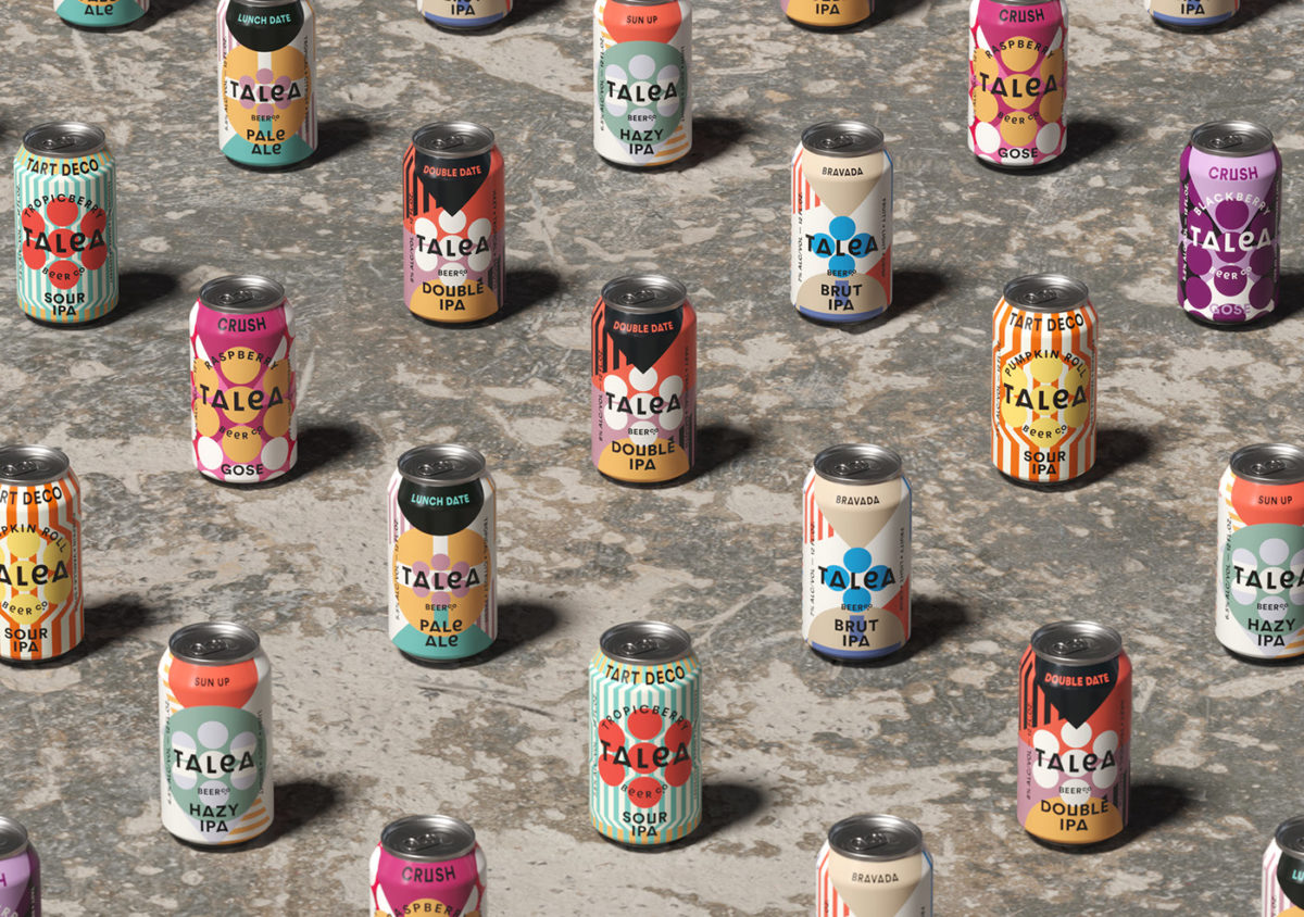
Shelf-space in the craft beer aisle becomes more and more limited with each passing week it seems like. Breweries, as of late, seem to be turning to bright, unorthodox can designs to catch a shopper’s eye while they browse, and Talea Beer Co’s can’s exemplify that trend. Talea’s cans are busy-busy-busy; covered in candy-colored patterns that wrap the whole can, randing from space-distorting stripes to all-over polka dots, some cans even mismatch the pattern work, shocking the eye but making it equally hard to look away. The typographic hierarchy and layout is the only consistent element from can to can; logo placement and any additional descriptive copy can always be found in the same place, perhaps marginally shifted in color in order to better standout on its background. Don’t think for a second, though, that this type is without personality. Roman letters freely intermingle with other letters where you least expect it (the letter delta replaces an A, and sigma replaces a capital E, for example) adding another layer of personality but not hindering legibility.
Talea Beer Co. Branding & Packaging Design by IWANT Design.
