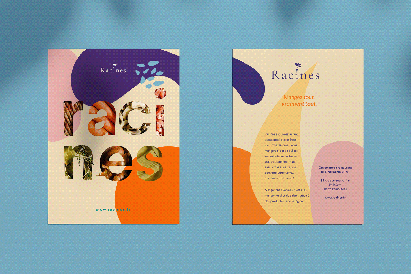
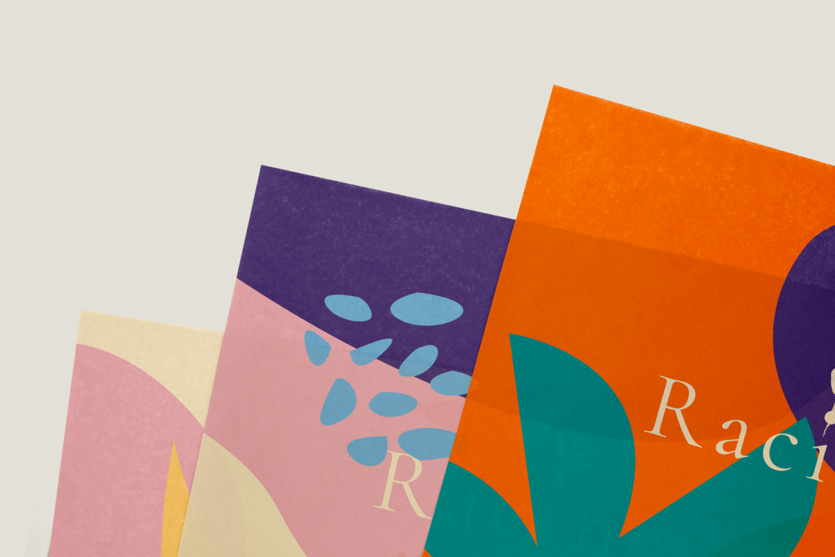
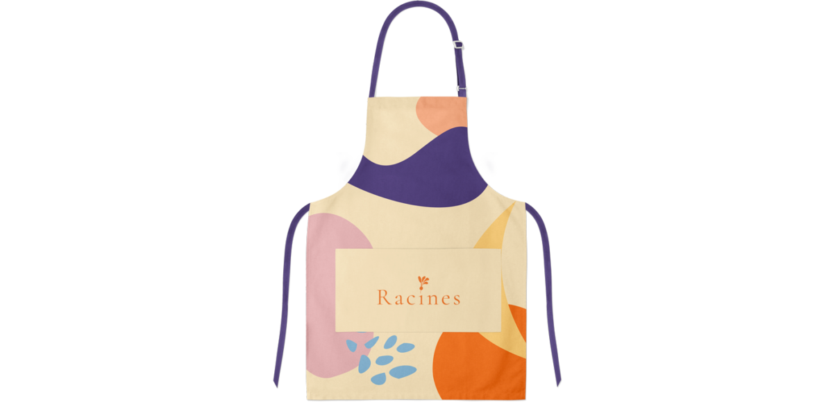
Racines is a Parisian restaurant focusing on all things green; not only is their menu focused on seasonal and local products, but the restaurant is also focused on providing its services sustainably. What does that mean, exactly? According to designer Laurianne Froesel’s case study, that means that in order to cut down on the use of wasteful materials, everything at Racines is edible, down to the plates and menu. As such, the branded touchpoints were designed to be as ‘tantalizing’ as possible, covered in juicy-looking colors that invite a bite. Abstract, loose blob-shaped illustrations follow the trend, but to be honest it’s not one I’m tired of just yet. Contrasted with sharp, regal serifed typography, it looks fresh and new.
*note that I am unsure, based on my research, is this is a real restaurant concept. Regardless, we wanted to showcase the beautiful work.


