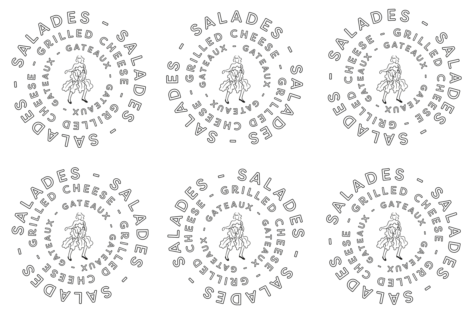
Salads don’t have to be boring; they can be so good they make you want to wear a lettuce-dress and do a little jig. Camila Salads’ branding makes us want to do that, too. For a simply executed visual identity, the look is brimming with energy and life. The minimal black and white color palette lets the typography do all the talking; a lively script, used in the logotype, is scrawled across the menu in bold strokes, punctuating the structured hierarchy. Type is used as pattern, too; Camila is spelled out in all caps, outlined, and then repeated to act as a textural element instead of a typographic one. Last and certainly not least, there is Camila herself, donning her lettuce-dress. I love the amount of personality in this small, simple illustration. The illustration style too pairs perfectly with the outlined-type treatment used in the system.
Camila Salads Restaurant Branding by Le Billyclub.


