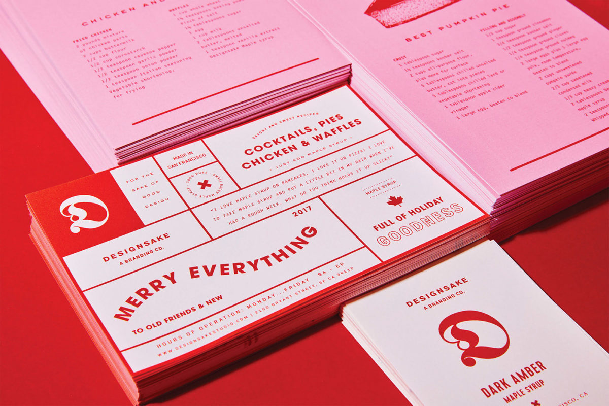
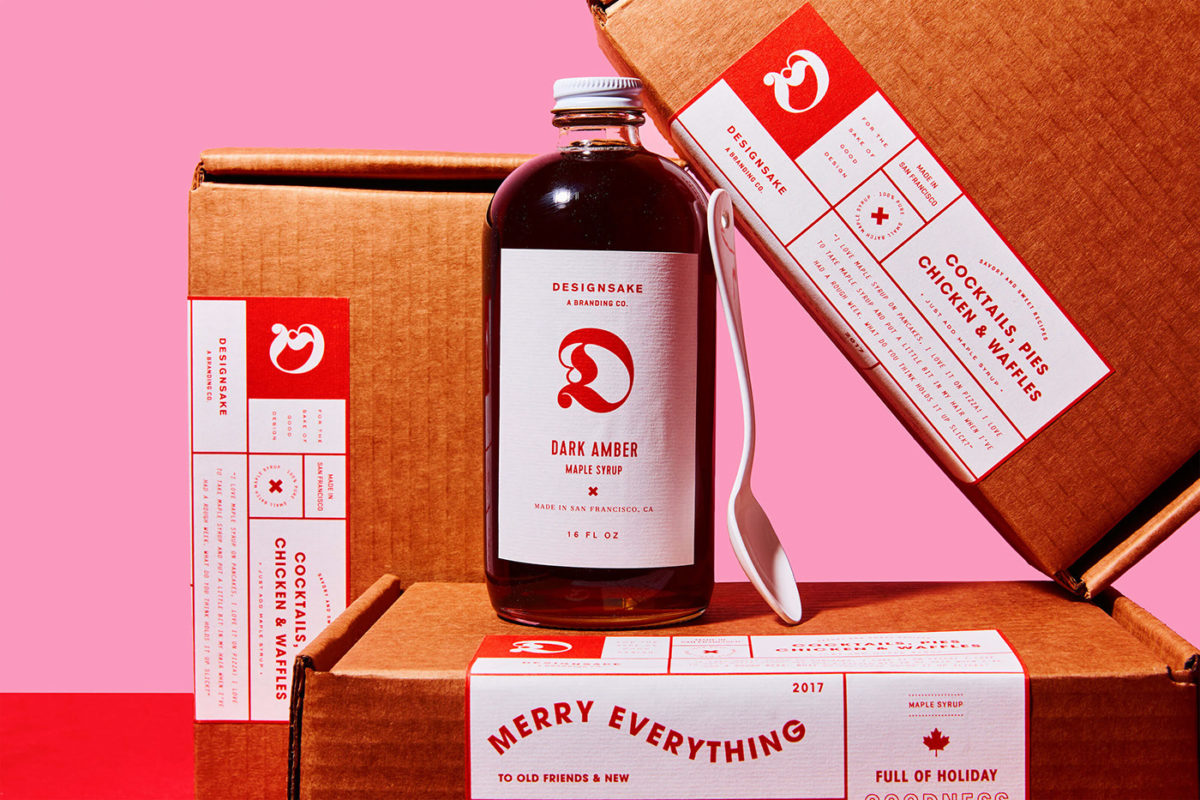
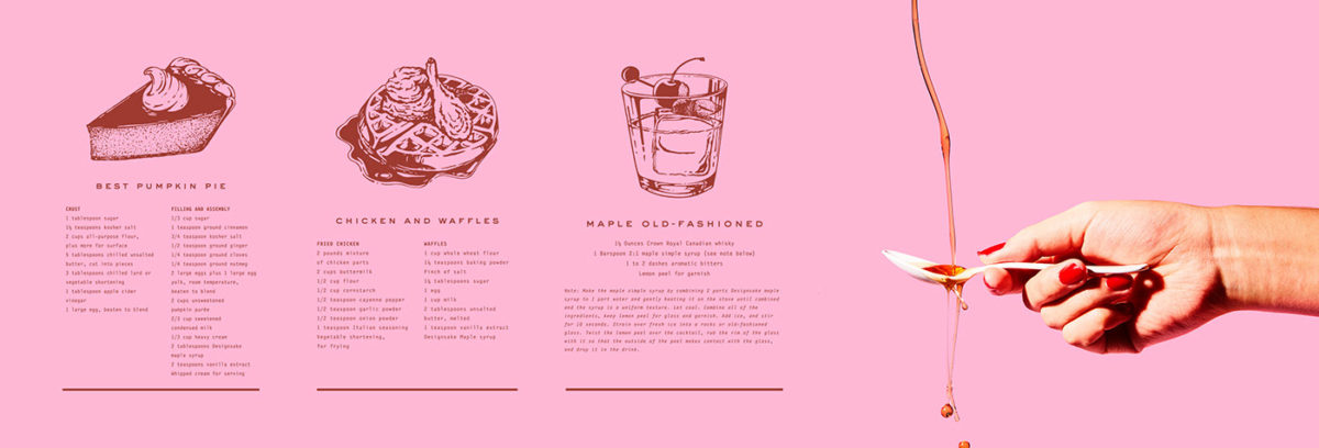
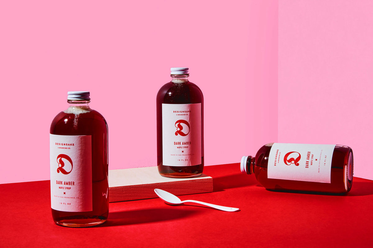
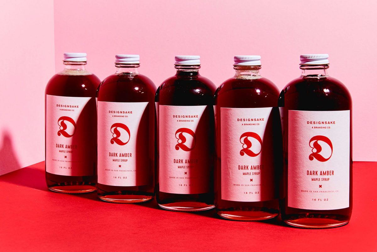
Yes, this case study is a couple years old and yes, its an agency holiday gift and we’re in the beginning of summer, but I want this case study by Designsake deserves to be celebrated year-round. Especially because it’s maple syrup. Walking down the grocery aisle, most maple syrups don’t look particularly interesting. They lean rustic and familiar. Since this is a gift from a design studio to help spread holiday cheer, they needed to amp the ante on what maple syrup could look like. Using a beautiful scarlet color resonates with what we already associate with the holidays and maple syrup, but pairing it with a punchy pink on the supplementary assets takes it to another level. Clean and highly structured typographic layouts paired with some playful typographic lockups push this look further into the trendy-sphere. I especially love that Designsake didn’t just send their clients bottles of maple syrup; they included recipe cards and really made it their own. Bravo, y’all.
Small Batch Maple Syrup Packaging & Print Design by Designsake.