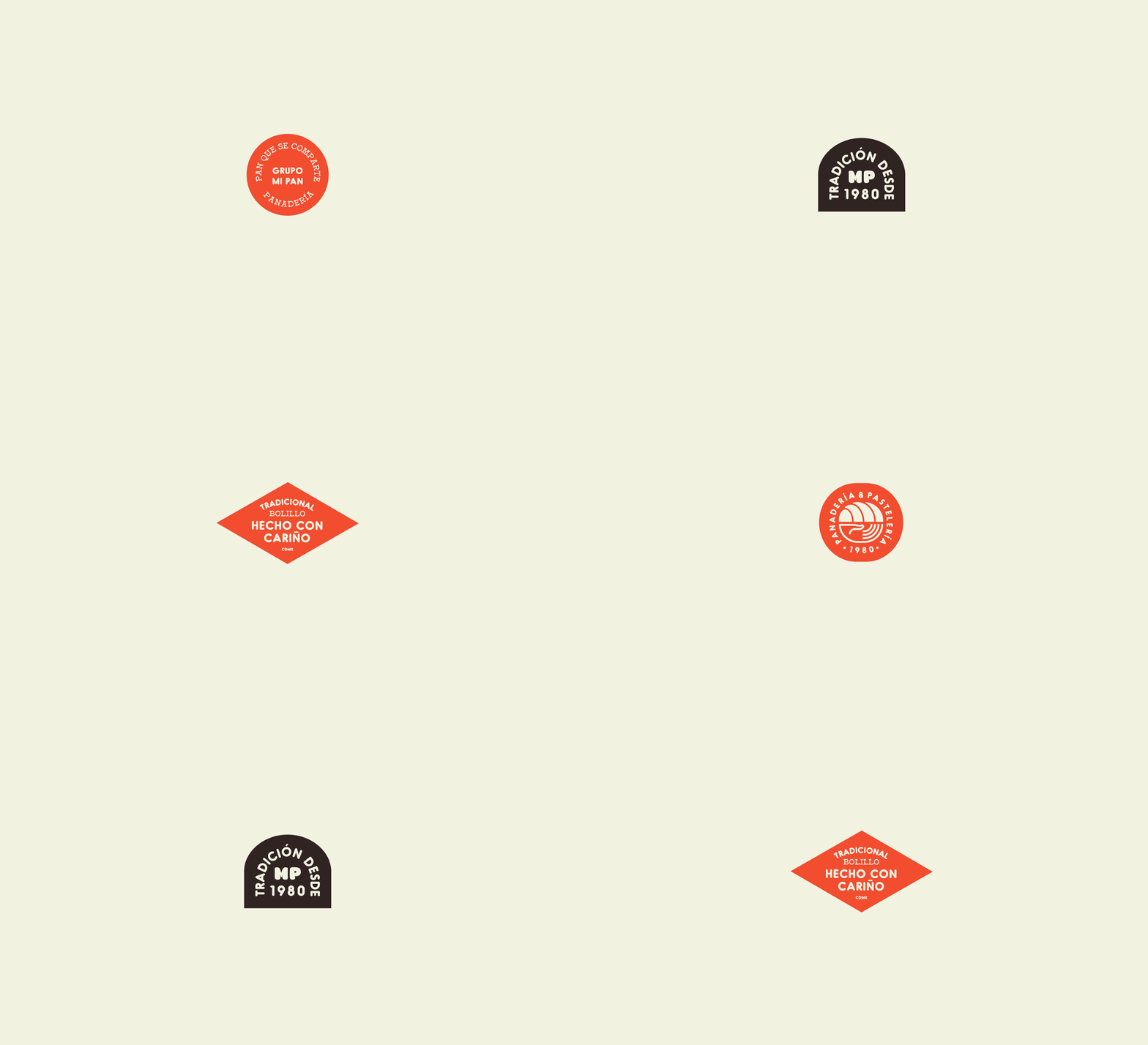
Rebranding neighborhood staples is no small feat. Mi Pan has been a Mexico City staple for over 30 years, and so Firmalt had to delicately navigate evolving the brand in a way that didn’t erase its rich history. Their solution was to update the wordmark, keeping elements of the previous logo such as the heart tiddle over the i, and updating the typography in a way that still dealt down-to-earth. The color palette is unique for a bakery; a bright orange hue serves as the main brand color, contrasted with softer, more expected tones of beiges and grays. Traditional type arrangements have been updated with modern typefaces, again alluding to Mi Pan’s history but with a fresh and modern twist. I think it was also a wise move that Firmalt built the year the bakery was founded into the supporting elements; the founding year 1980 can be found across packaging and other touchpoints, a literal representation of the bakery’s age.
Mi Pan Bakery Branding by Firmalt Agency.


